


I am happy to present my redesign of the Montreux Jazz Festival 54th Edition, following up my semiology thesis about the festival's official posters.
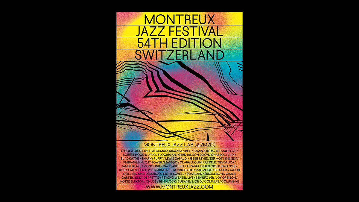
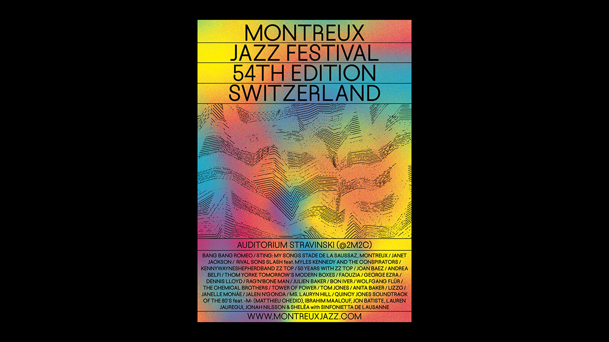
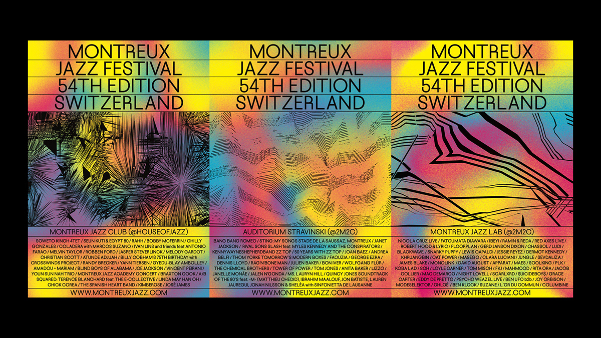
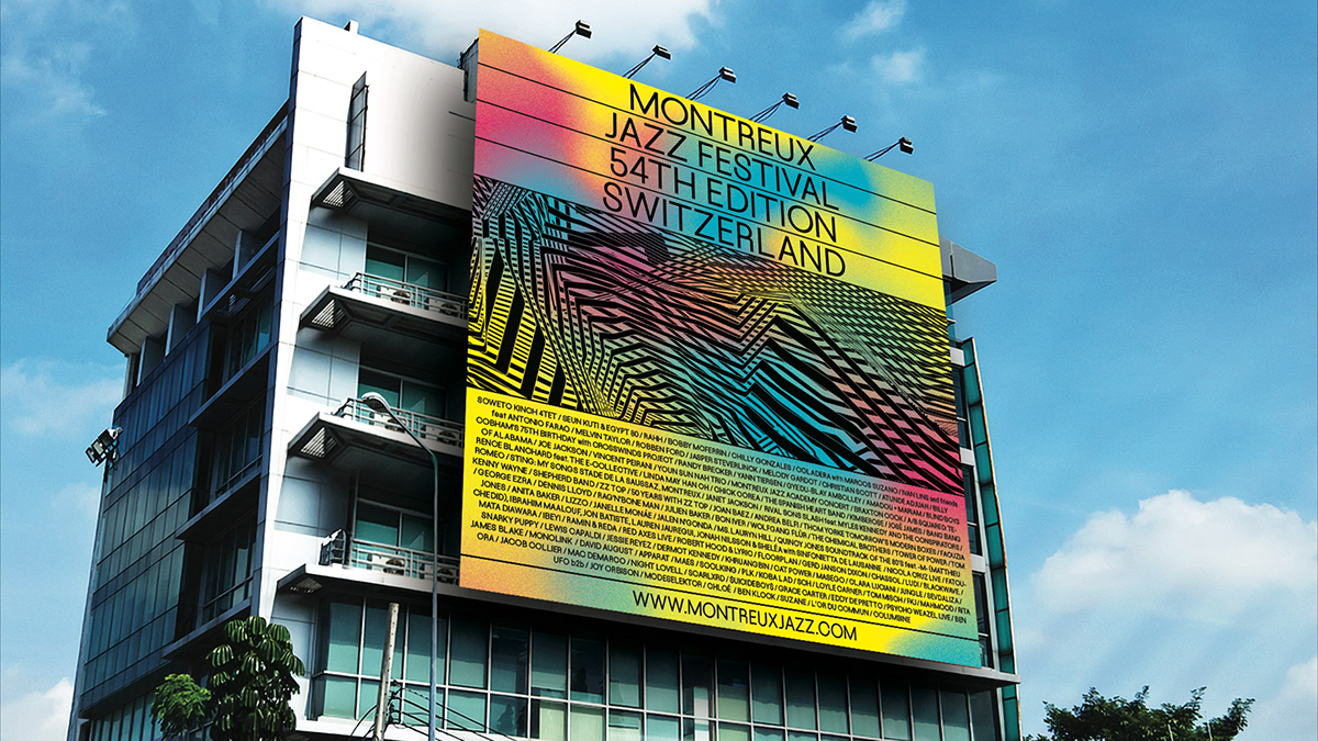
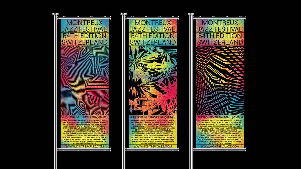
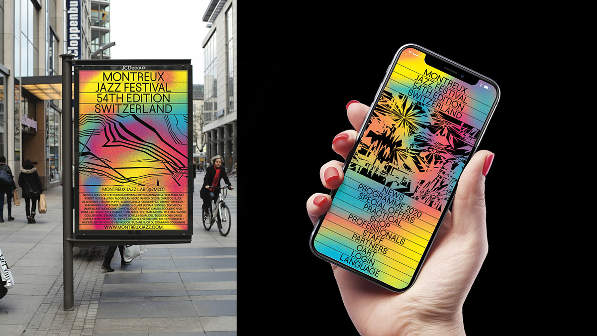
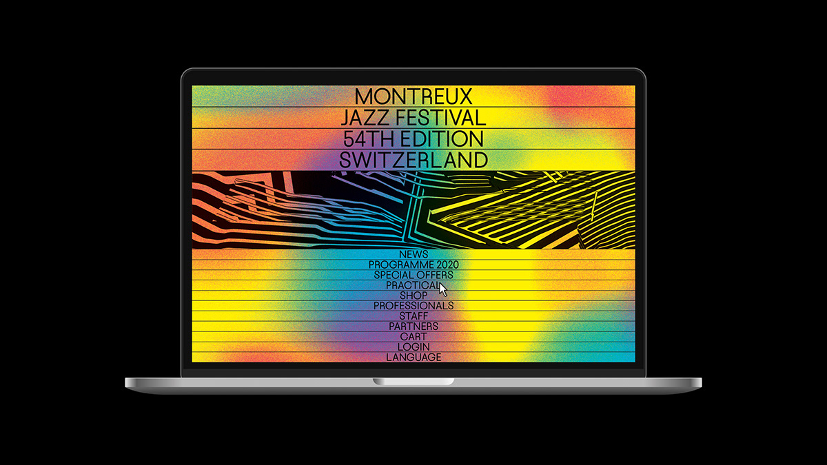
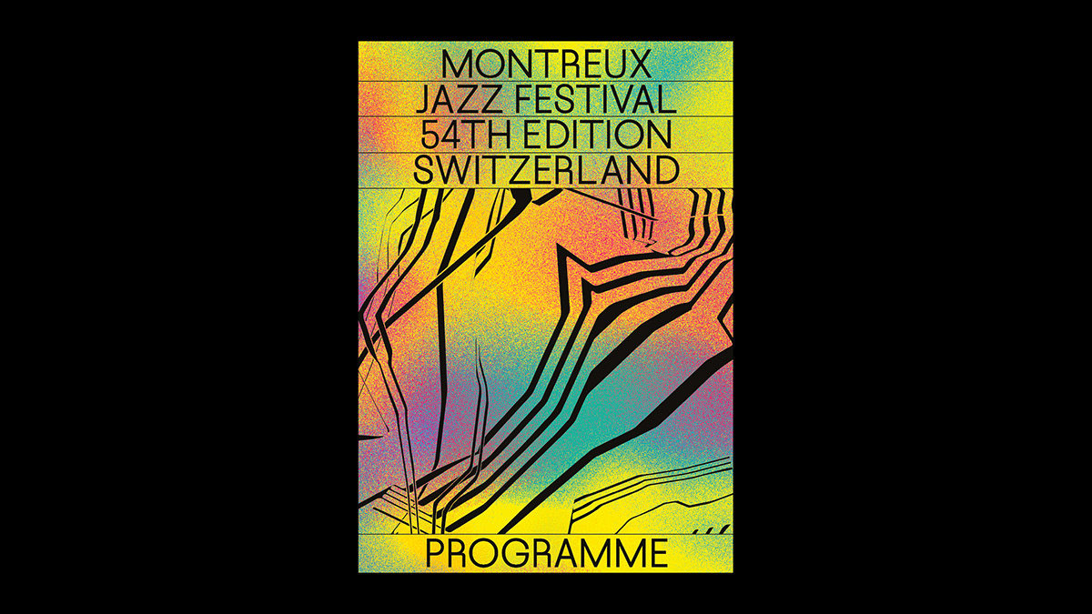
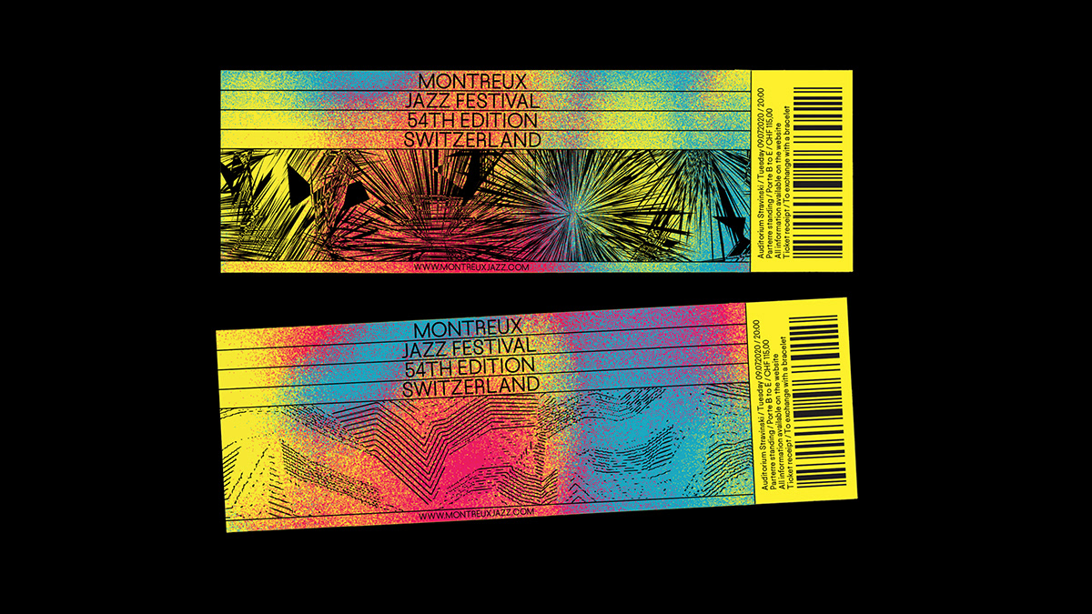
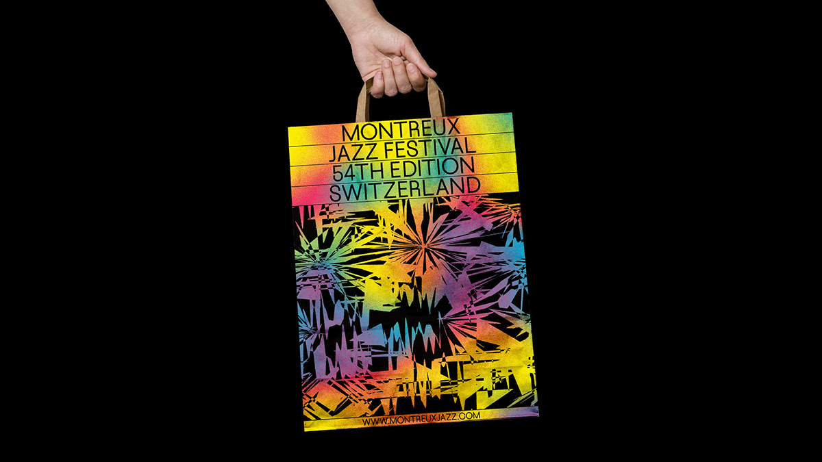
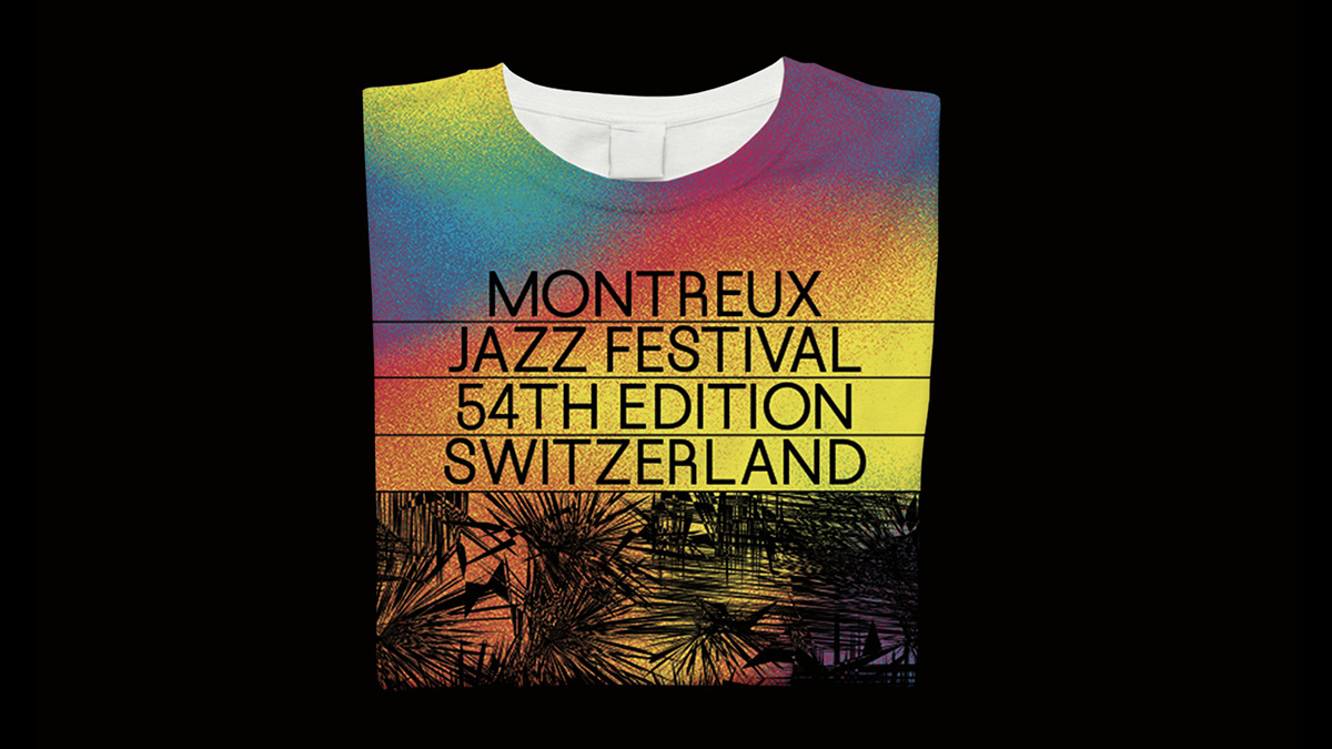
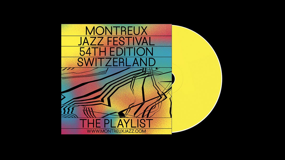
I created a system using grainy gradients of primary colours, yellow being the most prominent one, and structured text coming from Swiss graphic design history, with visuals inspired by audio waves, piano lines and music partitions. Each gradient and each visual is unique and semi-randomly generated, as unique is each festival-goer and each nuance of jazz.
I created a system using grainy gradients of primary colours, yellow being the most prominent one, and structured text coming from Swiss graphic design history, with visuals inspired by audio waves, piano lines and music partitions. Each gradient and each visual is unique and semi-randomly generated, as unique is each festival-goer and each nuance of jazz.
The goal was to create an identity that wasn't stereotypical or figurative, but still retained the idea of joy and party that a festival is, still retained the cerebrality of jazz but showed all the musical genres the festival now programs, particularly urban music, with the grain of the gradient reminiscing spray painting.
Font: Culver Grotesk, several weights, by Daytona Mess.
Project under the direction of Ophélie Hetzel.
Font: Culver Grotesk, several weights, by Daytona Mess.
Project under the direction of Ophélie Hetzel.


Thank you for watching :)


