MIGRAÇÕES
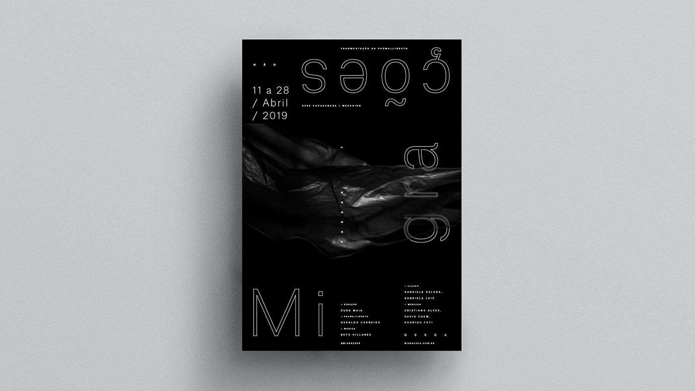
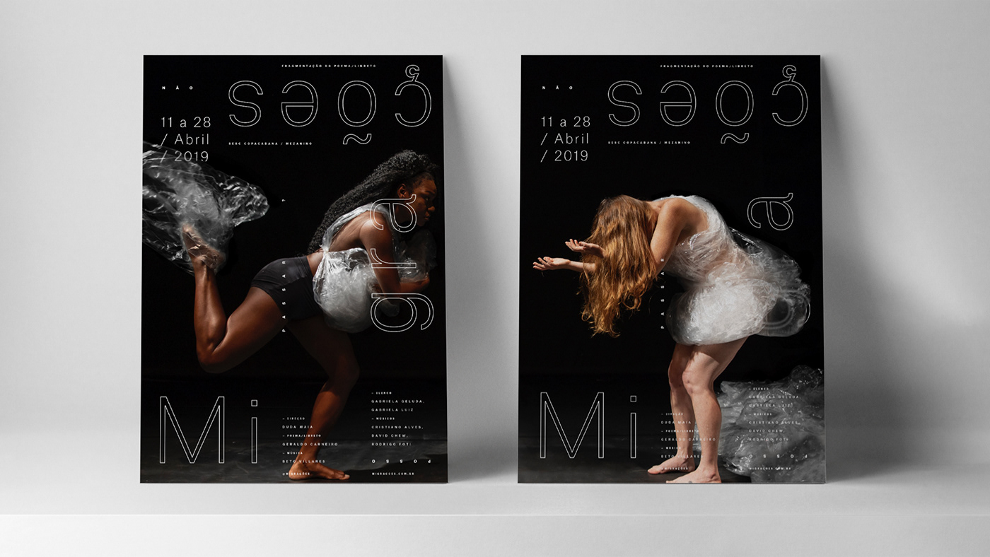
The performing opera Migrações addresses displacements of people of all ages, caused by wars, disasters or scarcity of resources. Faced with statistics, situations and testimonials of those who are forced to leave their lands, from Syria to Brumadinho, she invites us to look at what is saddening and, at the same time, shows with poetry, music and dance something inconceivable. By addressing human roaming in diverse cultures, Duda Maia's opera inspires design to work with a wide spectrum of unconventional materials. The visual identity enhances the theme through printed and digital pieces such as banners, posters, opera program, invitation and communication in social networks, as well as a 15-meter-long wall panel that makes up the stage set.
Client: Duda Maia


Branding, visual identity system and graphic pieces for the performing opera Migrações, through an investigative and experimental process, through immersion, inspiration, experimentation, conceptualization and creation stages. A dip in different fields of research. A parallel and complementary work to the development of the opera, where design plays an inseparable role in the creation of the show. A constant feedback.
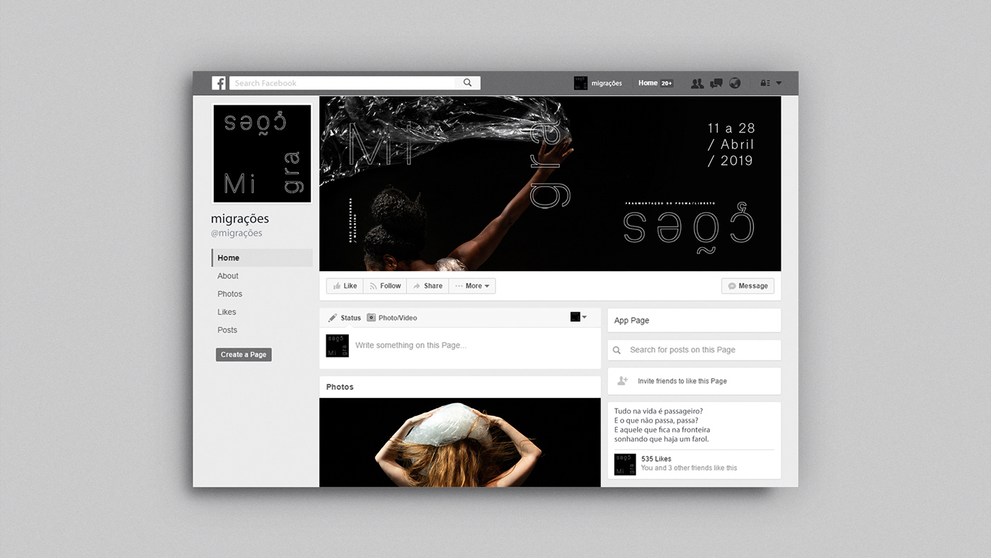

Inspired by the proposal to articulate opera through the poetry booklet, we define the basic design principles for creation: fragmentation, displacement, repetition and synthesis. These are the limits imposed on the project, such as the ones imposed for migrants. Live in a state of permanent transience, and never belong. The Mediterranean derives from the word Mediterraneus: “between the lands”, between what we leave behind and what will come. Under the concept “Mediterranean, sea that does not sail me”, the visual identity reinforces the theme of the opera through graphic elements and diagramming. It aludes to migrants with its fragmented logo, moving through the edges of the pieces, bumping into graphic boundaries, like barriers of paper itself. Atlas Grotesk typography has in its name the reference to the crossed paths and the restriction of materials is presented in the opera: plastic, rice and beans. Plastic, chosen as the main graphic element, represents the state of being in between, a barrier to break through that reveals the text or hides it, depending on which side of the border we are on.