It's 2017. Amazon has hit Australia, retailers are feeling the pinch and
value is no longer a dirty word.
value is no longer a dirty word.
How do you revive an Australian
retail favourite?
retail favourite?
Over recent years, the stigma has been lifted from discount department store shopping. To take advantage of the shift, Big W undertook a reinvigoration of its store experience and product lines. A full brand refresh was needed to signal a new Big W to customers.
Back to the future
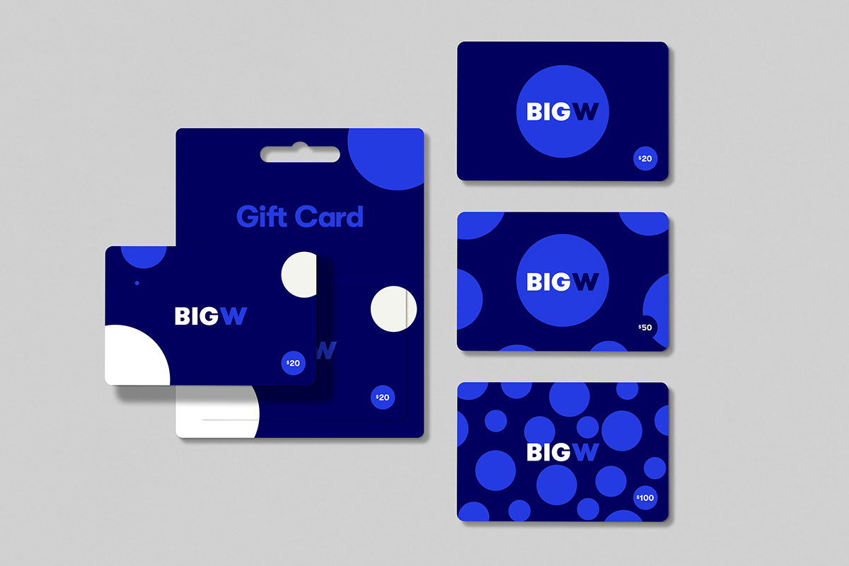
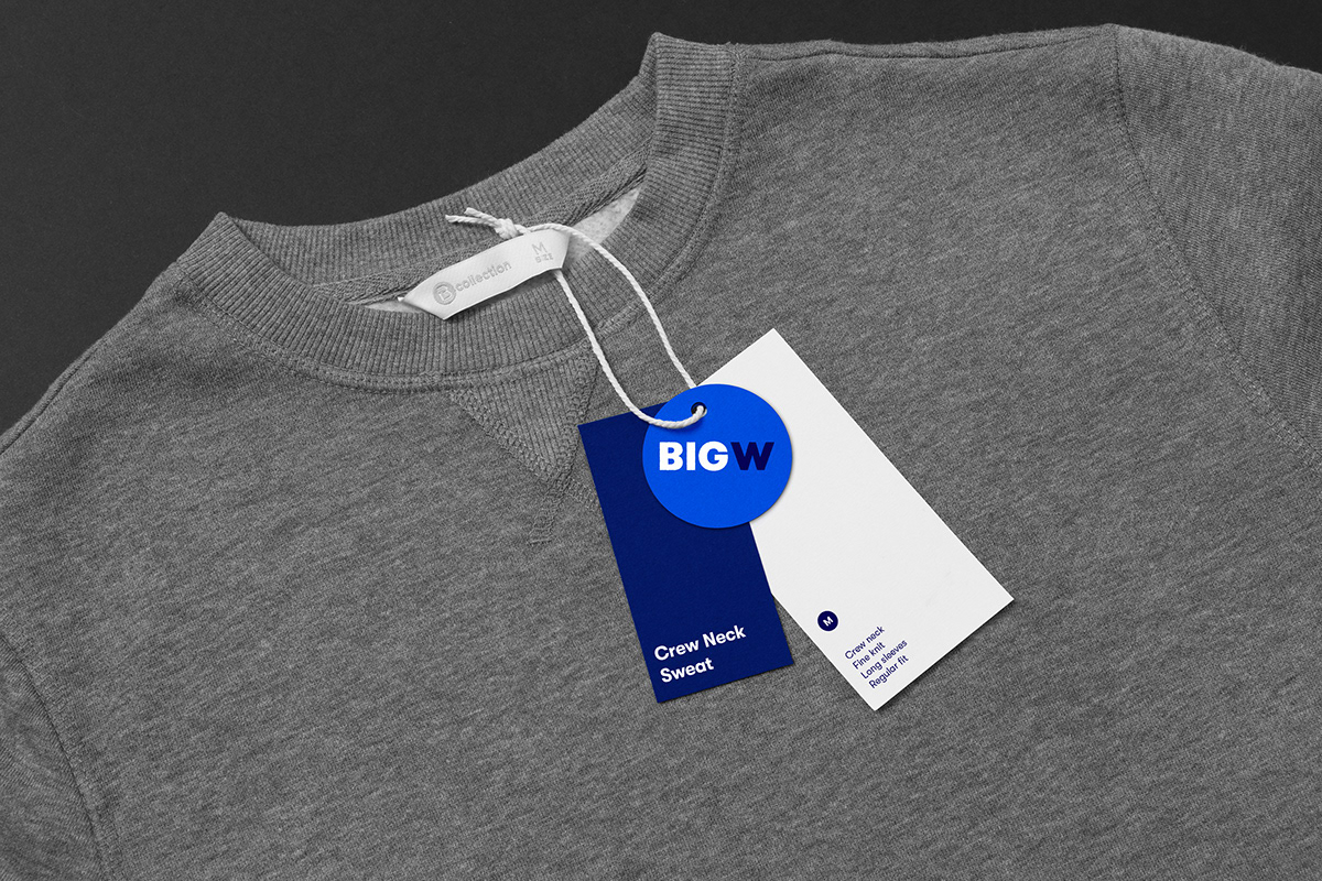
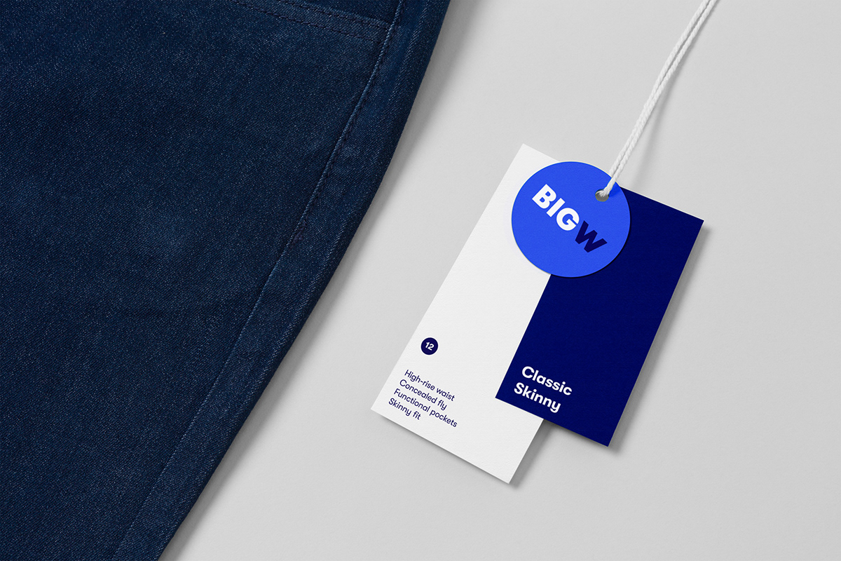
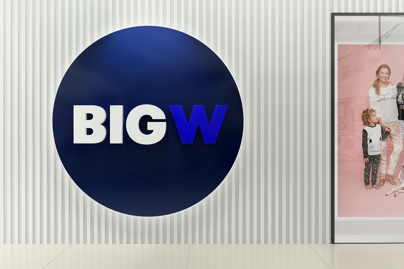
Big W has always had a big and bold personality. It was time to let that personality shine. We took the brand back to its roots, remastering their original logo, and dialling up the iconic blue and dot device, which have been Big W staples for decades.
Personality plus
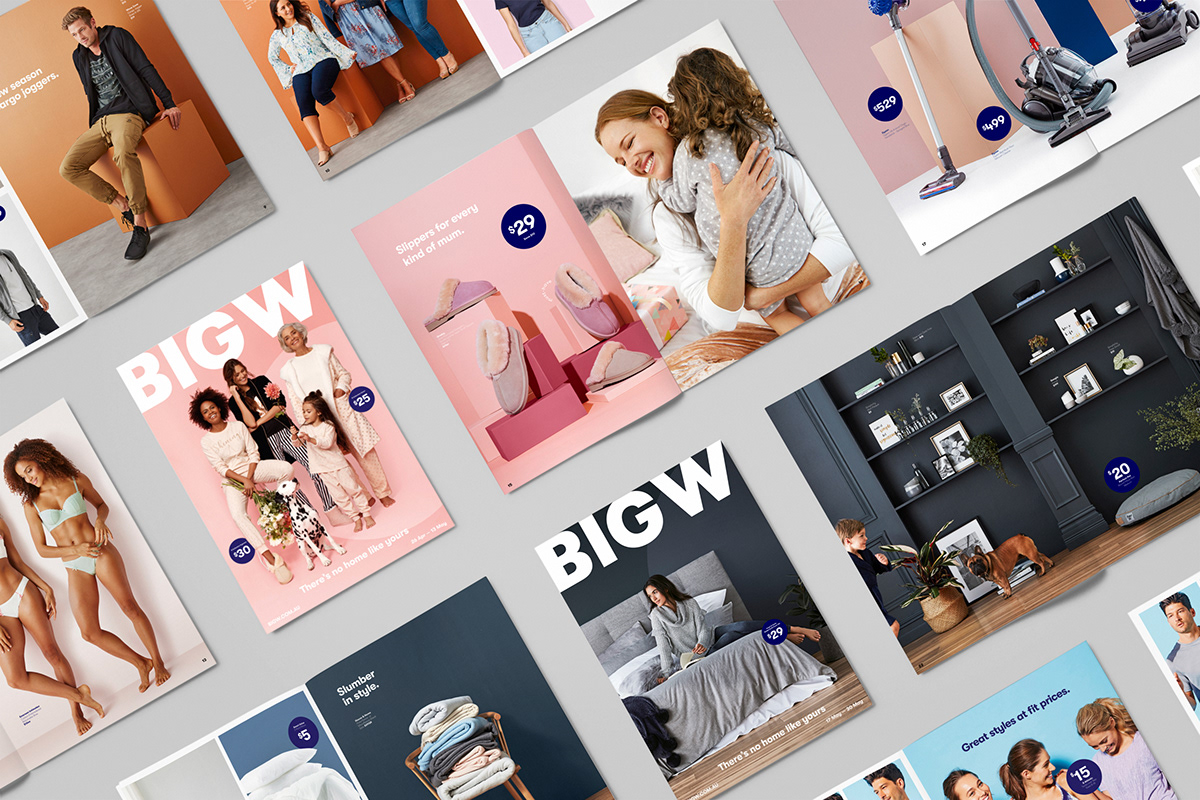
Three creative principles were developed to inform everything from photography to writing.
In motion, they help to give the humble dot loads of personality.
In motion, they help to give the humble dot loads of personality.
Created by M&C Saatchi Australia
Best and bluest
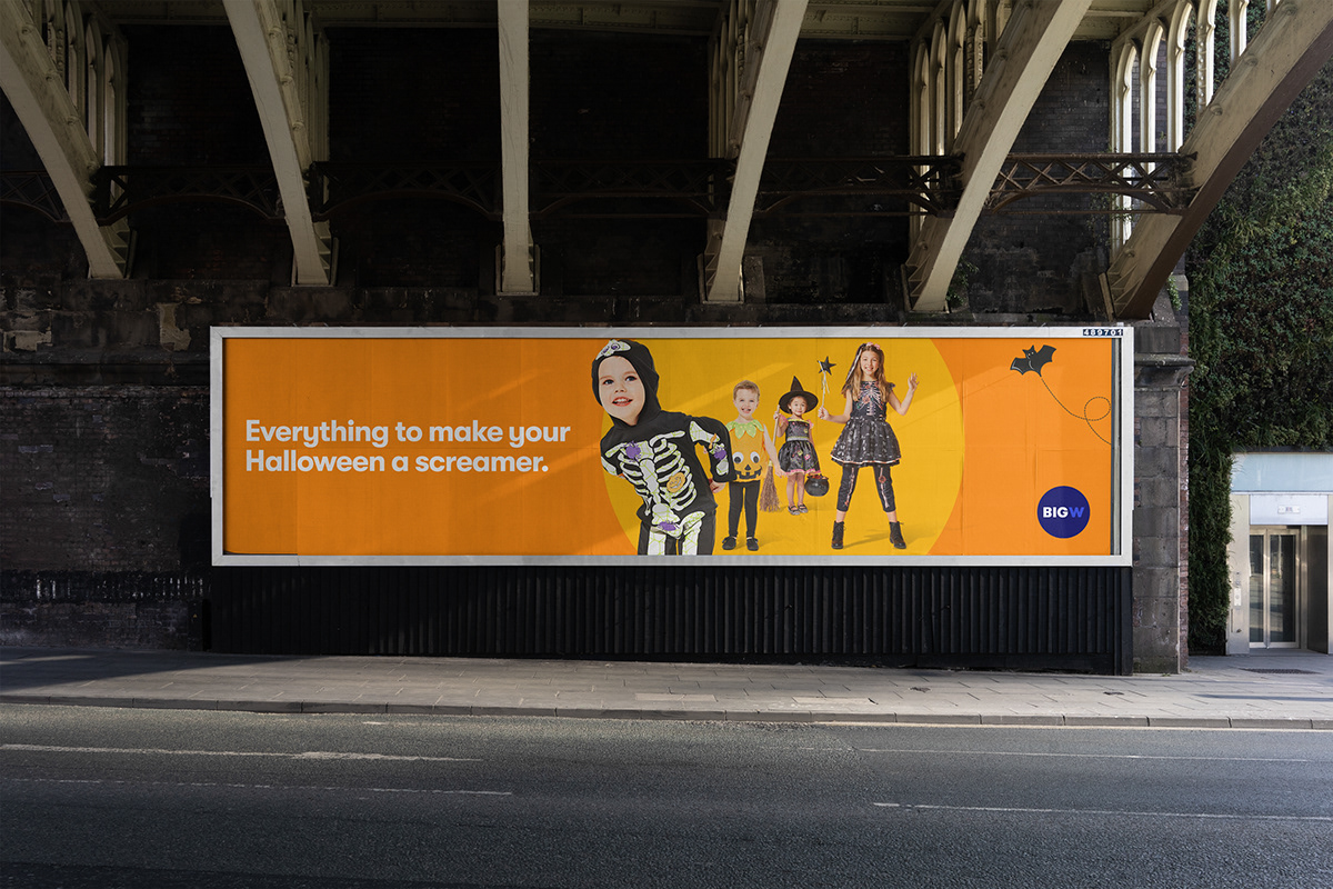
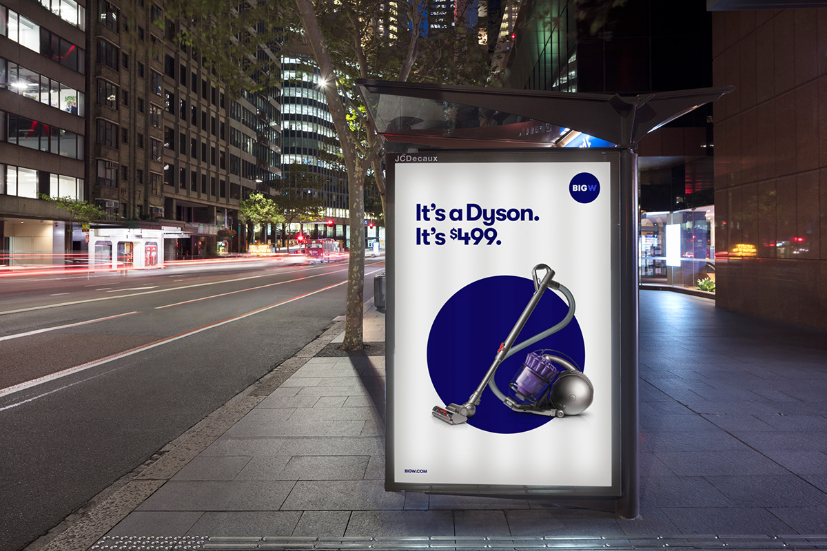
Big W is an unashamedly blue brand. Through a pair of fresh blue doors, we opened into a new world of colour
that enables the brand to flex to any situation, season or event.
that enables the brand to flex to any situation, season or event.
Art direction elevates everyday products to highlight the true quality of Big W’s range.


Dot Dot Dot
Thanks to clear guiding principles, the refreshed Big W brand can be easily executed by diverse
agencies and internal teams to ensure its big personality stays front and centre.
agencies and internal teams to ensure its big personality stays front and centre.