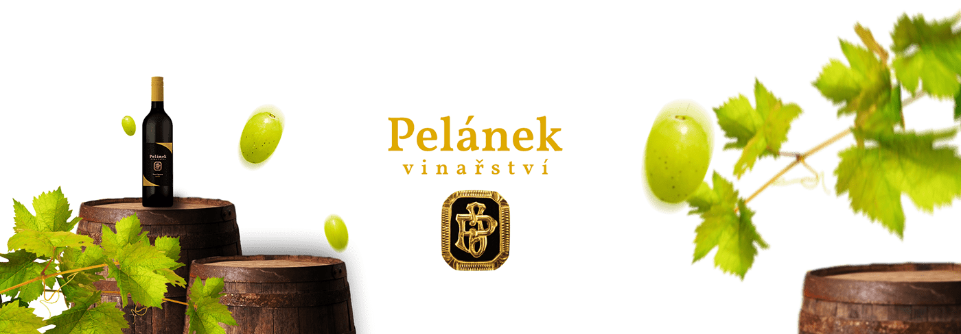
About the brand
Vinařství Pelánek is a small winery founded in 1997 and is situated in between Bohemian and Moravian region in the Czech Republic.
All work on the vineyards is done by the family members throughout the whole year, only a very low percentage of heavy machinery is used during the processes, which promotes the ecology and sustainability of the trails and the unique traditional taste of their wines.
In addition, the winery is included in the integrated production system and thus limits the use of chemicals in grapevine cultivation.
The Challenge
The mission was to redesign the packaging (vignettes) to be more elegant, traditional and also timeless. So nothing too influenced by the nowadays graphic design trends. The idea of the design was to withstand the pressure of time so even after decade you would not be offended by its looks.
Photograph as a part of the logo
I was asked by the founder of the company to try including his family ring in the design in any way, if it was possible. I tried turning it into an illustration, turning the initials into a vector logo - but it never was the outcome we were looking for. So in the end we decided to use the photograph.
The only problem was that the client did not have a photograph of the ring in the needed resolution. So I had to take it - I cut out only the emblem, retouched it and tweaked the colours a little bit.
The only problem was that the client did not have a photograph of the ring in the needed resolution. So I had to take it - I cut out only the emblem, retouched it and tweaked the colours a little bit.

The family ring with the initials of the winery's founder
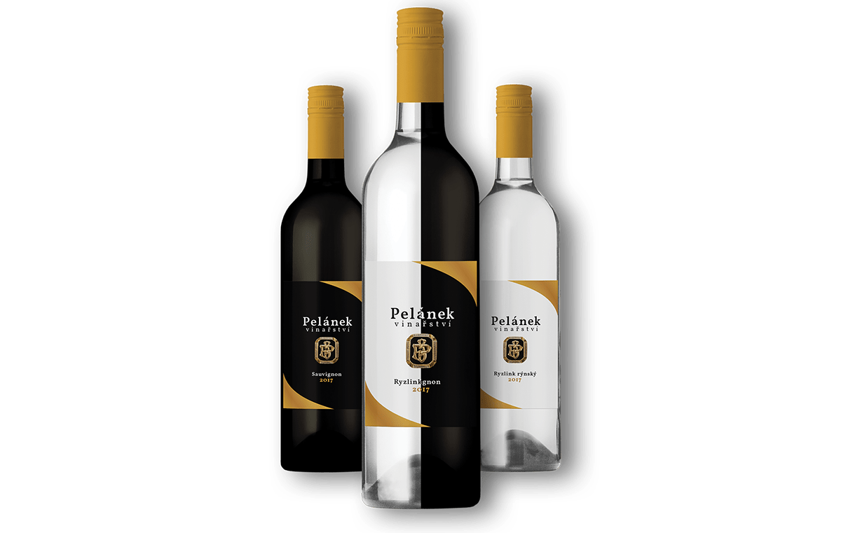
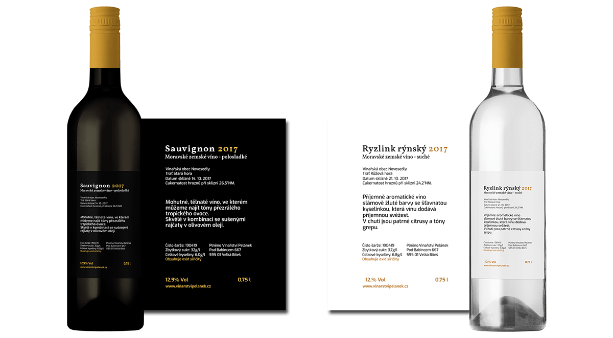
Two grape varieties
The client wanted to distinguish between the two grape varieties - sauvignon (red wine) and riesling (white wine). So we decided to just make inverse versions of the design.
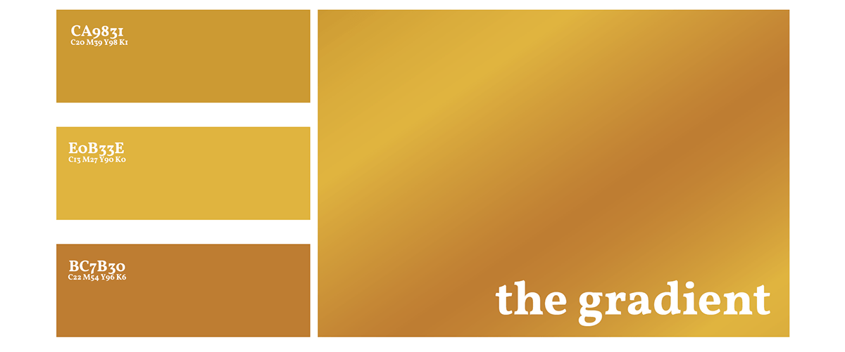
The color scheme
The colors were chosen to accentuate the gold of the ring emblem and also to give a warm feeling. The gradient was used to make the overal design look less flat.
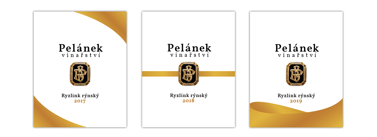
3 years - 3 designs
Because every year is never the same, we decided to change the elements for every year. The idea with the graphics was to give the impression of wine moving in the wine glass. The 2018's stripe going through the center of the emblem is a reference to it being a ring.

Sauvignon version
Riesling version
The business cards
The emblem of the ring was used only on the back side of the business cards along with ribbon stripe to give off the feel of the ring.
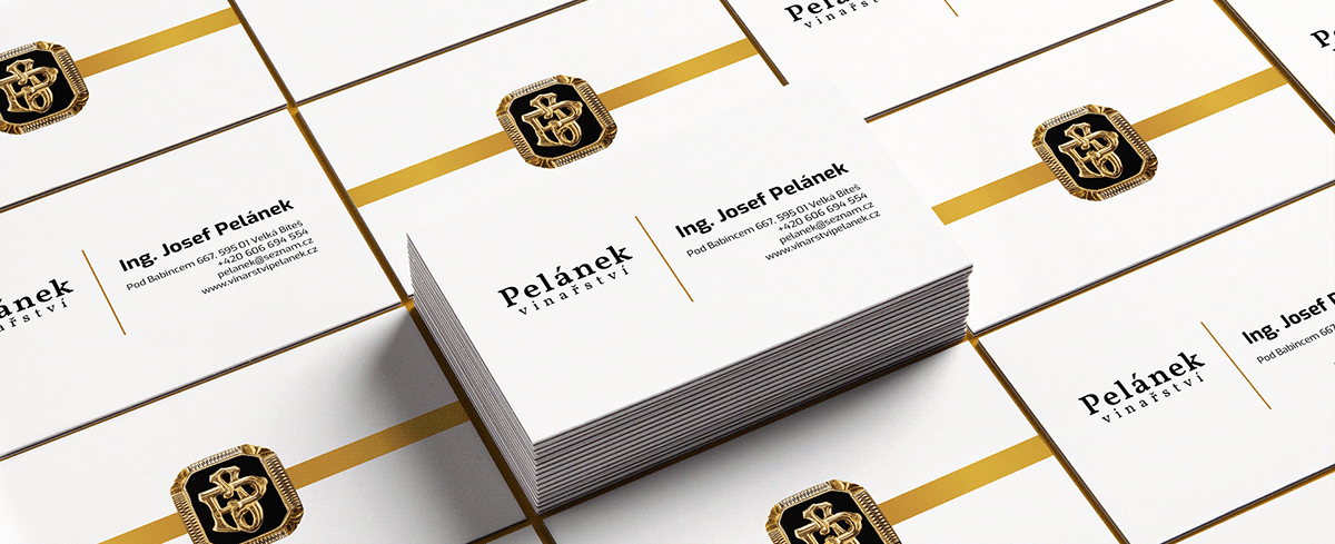
business cards design

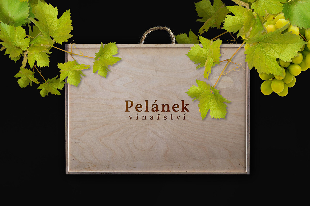
gift box visualisation