RANGE OF THREE ARTISAN WINES : WHITE, RED & ROSÉ
Live brief set by Marks and Spencer to create packaging for a range of a particular item - mine being a range of artisan wines. My range of artisan wines is based around a fictional small-scale specialist Leeds winery, Shire Oak, producing Yorkshire-grown wine for M&S. My ambition was to create a youthful, playful yet knowledgeable identity and tone of voice across my packaging elements, incorporating key Yorkshire traditions and sayings where appropriate. I focused on highlighting tradition throughout the design, particularly that of Leeds and the wider Yorkshire area being built on the foundations of both rural, countryside life and its sizeable industrial past, as well as through the naming of the range and its historical significance.

My aim was to create a wine with engaging, tactile qualities, using traditional, textured paper on the label/booklet as well as embossing to give the bottle stand out appeal on the shelf. I found that individual care and attention for each wine bottle when buying an artisan/specialist wine is something that is highly valued, and have attempted to give the range a ‘personal touch’, for instance through hand-numbered bottle/batch numbers on vinyl stickers on each bottle, and through explaining the story and traditions behind the wine range in a small booklet attached to the bottle with twine. Experimental printing techniques other than the regular, overplayed gold foiling, such as through using acetate and screenprinting, will hopefully give the wine that handmade, specialist feel - and that there’s a bit of Yorkshire in every bottle.
The target audience for my wine range is a customer perhaps at the slightly younger age range of M&S’ wine consumer demographic; I have tried to target them through the bold, easy-going and non-pretentious packaging to try and promote the ever-growing market of English (and Yorkshire) wine to a group of people that may have never considered buying or drinking it before.
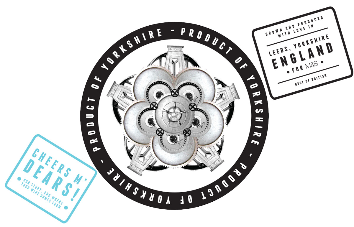
I created a Yorkshire white rose using rearranged elements from photos of machinery that I took, such as cogs and wheels - this serves as the centrepiece of my elements of packaging, featuring prominently on the label design, box, and booklet to highlight my range’s role as a Yorkshire-produced wine range.
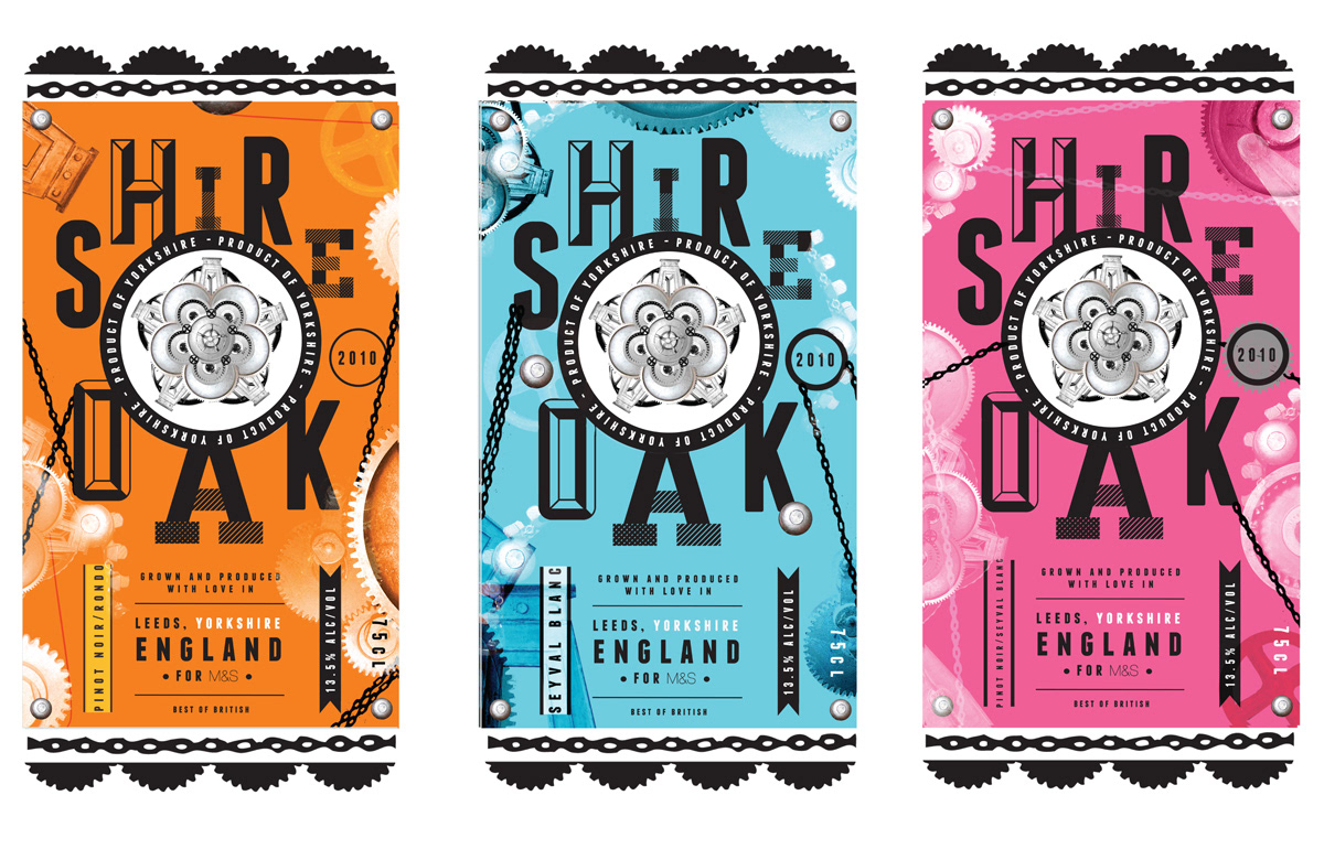
Bold, typography-based labels in colours complementing the colours of wine they concern, with an individual, rearranged pattern of industrial machinery on each of the different wines. I’ve used a combination of typefaces that I feel combine the traditional/industrial qualities I’ve tied in throughout the design of my wine, using a jumbled letterform arrangement in the setting of ‘Shire Oak’ reminiscent of individually typeset letterpress letters to evoke a handmade feel. I omitted naming the type of wine (i.e. red, white) explicitly on the front of the label, instead naming the grape type for a more specialist aspect.
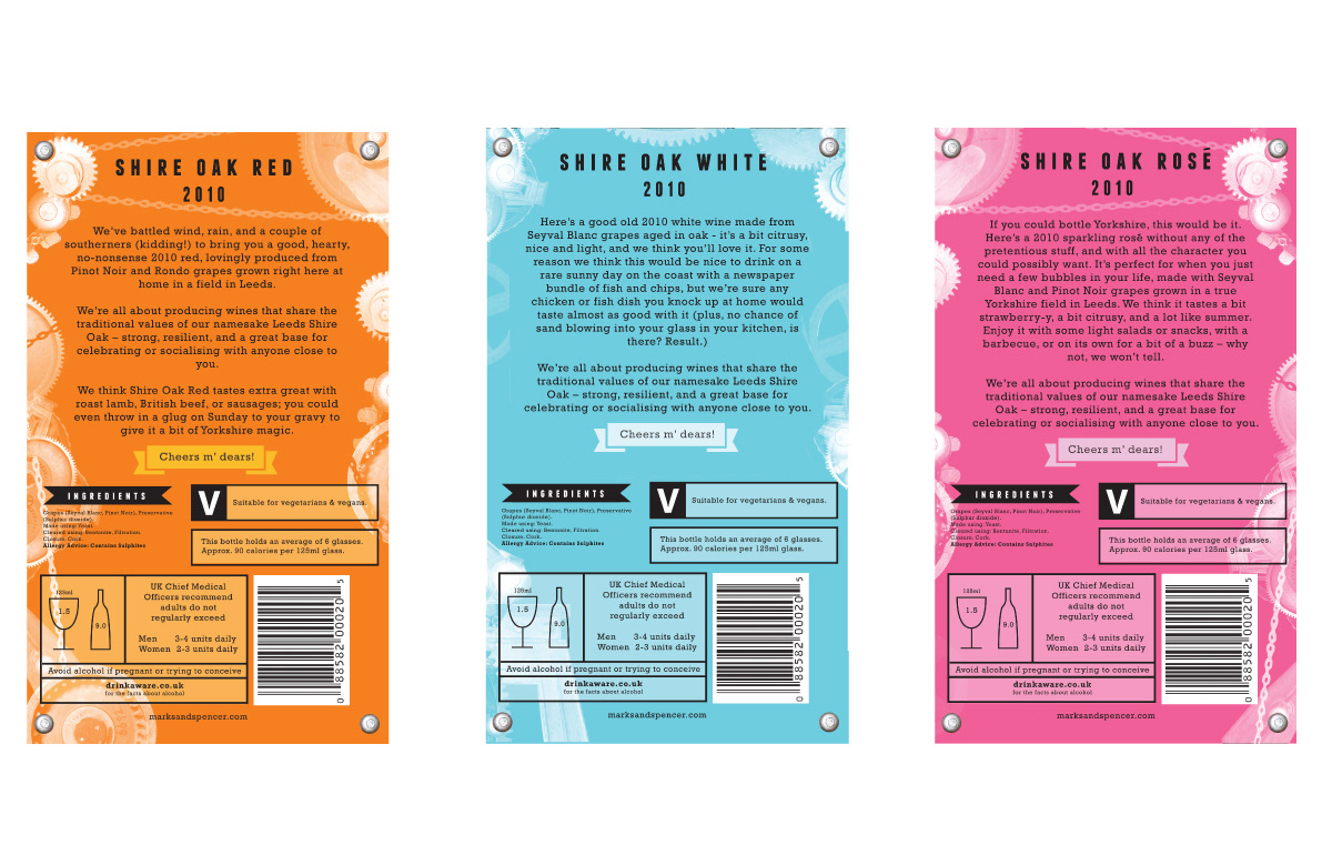
Back label keeps a playful yet informative voice throughout, detailing the technical features of the wine, along with suggested foods to accompany it. The label also mentions the story behind the range’s name, Shire Oak, which is further explained in the wine’s attached booklet.


Optional decorative box displayed on shelf at POS, ideal for a giftgiving situation to give a simple Yorkshire wine some gravitas. Features hand-written co-ordinating bottle number on every box.

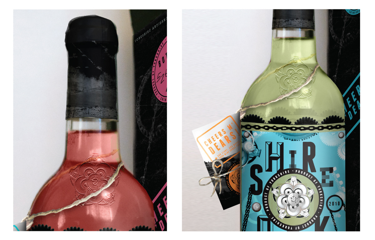
An image of countryside is also foil stamped onto the foil wrapper at the top of the bottle for another nod towards traditional Yorkshire; this is joined by the twine holding the booklet around the bottle.

The concertina-style booklet details the meaning behind the name of the wine, to give the range an interesting backstory - as written for the booklet:
“The Shire Oak is a special bit of our home of Leeds’ history, referring to a real oak tree in Headingley, Leeds, that managed to stand strong from the 11th century through to 1941. This tree was apparently pretty much the place to be – the hub for ceremonies, voting in the area, and for every kind of social event imaginable. It was so important that the name for the area for miles around Leeds at the time of the Danelaw (known as a wapentake) was ‘scir ac’ or ‘Skyrack’, meaning ‘Shire Oak’. Even though the tree is no longer standing, we thought it was a great local namesake that symbolises everything that a good wine should be – strong, resilient, and a great base for celebrating and socialising with your loved ones.”
I felt that the idea of this tree bringing people together translated well to the theming and purpose of this wine range. It also touches on the history of Yorkshire winemaking and technical information about the process, printed on a background image of Yorkshire hills.

