

Naming & Logo Design
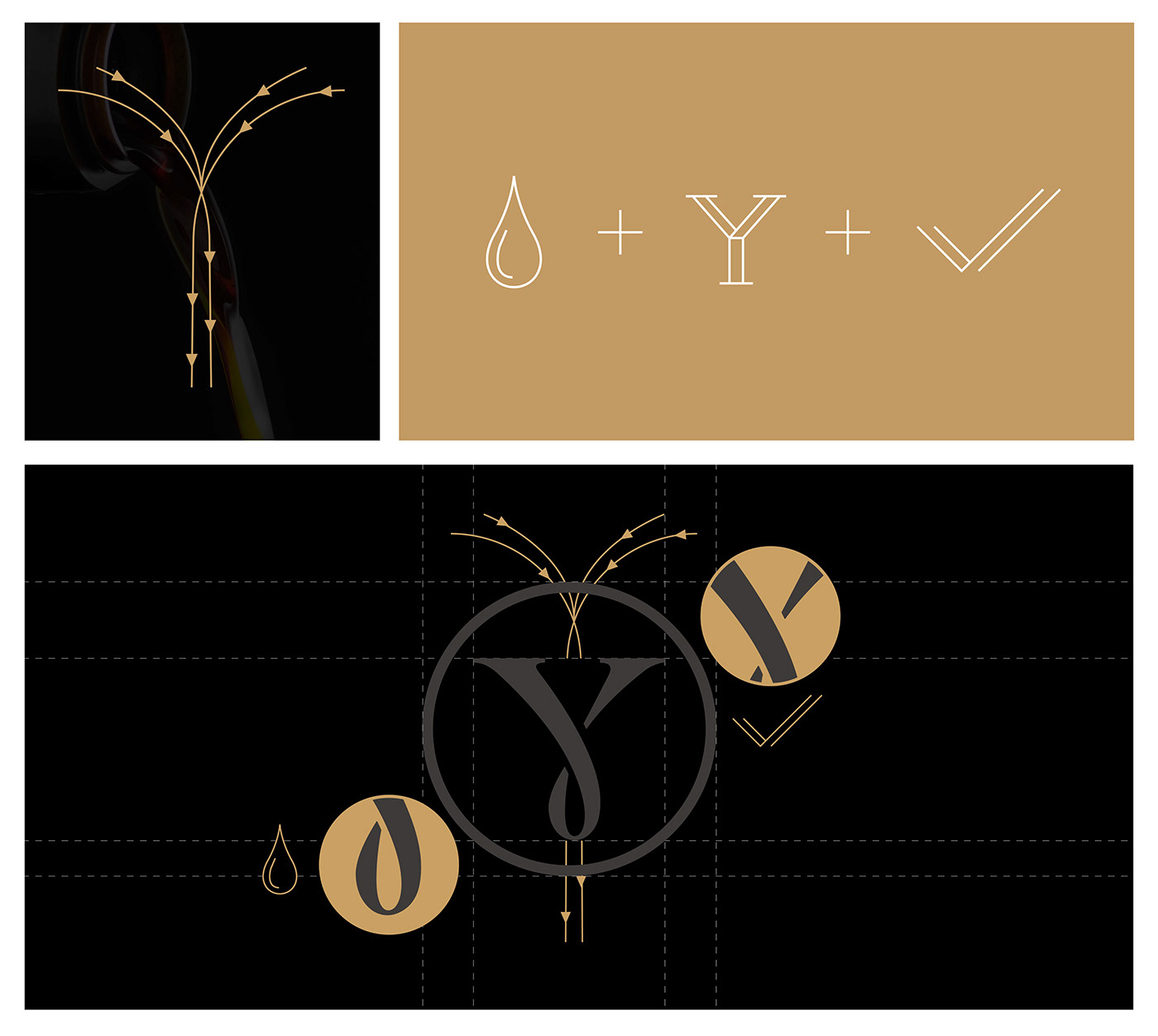
Though made in modern factory, YEASTMASTER also means the craftsmanship heritage from the history of its kind. We wanted to show the spirits in the logo. It combined three elements in a twisted Y:
1. the initial of YEASTMASTER
2. the drop of all the best ingredients
3. the check which means good quality
Plus by using serif fonts, the identity delivered a sense of simplicity and humanity.
1. the initial of YEASTMASTER
2. the drop of all the best ingredients
3. the check which means good quality
Plus by using serif fonts, the identity delivered a sense of simplicity and humanity.
Package Design
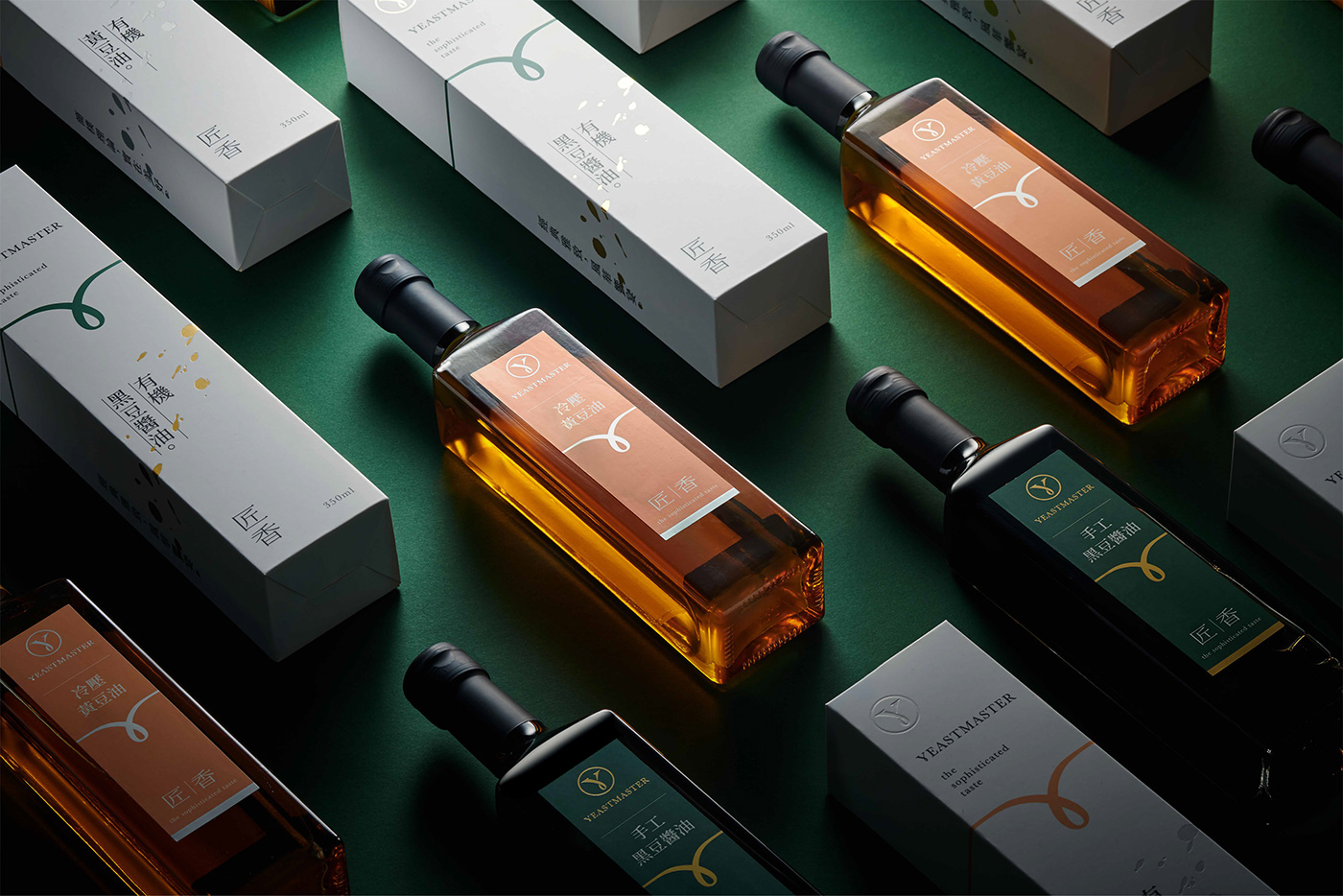
We also wanted to keep the brand visual sophisticatedly simple and delicate, just like its taste. For the single product package, extended from the logo, the image of ribbon represents the essence of sauce. Hot foil stamped drops create a joyful sense of good taste.
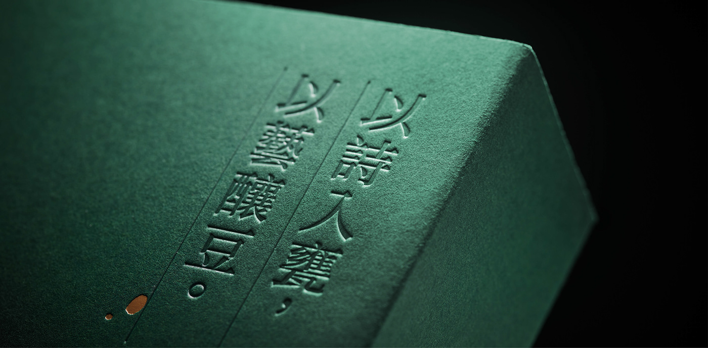
For gift box design, we used art paper to show a different touch. The slogan on the top right and the drops at the background were, on the contrary, debossed to create a mysterious look that invited people to open it.
We also wanted to keep the brand visual sophisticatedly simple and delicate, just like its taste. For the single product package, extended from the logo, the image of ribbon represents the essence of sauce. Hot foil stamped drops create a joyful sense of good taste.
For gift box design, we used art paper to show a different touch. The slogan on the top right and the drops at the background were, on the contrary, debossed to create a mysterious look that invited people to open it.


Workscope
Brand strategy development : Lynn
Branding design : Sean
Agency : think™必思維品牌顧問公司
Agency : think™必思維品牌顧問公司


