A Story to Tell
The real story can always be found by looking back at the origins.
This philosophy is the one adopted by this fruit brand in their process.
Yet, we saw an opportunity for a bigger message.

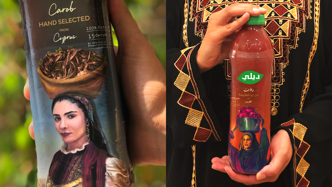
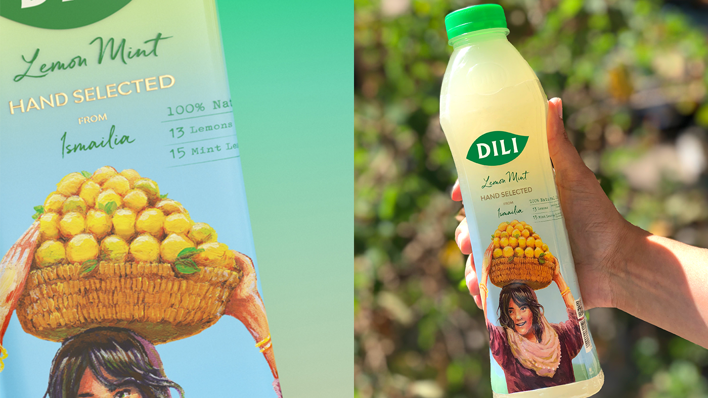
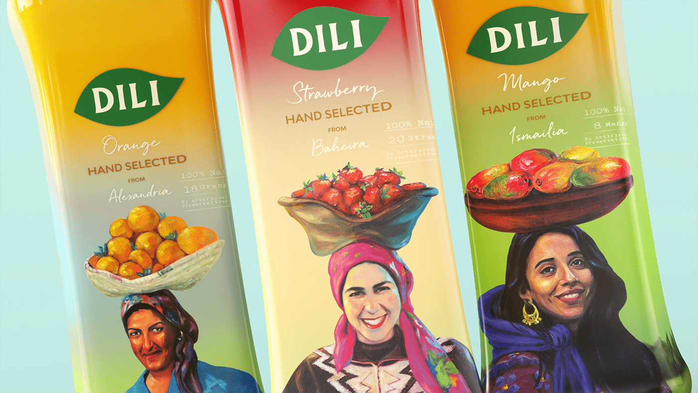
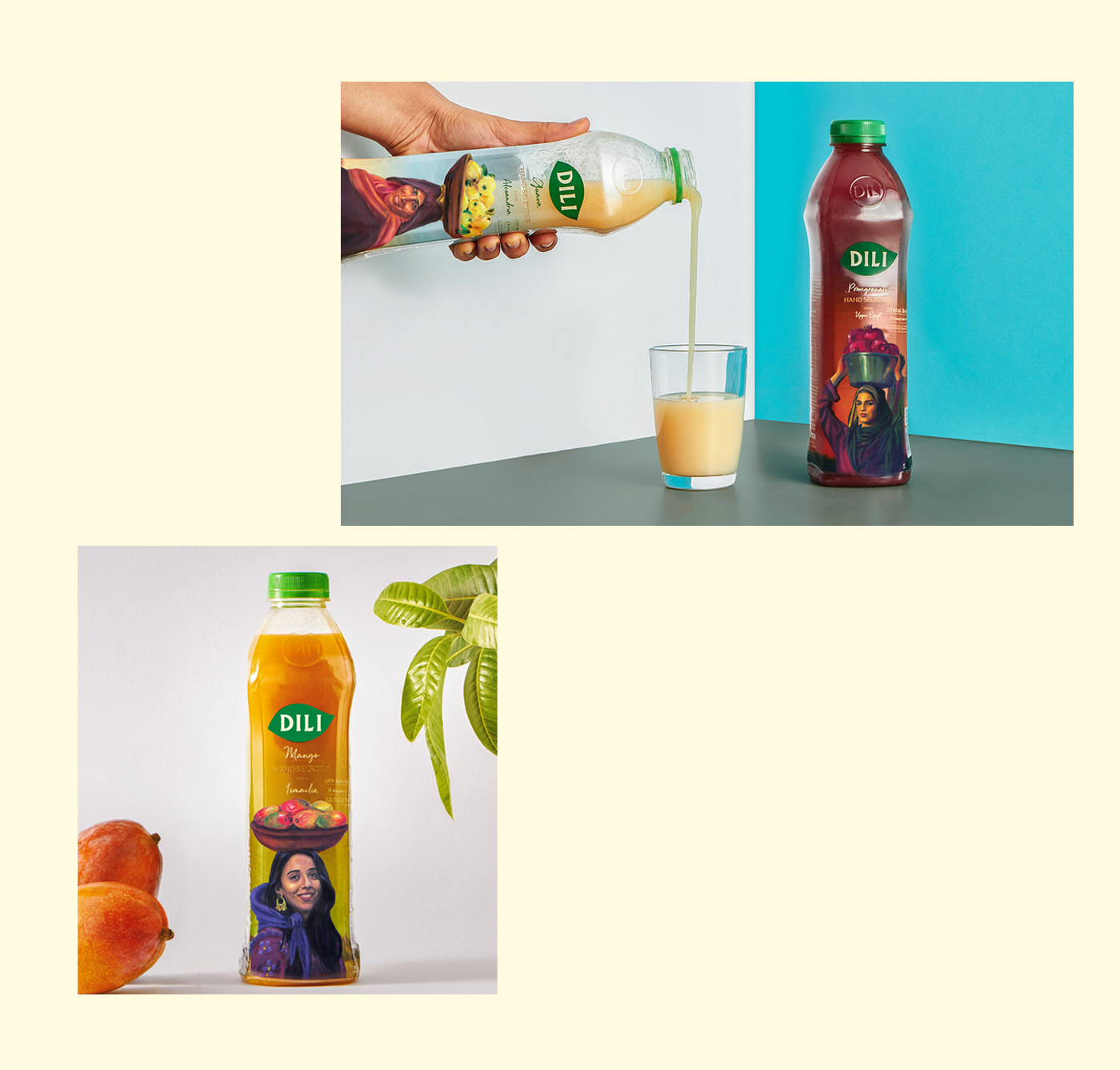
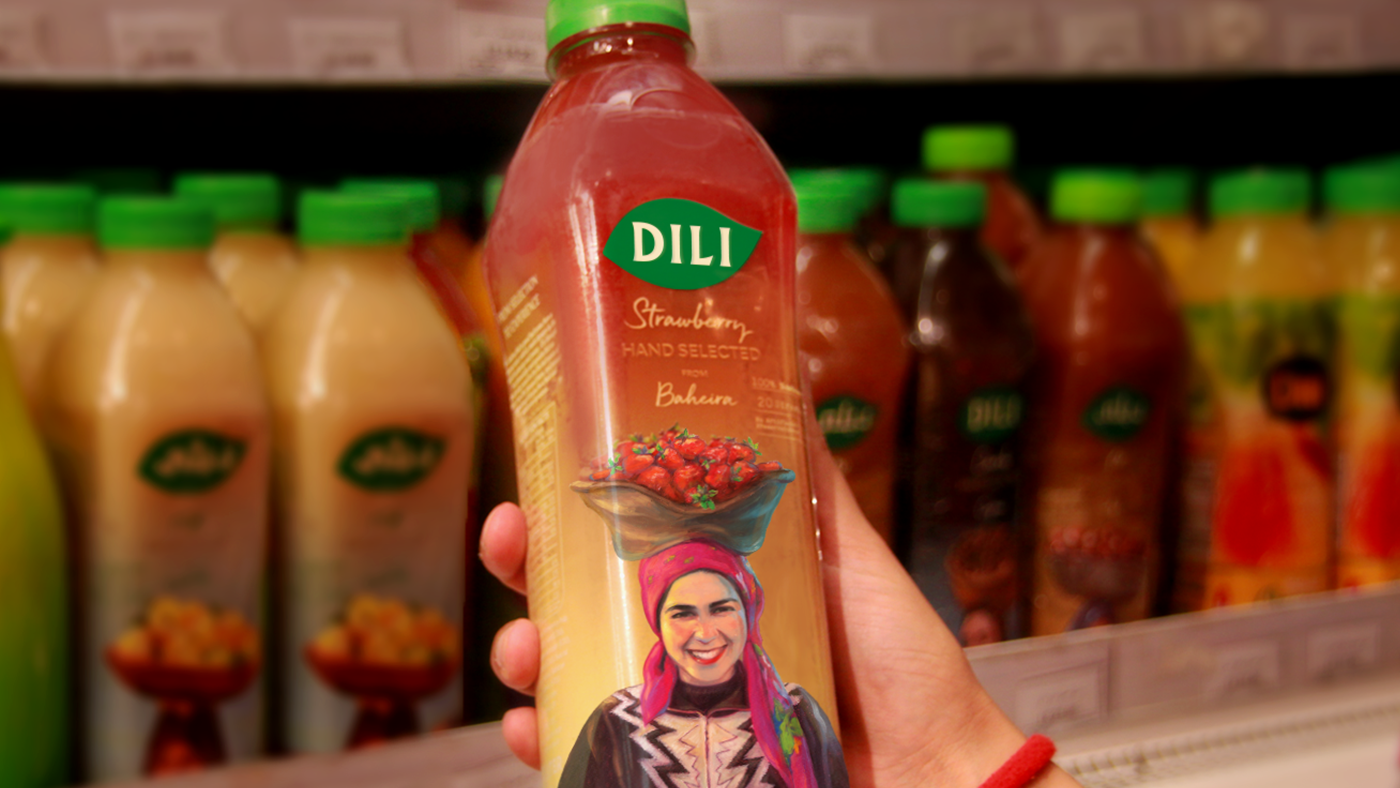
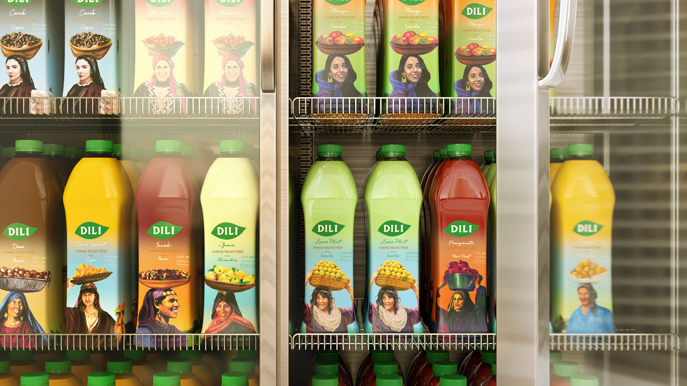
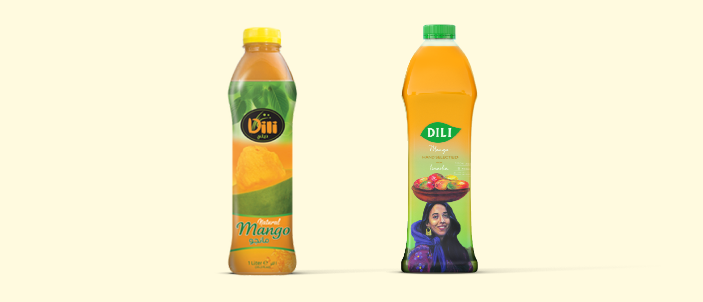
The new visual identity for Dili is created to complement the product's natural ingredients and convey the honesty of the brand.
Dili’s new logo is inspired by the goodness of the product, so we crafted a logo that is an abstract silhouette of a leaf conveying the purity and honesty of the brand.
We went from black - a non-existent color in nature -
to green and off-white, while the leaf with its natural curves acted as a device allowing our brand to travel across different Sku's;
keeping the same message of simplicity and authenticity across all touch-points.


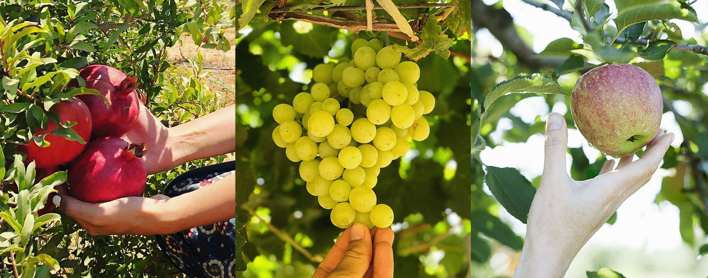
From Selection to Experience
Dili’s thorough process of picking out the fruits, and ensuring quality from the very first step was our main inspiration while building their new strategy. We wanted to tell their intricate story, follow their passion, and bring their effort to life.
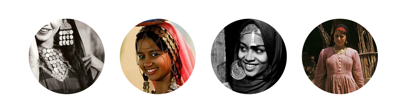

And People to Honor
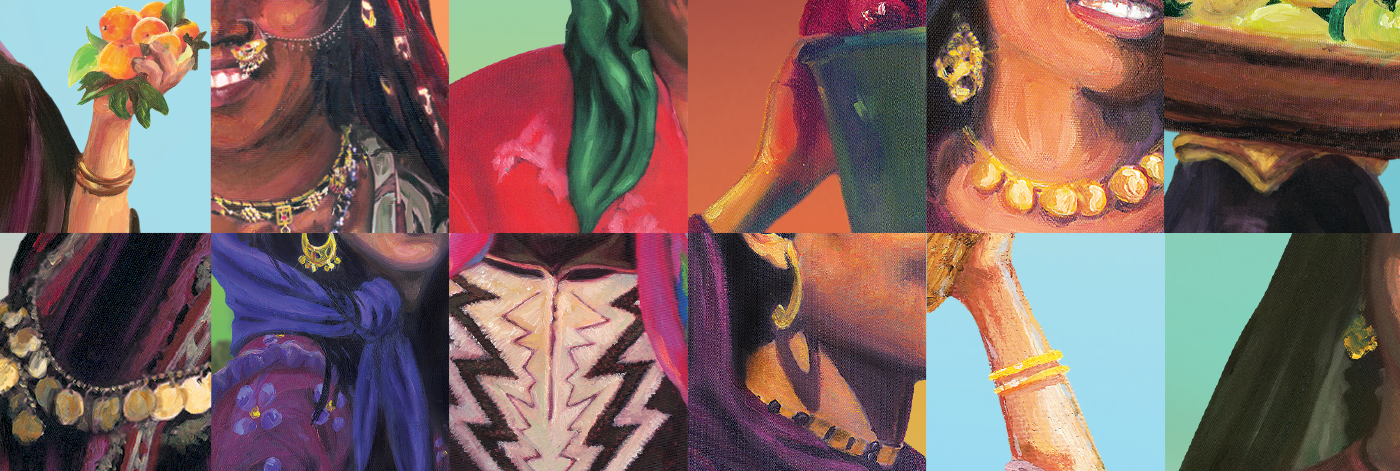
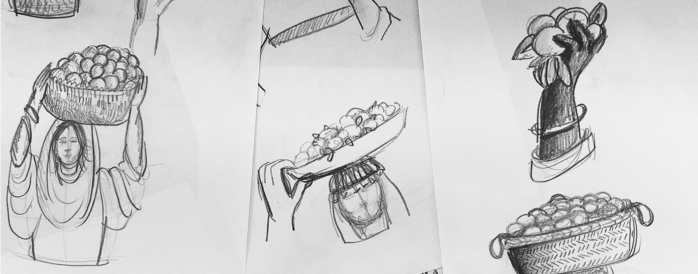
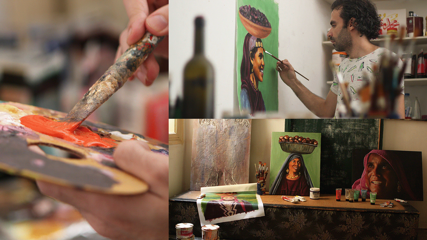
By following this thread, we realized that it all boils down to the first step of the process: the Egyptian woman,
in the rural agriculture areas, picking out the fruits.
We saw an opportunity to shed light on these women,
working day in and day out to give us the best that nature has to offer. We pay tribute to their efforts, and celebrate them
being a main symbol of our rich culture.