
Bad Seed is a new display typeface that can form unusual ligatures and figure/ground relationships. It has a solid (Plain Jane) and two stencil variants (Bad Seed with Cheese, Bad Seed with Fries) that provide many letter pairing options. Some letters have alternate forms within each variant. Naming conventions are a nod to rule-breaking typemaster Jonathan Barnbrook.

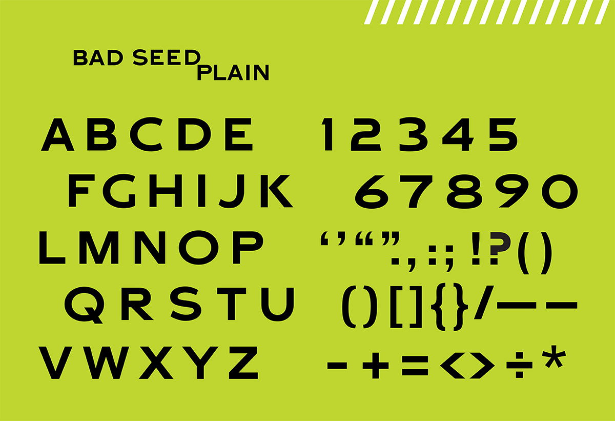
Plain Jane, the basic letterforms. A bold extended display face with clean lines and proportions. The counterspaces interlock perfectly, because they are exactly the same height as the horizontals.


How 'bout some fries with that? Go deluxe. More cut-throughs, more missing pieces. Stemless R's and K's, the slashed Q and handy slanted endcaps on the E's. (Should you need a drink, the Y is now a two-olive martini.)

Type spec sheet showing type from 72 pts down to 12 pts. Instead of choosing a typical pangram, I used lyrics from "No Thugs In Our House," a song by XTC about a suburban mother's blindness to her son's true nature.

Complex figure/ground ambiguities

Bad Seed themed posters: Bad Boy Marlon Brando in 'The Wild One'

Bad Seed themed posters: Bad Boy Mick Jagger, lyrics from 'Sympathy for the Devil'


