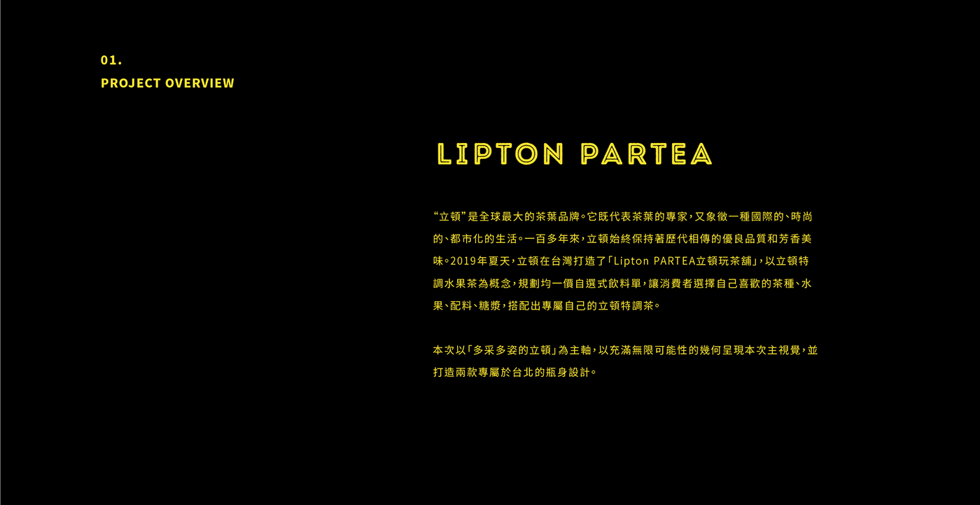
Lipton PARTEA Taipei
Design Agency : StudioPros.work
Design Agency : StudioPros.work
Creative Director : Yi-Hsuan Li 李宜軒
Art Direction : Yi-Hsuan Li 李宜軒
Art Direction : Yi-Hsuan Li 李宜軒
Design : Yi-Hsuan Li 李宜軒 / Kai Ho
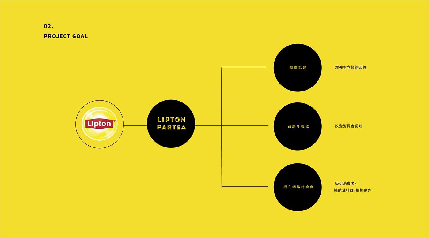
Integrated marketing 整合行銷:傳揚行銷廣告 (TRENDYOUNG)
Integrated marketing 整合行銷:傳揚行銷廣告 (TRENDYOUNG)
Interior Design : 傳揚行銷廣告 (TRENDYOUNG)
Client : Lipton 立頓 ( Unilever 聯合利華)
設計概念
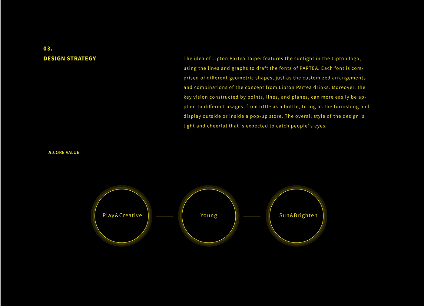
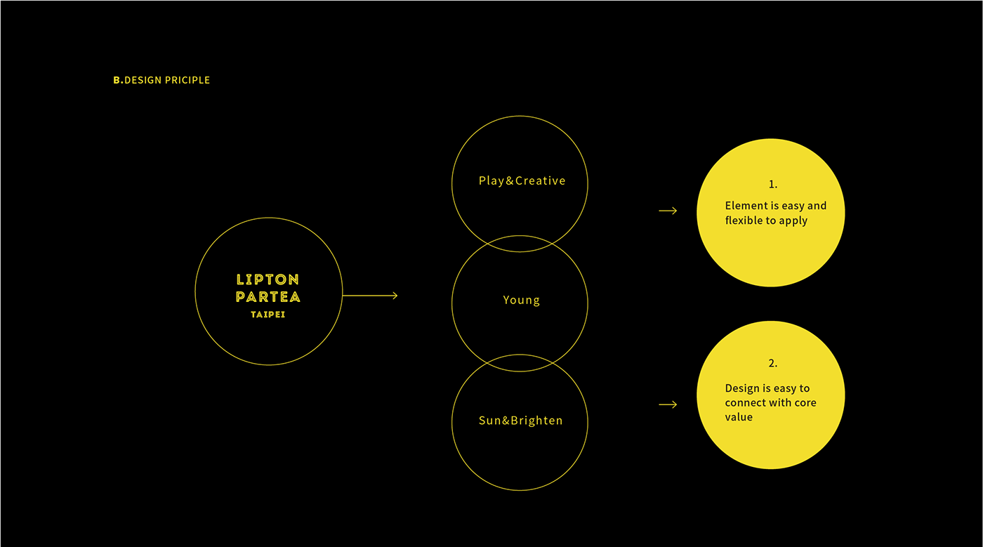
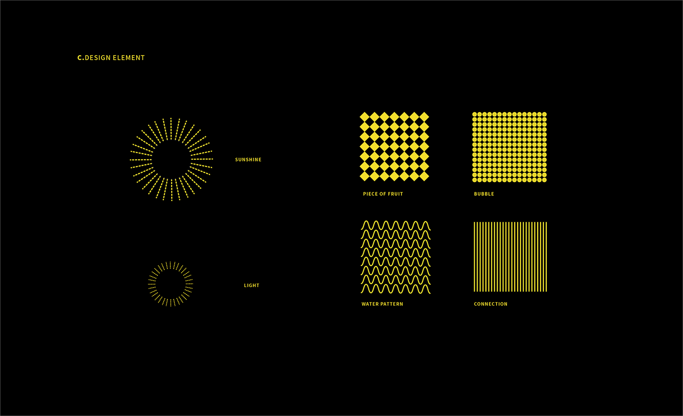
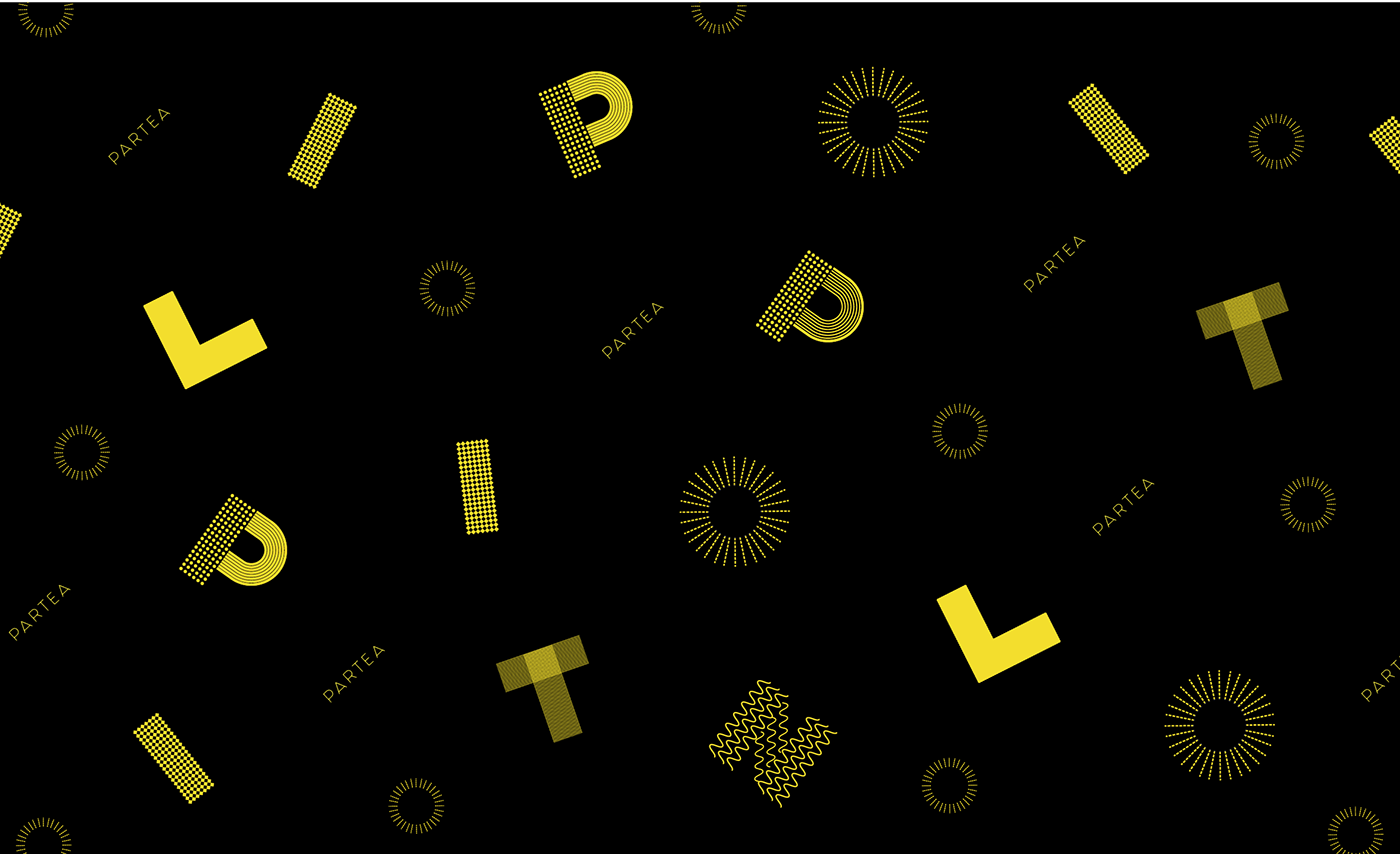
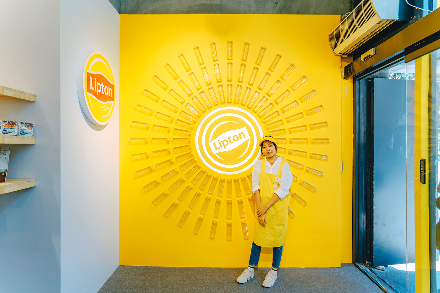
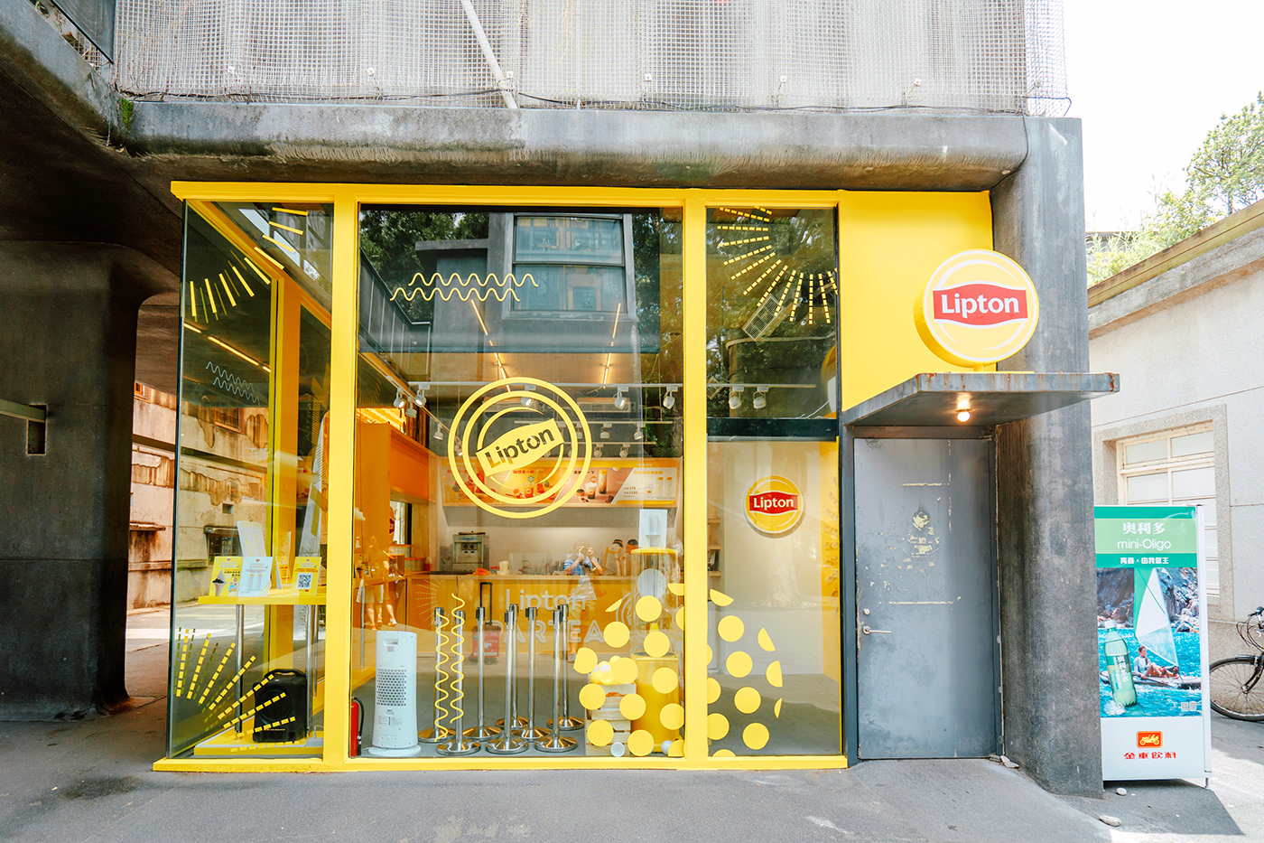
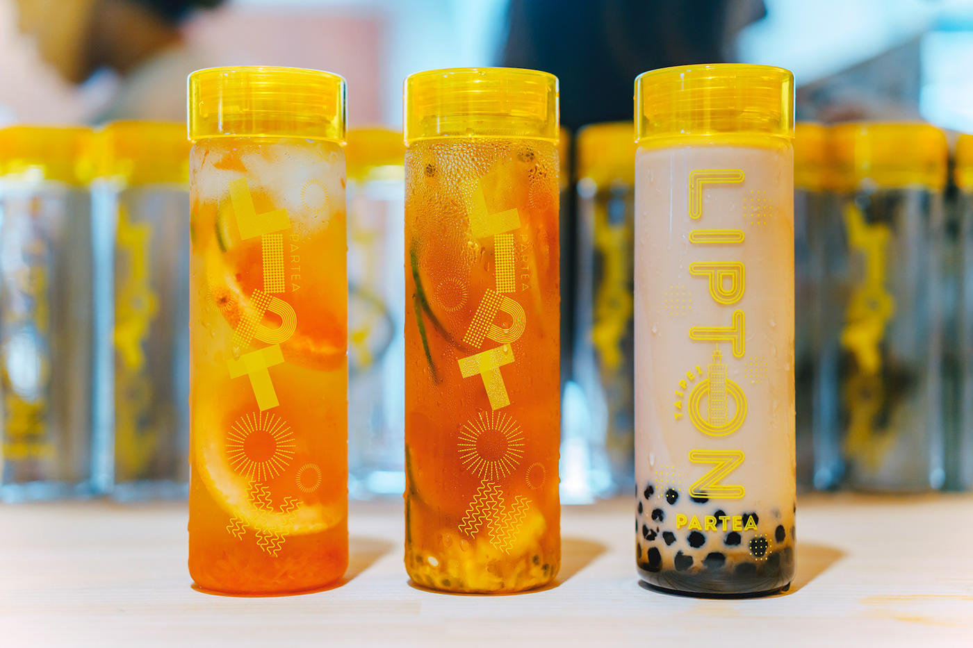
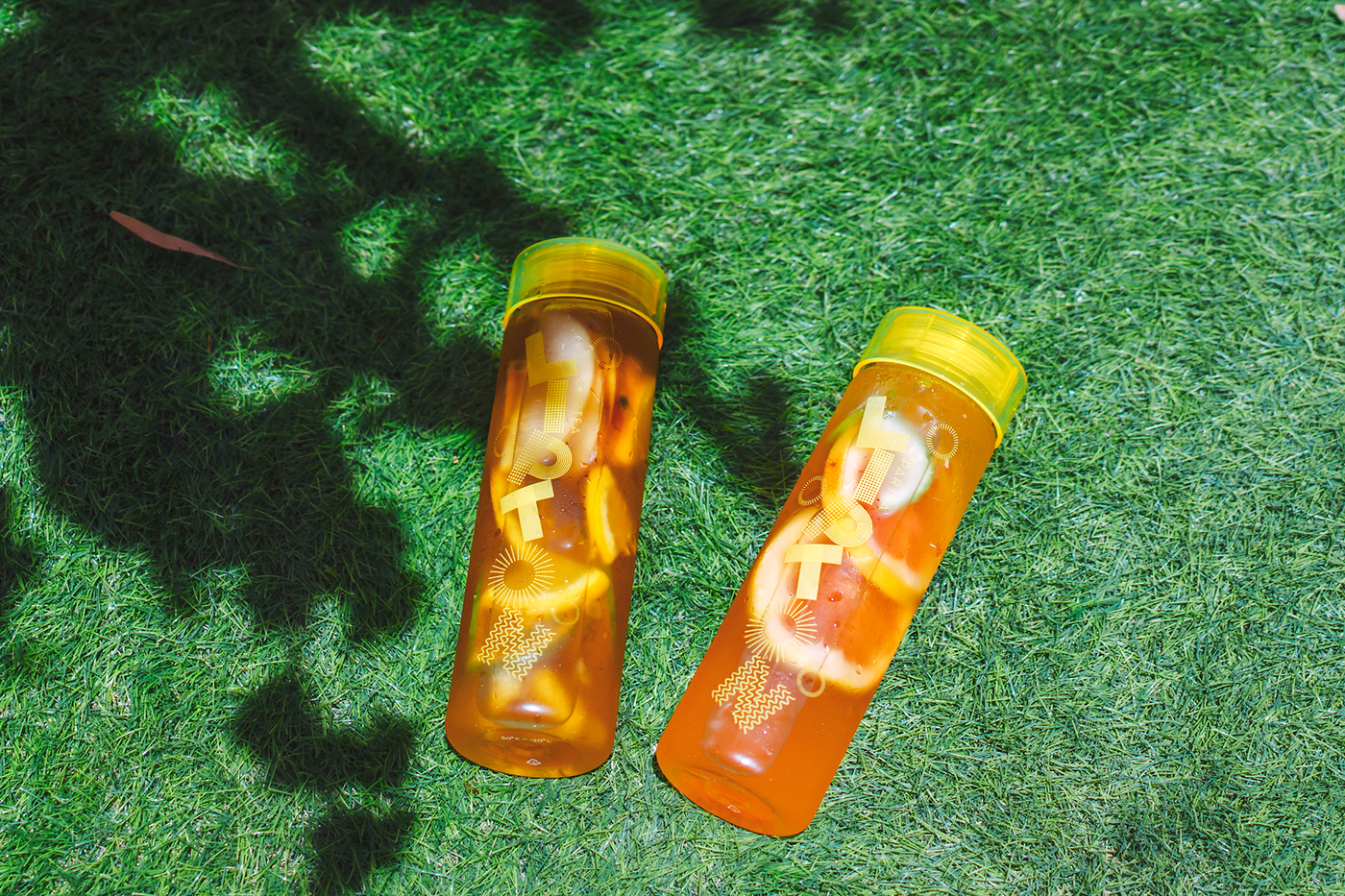
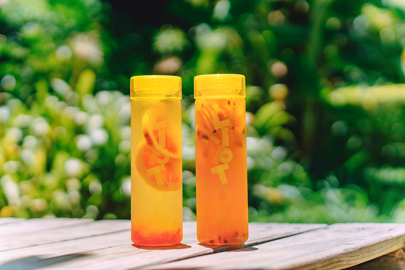
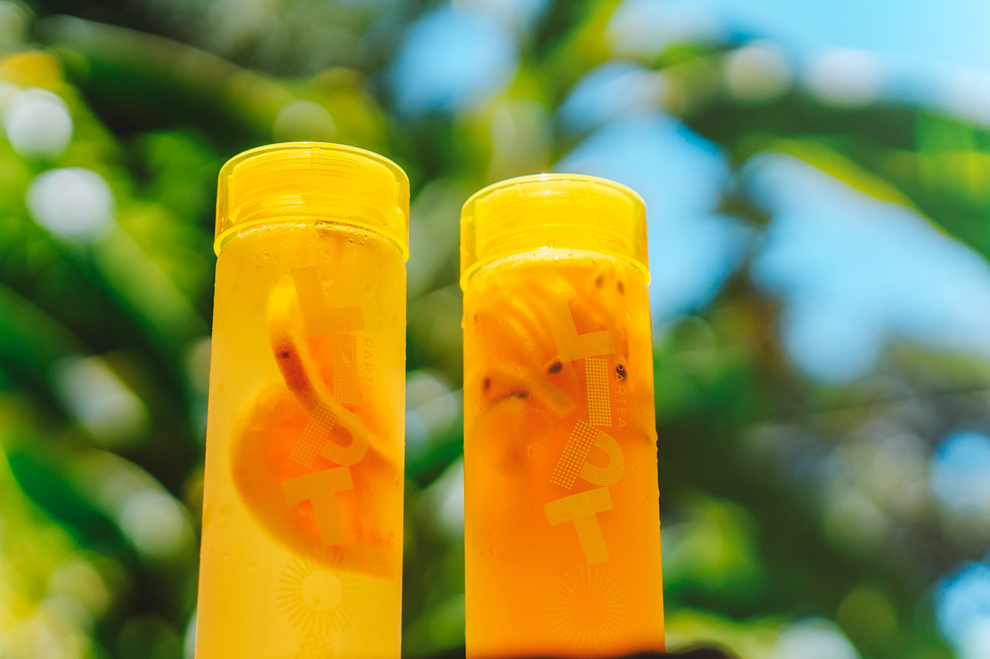
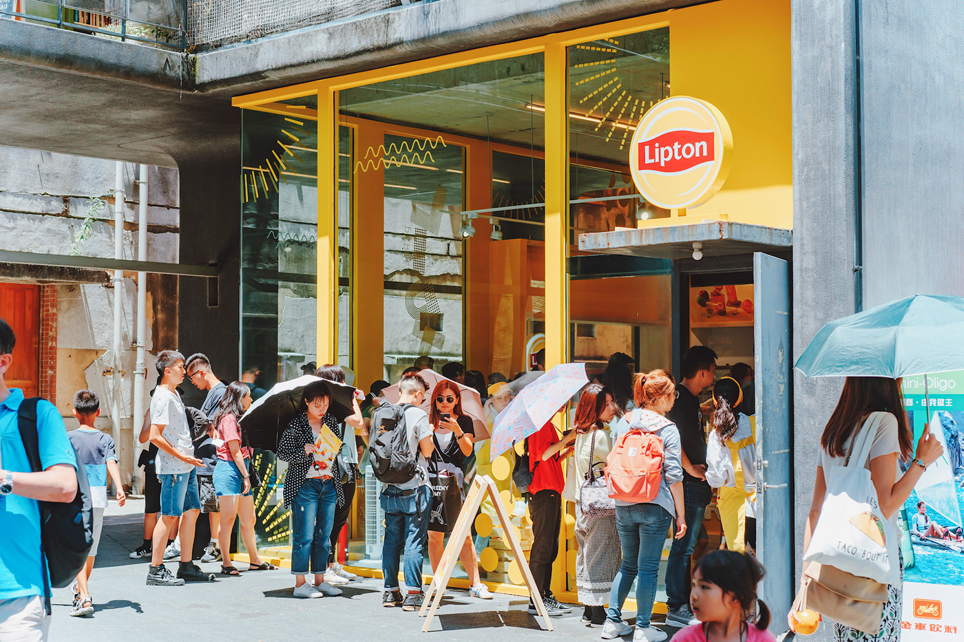
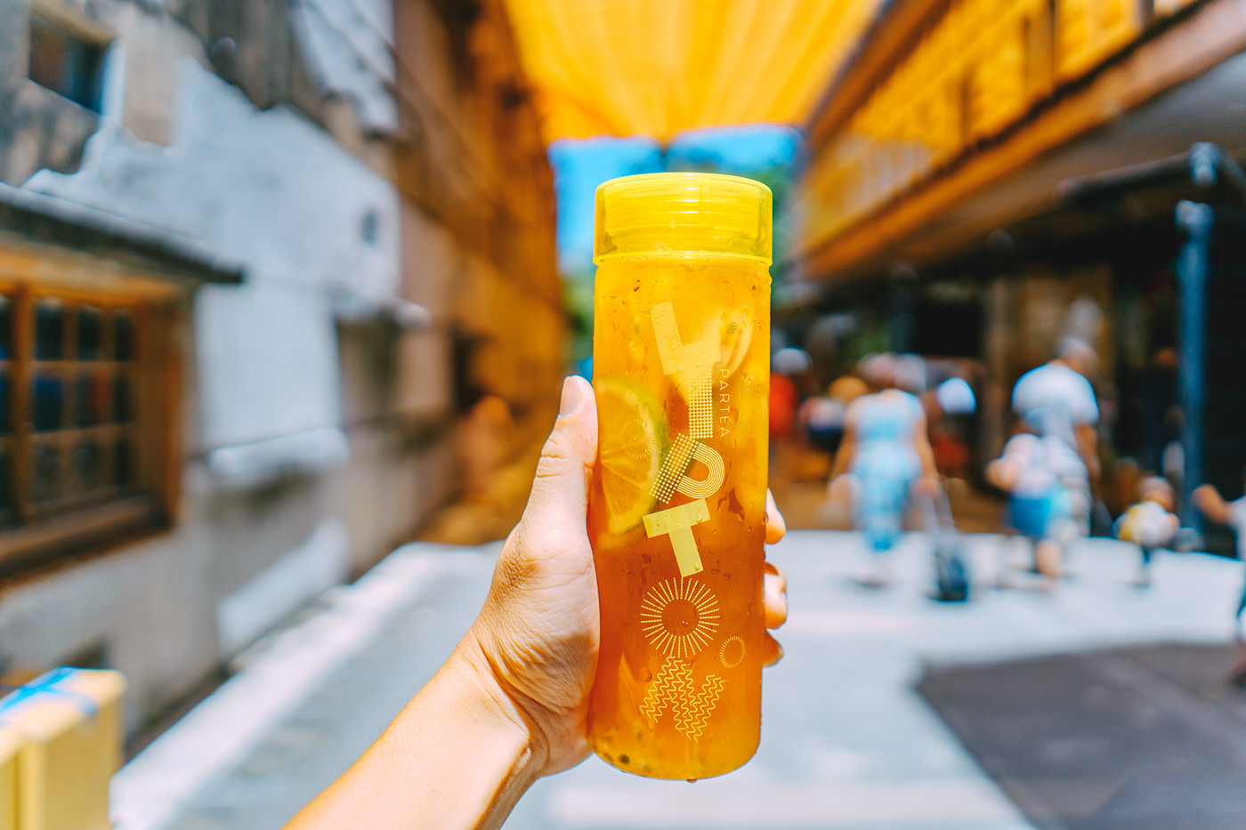
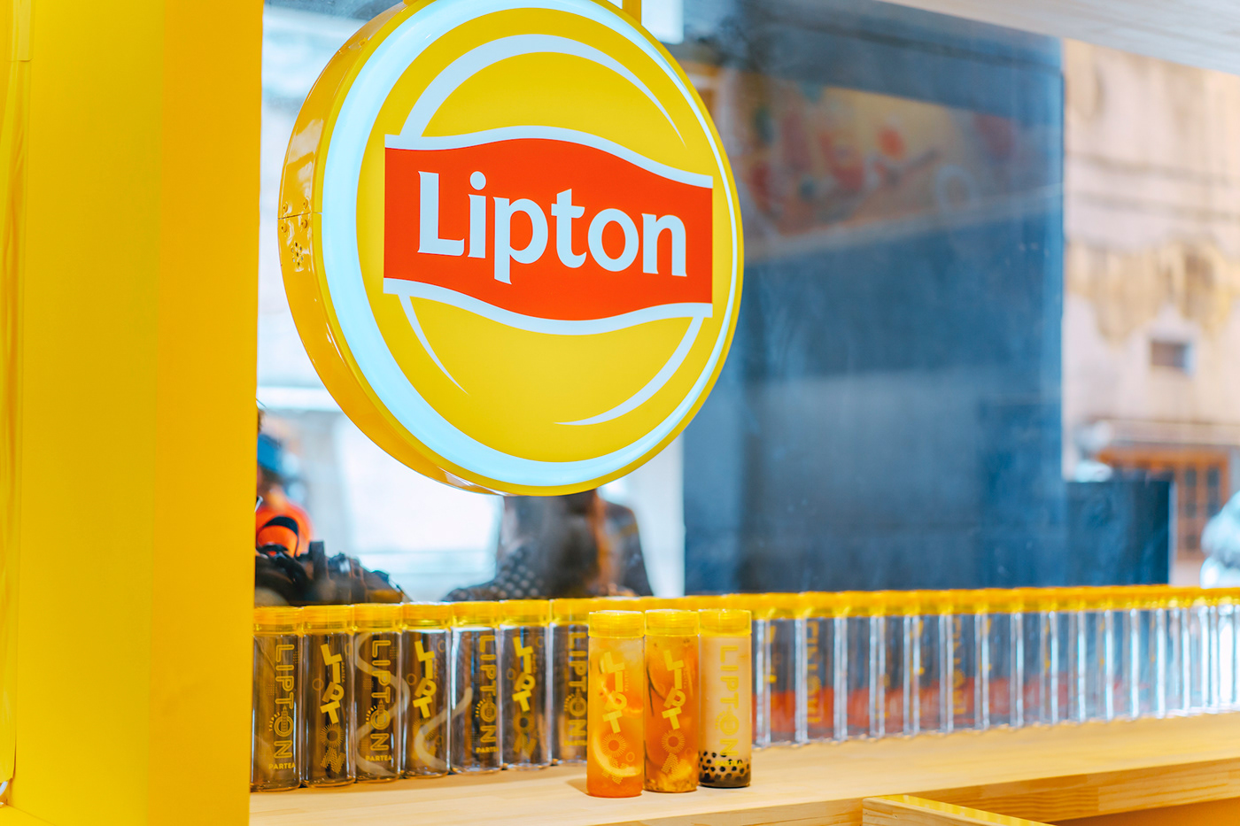
The idea of Lipton Partea Taipei features the sunlight in the Lipton logo, using the lines and graphs to draft the fonts of PARTEA. Each font is comprised of different geometric shapes, just as the customized arrangements and combinations of the concept from Lipton Partea drinks. Moreover, the key vision constructed by points, lines, and planes, can more easily be applied to different usages, from little as a bottle, to big as the furnishing and display outside or inside a pop-up store. The overall style of the design is light and cheerful that is expected to catch people’s eyes.
The idea of Lipton Partea Taipei features the sunlight in the Lipton logo, using the lines and graphs to draft the fonts of PARTEA. Each font is comprised of different geometric shapes, just as the customized arrangements and combinations of the concept from Lipton Partea drinks. Moreover, the key vision constructed by points, lines, and planes, can more easily be applied to different usages, from little as a bottle, to big as the furnishing and display outside or inside a pop-up store. The overall style of the design is light and cheerful that is expected to catch people’s eyes.
Lipton Partea Taipei 概念以立頓Logo的「陽光」為主軸,以線條幾何圖形型(勾勒)出本次的 P A R T E A 字體。每一個字體都是不同的幾何圖形排列組合而成,就如同 Lipton Partea的飲品配料自行組合的概念相呼應。此外,由點線面建構而成的主視覺更容易的使用在不同的載體上,小至瓶身,大至整體的快閃店室內室外設計裝飾。整體風格歡樂鮮明,以此達到吸睛的視覺效果。