


A N G I A
Corporate Identity
____
Context
Project’s mission is to build a unique identity that accomplishes the brand’s ambition and achieves global standards
We have approached by ΛNGIΛ Investment in a mission to redefine this huge brand’s visual identity. Founded in 2008, ΛNGIΛ has been one of the most developed and potential real estate investment corporations in Vietnam. To gain more trust and achieve better positioning in the market, ΛNGIΛ desired to emphasize its pioneering spirit and establish an outstanding identity.


Challenge
ΛNGIΛ is a potential developing company in Vietnam's real estate industry which is rarely noticed because of the lack of renovation in visual identity design. The tactic to apply minimalism to ΛNGIΛ logo and the visual system became a risky challenge since Vietnamese real estate firms’ logo are familiar with busy and complicated graphics. It caused a big question “Should ΛNGIΛ go with a “same same, but different” logo or a creative breakthrough symbol?
To develop a new bold identity for ΛNGIΛ, we need to establish an exceptional brand that can represent greater values besides the basic characteristics of a property business. That is a brand can communicate inspirationally and influentially and own a proud icon.
“In an environment where every brand competes for the highlight by plenty of details, a minimal meaningful brand surely stands out.”

ΛNGIΛ identity is the symbol of action spirit that builds positive business culture.


CONCEPT
Simple and visually comprehensive, from emotions to functions
From new brand values and strategies, we formed a simple yet flexible identity. That is the symbol of action spirit to construct a positive brand culture with different values: challenges, conquest, discovery, investment, and experiences. These principals are examined with both internal and external aspects.
Internal: Aim to nurture the business culture, inspire and motivate employees to achieve short-term and long-term targets.
External: Personalize customer’s experiences for various target groups and partners with close relationship and transparency.
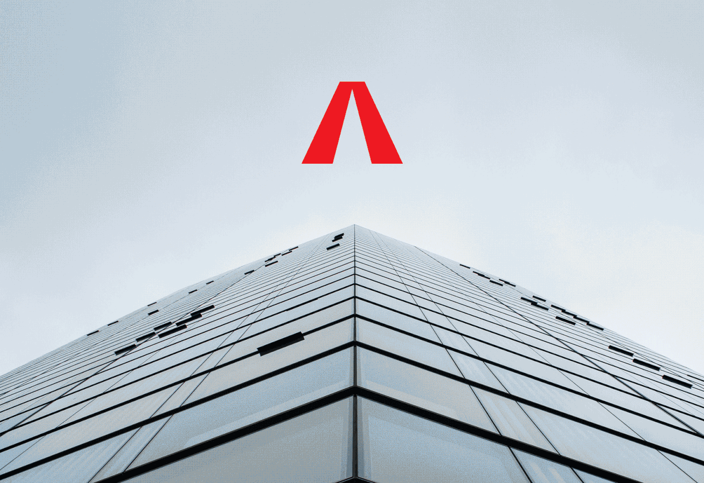
The new logo became a story-teller narrating the effortfully developing journey of ANGIA. The brand name's letter A was exceptionally modified with the removed crossbar, higher contrast promoting the depth and upward movement. The balance of two simple “Λ” letterforms in the beginning and the end constructed the stability and solidity of the logotype.
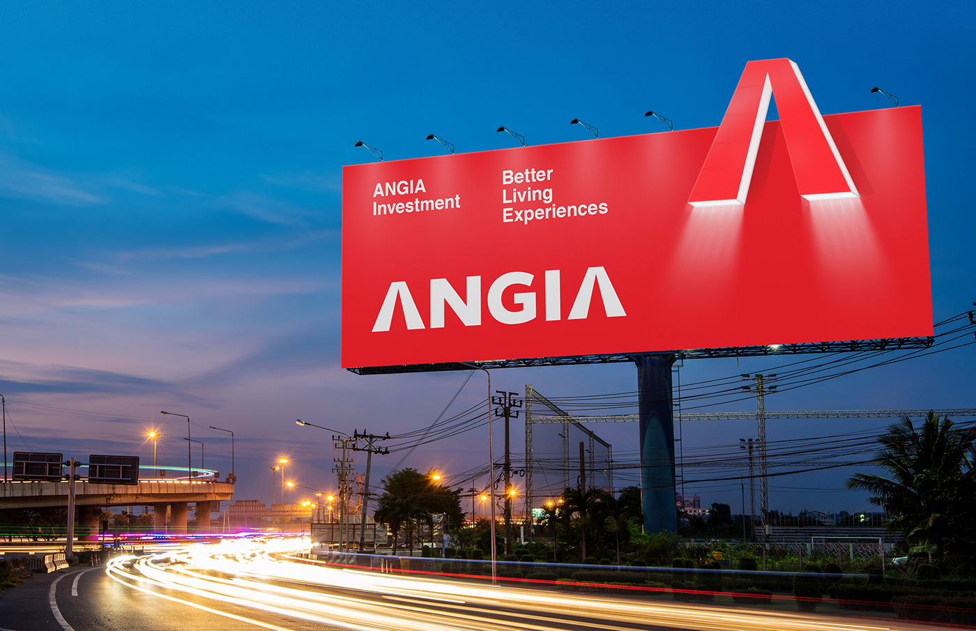
The single letter Λ was also used as the logomark on different applications to make the visual identity more flexible and powerful. Moreover, we experimented with visual languages including typography, colors, composition, spaces, and materials to deliver a modern minimal identity and focus more on the clarified brand message. All elements of the layouts were built on a flexible grid to diversify visual contents as well as manage the visual system on every touchpoint - online and offline.


Brand Message
Speech and words have the power to shape stories. And then stories shape brands
Continuously employing letter Λ as the narrator, we established the message system to reflect core strategic values, as well as created direct visual associations to the logomark. The message content concentrated on customer’s experiences, partner’s collaborations, investment, and brand values, with comprehensive contents, matched with brand tone of voice to deliver ΛNGIΛ intentions.


ΛNGIΛ identity is the symbol of action spirit that builds positive business culture


ΛNGIΛ logo is a story-teller on flexible application system


Client: ANGIA Investments
Design Agency: Bratus Agency
Creative Director & Designer: Jimmi Tuan
Graphic Designer: Trang Pham, Si Tran, Nguyen X Hoang, Alex Dang
Showcase & Motion: Si Tran
Account Director: Quyen Tran


