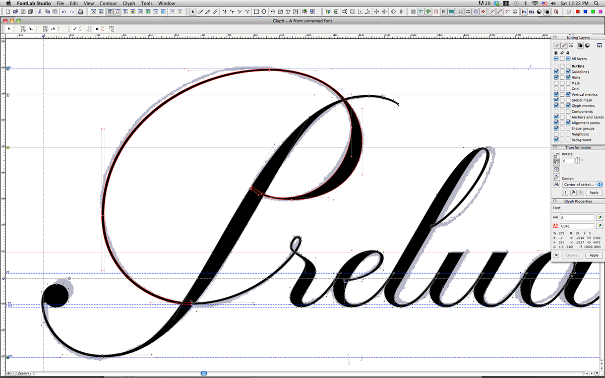
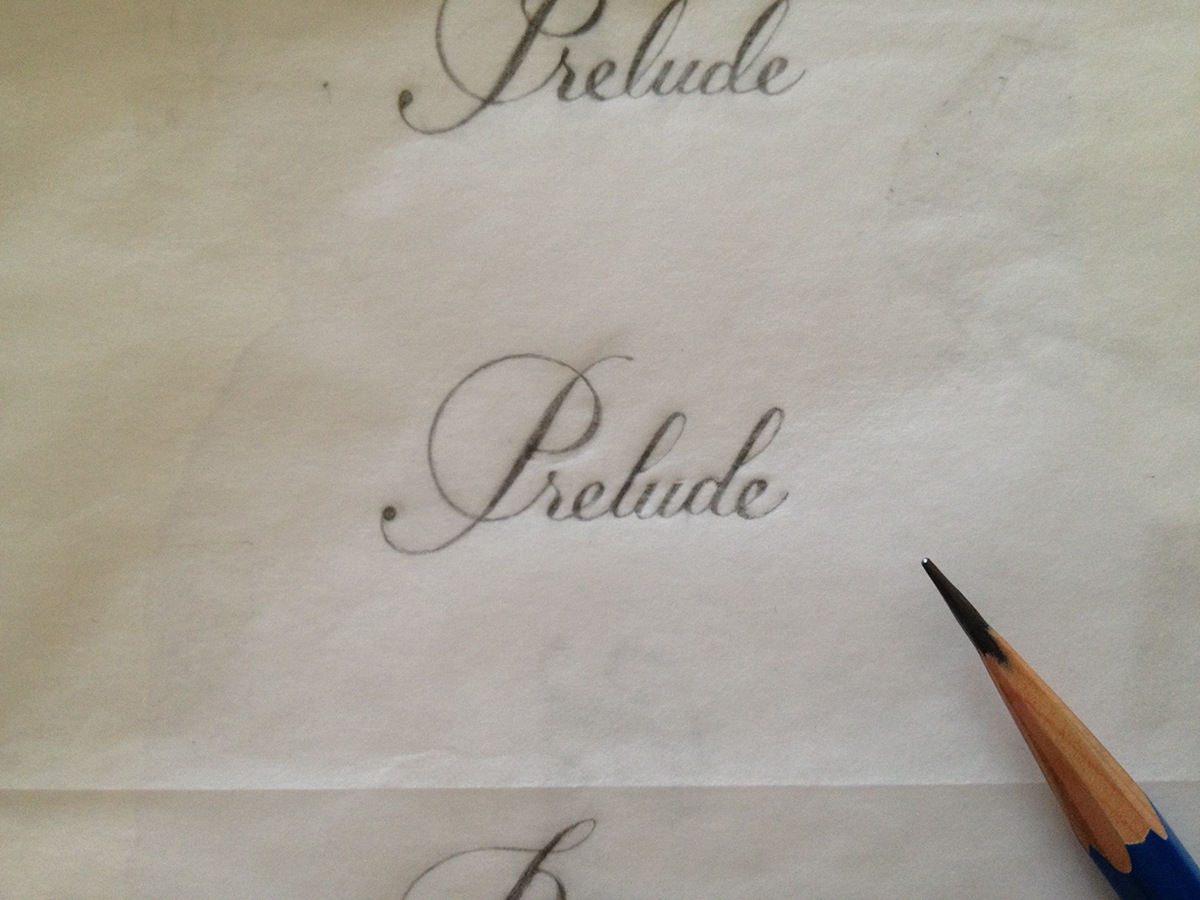
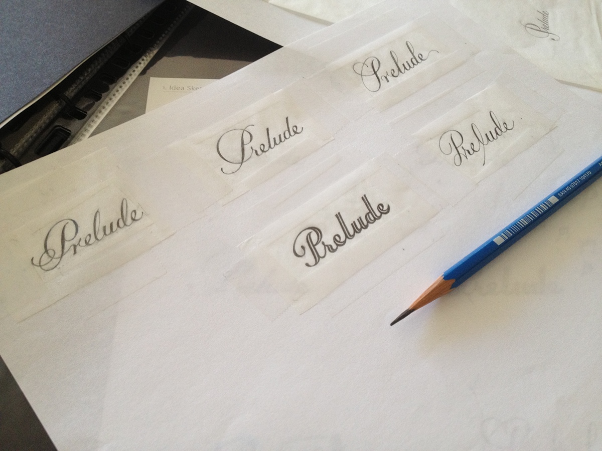
Logotype design for Prelude Wines. The concept of the entire design is about 'music.' The flourished "P" is designed to be looked like a G-clef, and long stems of "l" and "d" could remind the violin bows moving up and down among the orchestra.
Prelude |ˈprɛlˌjud| |ˈpreɪˌlud|
an introductory piece of music, most commonly an orchestral opening to an act of an opera, the first movement of a suite, or a piece preceding a fugue.
an introductory piece of music, most commonly an orchestral opening to an act of an opera, the first movement of a suite, or a piece preceding a fugue.