A NEW IDENTITY
This is a long project, so I ask you to be patient. This project was born as a result for my (and of many others) disagreement regarding the logo chosen for the Quito metro system. The current logo has 3 main problems: the concept is not clear, it has no personality and it lacks coherence in its brand architecture and visual identity.
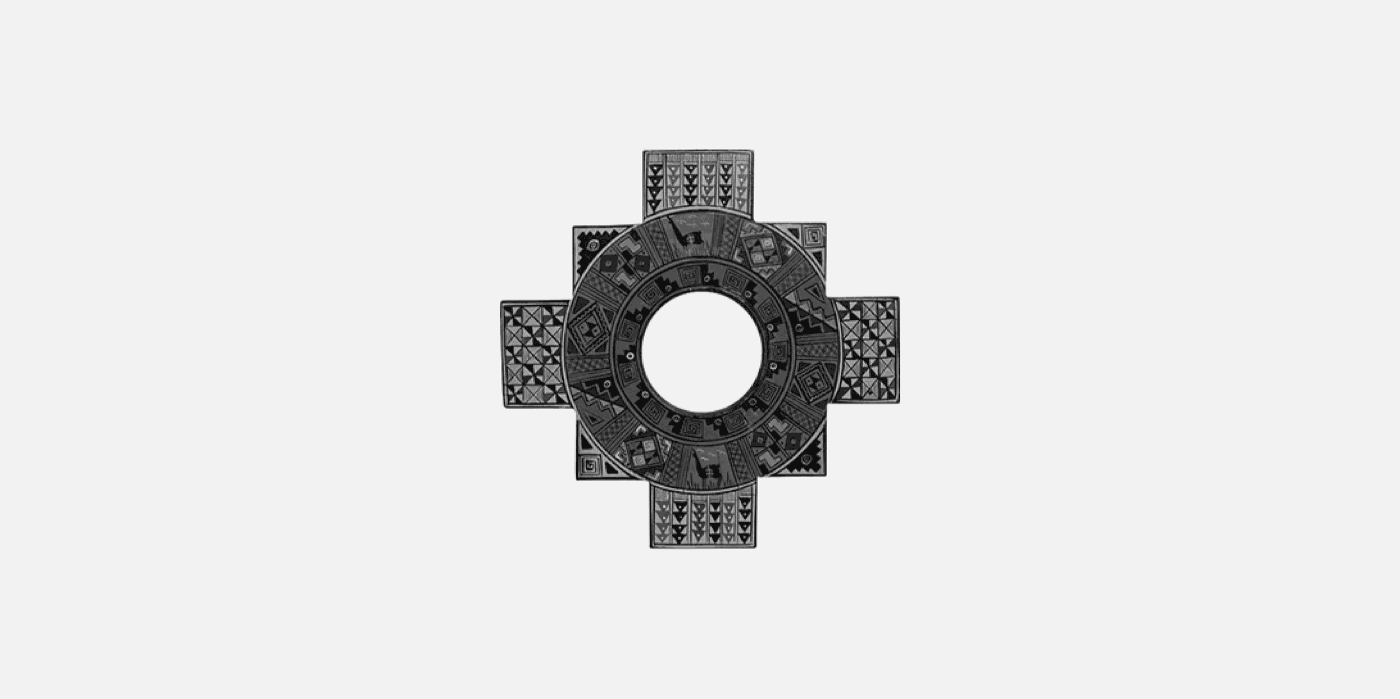
According to the research carried out by my students, people from Quito want to see a more cultural approach to the logo, and feel that it doesn't represent something special. My starting point was to use the "Chacana", an ancient symbol used by the native ethnic groups of the Andes, even before the appearance of the Incas. This symbol has a myriad of meanings, however one of the strongest is that of union. Chacana can be translated as bridge, an element that unites, as does a transport system. The color palette is inspired by the flag of Quito, a symbol that all citizens associate with the city.
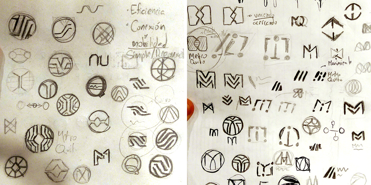
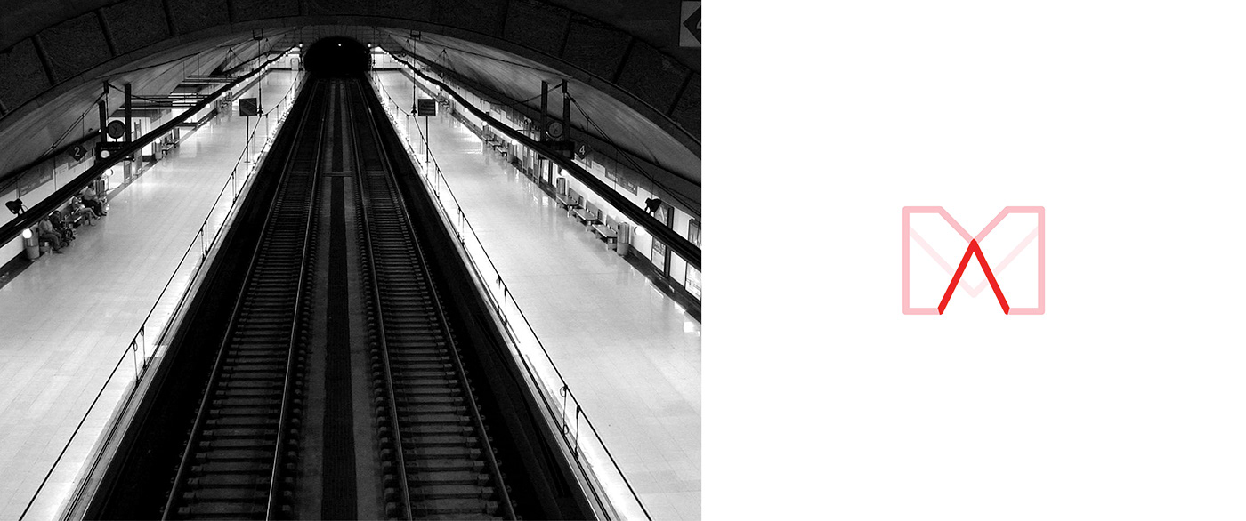
From this element, both the logo and all the brand architecture and visual elements were built. My goal from the beginning was to find something simple and iconic, that is easy to remember and that represents an ideal; a symbol that is easy for people to appropriate the brand.


VISUAL ARCHITECTURE
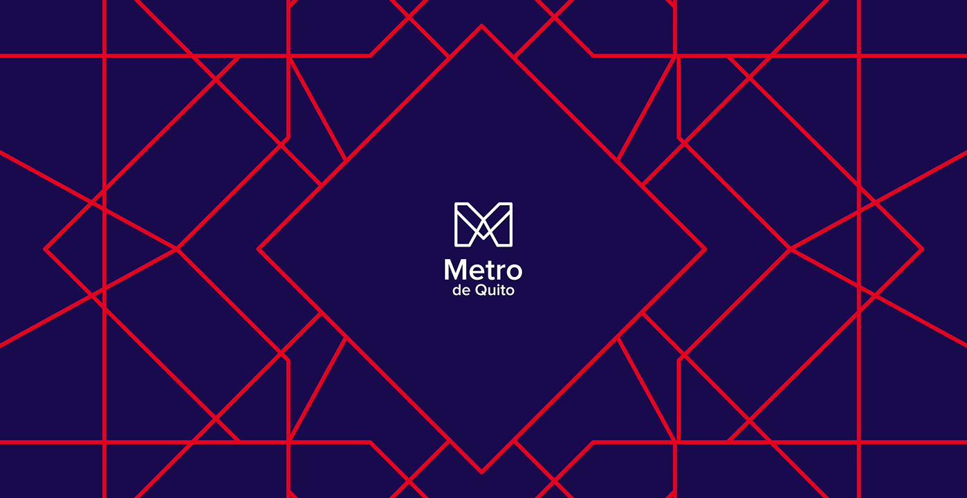
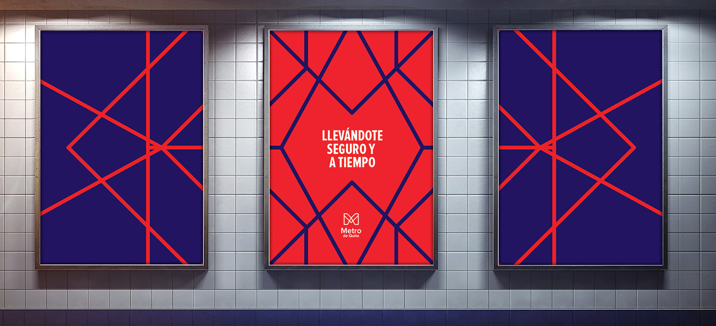
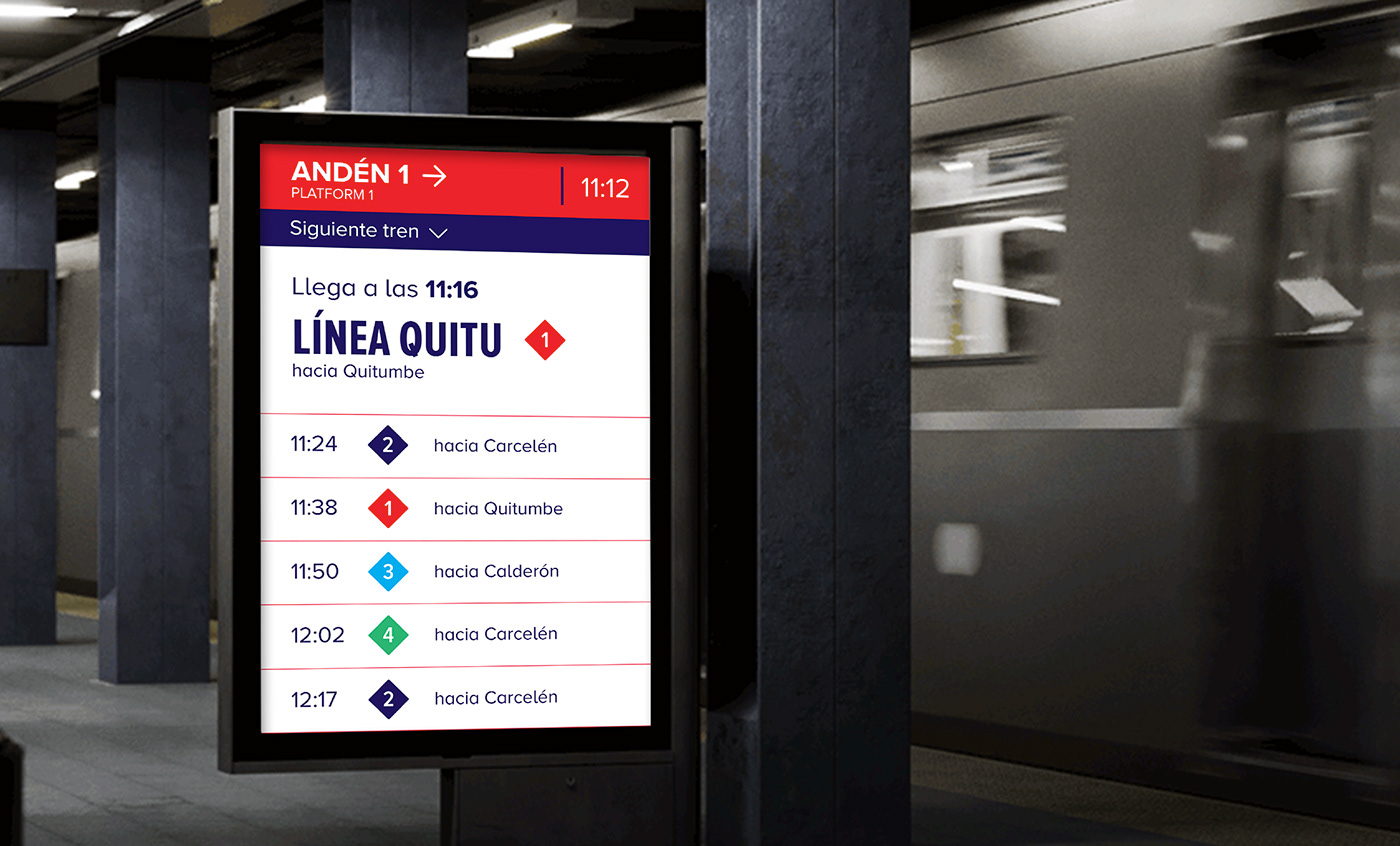
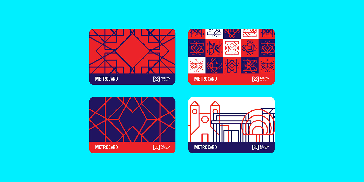
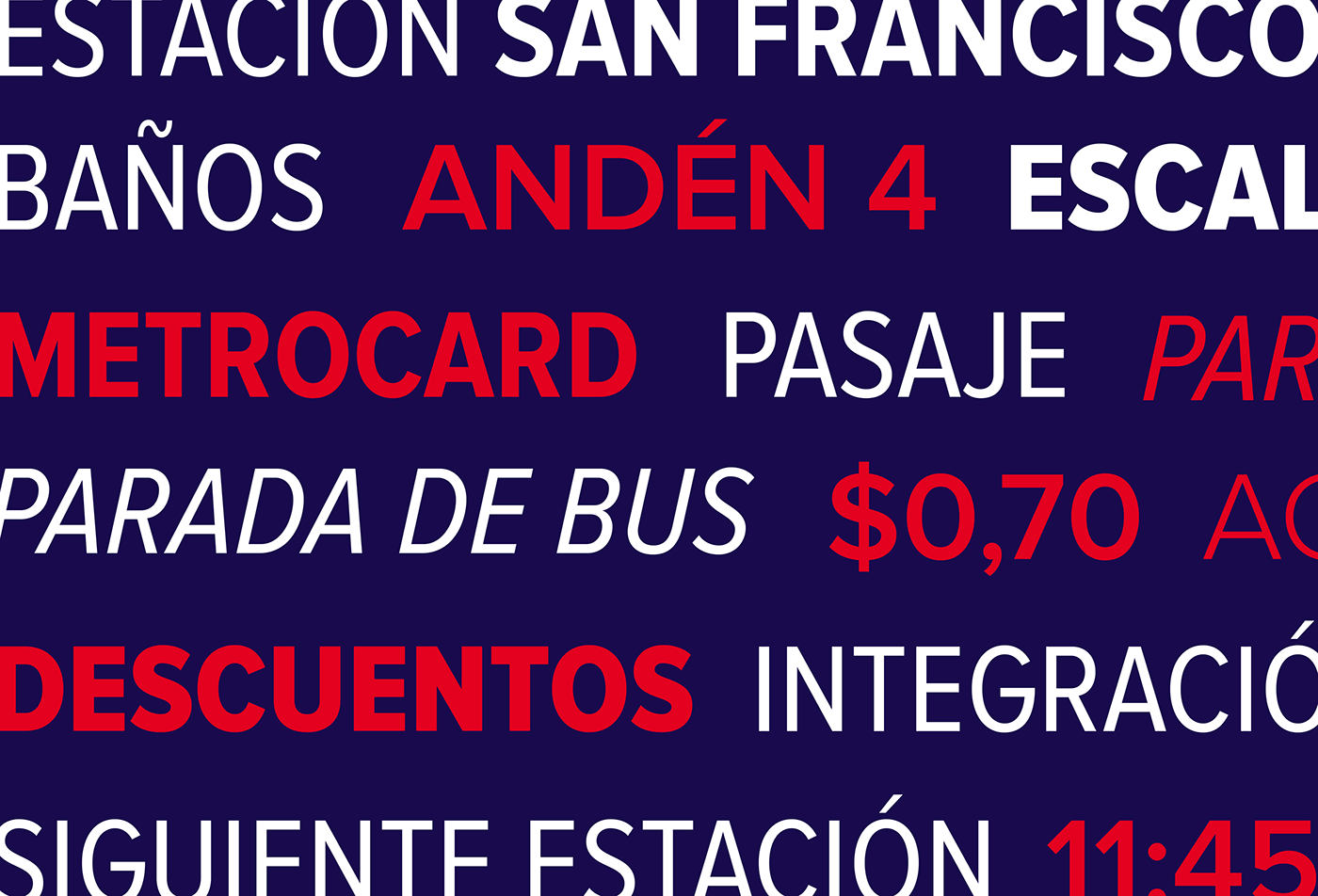
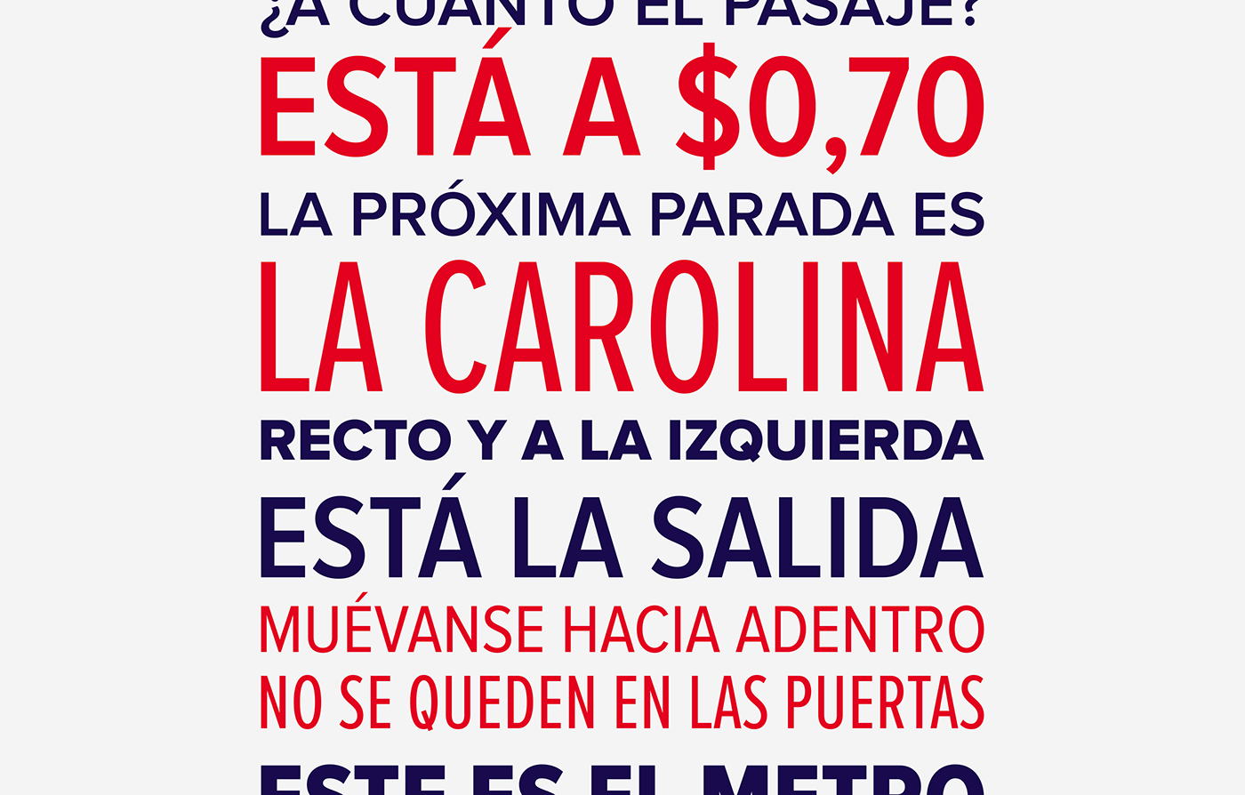
The brand architecture for the different metro lines is born from the diamond-shape that is formed by reflecting the isotype. This shape has a cultural connection as well, as it is present throughout the different artistic expressions of the Andean cultures. The names of the stops are based on the names of indigenous cultures, national heroes or local places, so that the metro users can relate to them and also to create a sense of ownership.
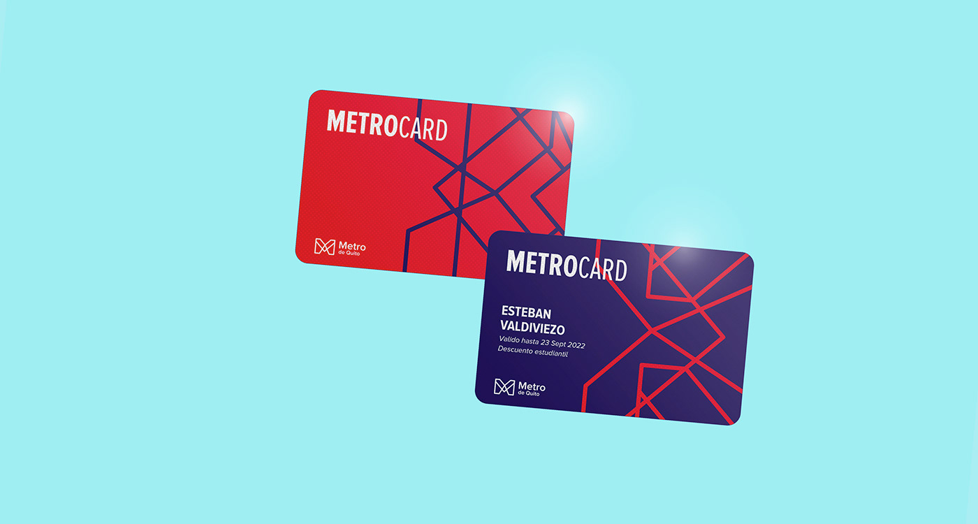
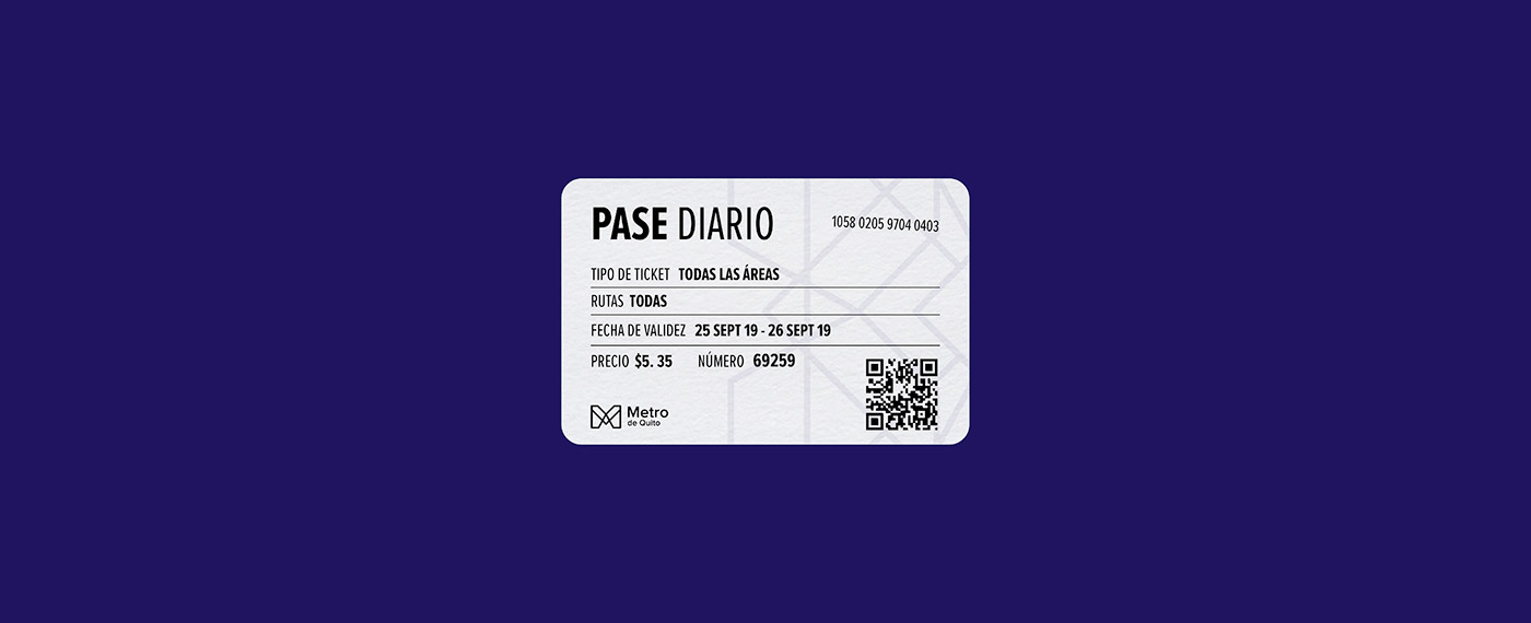
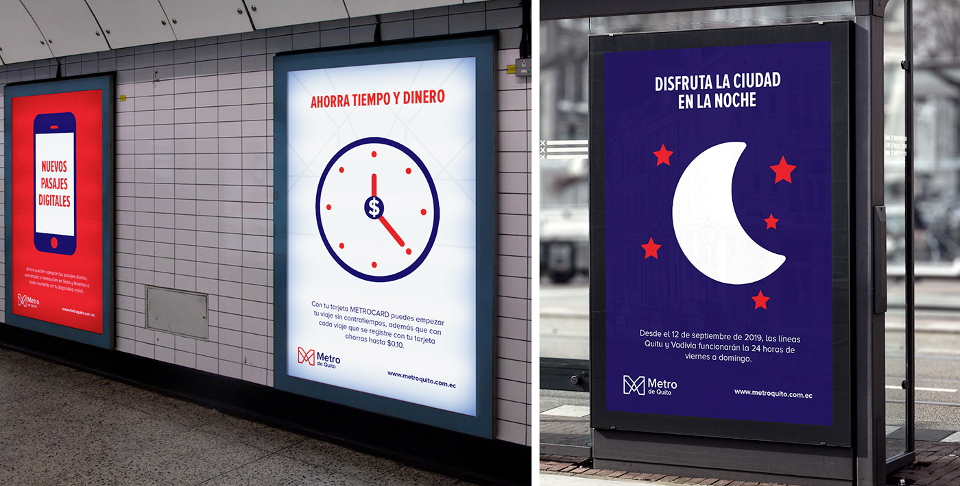
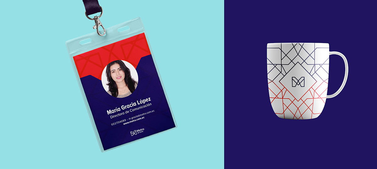
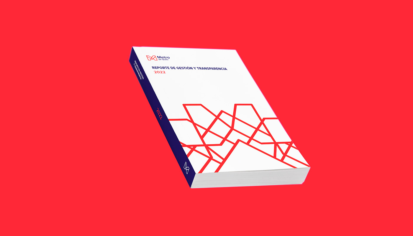
The visual elements for the brand are created through replicating the logo symbol in different ways and angles, thus giving versatility to the entire identity.
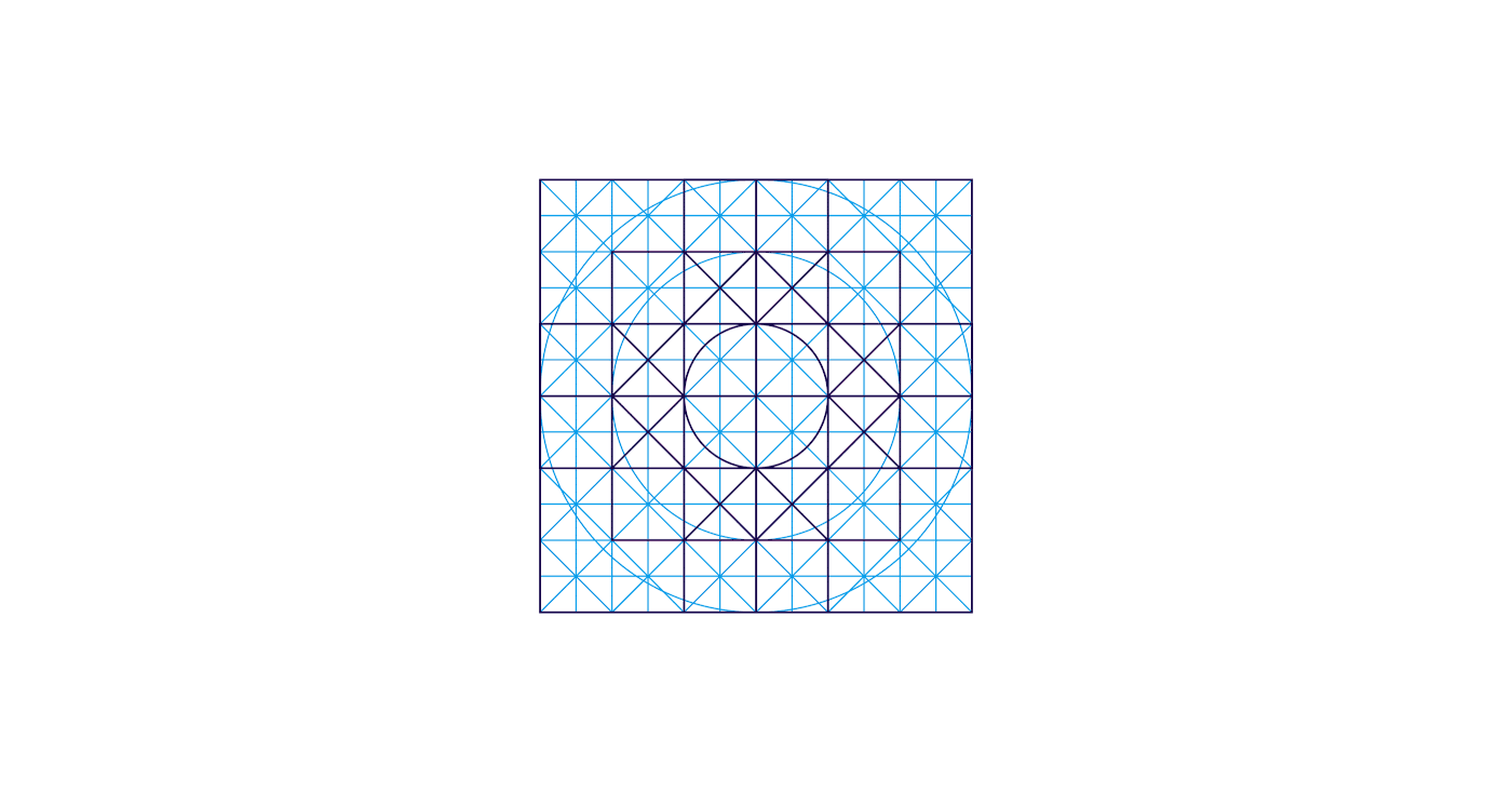
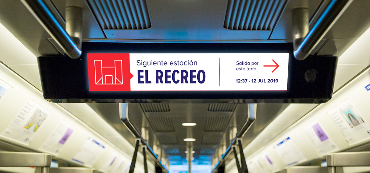
As for the icons, the same grid for the logo was used to create them, achieving the objective that all the brand's visual elements maintain visual coherence and their features become unified.