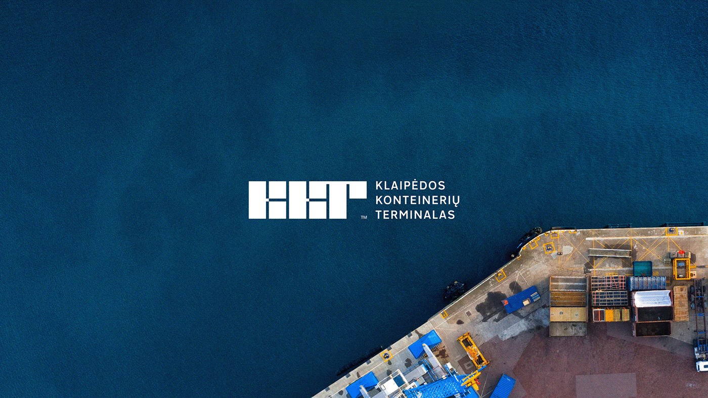
Klaipeda Container Terminal
KKT is one of the leading stevedoring companies in the Port of Klaipeda. Founded 26 years ago, Klaipeda Container Terminal was and is a pioneer of container handling in Lithuania.
Situation
Despite being a leading cargo terminal in Lithuania providing more than 900 vessels per year and having a capacity of 6 million tons, KKT’s visual identity remained the same since it was founded in 1996. In fact, when it changed its name to Klaipeda Container Terminal, the logo remained the same. The old container terminal logo was morally obsolete and could no longer adequately represent a company that had changed and grown significantly during 25 years.


Insight
Only after visiting the terminal and seeing everything for ourselves did we realise the scale and immensity of these containers being stacked on top of each other. Watching cranes as tall as five story buildings being driven around in near perfect precision we understood that the logo and whole visual identity must be a reflection of this structured boldness.
Result
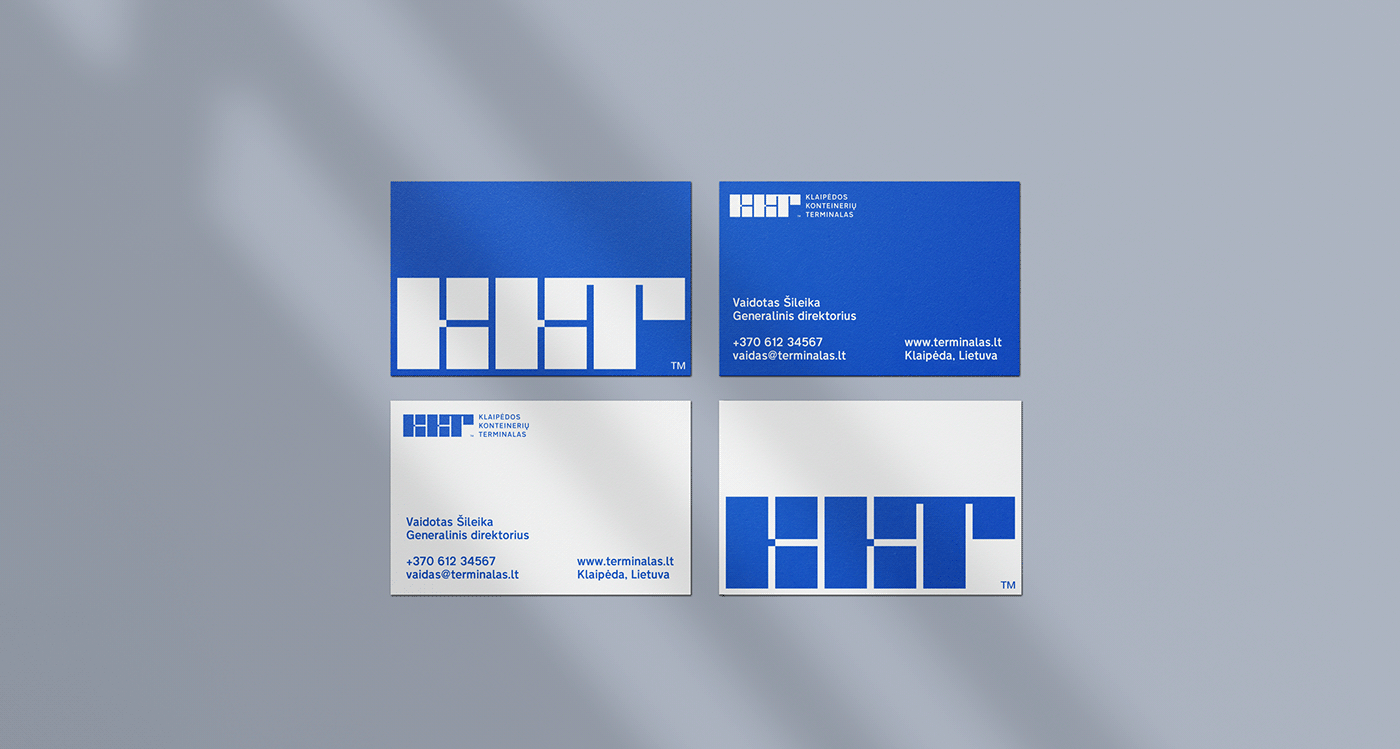
The container, a unit that everything revolves around, became the logo. Constructed in a way that dictates a sense of stability and reliability and is often used as the only graphic component on various brand assets.


Terminal Block Type
We created a custom block letter typeface based on the logotype. It’s a bold modular typeface used to create strong typographic visuals which is one of the key identifiers of KKT’s visual identity.


Client: Klaipeda Container Terminal
Intro videography: Rytis Aliukonis
Year: 2018


