


This chart follows music artists and their music world tours. It is interesting to see which continents get to host more music concerts, and which one is utterly deserted and bereft of all music.
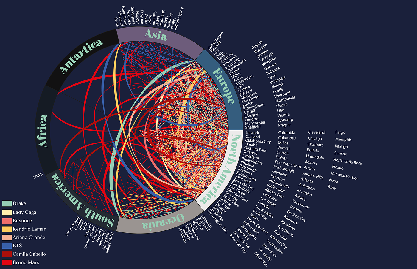
The lines represent the number of times an artist visit a continent in a single world tour. Every time a new city is visited, it is added to the chart too. Although I find this information very interesting, it is also important to say that this chart displays only eight music artist and therefore it is not a representation of the entire music industry, but rather a sample.

I used the target image I had created with Unity and the app on an iPad. People could use the iPad camera to see the poster change by showing all journeys conducted by artists in their music tours.
AR makes the poster "become alive" to make the interaction with it more interesting and immersive.


Thank You!


