Ryori
Location
Singapore
Role
Branding, Illustration & Packaging
—
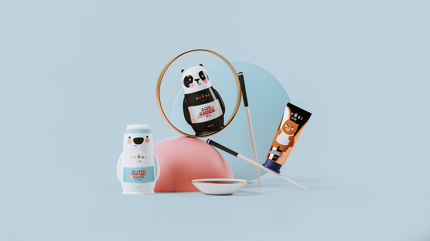
Ryori is the extension of the owner’s current business Omoté – a well-known Japanese food restaurant based in Singapore. Due to the success of Omoté, the business is moving into food retailing at supermarkets. Ryori is a line of sauces and pastes inspired by the successful recipes of Sushiro.
The Challenge
Ryori is the new product brand for Sushiro’s restaurants. The challenge was to create a brand identity and a set of packagings with its own personality, while maintaining the fun behind the restaurant’s universe, with a distinct use of characters.
The Solution
We created a set of cook bears, as part of an extended family with Sushiro’s mascot. The geometric, modern logo plays along the brush-style illustrations, creating an unique universe for the brand. The colours represent a fresh look into pastel tones, inspired by the rich colours from the Wasabi and Mentayaki sauces.


.
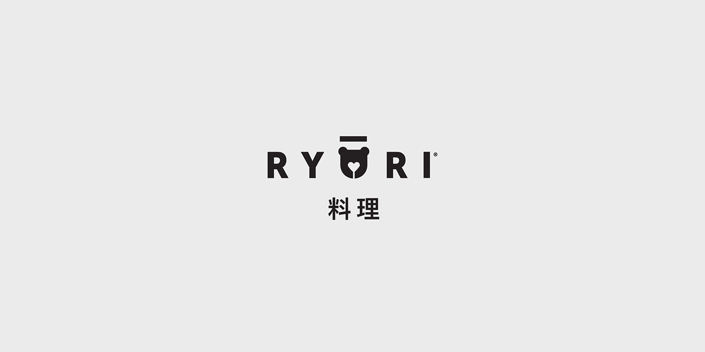
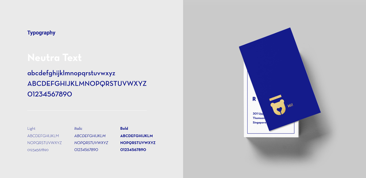
TYPE
To bring coherence and geometrization to the Eastern writing system, we chose a sans-serif font to create the Ryori logo.
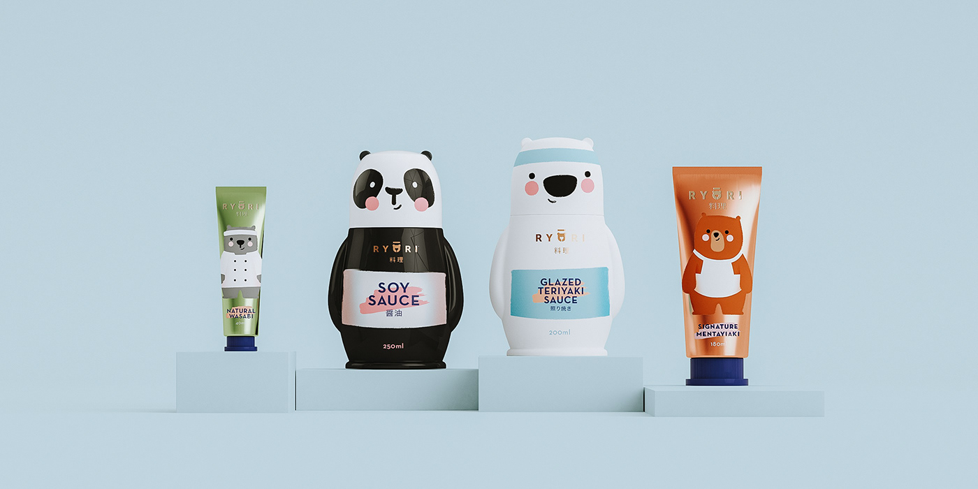

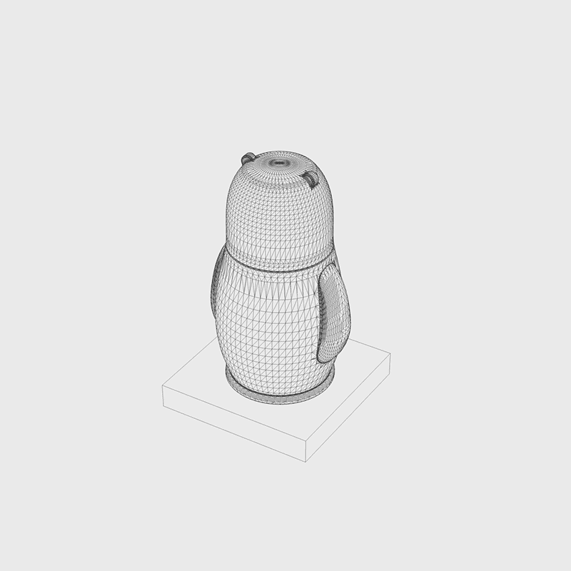
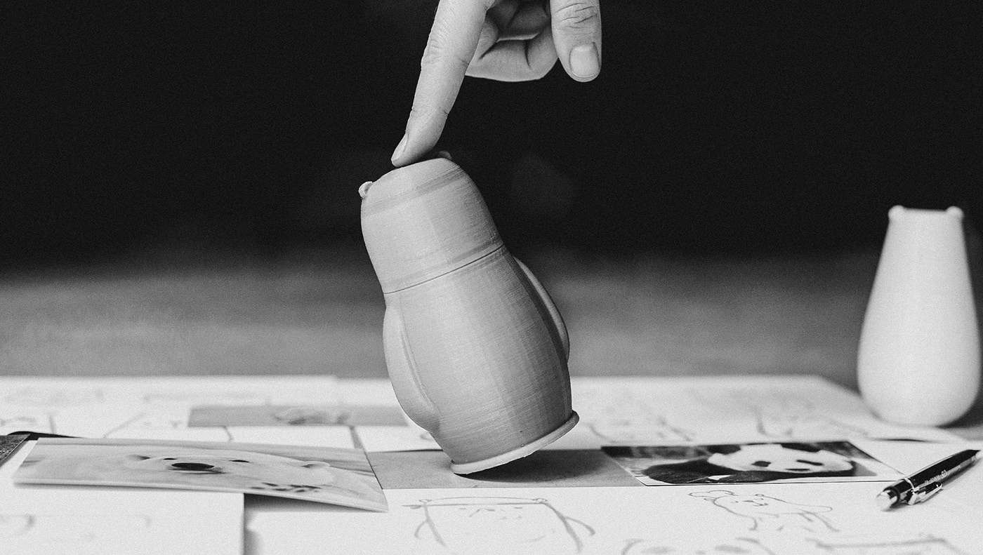
SHAPE
Unique and memorable
Our goal was to create a shape that would represent the proposed concept and still make the object easily associated and memorable to the POS.