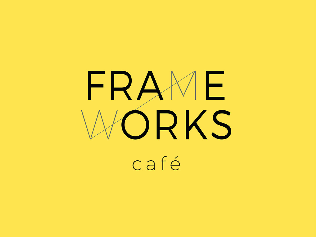
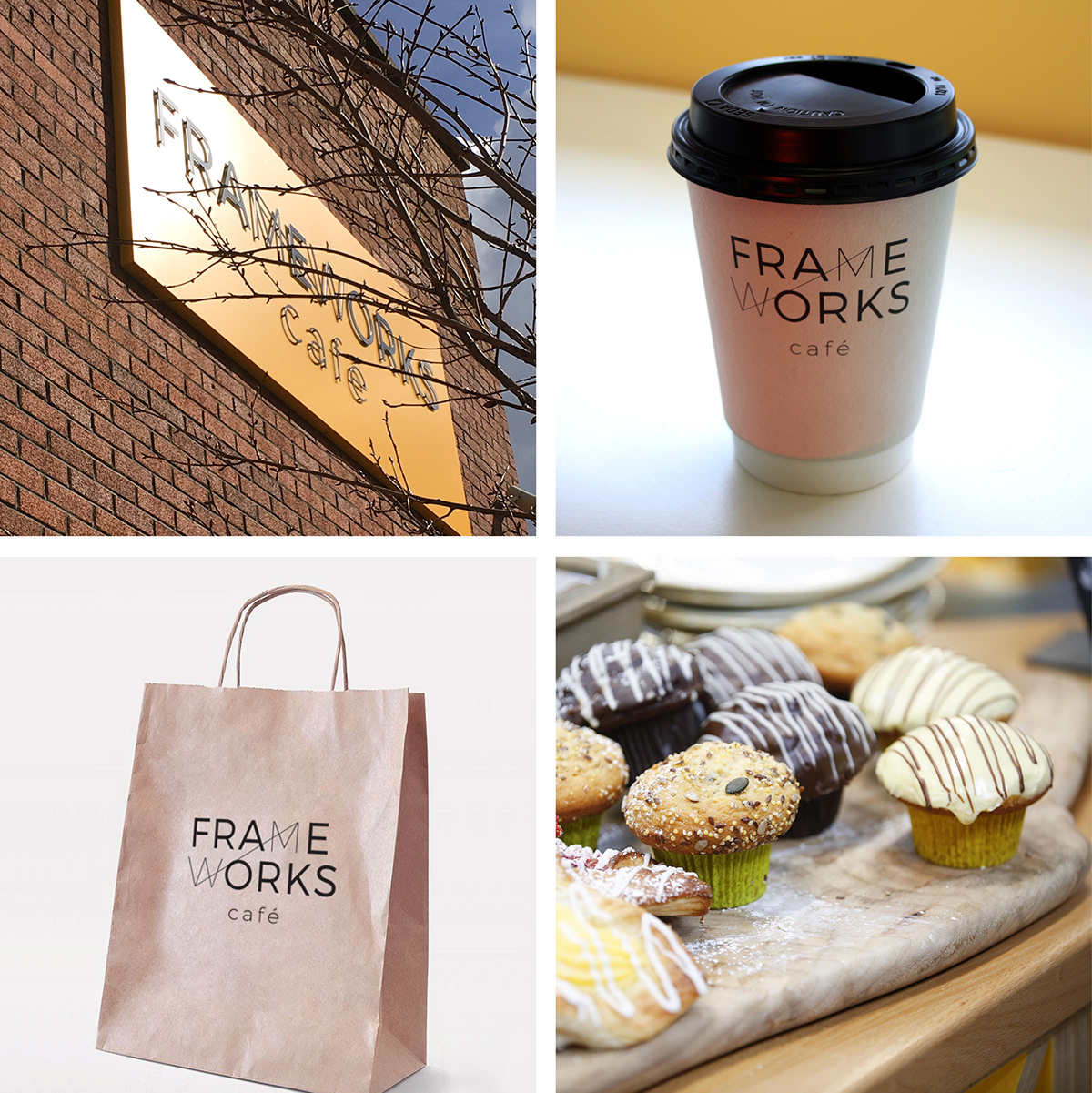
Frameworks Café brings two great things together - cycling and excellent coffee (and also some very tasty food!) The name of the café originates from the name of the building itself — 'Frameworks,' which works really well for a cycling-themed café.
When designing the logo, I was influenced by the simple geometry of bicycle parts, such as the handlebars, the bicycle frame, the wheels and the way these shapes interact when assembled. I experimented by pairing these shapes with geometric sans serif typography. The letters 'M' and 'W' in the word 'Frameworks' draw similarities to bicycle frames and so I focused on creating a relationship between these letters. This simple, yet effective graphic device allowed me to create two iterations of the logo, a portrait and a landscape version.
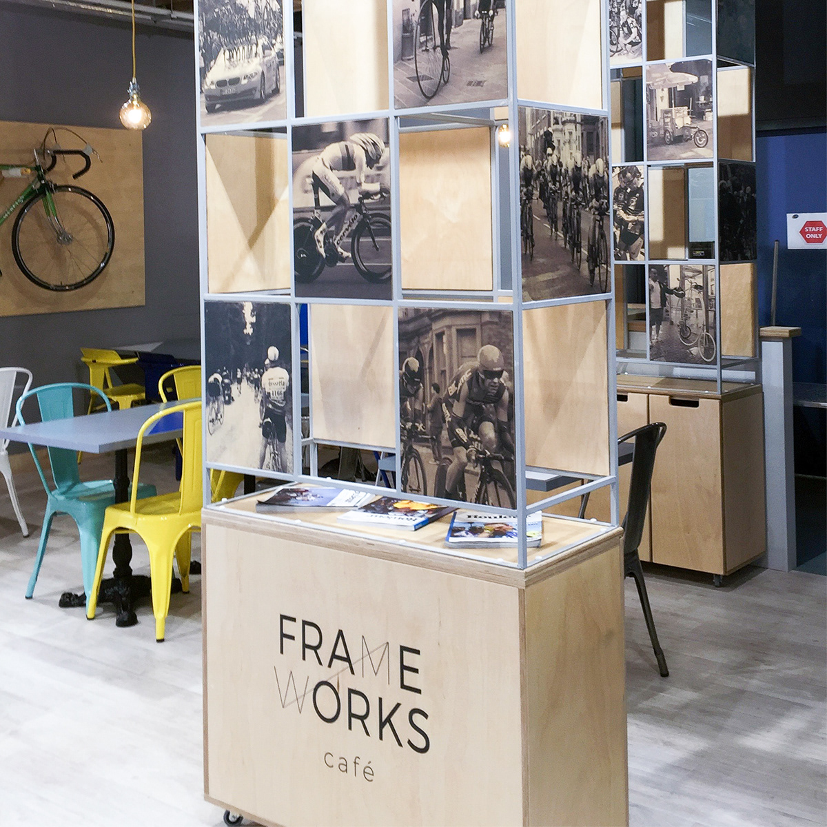
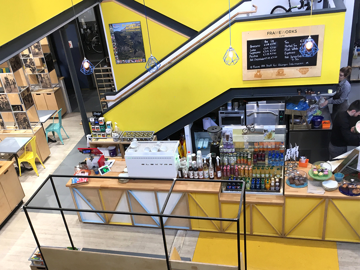
The brand features a bright colour palette, which works really well with the contemporary material finishes of the interior. The space features industrial style lighting, geometric wood panelling and modular display units featuring photography. The theme of cycling is emphasized in the black and white photography, the unique metal chairs and the abstract display of bicycle parts.
Exhibit Design
Client: Kay's Cycle Superstore
Richard Barnwall, Project Management & Design
Rosanne Lancaster, Art Direction & Brand Identity
Ciaran Farrell, Interior & 3D Design