

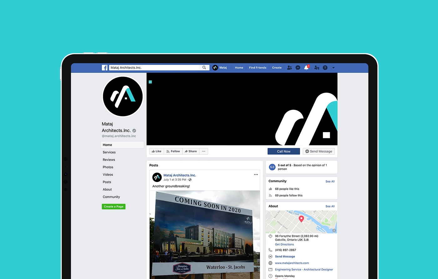
Mataj Architects Inc.
Rebrand and Web Design
Mataj Architects Inc. was established with the aim of delivering a fine architectural design that is both unique and cost-efficient, but most importantly providing great client value which surpasses ordinary expectations.
The founders Eva and Artan strongly believe that architects can provide a final touch of beauty and sophistication worth paying attention to.
The founders Eva and Artan strongly believe that architects can provide a final touch of beauty and sophistication worth paying attention to.
Challenge
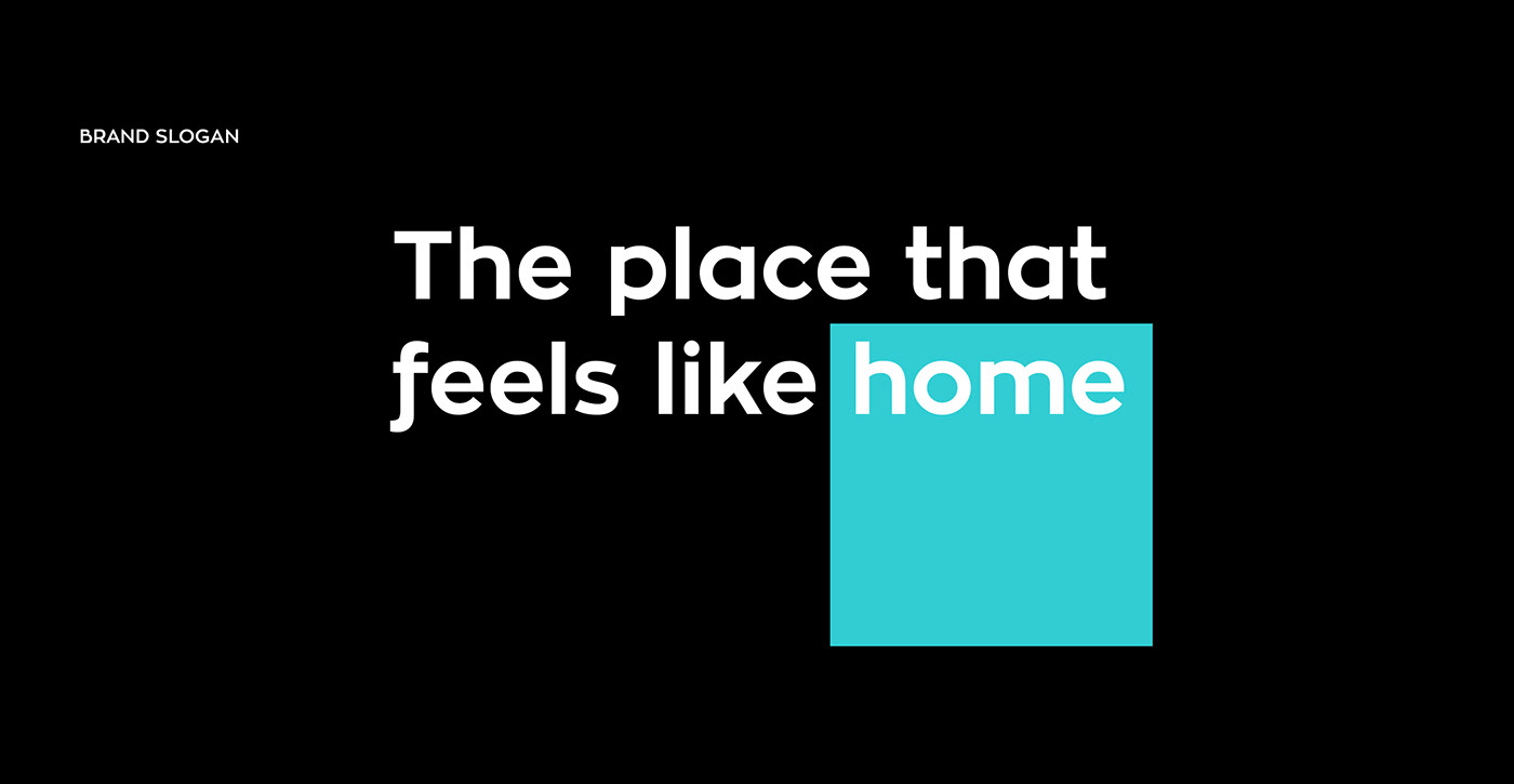
The goal was to design and develop a brand that personified Mataj Architects Inc. core values of sophistication and beauty while revitalizing and modernizing their look to stand out as a cut above their competition.

Solution
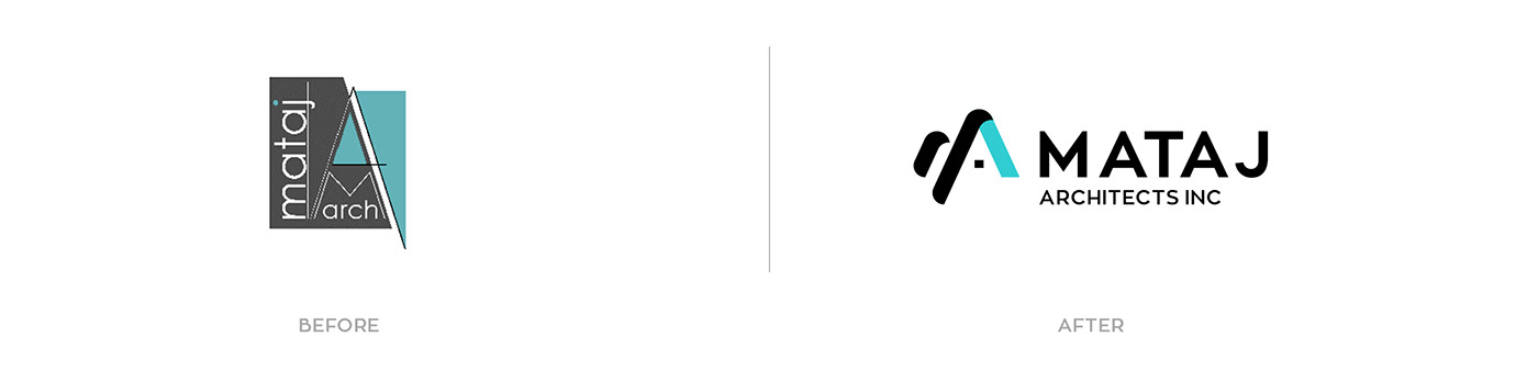
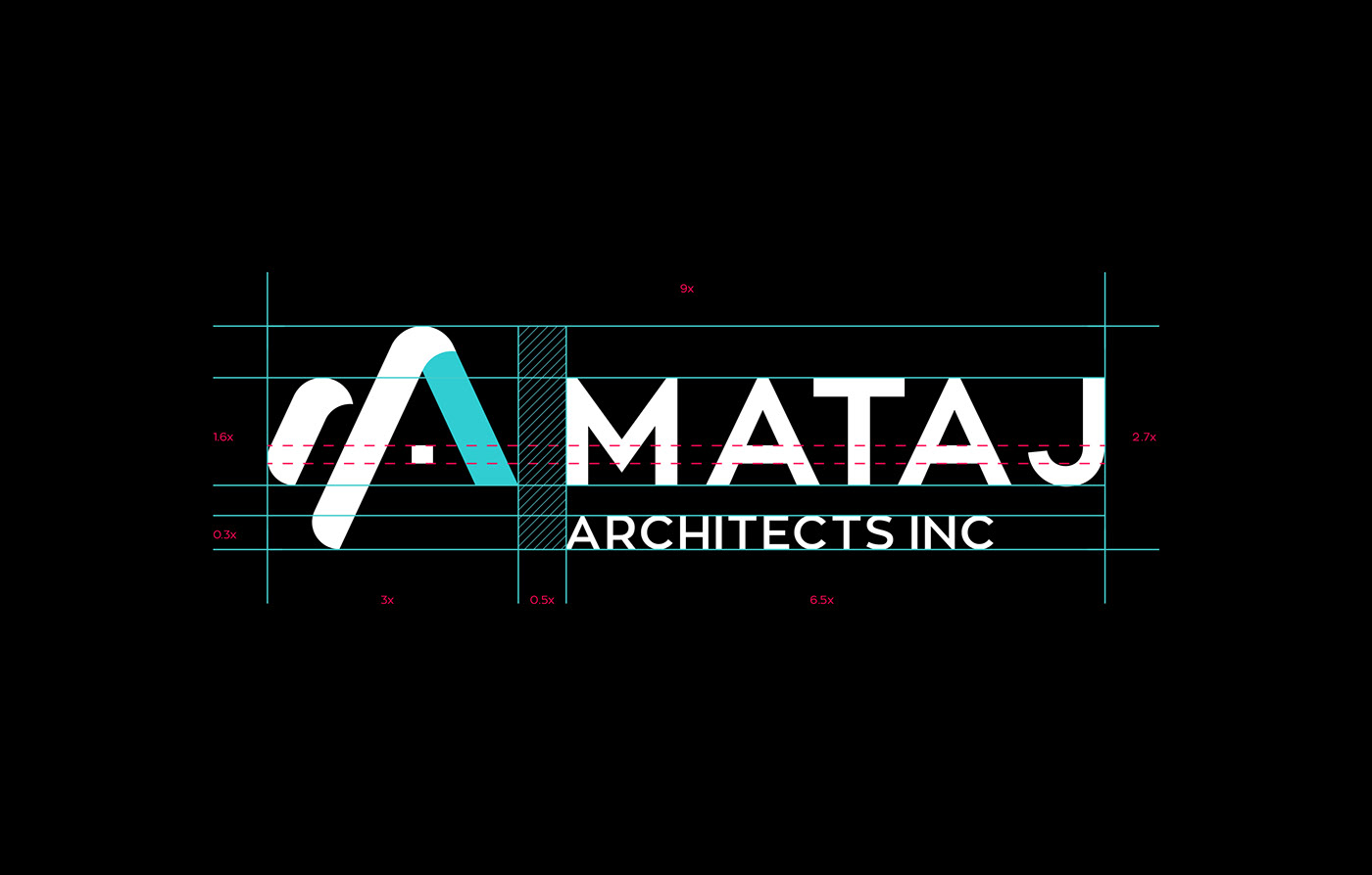
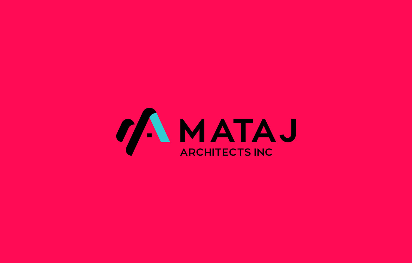
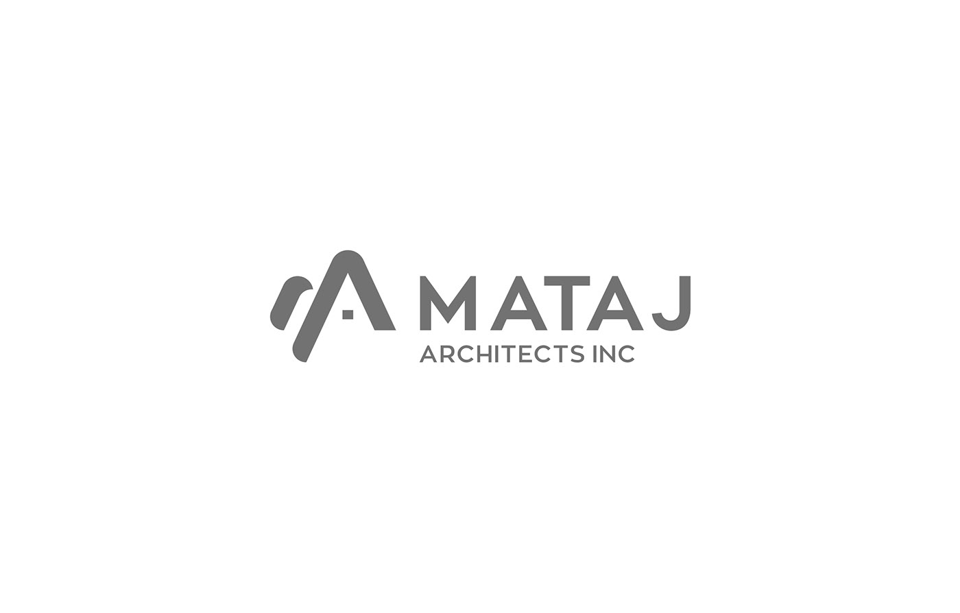
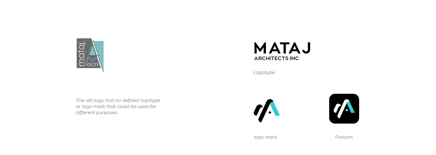
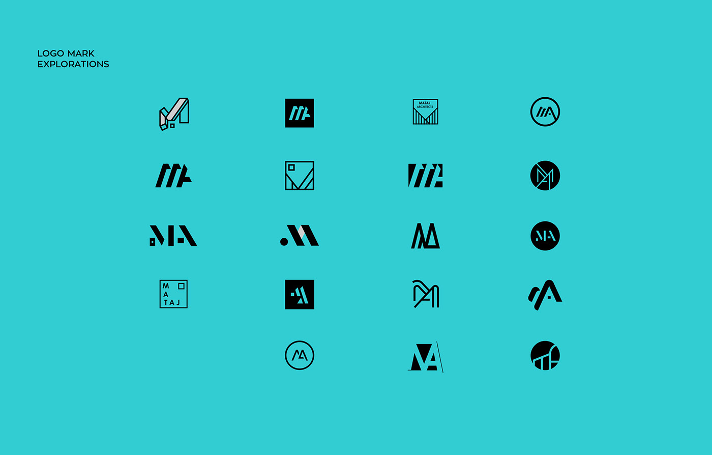
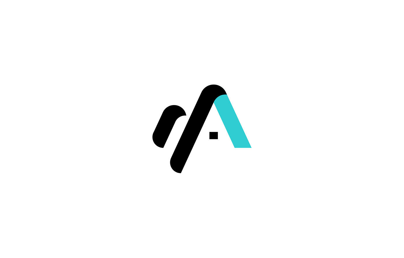
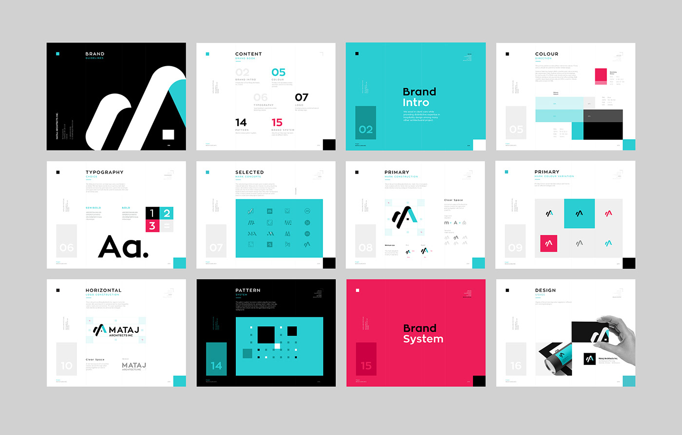
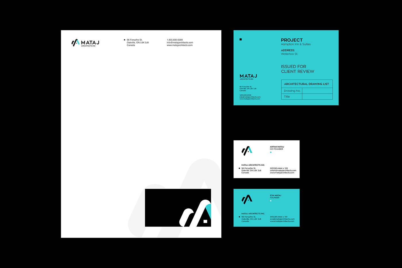
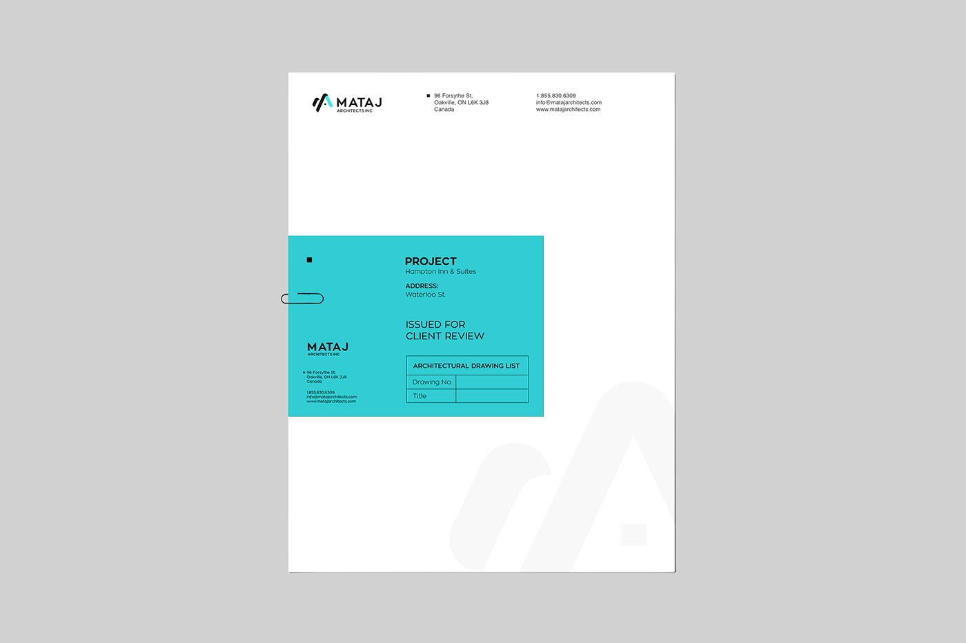
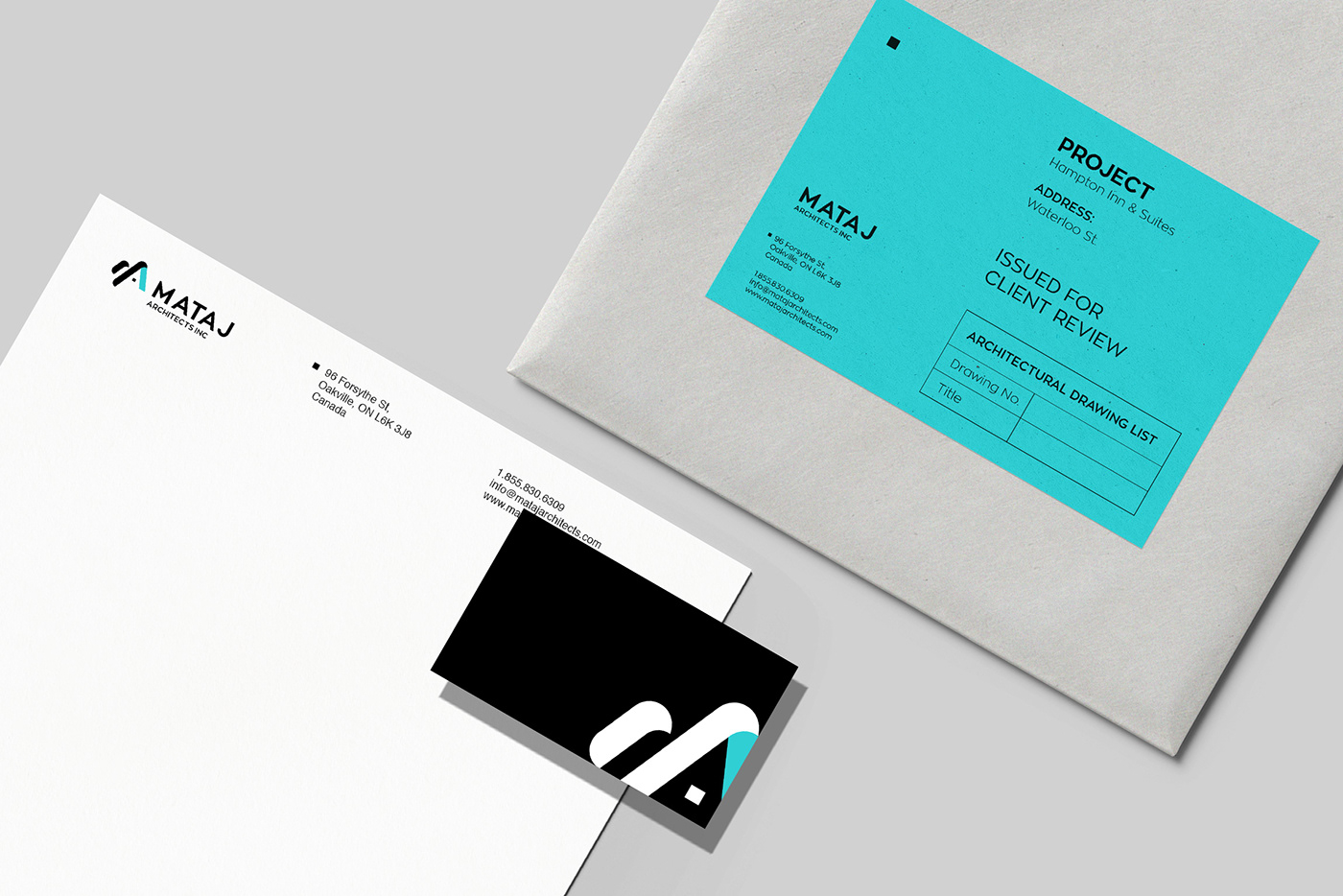
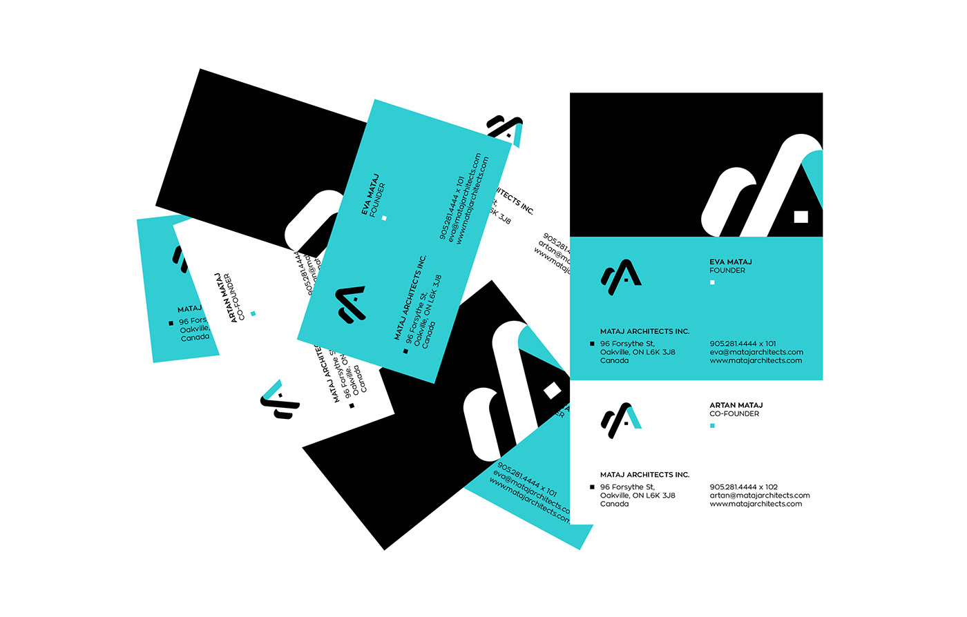
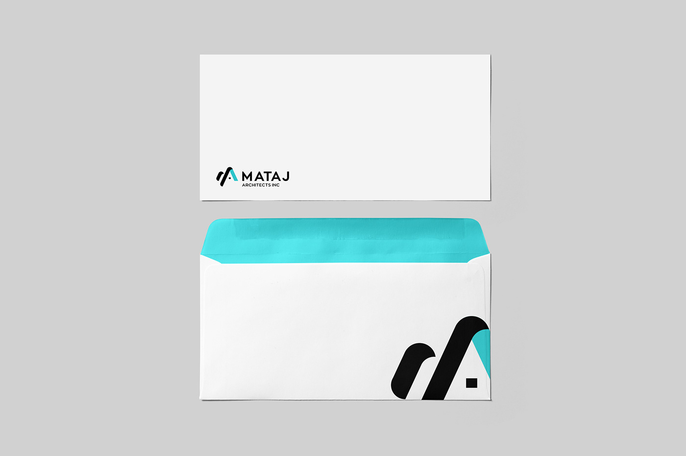
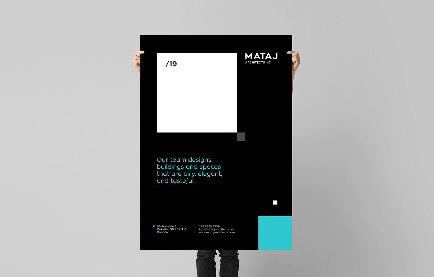
There was only one prior identity that existed since 2016. Without versatility and adaptability, the old logo mark lacked the timeless quality it needed. We redesigned a logo that was both versatile, scalable, and paired well with different colours as well as different backgrounds while also being legible in both print and on-screen designs.
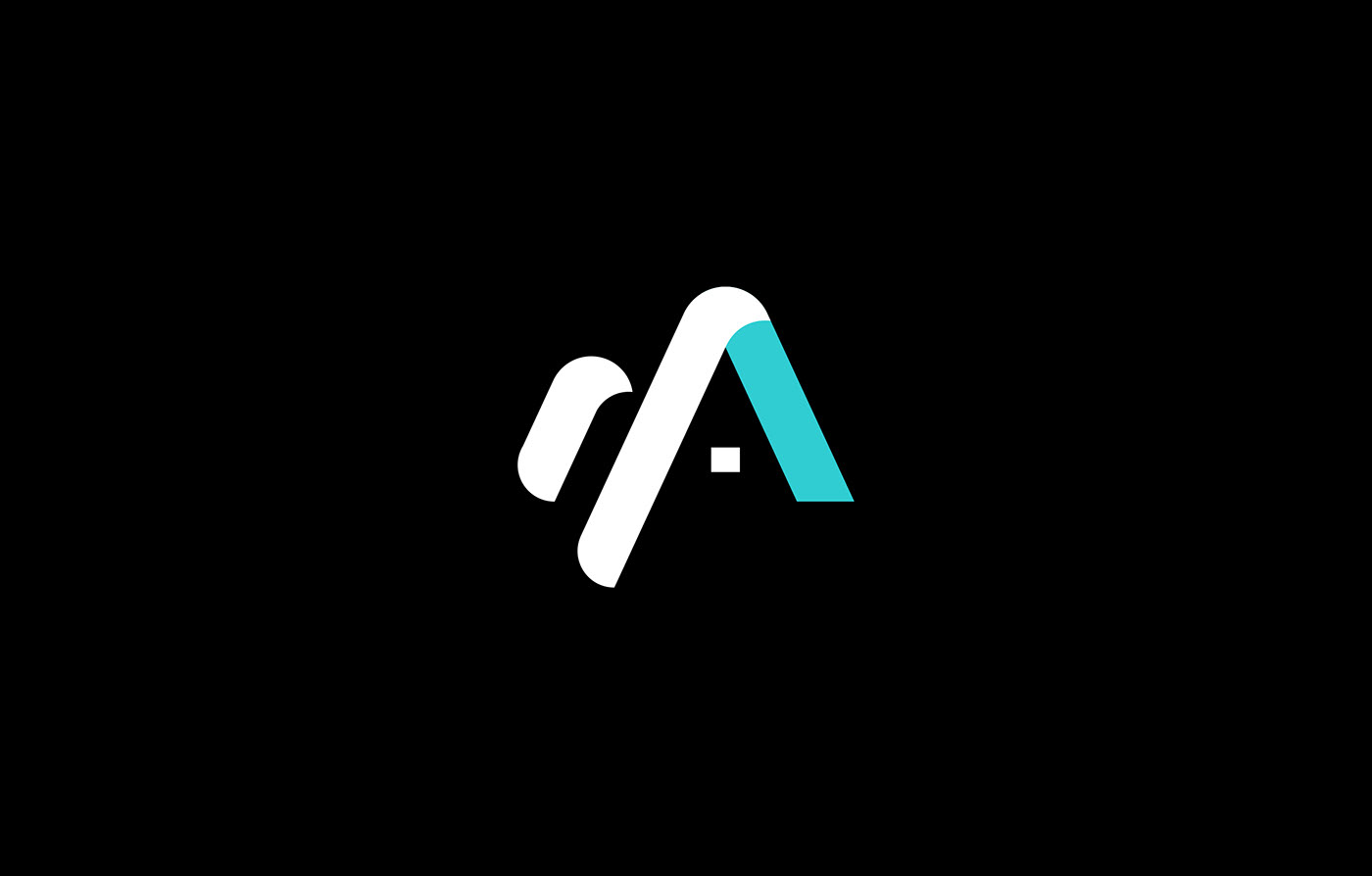
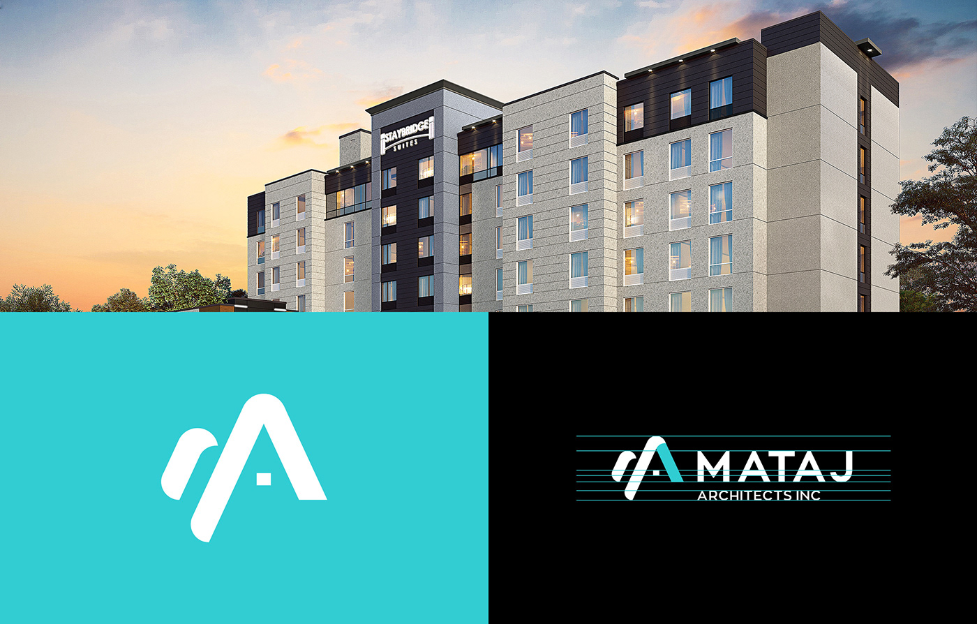
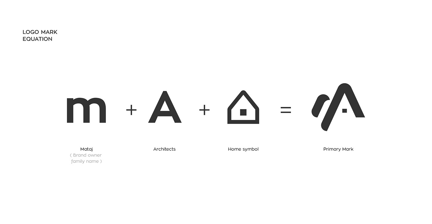
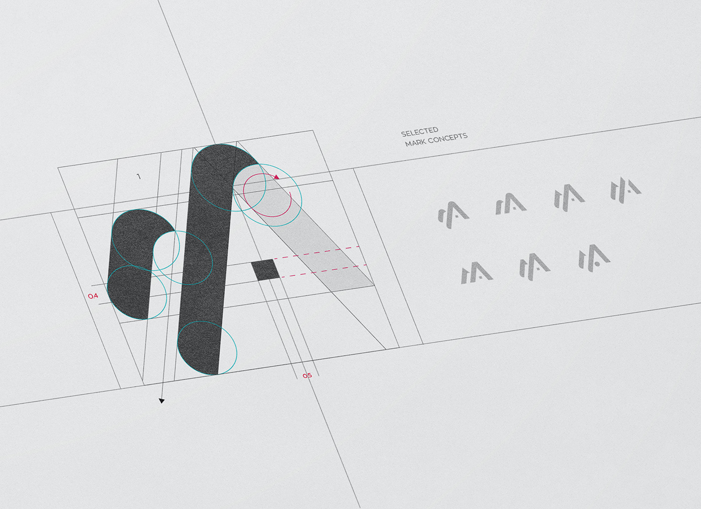
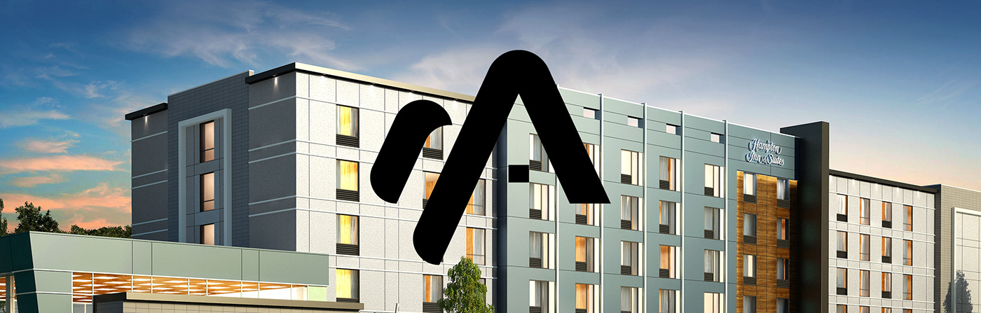
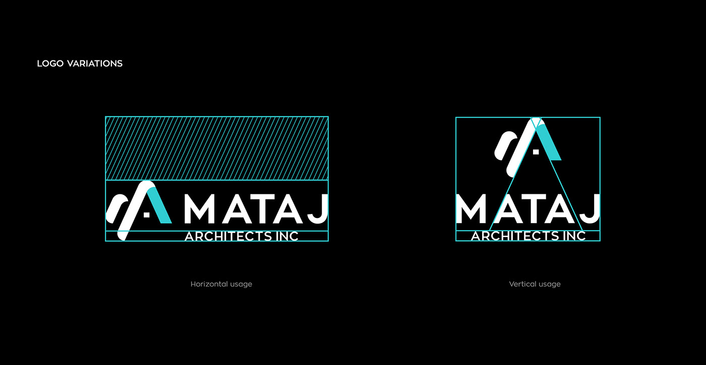
It was crucial to maintain the clean and functional form of the logo mark while keeping a balance of feminine and masculine aesthetics. The strategically designed monogram incorporates the first initials M and A (for Mataj and Architects), with the clean lines of architectural design, and the subtle portrait of a home symbol. We believe using initials to develop the logo mark works well to represent Mataj Architecture to give that clean, sophisticated and modern design look.
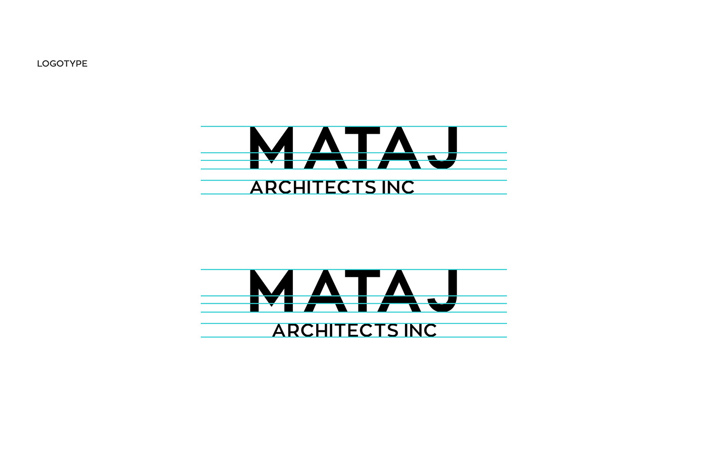
Colour pallet and Typography: The original Mataj Architects Inc. logo featured a dull turquoise colour and dark grey, which was distinctly unique to the brand. We maintained the colour heritage but elevated it to be brighter to emphasize its’ difference from their competitors. We needed typography that was modern yet elegant but also exemplified the geometric qualities of architecture, for this we chose the multifunctional and versatile font type: Zona Pro.


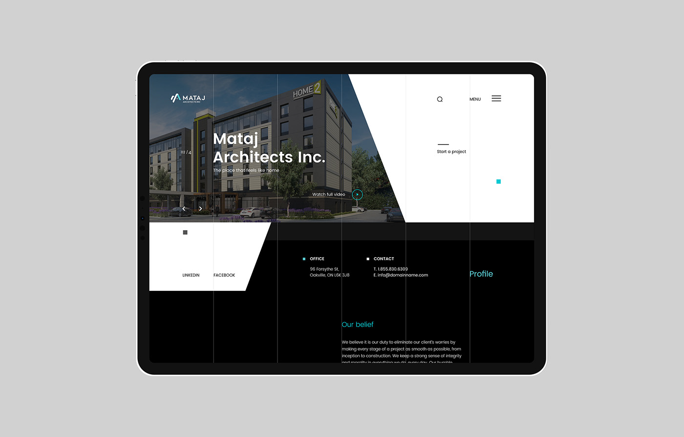
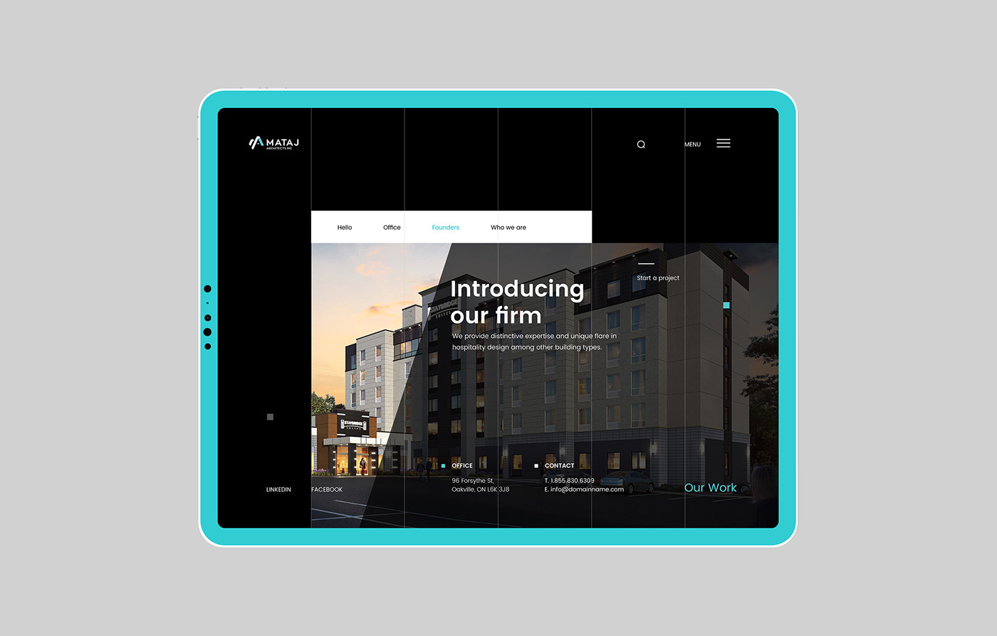
Web design result
To compliment Mataj Architects Inc.’s new brand identity, we took inspiration from the newly redesigned brand and created a new web design that truly reflects the Mataj Architects Inc. name and values. A strong emphasis on elegance, modern feel, and a powerful sense of symmetry were key factors in our redesign.
Using subtle yet visible guidelines, the Mataj Architects Inc. desktop homepage was designed using the same structure of the primary mark. The use of symmetry also carries on from the primary mark to further add elegance to the new website design. As the eye follows the strategically placed lines, the white spaces provide depth to the website while making the CTAs stand out with confidence. We finalized our design complete with a responsive mobile version designed for great customer experience. Visit live site www.matajarchitects.com


Credits
Design Studio: BROKLIN
Art Direction, Graphic Design & Web design: Broklin Onjei
Web development: Amir Arhami
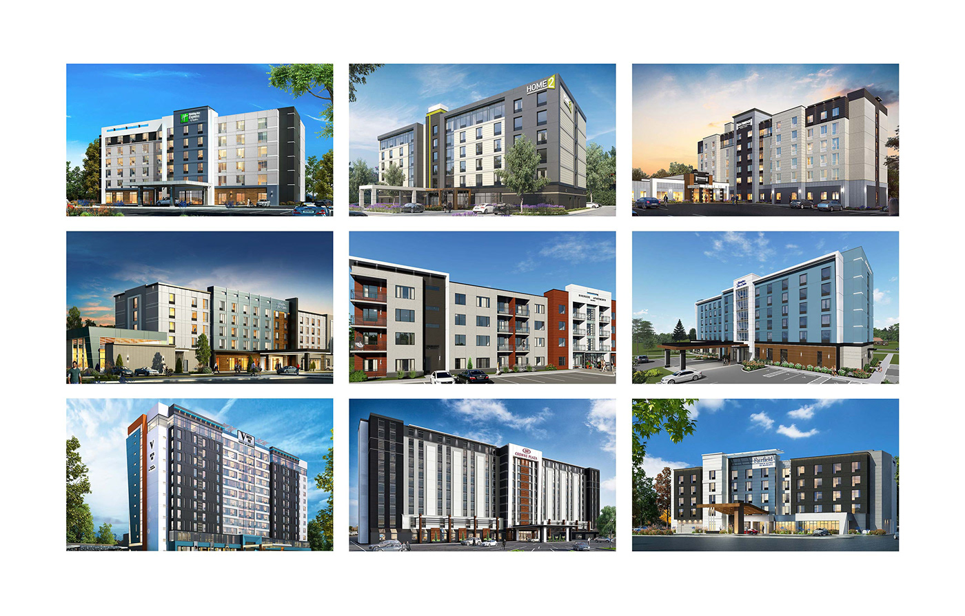
3D Architectural Renderings: Mataj Architects Inc.


