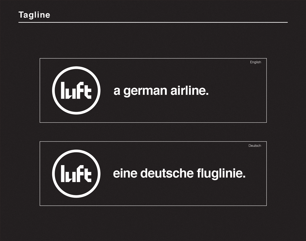
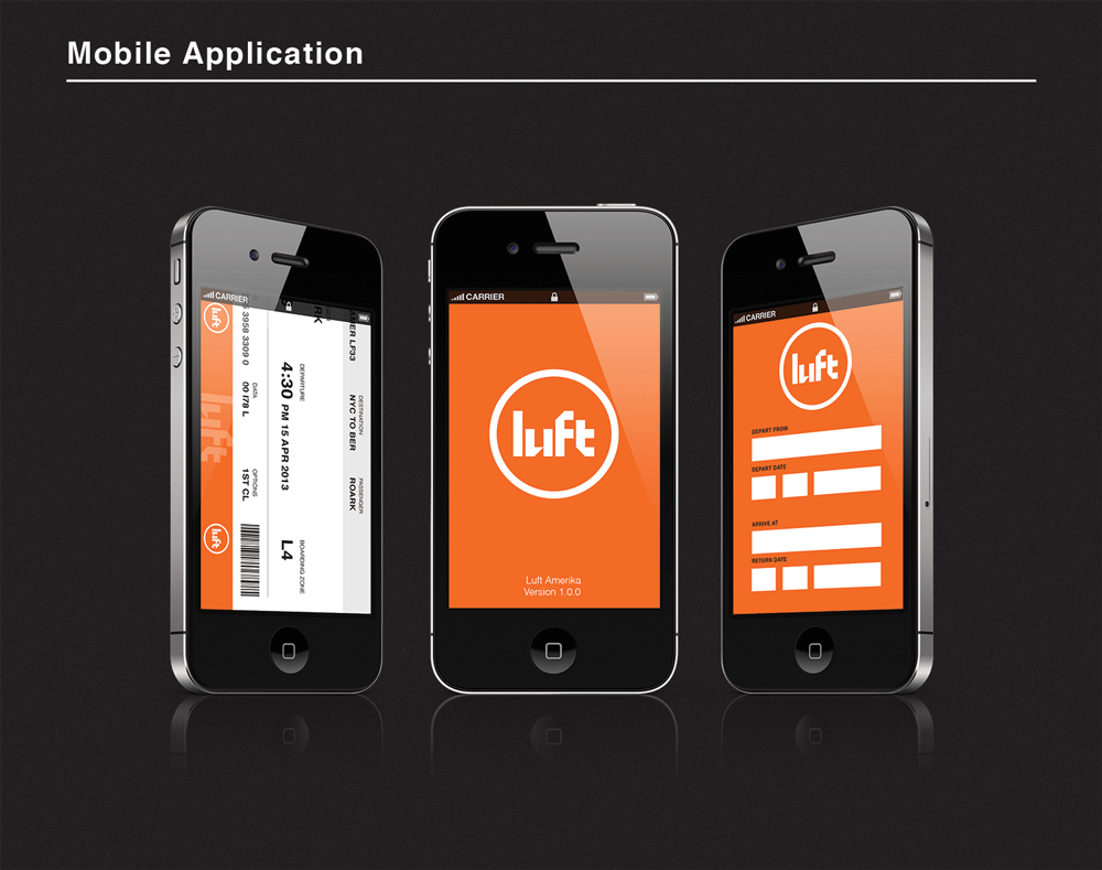
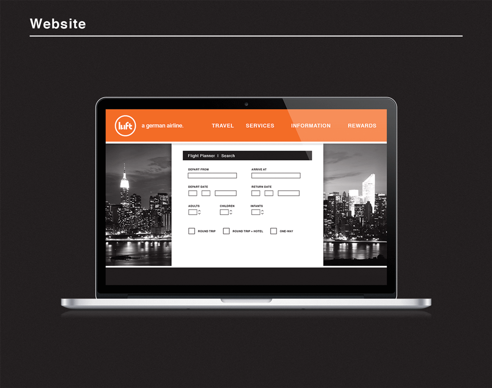
Originally, this project was created for a Design Method's class but was re-imagined in the summer of 2012 to what you now see as "Luft". In creating this brand, I started with doing research on Germany, specifically its culture and language. I began looking for words that were simple, yet pertained to an airline. When I finally came down to the word "luft" (which means air, wind, breath and breeze) I knew I found a word that on its own was powerful enough to stand and be pronounce in relationship to other airlines in Germany and even the rest of the world.
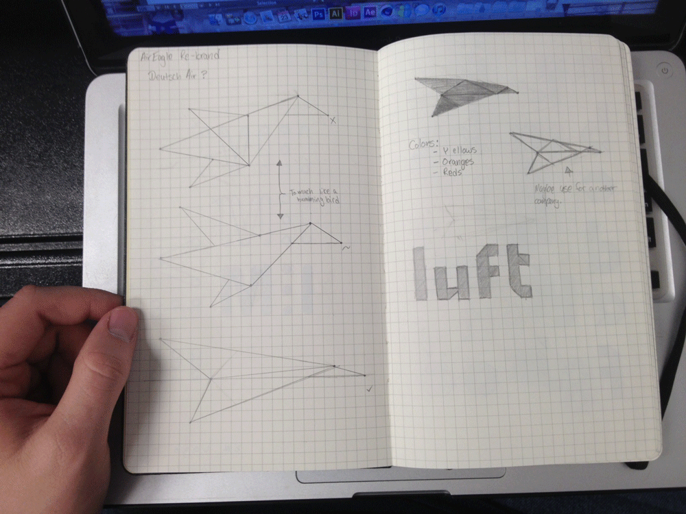
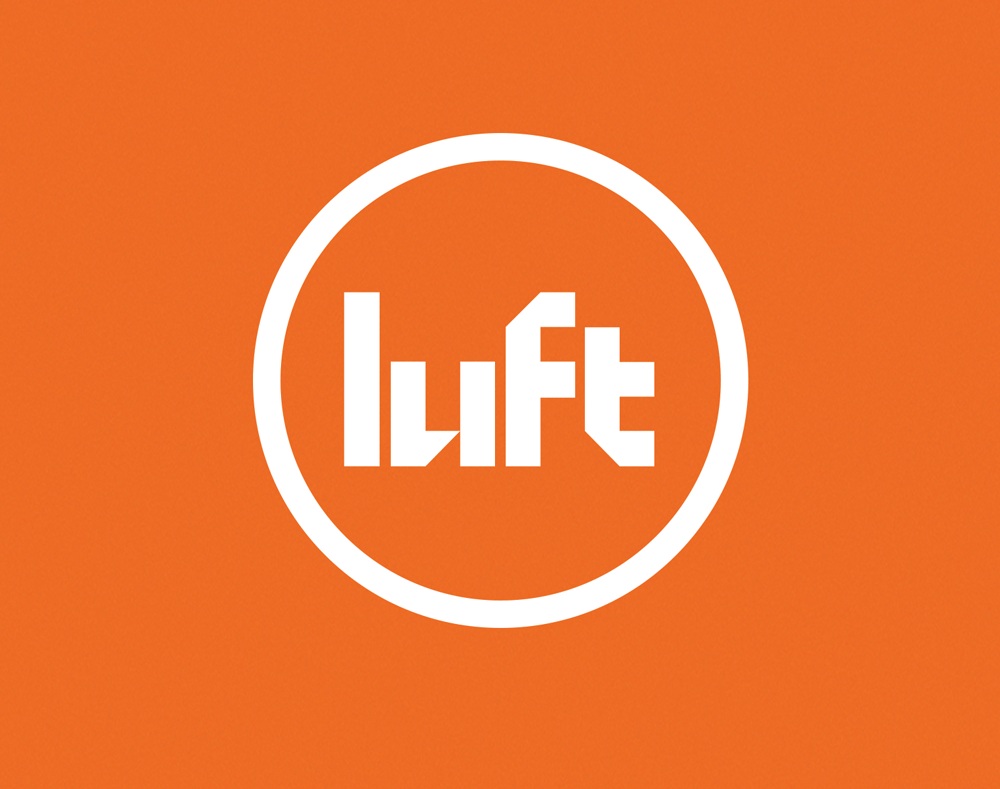
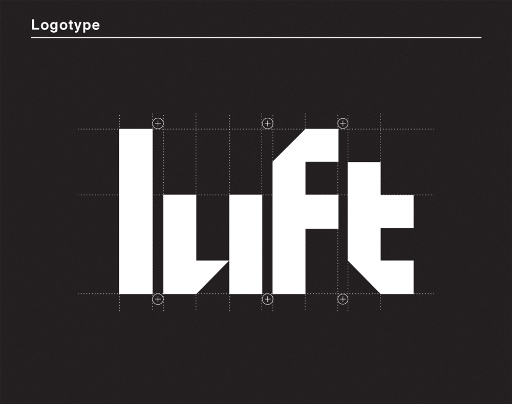
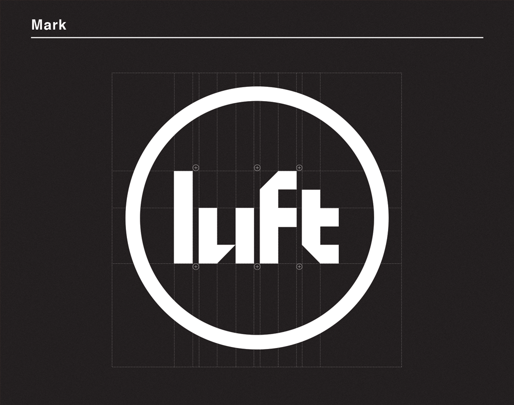
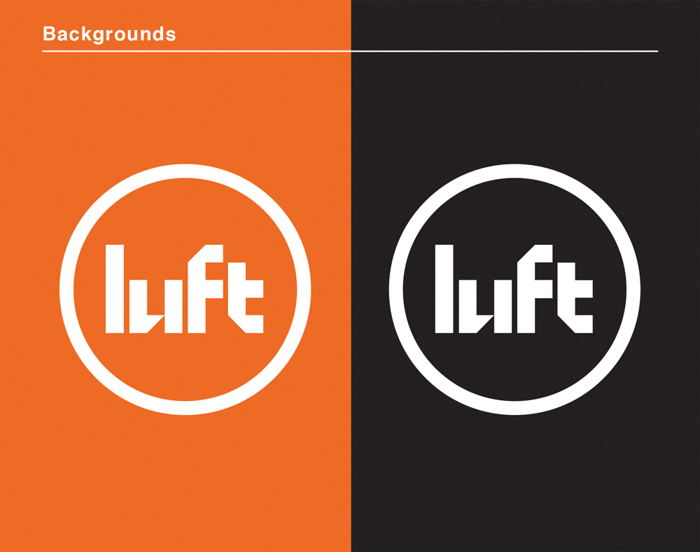
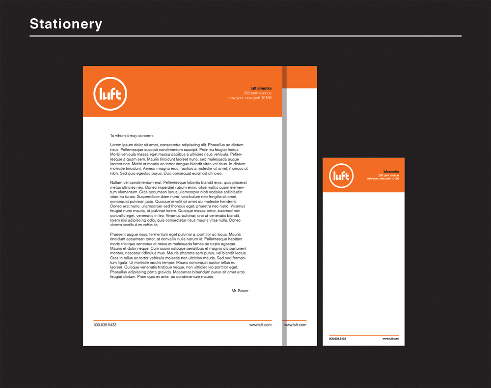
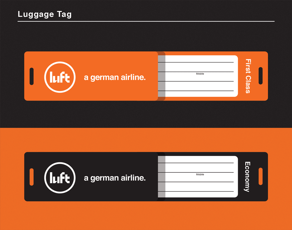
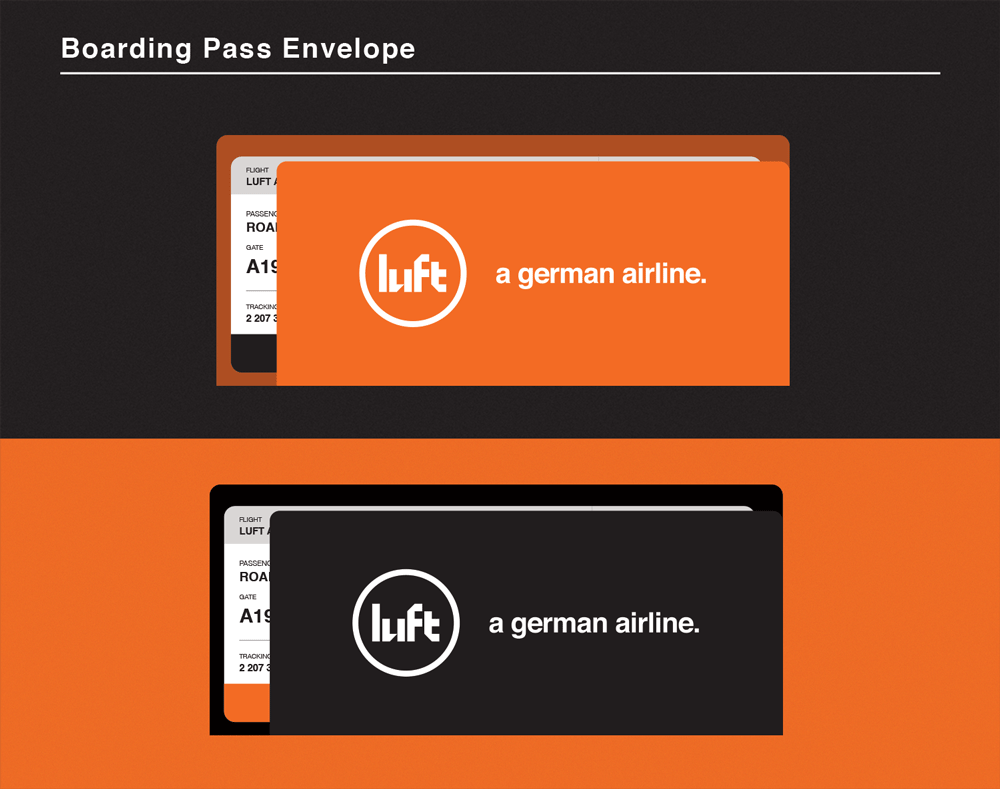
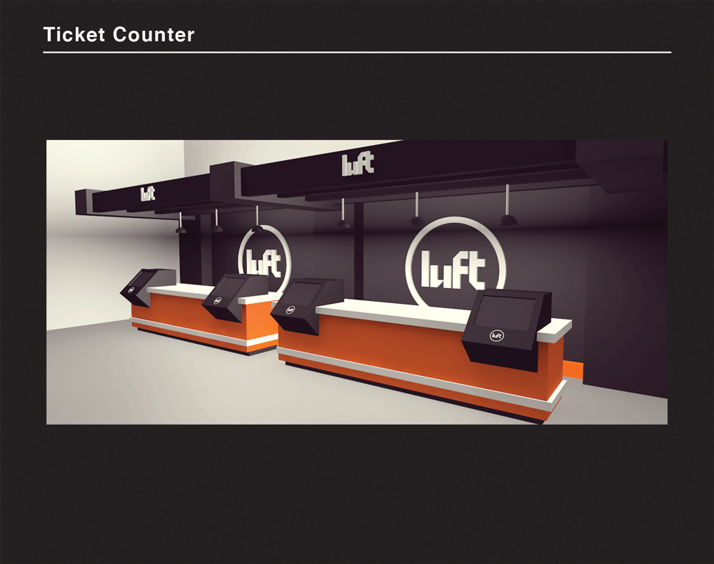
The initial sketches, I created a mark that included the handmade logotype with an abstract jet. The problems that came about with those initial designs was that it looked too much like a paper plane and it wasn't a really strong combination. After a few experimentations and studies, I found that the best solution visually and conceptually was to encircle the logotype. In doing so, the circle helps to create a globe which represents the airline's global reach.


For more information on this project, visit my website: http://www.rockyroark.com/luft


