


It’s 2018. As the Australian economy continues to grow,
the market is awash with investors seeking short-term profits.
How do you reset the scene for one that makes a real difference?

One ventures, all gain
OneVentures is a leading Australian venture capital firm with over $320 million in funds under management. But more than just investing in companies, OneVentures “injects its expertise” and knowhow to shape their growth and success.
Throughout their vast and varied portfolio there is a common thread unique to OneVentures. A unifying belief and methodology shared by its highly qualified team of industry experts. One that seeks long-term gains over short-term profits, and performance with purpose.

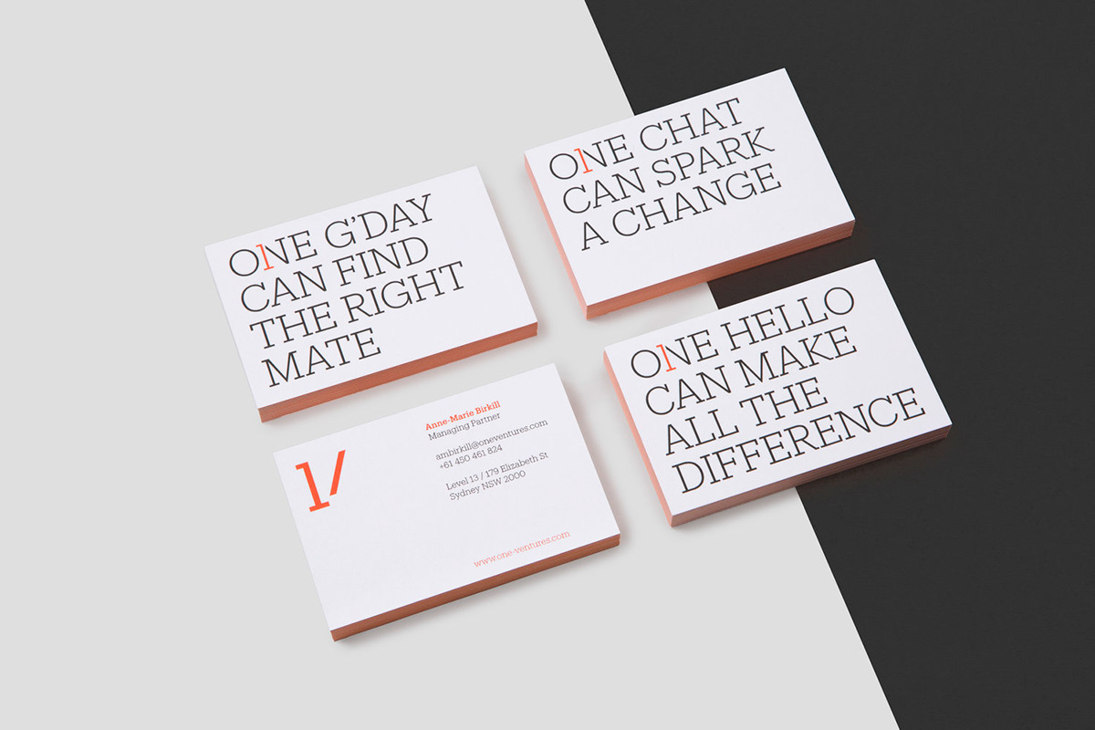
One simple device
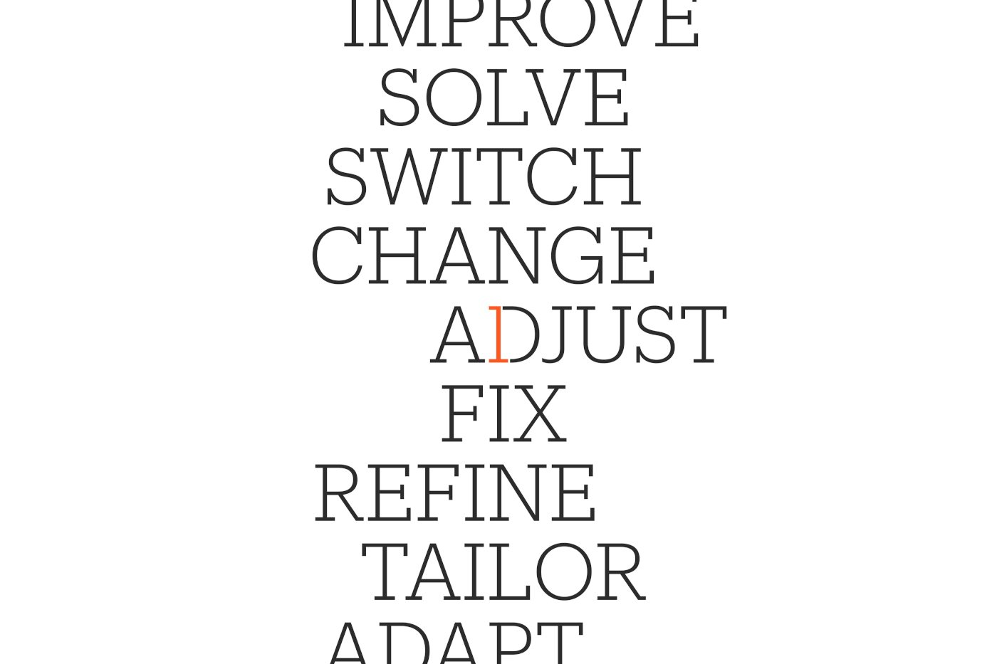
This “injection of expertise” soon lead to our creative idea that OneVentures is the single thing missing in your company, the piece that fits right in and makes it better. Rooted in the logo, we wove the figure ‘1’ into all communications and collateral.
This created a distinctive typographic treatment for our messaging. The deceptively simple type treatment allowed for a vast array of writing to communicate their principles and methodology. It would also form the base for the entire visual identity.


A pattern of expertise
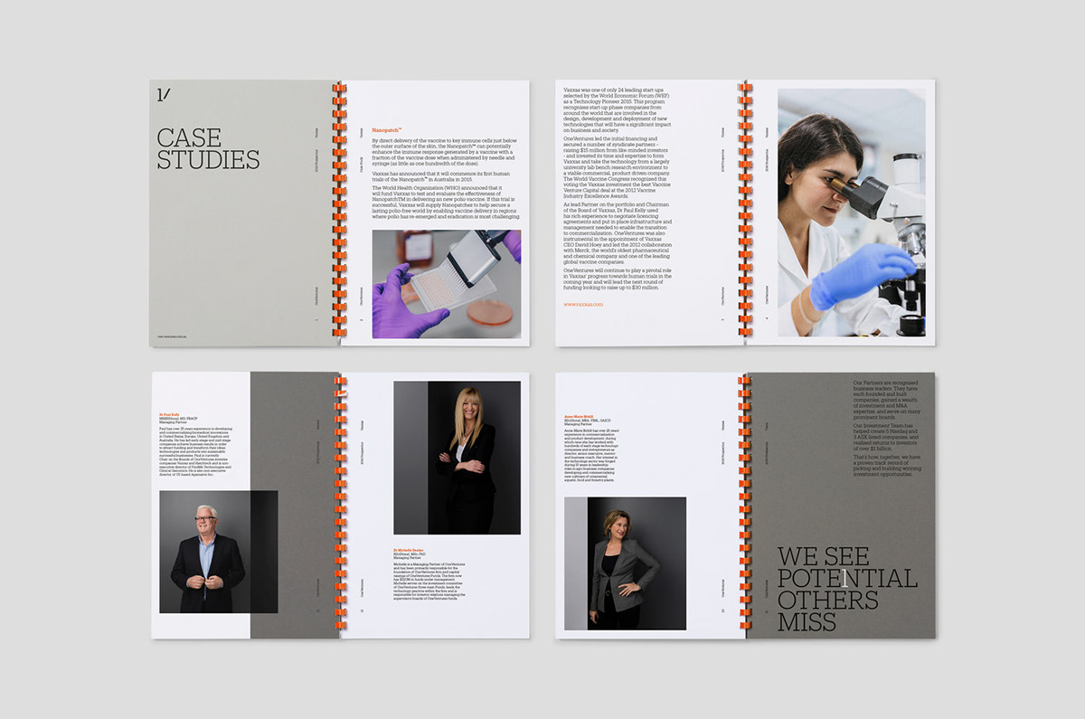
OneVentures works with many different partners who specialize in a variety of fields. In particular they are incredibly well respected for their work at the intersection of health and technology. With two of the founding partners being doctors themselves.
To pay tribute to this we developed a suite of patterns with a hidden “1”. Each pattern was inspired by genetics, data and cell division. Always with a single orange element, that might be a breakthrough or key piece of information which changes things for the better. The pattern was also super easy to implement by the internal brand team at OneVentures.


Boardroom expertise
OneVentures is built on the culture of it’s people. The client requested a photoshoot to celebrate their staff. Whilst still remaining impeccably professional and slick. Using large painted boards we developed a gradient and hard edge backdrop evoking the straight edges and corner of the “1” device used elsewhere in the identity.


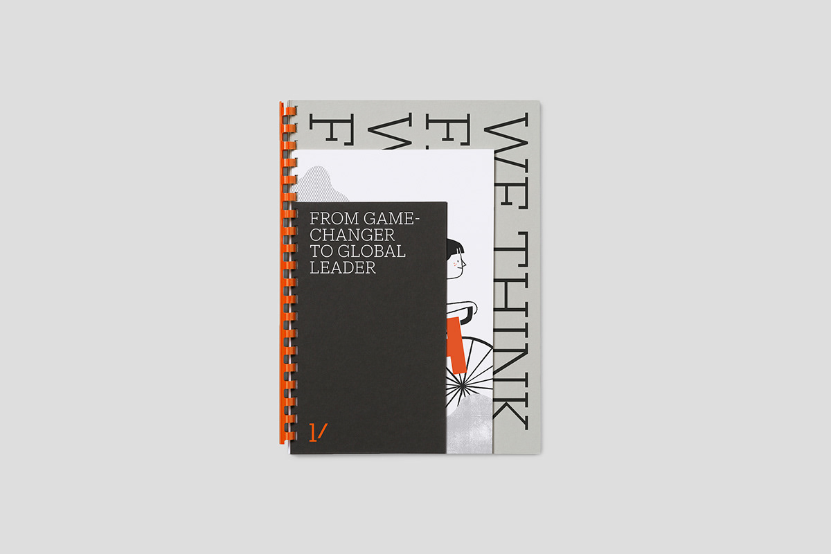
Say hello to Olive
A large part of Re’s work was articulating the strategy both internally and externally. We soon realised we needed “human” a way to bring to life some of our key messages. This led us to Olive, she’s an illustrated hero who embodied all OneVentures’ principals and beliefs. Someone who could venture out into the world for the betterment of everyone.


