鲜逅 (pronounced shehos) is a Chinese franchise specialising in fresh pressed juices and super foods. The letters making up the name mean (鲜) fresh and (逅) encounter.
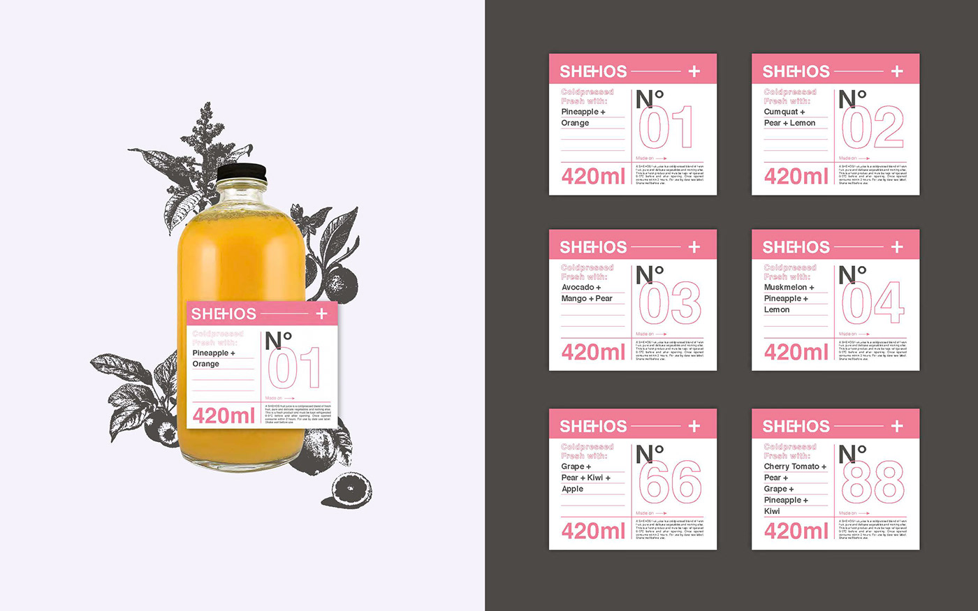
This aspect union is represented in the in the logo, which uses the + symbol, which fittingly also represents health and first aid thereby summarising the core values of the brand. Medicine for mind and body.
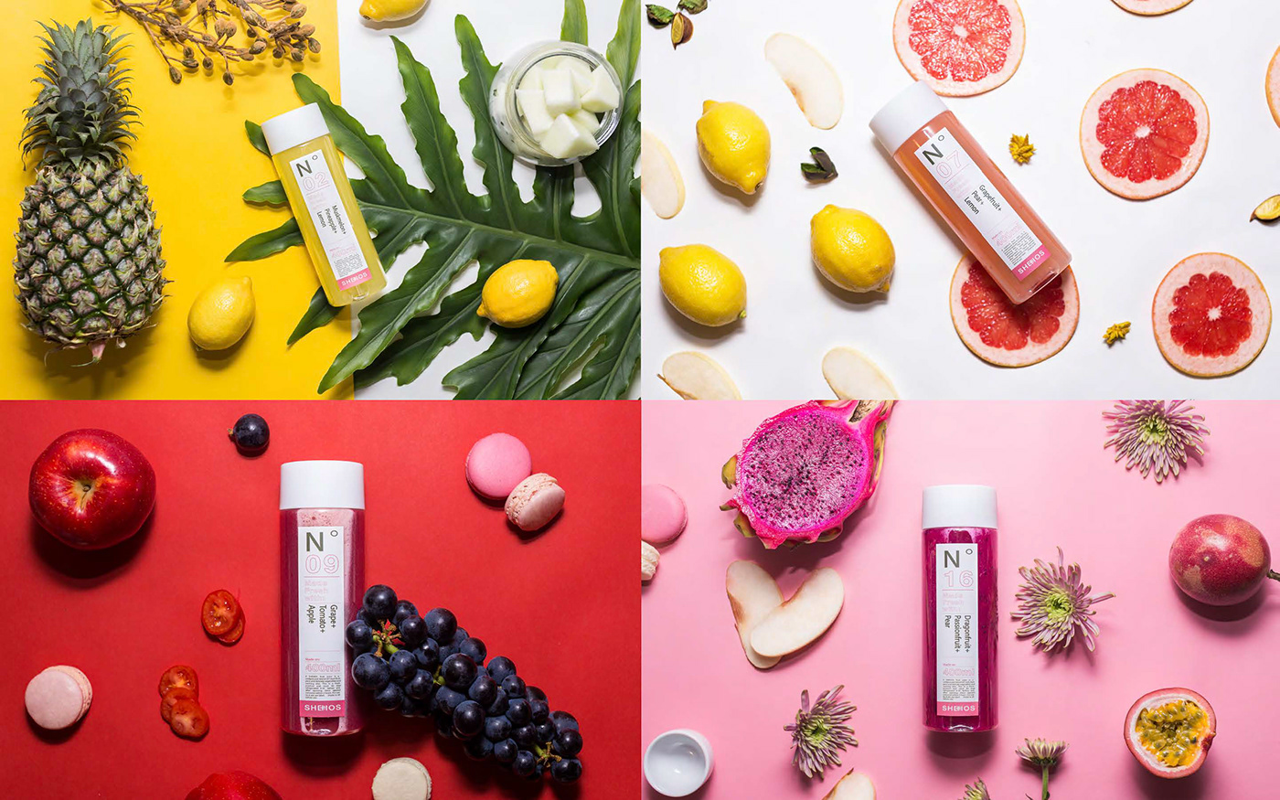
Together with a set of old-school illustrations that act as pictograms of the main ingredients and a minimal application the brand achieves a light hearted look but professional look.