Wixx Telecom
/ About
Created in 2009 and since then operating in the B2C and B2B segments, Wixx Telecom understood that because of its location, expertise and current financial results - focusing on corporate clients (fixed or temporary infrastructure) would be the most viable path of growth for the company.
The challenge was to drive, through design, the brand positioning change and the specialization of its service offer, which focused not only on customized infrastructure of fixed networks, but also for temporary networks used in large corporate events.
Deliverables
Brand Positioning
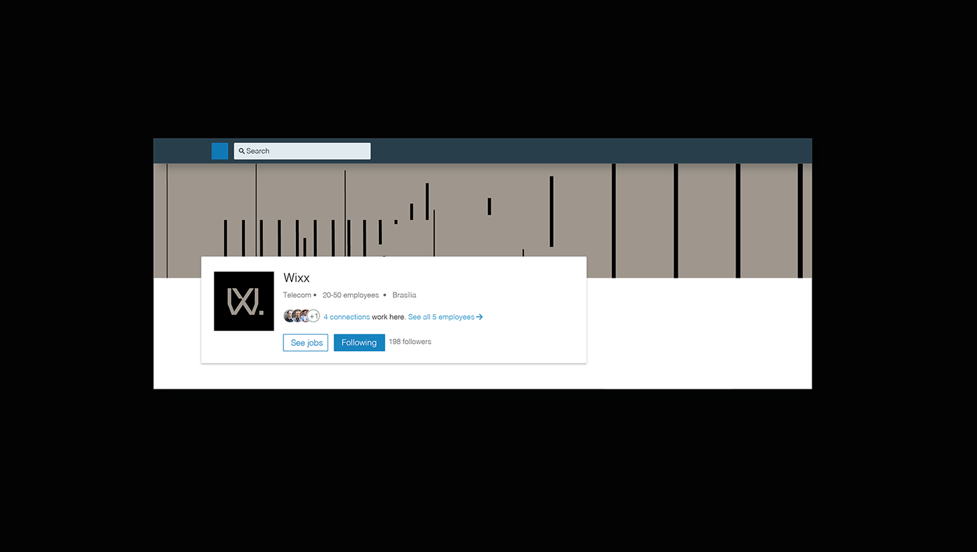
Brand Identity
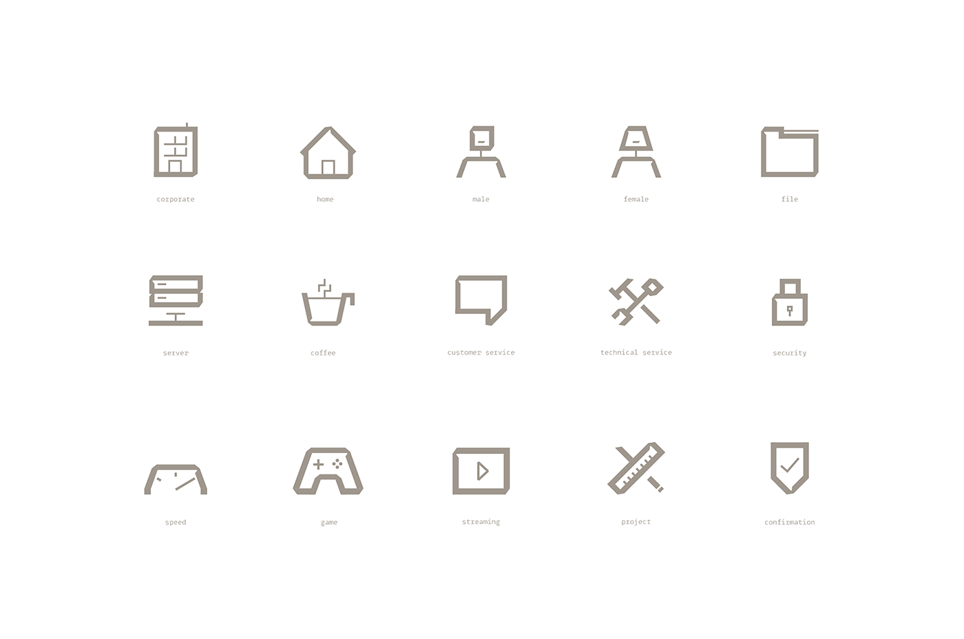
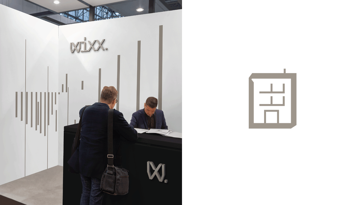
Custom Iconography
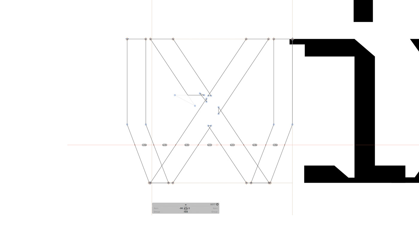
Custom Typography
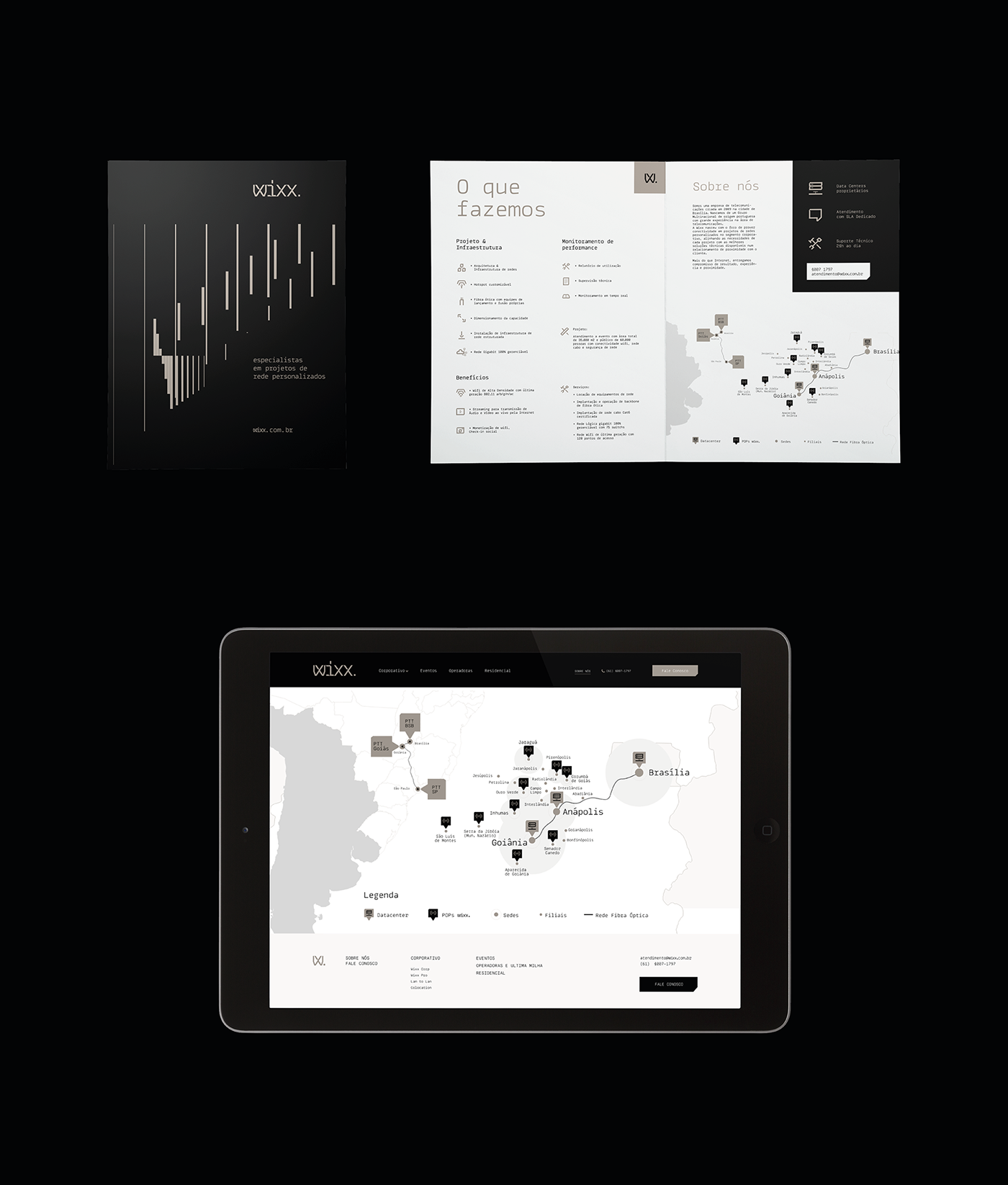
Website
Approach
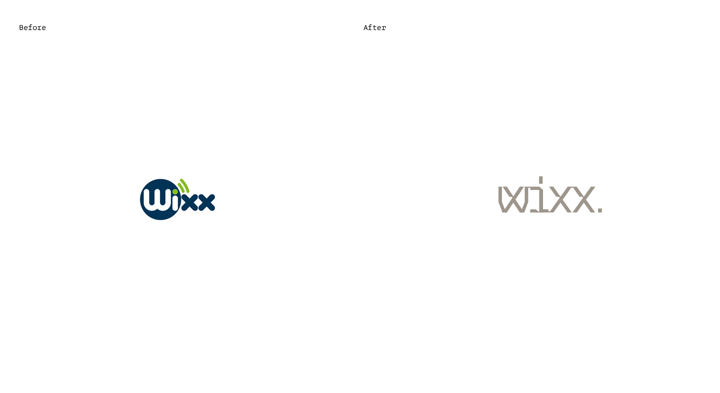
We diagnosed in the process that the way Wixx identified itself was a reflection of what the market practiced: excessively friendly verbal identities, along with overly playful visual identities, illustrations and graphics inspired by what is perceived as "wireless "or "wifi " along with common advertising language, even the logotype symbol was an allusion to wifi connection, a language usually found in smaller B2C consumer telecom companies in Brazil, like Wixx before the business positioning shift.
Understanding the context of the shift, we looked into understanding the verbal and visual language necessary to ensure that Wixx graduated from being a "small generic telecom" to a corporate service "specialist telecom". The first step was to define through brand archetypes, the persona whose personality would guide the process: The Governor, whom with technical mastery, expresses his expertise objectively through a direct tone of voice and total control.
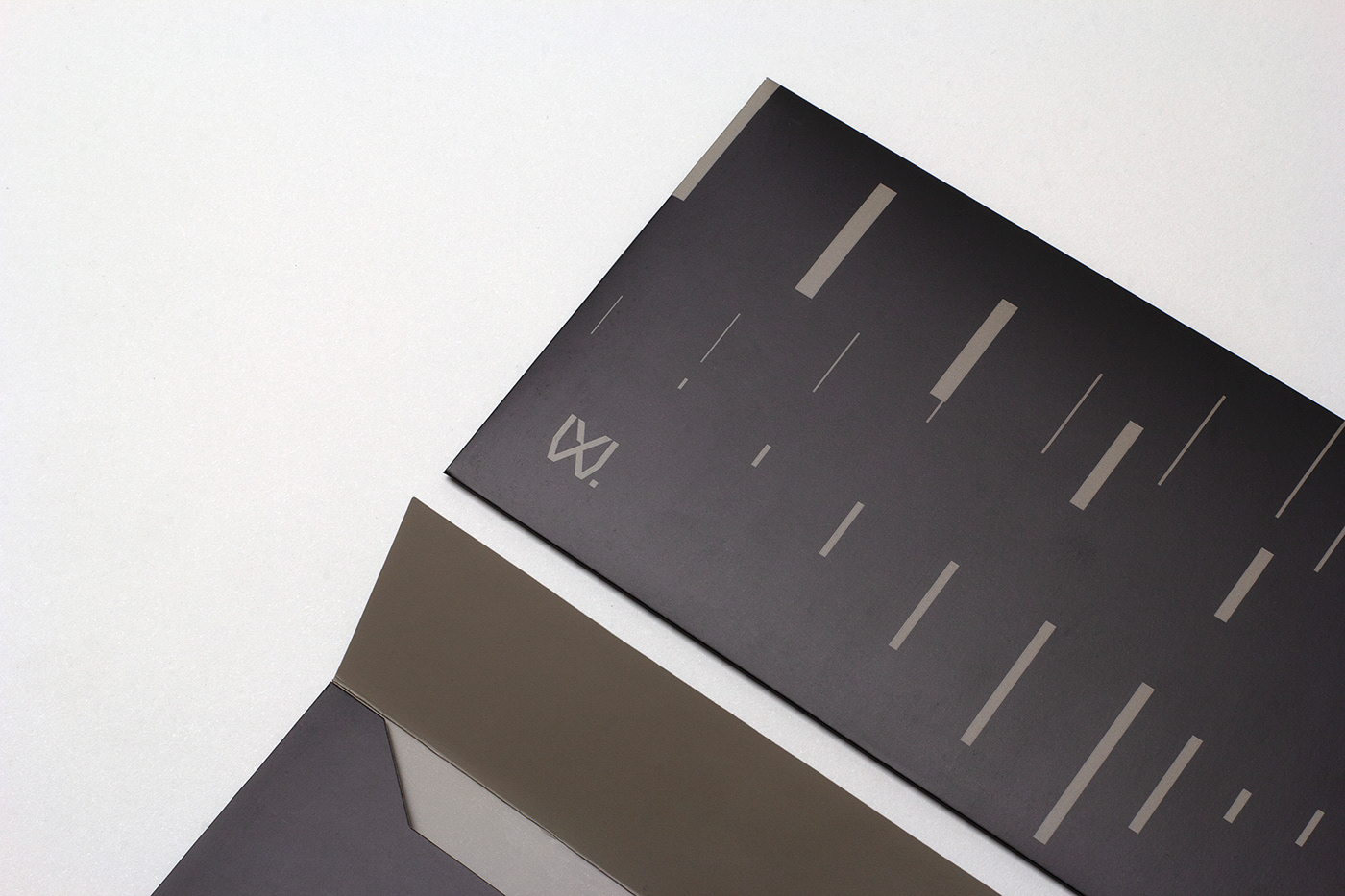
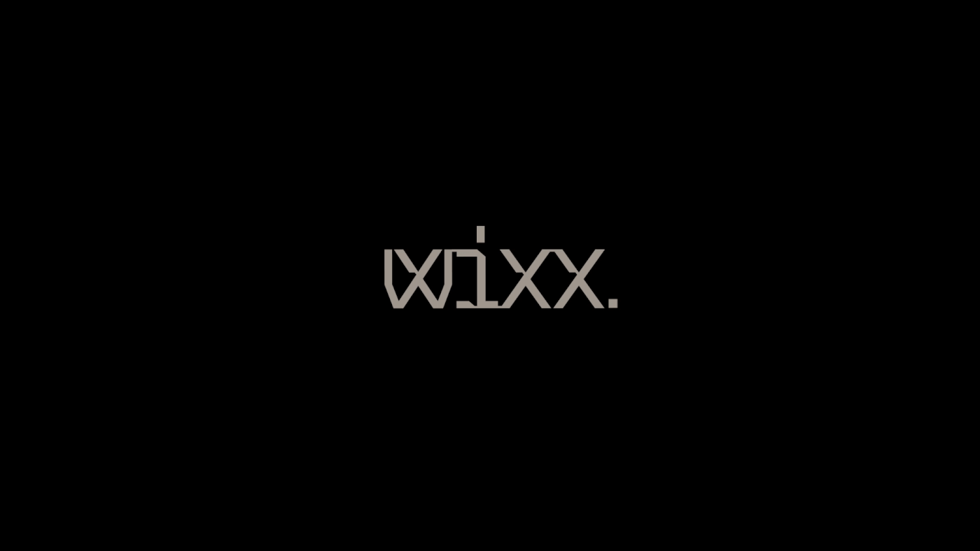
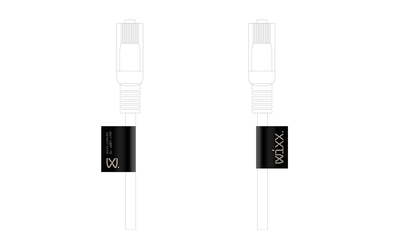
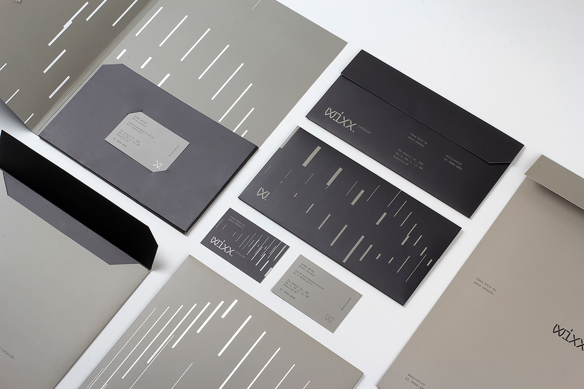
Visual and Verbal Identity
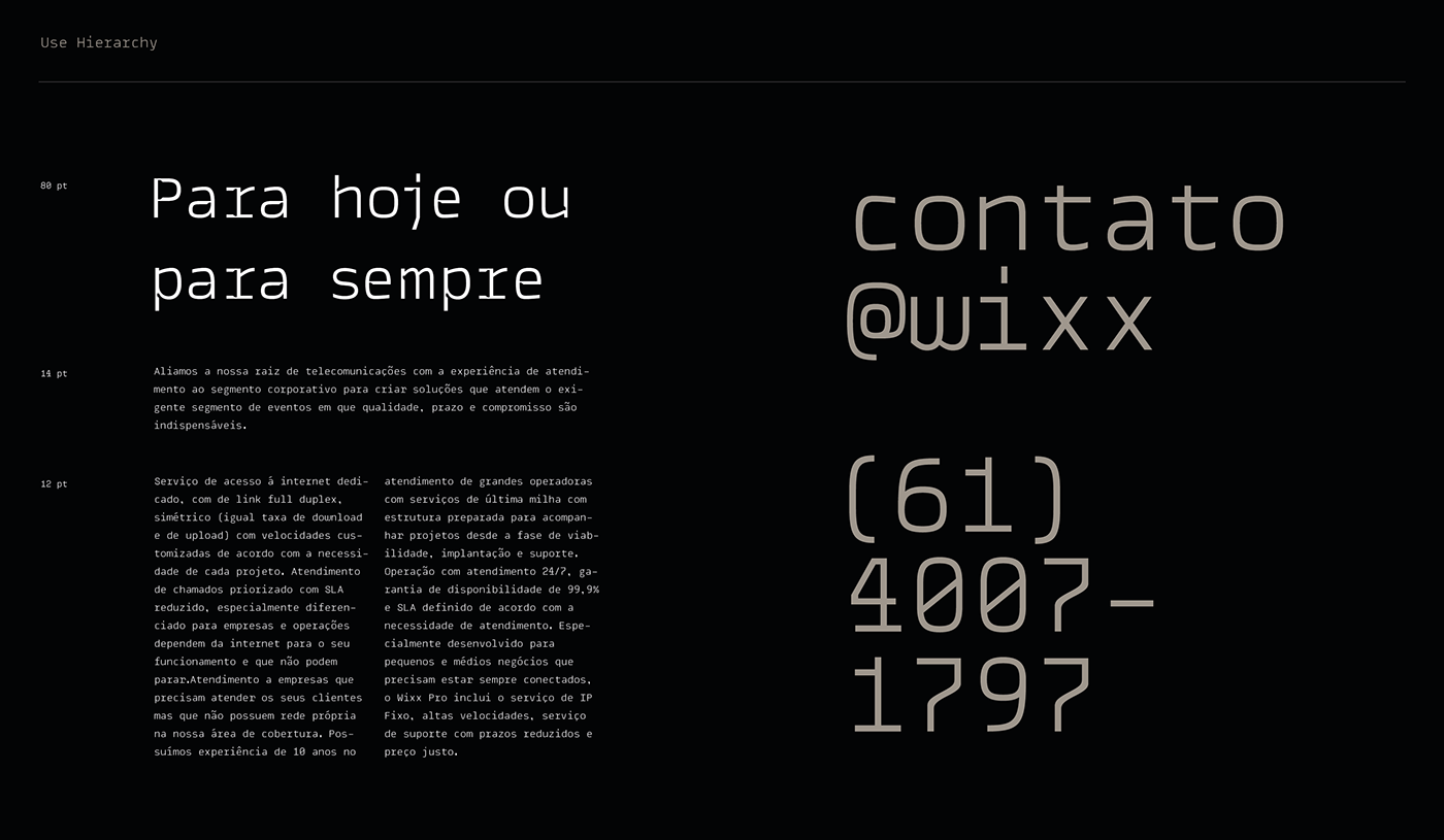
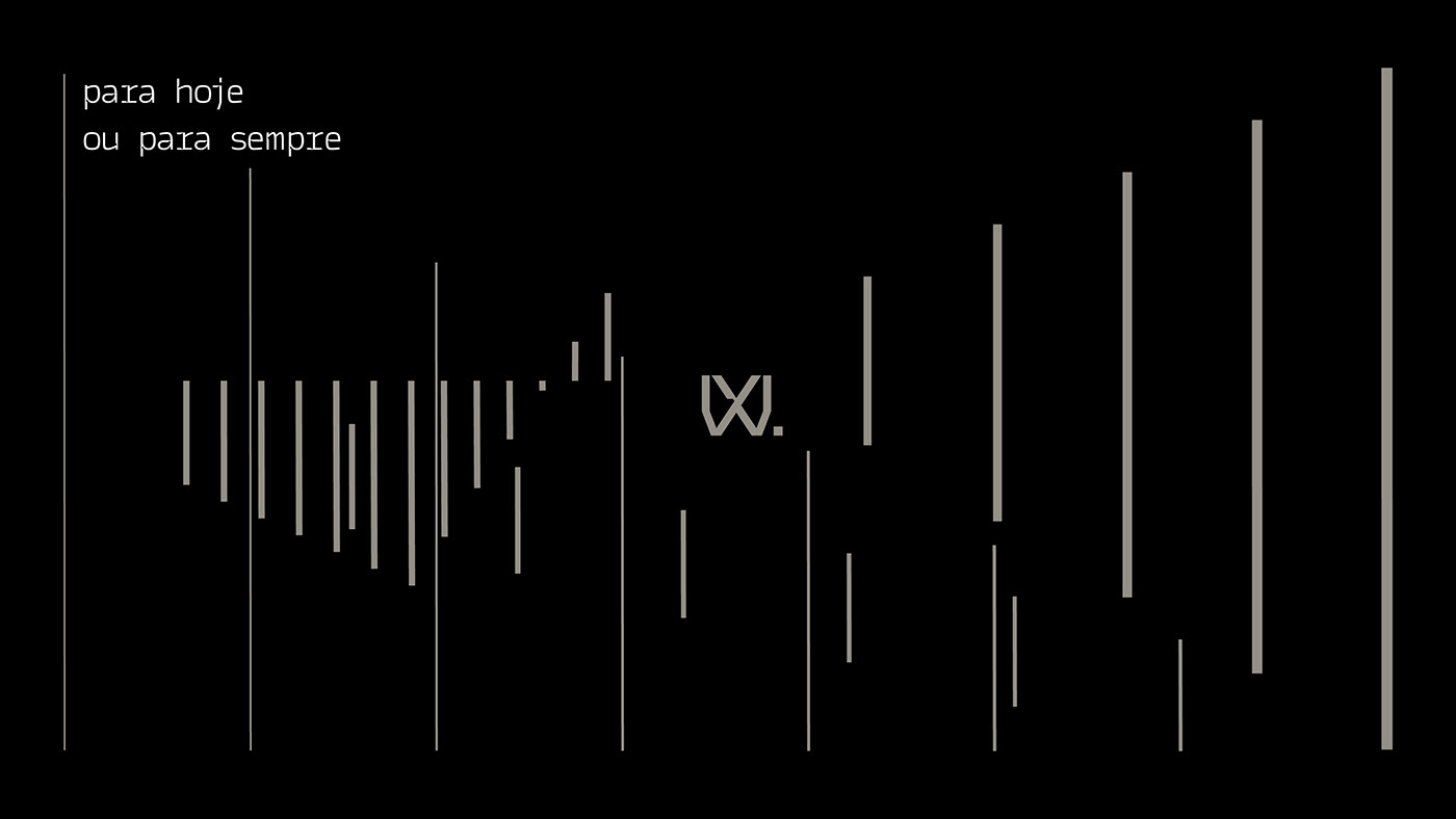
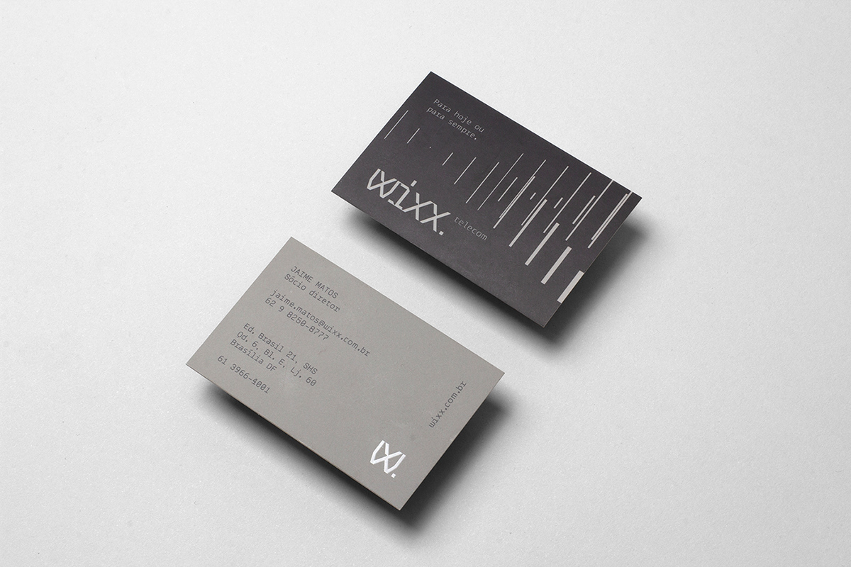
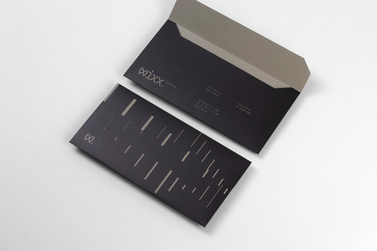
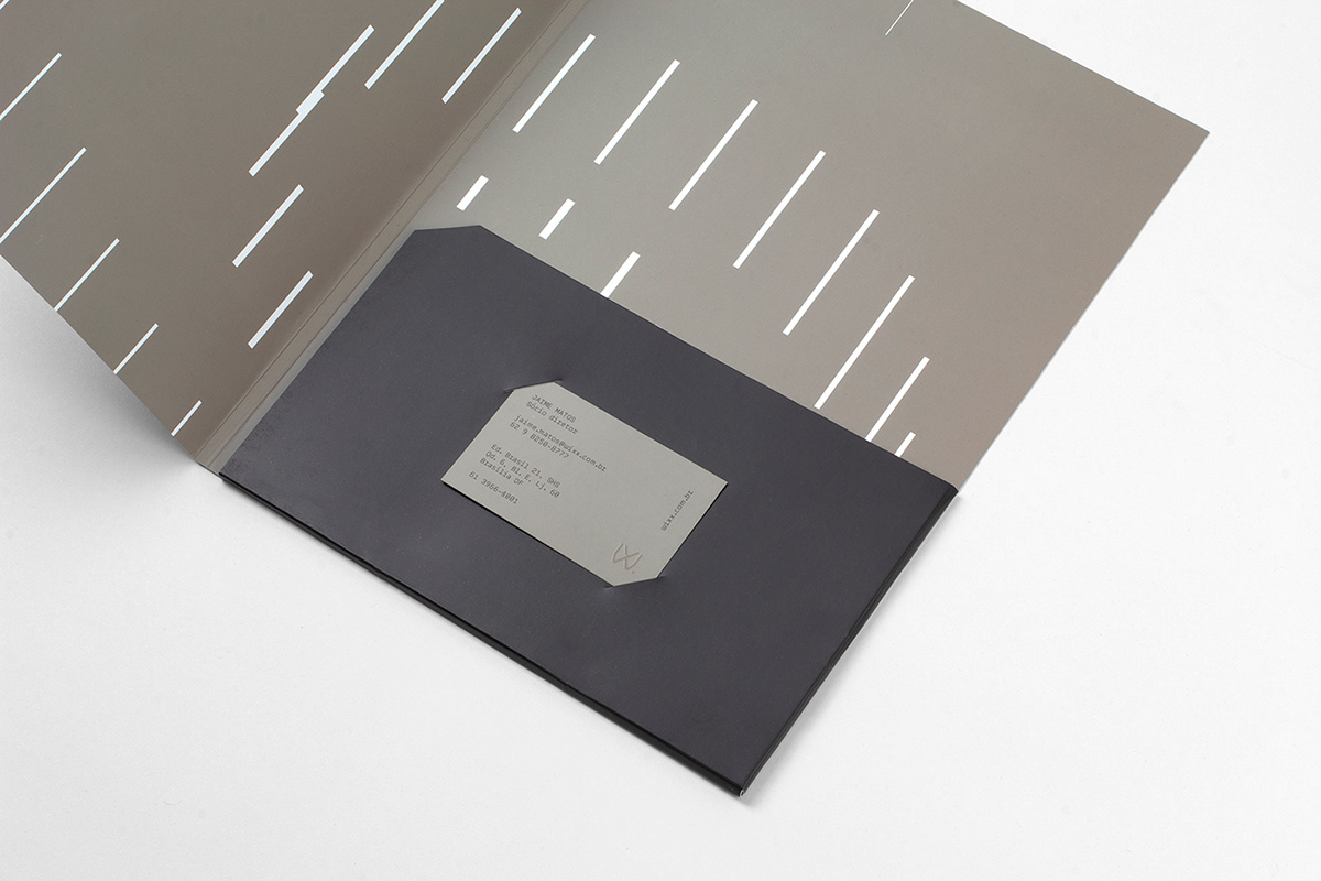
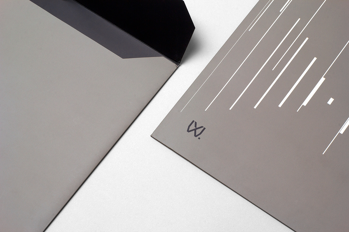
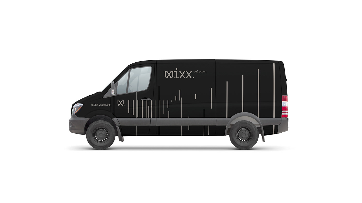
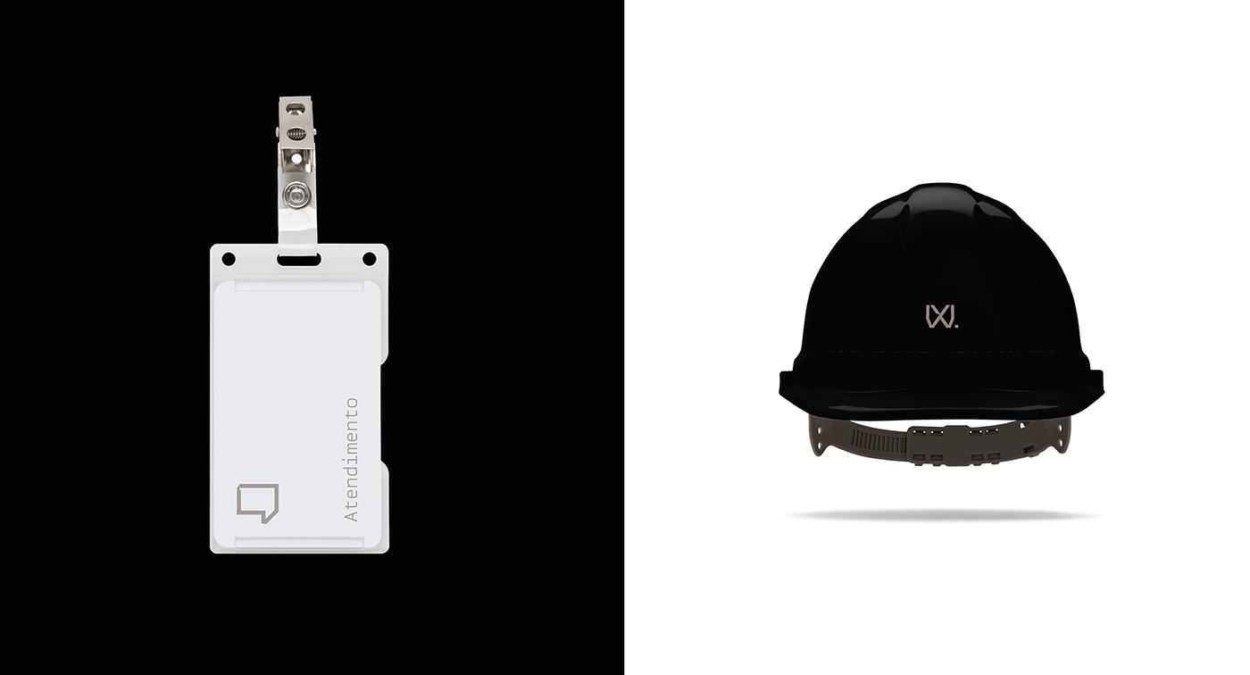
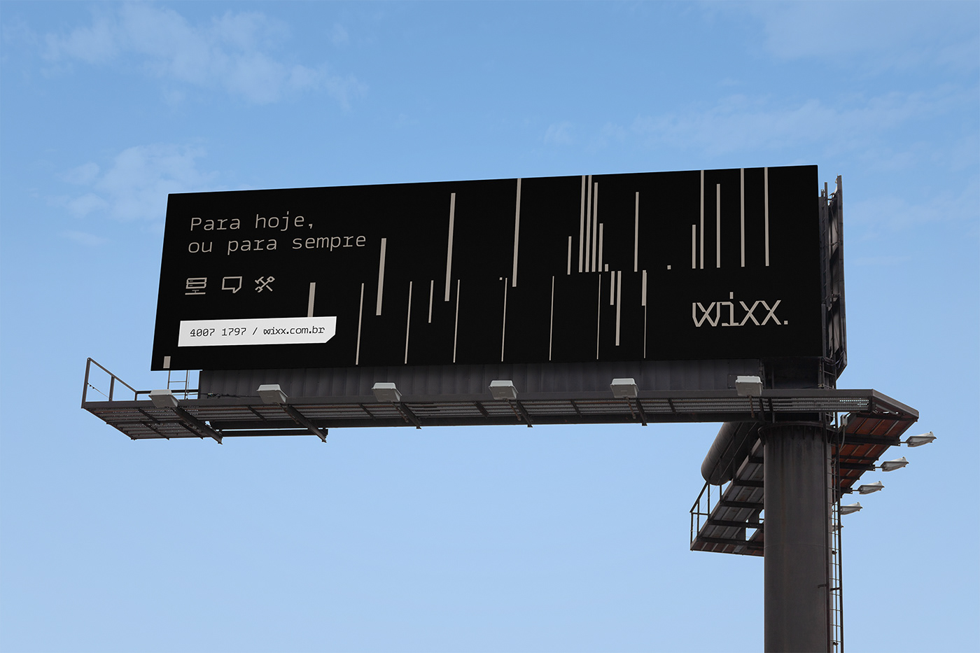
To support this discourse, we created the visual identity and its elements for maximum objectivity and identification: Wixx wordmark and short signature "W.", a graphic compositions language (inspired by transmission and responsiveness) which is extended to all printed material randomly. The chromatic palette was reduced to 3 colors, where black and copper predominate and with a tone of voice adjustment that establishes their perception at the desired balancing level: Wixx are experts, "for today or forever", where 'today' = events and 'forever' = fixed networks - which become the brand's tagline.
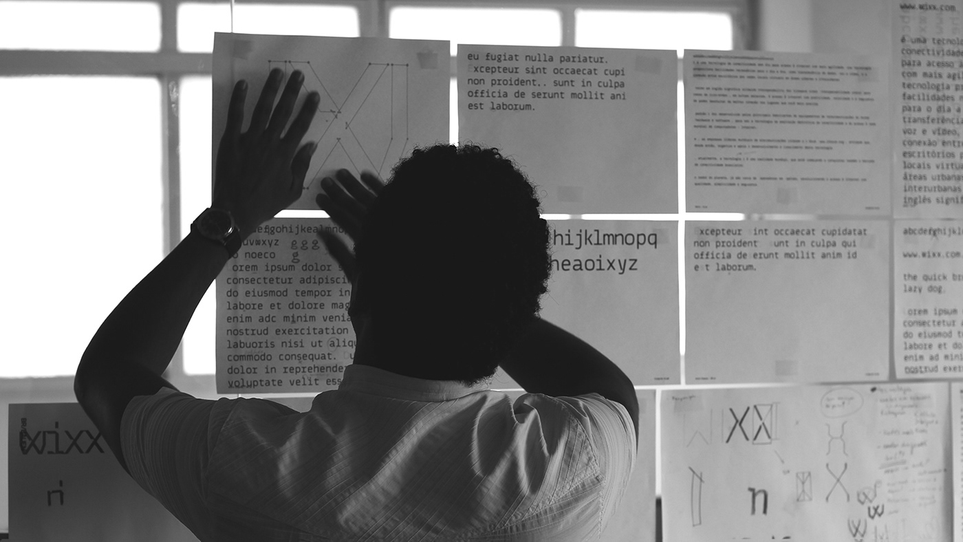
Custom Typography
Considering the importance of the typographic voice for conveying corporate messages, we created a custom typographic family. An alphabet inspired by monospaced fonts, widely used in contexts perceived as technological, typography of code lines, a visual language that with coherent institutional brand messaging - enables us to develop all brand touchpoints necessary for the positioning shift.


/ Results
The identity system was implemented and since mid-2018 has been showing its strength: Wixx perception has raised to the desired level of objectivity and seriousness in the telecom segment. The transition to 100% B2B segment is ongoing, as financial results are established and positioning is aligned with the company's strategic objectives.


Design Direction
Rodrigo Francisco
Brand Research & Strategy
Luis Feitoza
Design Development
Caio Kondo, Felipe Carneiro, Eduardo França, Luis Feitoza, Rodrigo Francisco, Satsuki Arakaki
Type Design
Caio Kondo
__
Follow us!

