v.i. + branding for koé donuts
branding: artless Inc.
creative direction & art direction: shun kawakami, artless Inc.
art direction & design: koyuki inagaki, artless Inc.
assistant design: kanako ueno, qiwen cao, artless Inc.
project management: asami kinoshita
web development: adrien dufond, manmaru Inc.
photography: masaki hamada (kkpo), yuu kawakami
art direction & design: koyuki inagaki, artless Inc.
assistant design: kanako ueno, qiwen cao, artless Inc.
project management: asami kinoshita
web development: adrien dufond, manmaru Inc.
photography: masaki hamada (kkpo), yuu kawakami
architecture & interior design: kengo kuma, kengo kuma and associates
illustration: yu nagaba
client: STRIPE INTERNATIONAL INC.
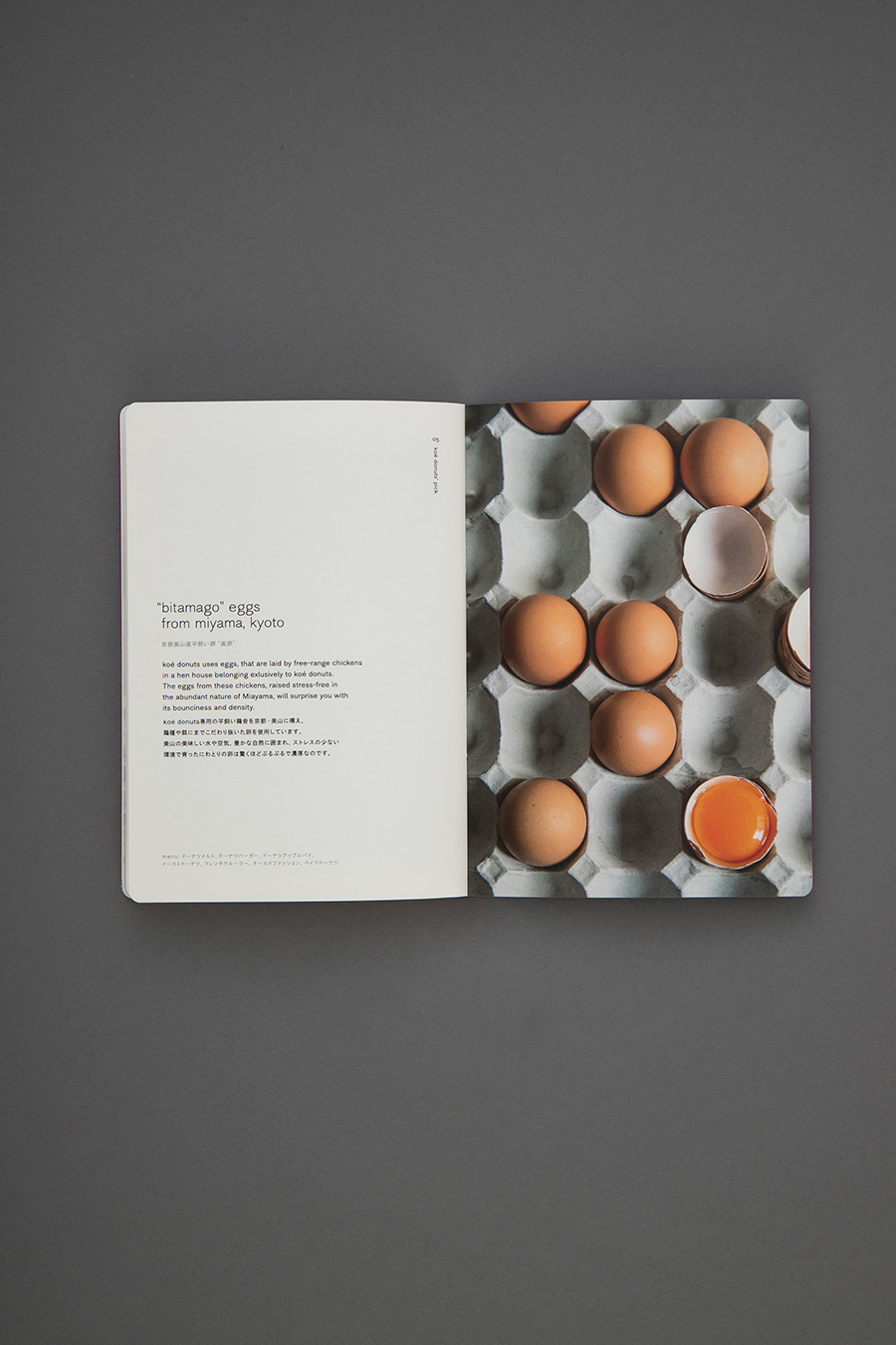
artless Inc. was responsible for designing the signage, goods, website, and total branding/identity of “koé donuts”, a donut factory opened in March of 2019 in the Shinkyogoku area of Kyoto.
Similar to koé, which artless also conducted the branding for, koé donuts embraces the true meaning of the words “organic”, “natural”, and “locally grown”. They carefully select ingredients that are both good for the body and the environment—ethically reimagining Japanese donuts.
The architecture and interior design was carried out by Kengo Kuma, recipient of numerous national and international awards including the Architectural Institute of Japan Award as well as responsible for the architecture of the New National Stadium set to be complete in 2020. Kuma took an ethical and organic approach to the interior of koé donuts and spread Kyoto Arashiyama woven bamboo baskets across the ceiling, creating a warm and relaxing atmosphere.
Furthermore, koé donuts’ character illustration was done by the well-known and talented illustrator, Yu Nagaba, renowned for his work in “POPEYE” magazine and numerous other publications.
artless Inc. collaborated with architects and illustrators during the branding and design process; striving to preserve the identity of the brand established with koé while expressing the value and importance of Kyoto. Further solidifying koé’s brand identity, the same typeface was used. It was then combined with a more contemporary monogram of the K and D to give a fresh and Kyoto-like feeling to the logo. The brand color is a traditional Japanese purple, lending to the overall elegance of the identity. Lastly, coinciding with the brand philosophy of being “ethical”, the shop cards and take-out boxes are all made with environmentally conscientious craft paper.
Next time you find yourself in Kyoto, come stop by koé donuts.