We have redesigned the logo and developed the new visual identity for one of the largest regional newspapers in Norway. Sunnmørsposten has existed since 1882, and last year we started the job with making it better suited for digital surfaces – while maintaining the history.
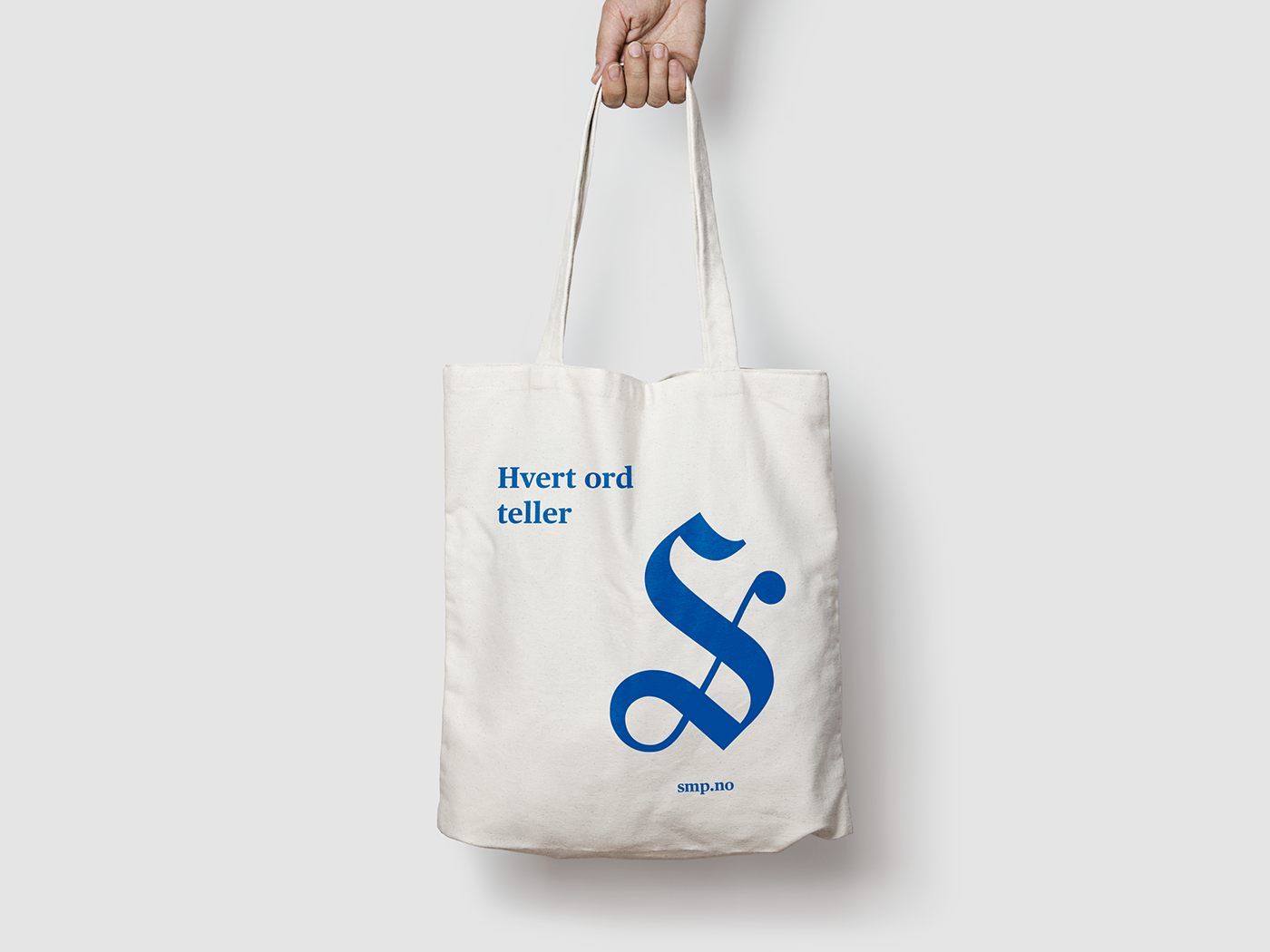
With such a complex logo consisting of Gothic letters, it was a lot to clean up. More air has been added between the letters and in each letter. Serifs have been taken away or been simplified. The large S, which is also to be used alone as a graphic symbol for Sunnmørsposten, is tightened up and better adapted to the rest of the font image. Now the logo is finally pixel perfect!
- Sunnmørsposten is very pleased with both the process and cooperation with ELLE mELLE, which has led to the redesign of the logo. In addition, we have a flexible profile program that supports our identity in a good and clear manner, tells the CEO of Sunnmørsposten; Kjell Slinning.
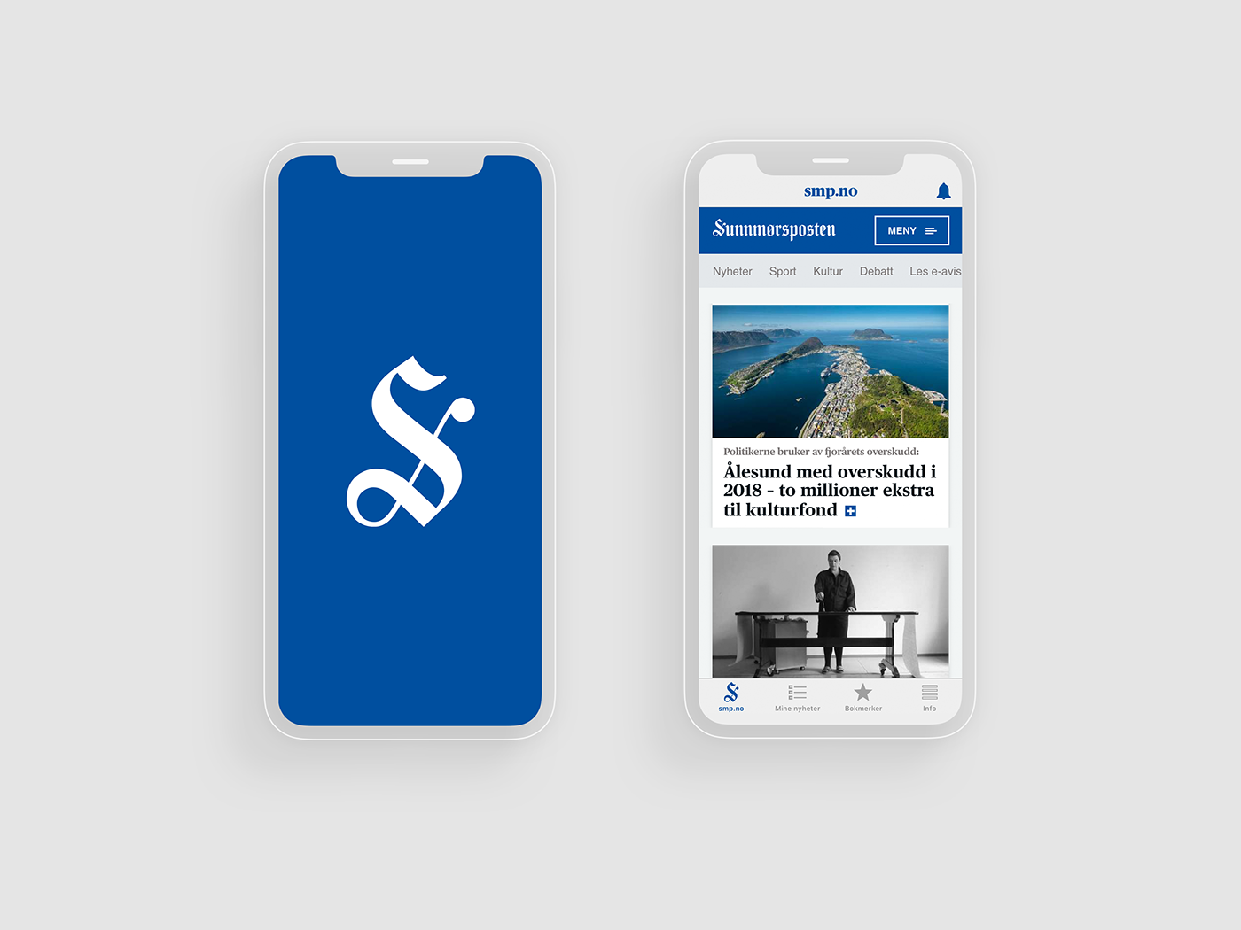
Sunnmørsposten News app
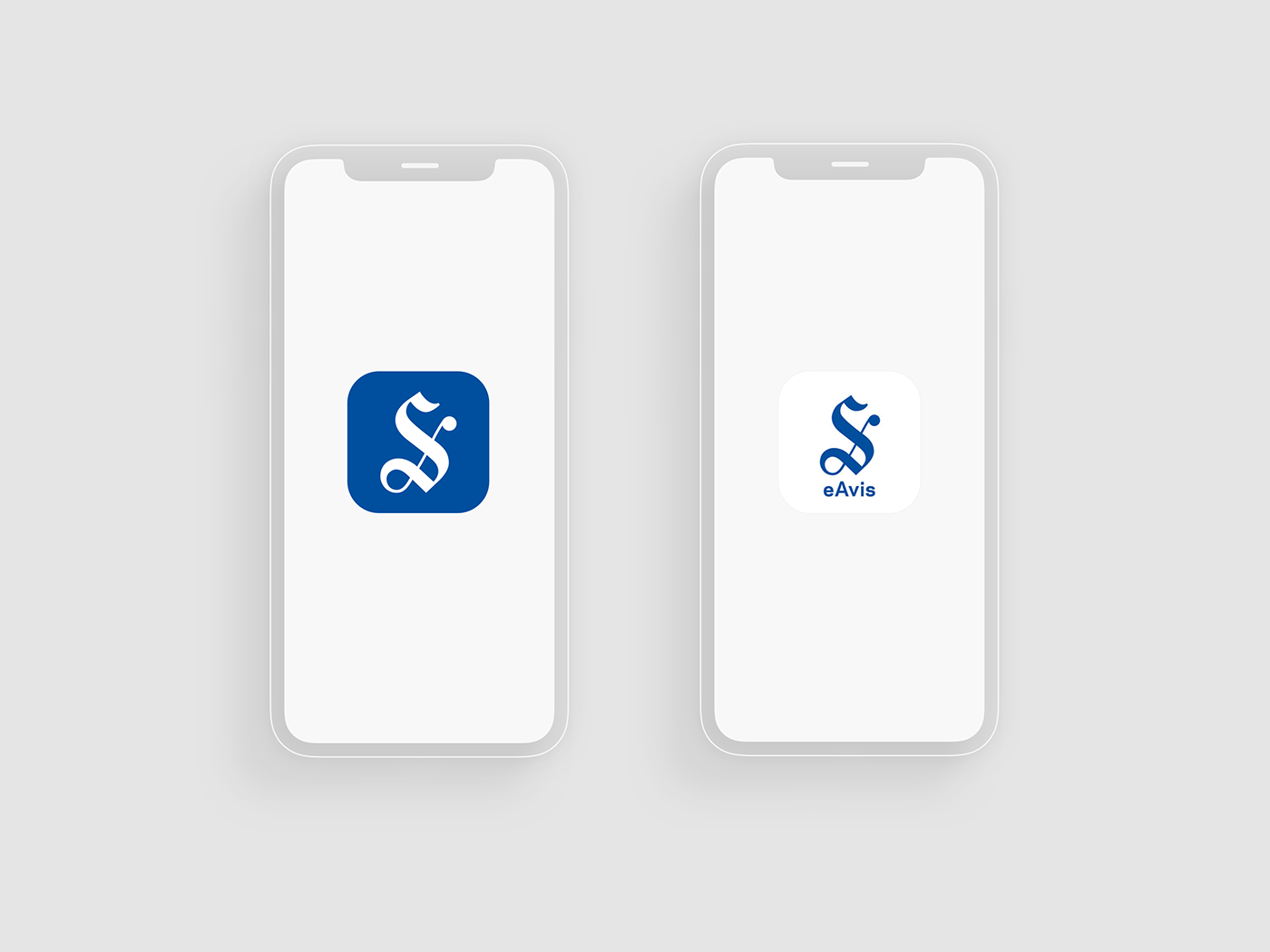
Sunnmørsposten News app & E-paper app icon
Sunnmørsposten Newspaper

Logo history 1882 - 2019

Logo New vs Old

Signature Icon New vs Old
The S is the letter that has been changed the most over the years. The team stayed in the archive for Sunnmørsposten for hours and there they found, among other things, that in the weeks after the city fire in Ålesund, in 1904, the logo was changed three times in a short time.
In order to ensure that all letters are still historically anchored, we got help from typographer Carl Gürgens. He came into the picture when the logo was approved by Sunnmørsposten and added the final touches. Then it was all about adjustments of proportions, lines and angles in the letters.
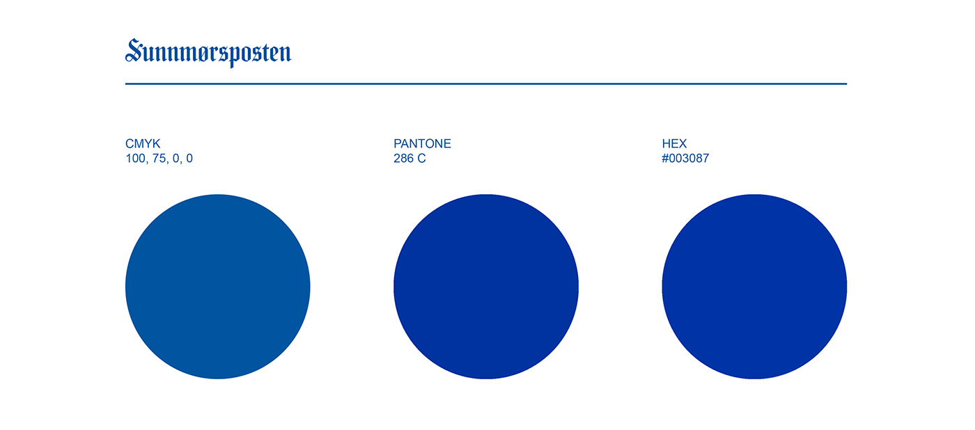
We also prepared a questionnaire prior to the design process. There, a majority replied that blue is a color they associate with both Sunnmørsposten, Ålesund and the region. Then pictorial artist Bent Erik Myrvoll was contacted. He has, among other things, contributed to creating his own color palette for Storgata in Molde, and has good expertise in the field of color. After talking to him, we landed a shade of blue for Sunnmørsposten, based on a cobalt blue known from the Art Nouveau buildings in Ålesund.

Colors Print & digital