


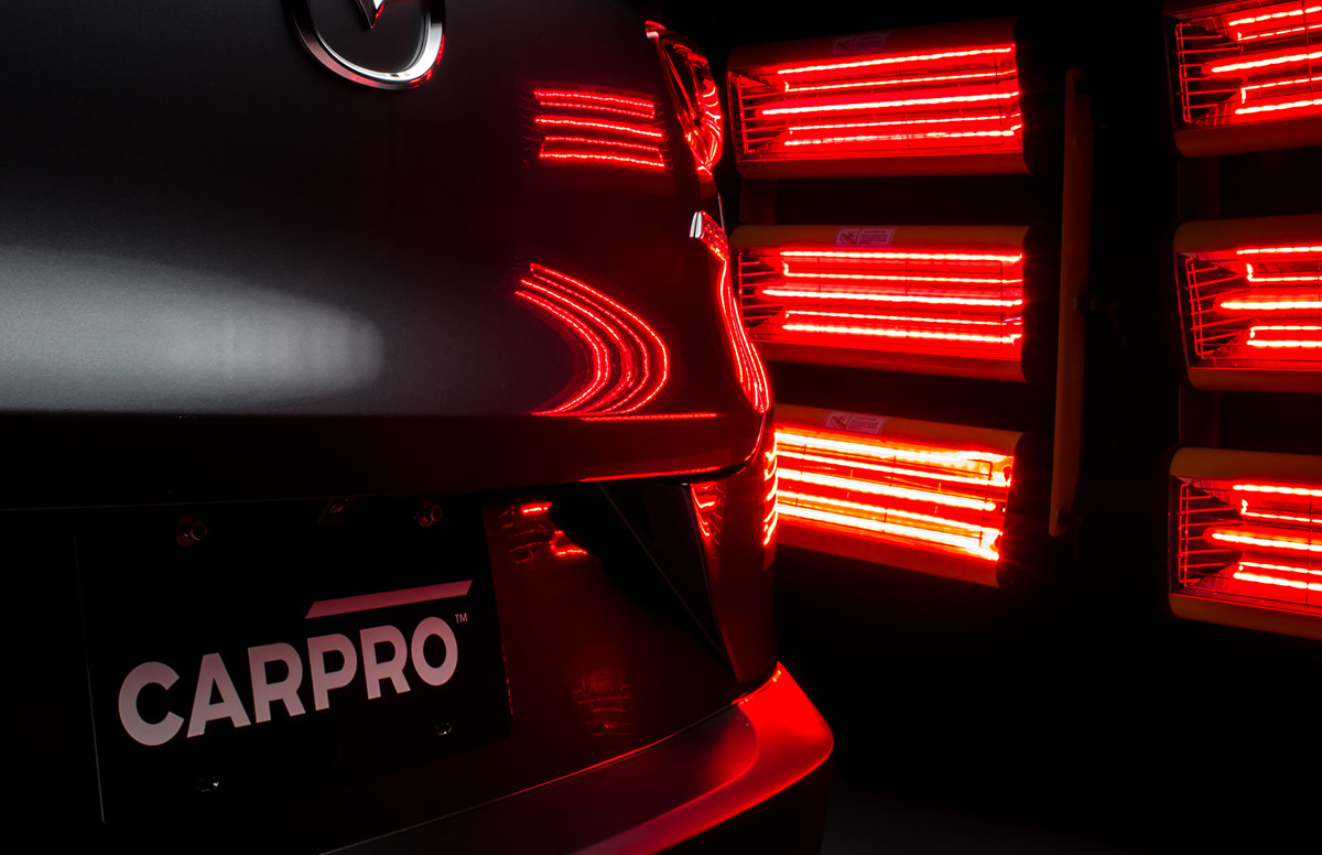
CARPRO
/ Of armor and art
INDUSTRY / LOCATION
Automotive detailing / Jeonnam, Korea
SCOPE OF WORK
Communication analysis / Communication strategy / Visual identity / Packaging design / Print management / Brand collateral design / Web design / Web development / Brand consulting
SHORT DESCRIPTION
CARPRO was one of the pioneers of automotive detailing products in Europe and the US. Over 10 years, their products have gathered an almost cult following and have been at the very tops of rankings and reviews. Nevertheless, product quality is one thing, while impressions and branding is another. Younger players started excelling in the latter and CARPRO’s position started to diminish. Here’s where we come in.

Concept
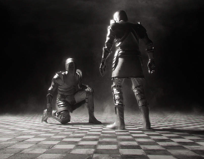
Between rough and refined
Between savage and spotless
Between brute and beauty
Between savage and spotless
Between brute and beauty
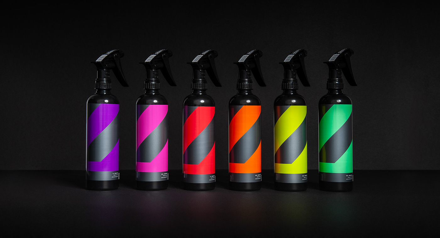
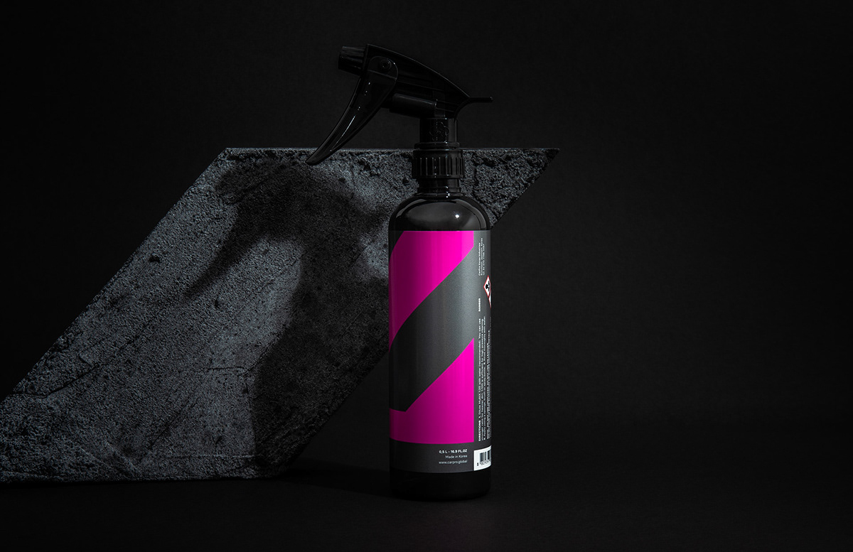
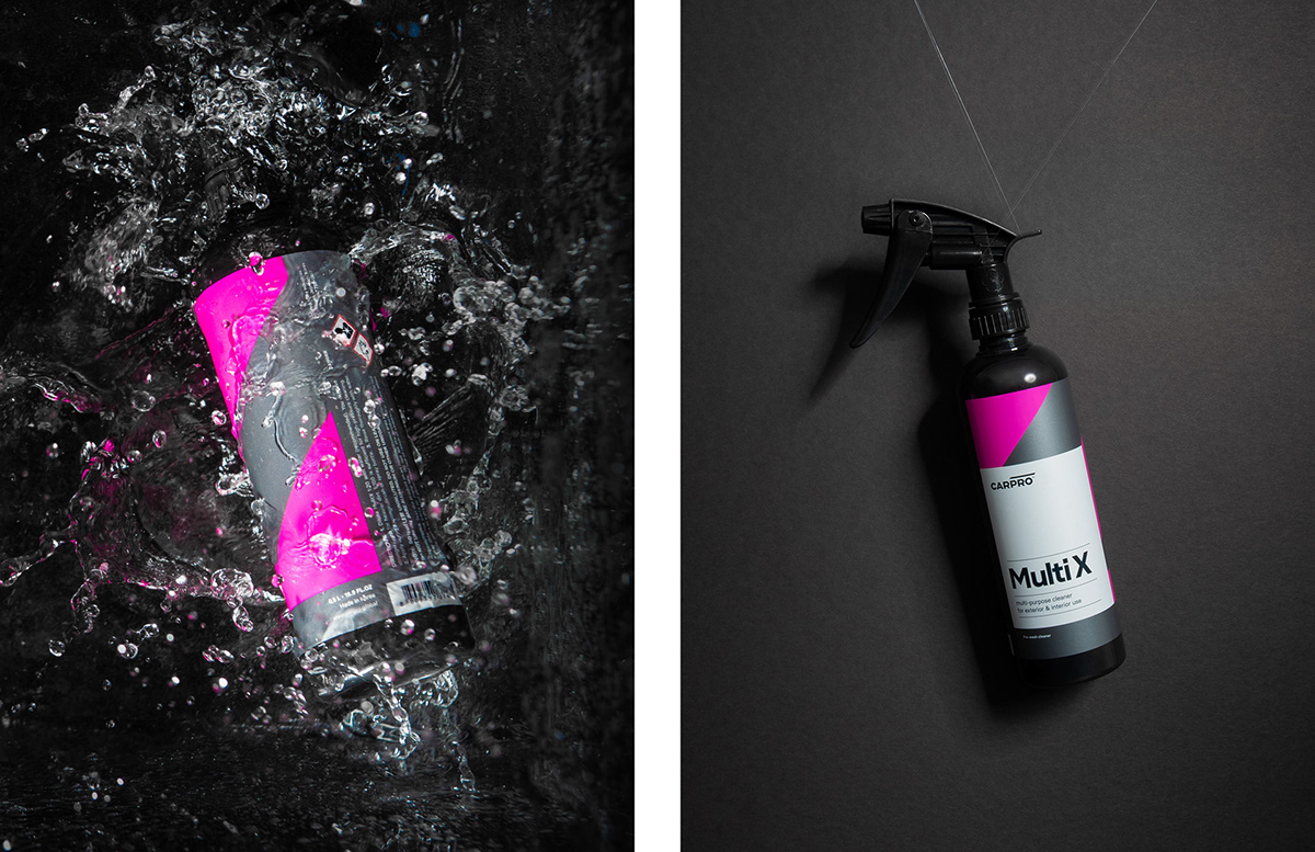
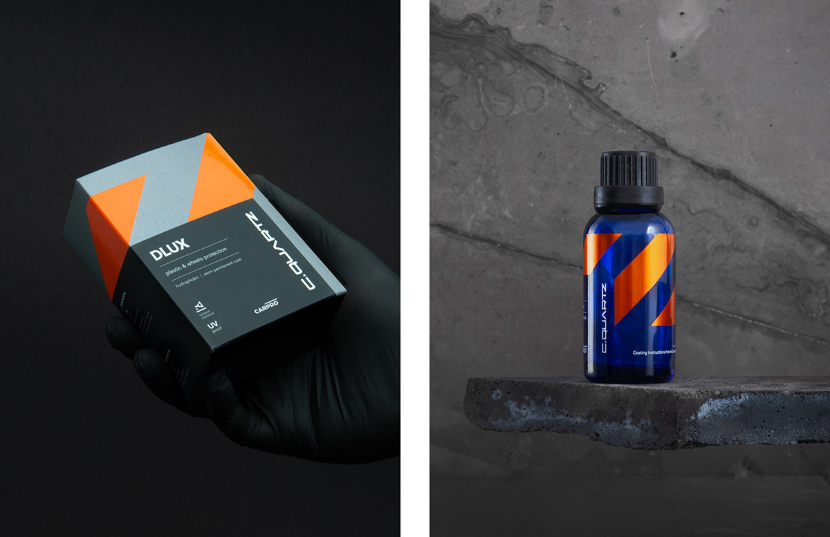
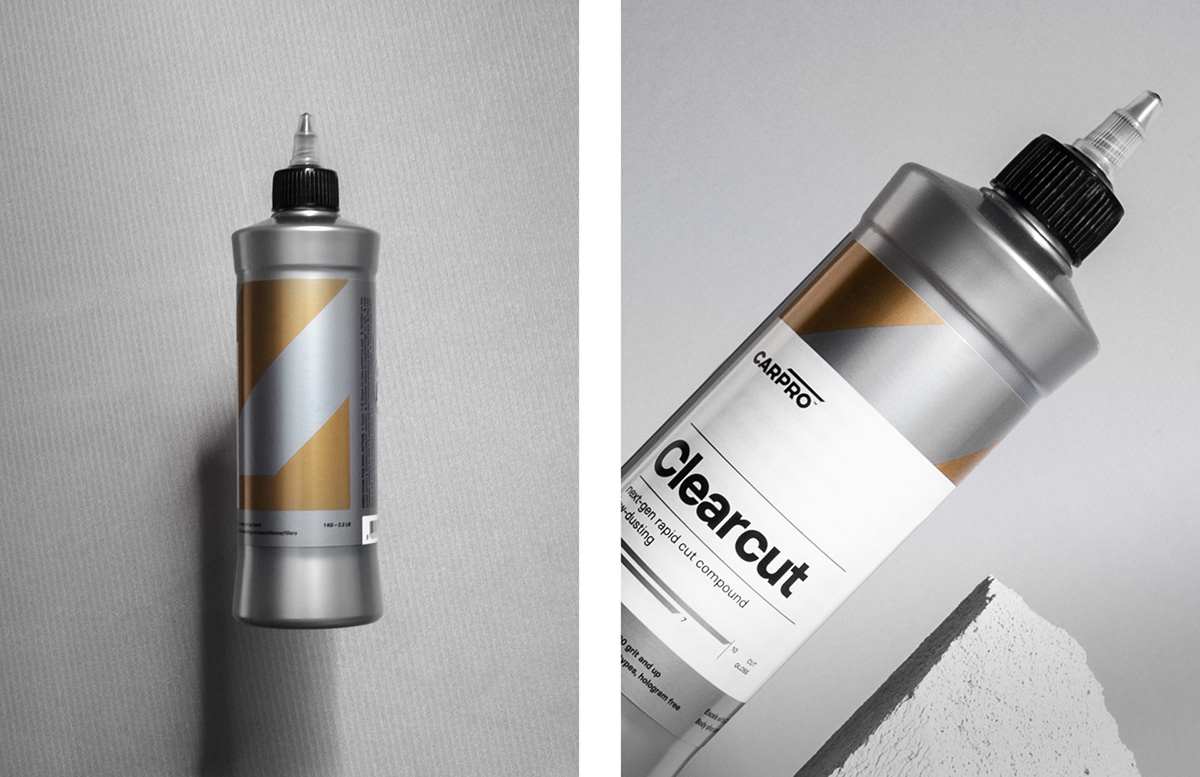
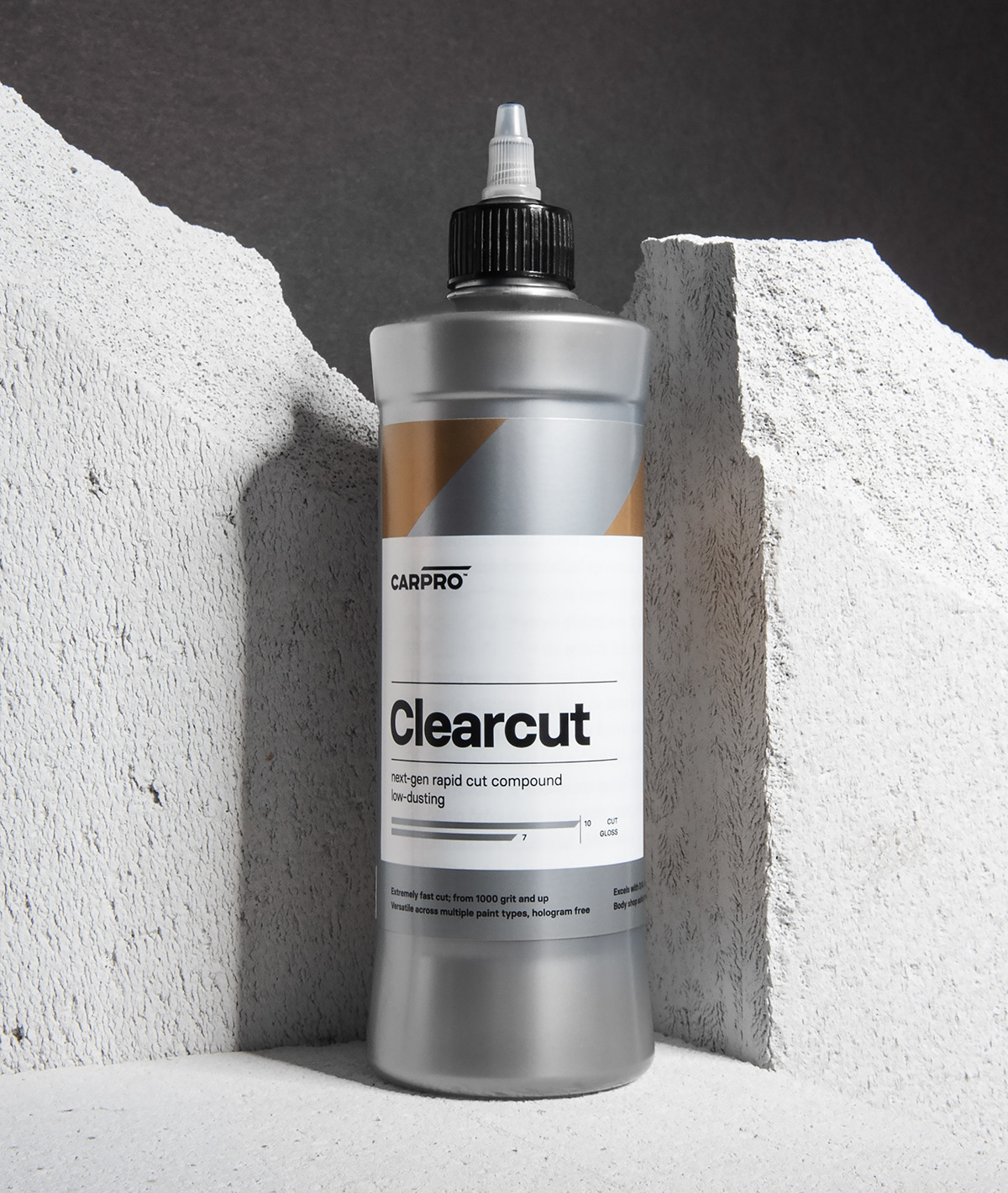
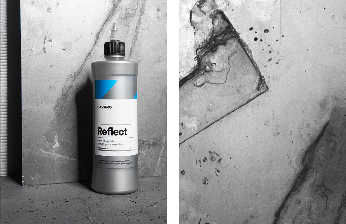
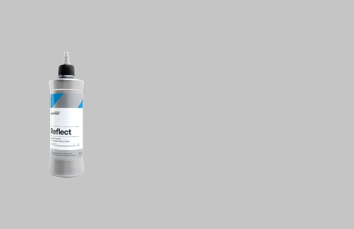
Packaging design was the core task of the project. Navigating product lines and subbrands, colour differentiation within a palette that makes sense for over 80 products, various bottle types and sizes, boxes, all while maintaining distinctiveness and being able to visually compete on shelves…
You get the idea.


Concept
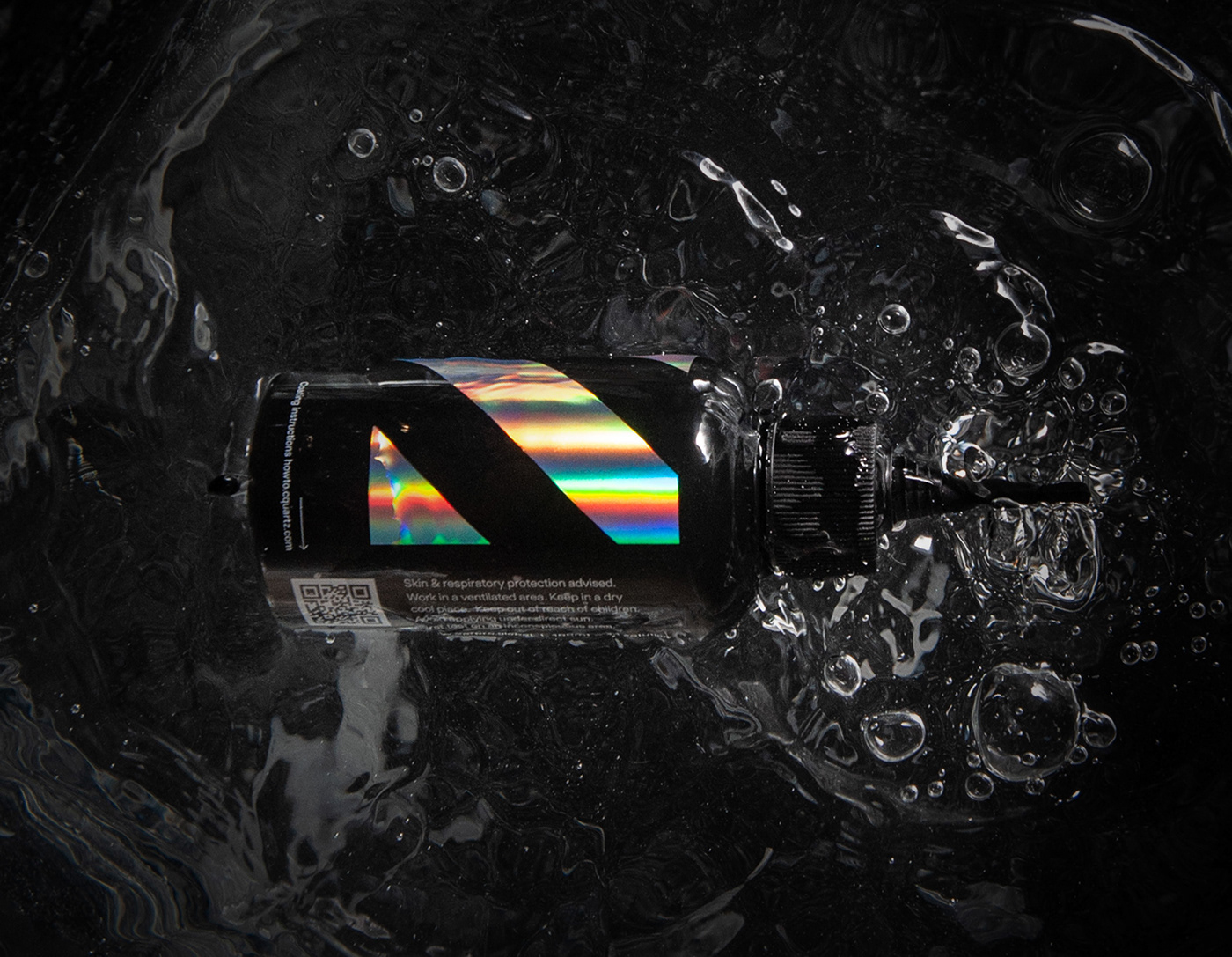
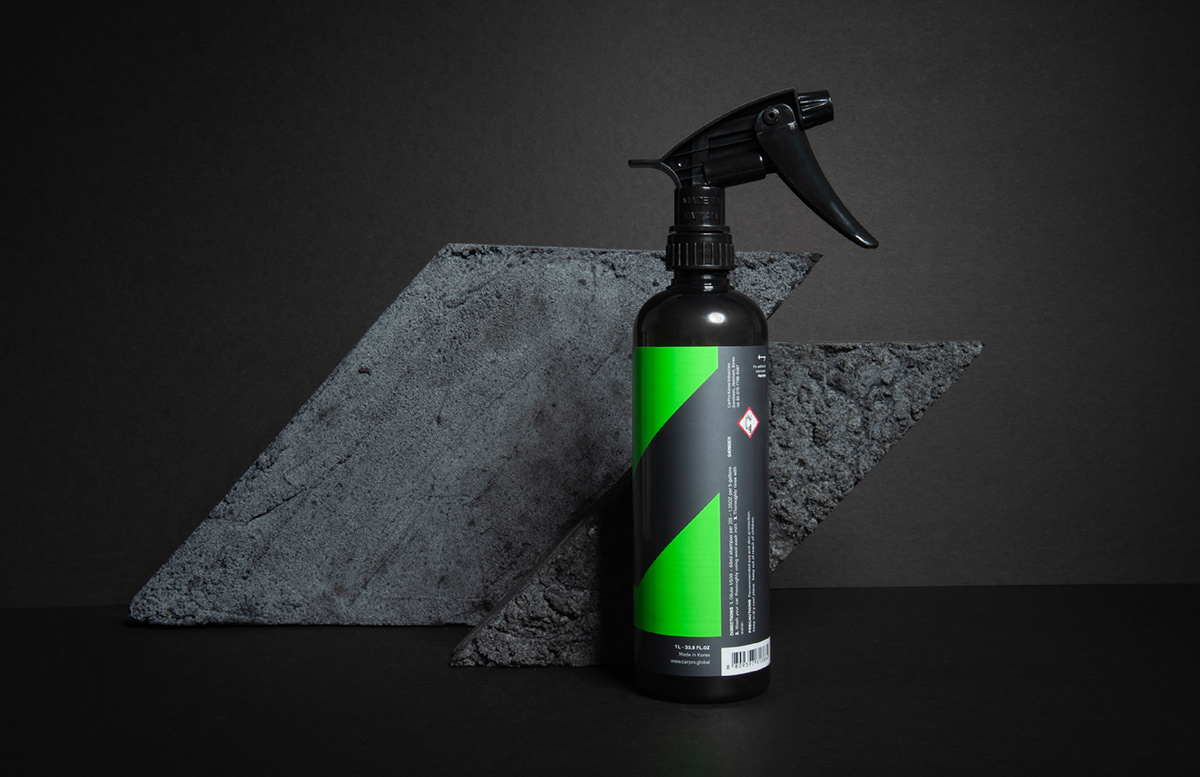
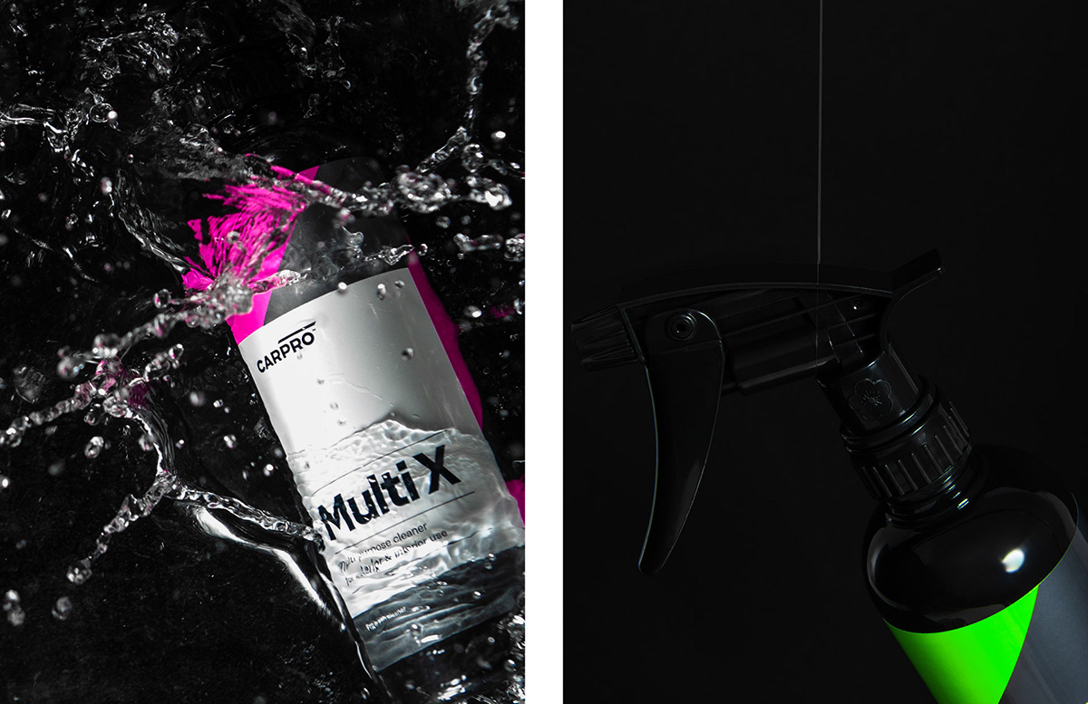
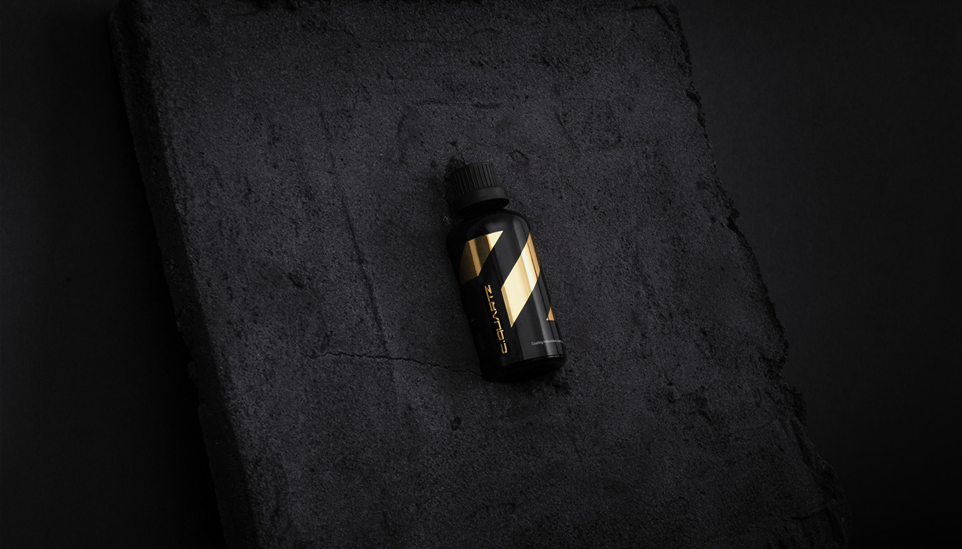
The simplicity and energy of angled stripes unified the identity system.

We have used a variety of printing techniques and heavily experimented with materials, pigments, foils and production methods, to achieve the final effect of full cohesiveness and impression of ultimate quality the products always deserved.
Production
We have coordinated and supervised the entire printing process of literal millions of labels.
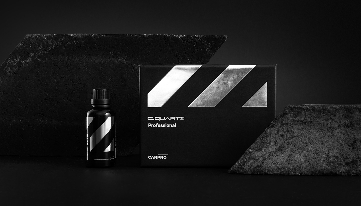
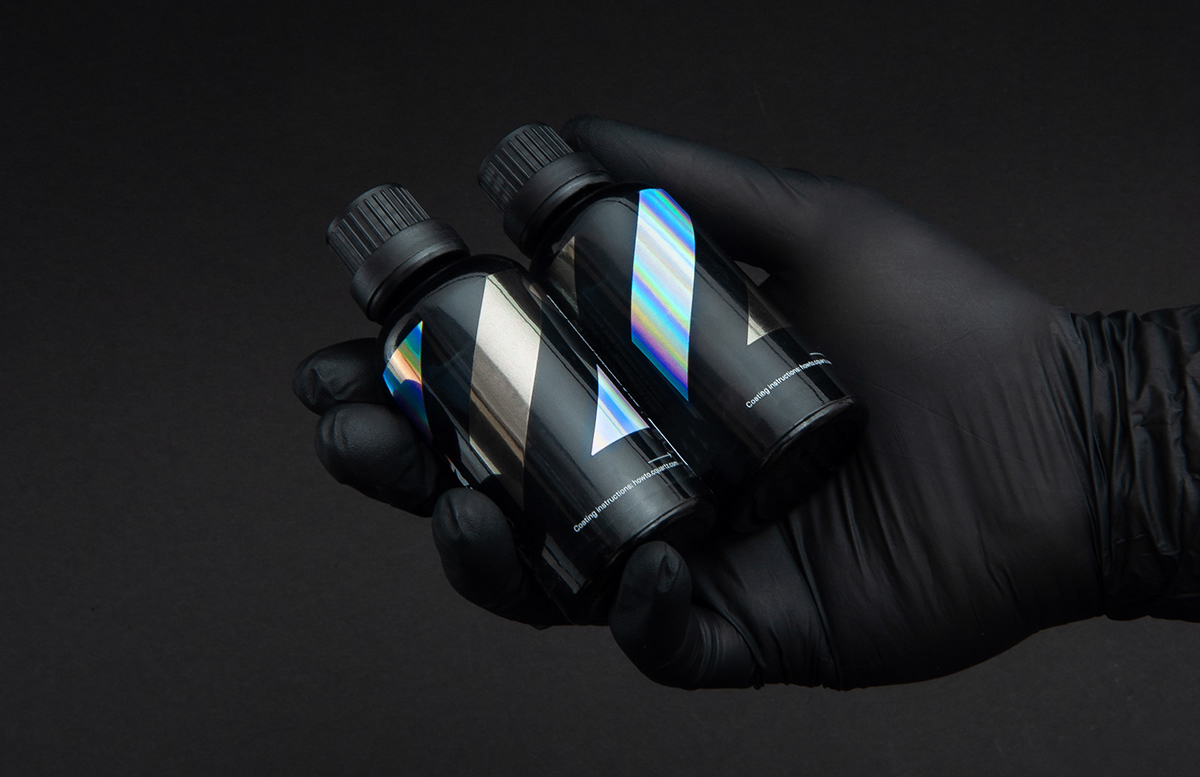
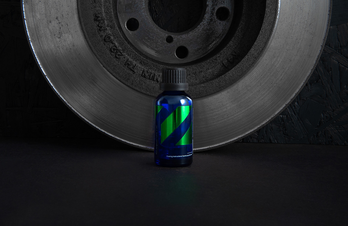
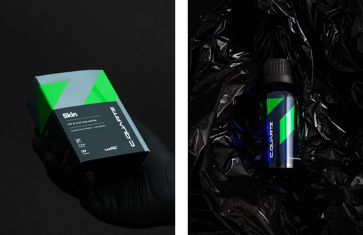
CQUARTZ products are the brand’s flagships.
Fine nano-tech coatings with incredible hydrophobicity and gloss required
a special approach to position them adequately, while preserving a unified brand style.
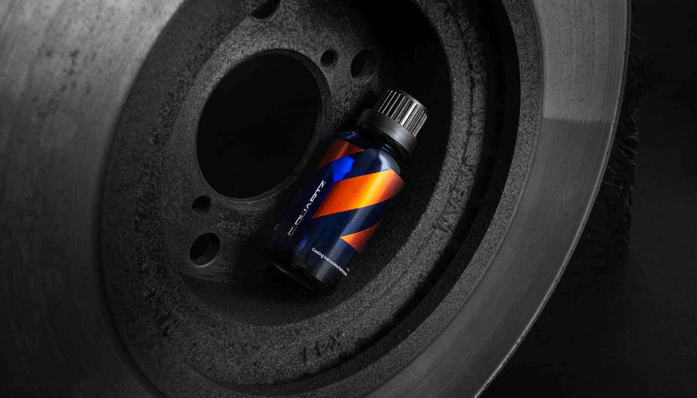
Then came the polishing products, which again required a different approach dictated by the packaging’s chemical resistance and need to differentiate another line.
The packaging system again proved to be infinitely versatile.
Launch
The brand launch at the SEMA Show in Vegas was followed with thousands of eggplant emojis from the fans. Best. Reaction. Ever.

The system again proved itself with the use of imagery. The principle was not to damage
the eye-candiness of carporn images constantly shared by the brand, yet be visually distinct from the competitors, who after all, do show the same beautiful cars and a similar process.
the eye-candiness of carporn images constantly shared by the brand, yet be visually distinct from the competitors, who after all, do show the same beautiful cars and a similar process.
Too much
If we’ve shown everything, this case study would have been miles long. We care for your time.
But here’s the website. Final thing. Promise.
We’re just proud. <3
Thank you!