AKASHA Foundation is a non-profit born at the intersection of blockchain and collective intelligence. They nurture projects helping individuals unlock their potential through open systems that expand our collective minds at local and global scales.
Decentralized application
The AKASHA Dapp is a next generation social media network powered by Ethereum and embedded into a content addressing protocol known as the interplanetary File System. AKASHA challenged us to understand the app’s architecture and shape the app’s user interface and experience. To better understand the app’s flows and to ensure we didn’t compromise any core product decisions, we started to create low-fi greyscale wireframes.
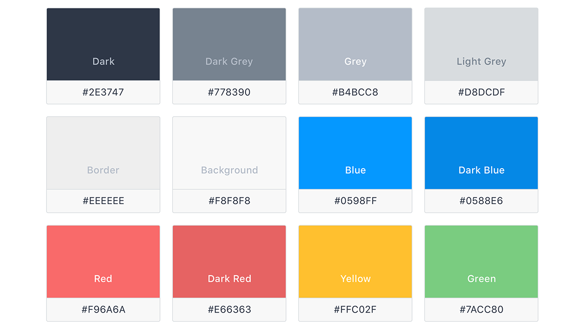
Colours
Once the app's structure was defined, we set out to create a practical user centered styleguide. We used colours for hover effects, highlight, disabled negative, and positive states.
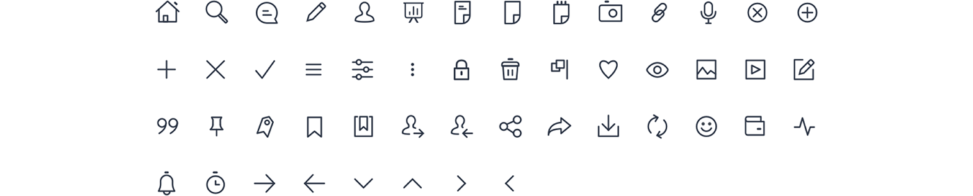
Iconography
Icons are visual representations of commands, files, directories, or common actions and are used to provide visual context and enhance usability. Icons are auto-scaled to provide three additional sizes: small (16px), medium (20px), large (24px), reducing the visual complexity of elements in tiny sizes.
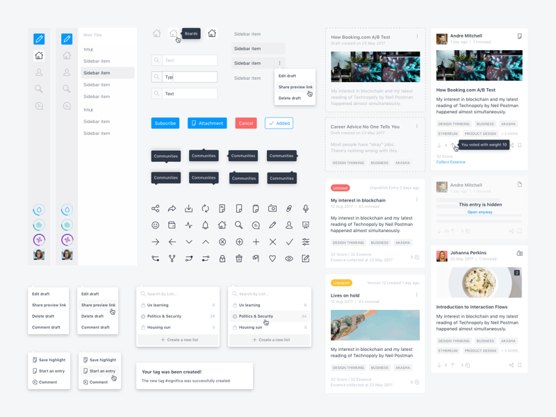
Components
Spacing can be applied using either margin or padding. Both margin and padding share the same predefined scale, multiples of 8.
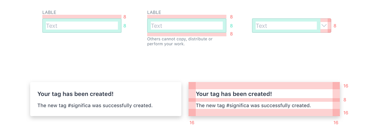
Consistent use of a grid system provides the foundation for harmoniously and consistently positioning elements on screen. Designing on the grid helps create an experience that facilitates understanding and brings order to the page.
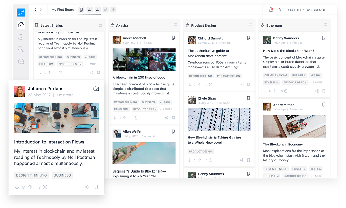
Dashboard
In today’s blockchain realm, AKASHA is a social and technological experiment enabling our collective memory, feelings and ideas to echo freely throughout humanity’s existence. According to Mihai Alisie, the co-founder of Ethereum and founder of AKASHA, "the user view when navigating content is now thought as a modular and customizable dashboard. The "boards" allow the users to organize various topics while "columns" can take the shape of a stream from the people you follow, a particular tag or a specific person."
To present the app’s main flows and features at the DevCon3 conference, we recorded a video on how to add a new column to the board, see an entry and on how to leave a comment on an entry.
Prototype created to present the Dapp at the DevCon3 conference, featuring the app’s main features.
New Entry
The user can write his own articles directly on the dapp’s editor where he can save it as a draft or publish them as soon as it’s ready. On the right panel he has access to the publishing options where he can set the type of license, cover image and a preview excerpt for his entry. As soon as the entry is published, users on the network can vote, comment and share.

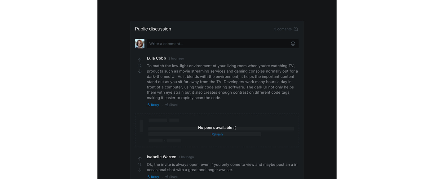
Dark Theme
To allow for better readability at night or for sheer preference, the user can use the AKASHA dapp on dark mode. We designed every component in both a light and dark theme, ensuring legibility and more coherence. A great example of this is the user’s overview page, where he or she has access to statistics of his actions and consequent individual score.

Every project has its own challenges and particularities. In this case, developing an app that works as a peer to peer social network, it was our concern to keep the user always informed on the ongoing actions, with the constant feedback, always visible.
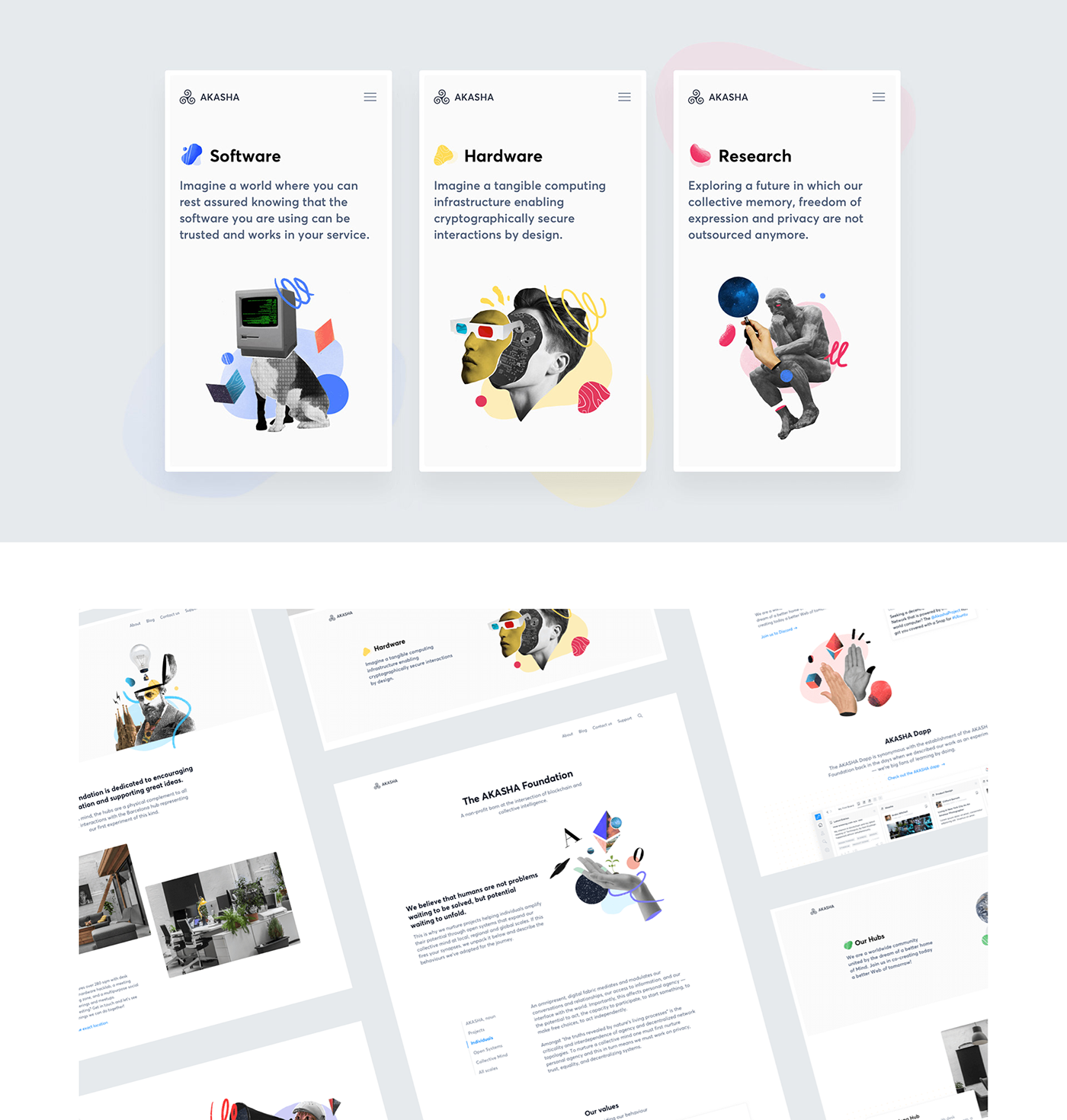
The AKASHA website
AKASHA's voice and tone projects reflects who they are. Their brand must personify the values they have identified as critical to their purpose and culture. To reflect this we designed and developed a website that not only showcases the dapp but also the brand's other projects.
Colours
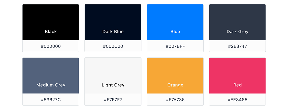
Colour helps every brand to distinguish itself by adding consistency in all forms of communication, media and products. We use color in all expressions of the AKASHA brand, from illustrations to simple elements. Our palette uses colours to bring the personality of our brand used in logical ways throughout all communications products to guide the user and highlight every important point.
Typography
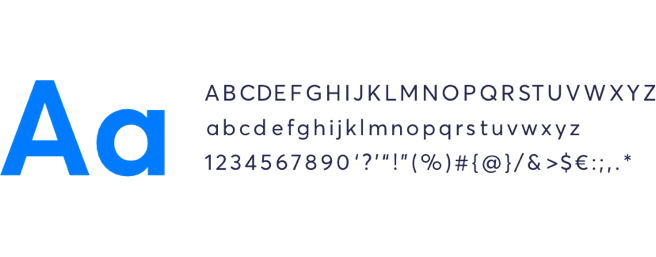
Meet our brand typeface, Averta Standard! It’s a geometric sans serif family with a simplistic, yet appealing, personality. The purely geometric rounds and open apertures manage to express an unmoderated, straightforward tone resulting in a modernist, neutral and friendly typeface.
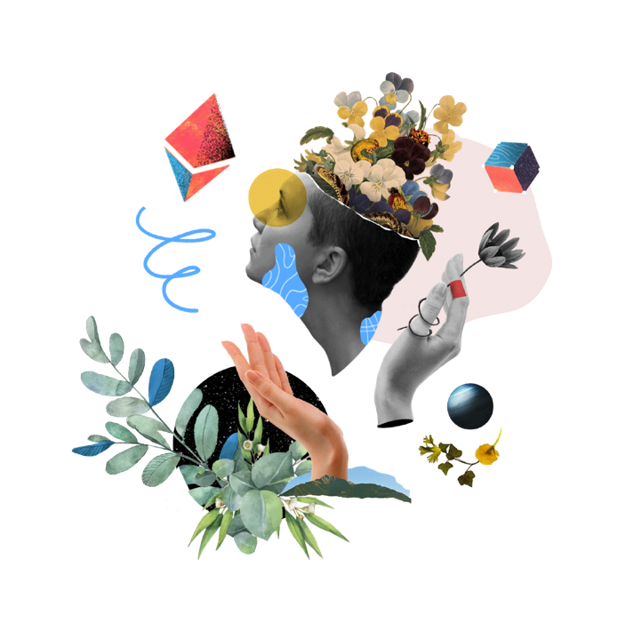
Defining a style
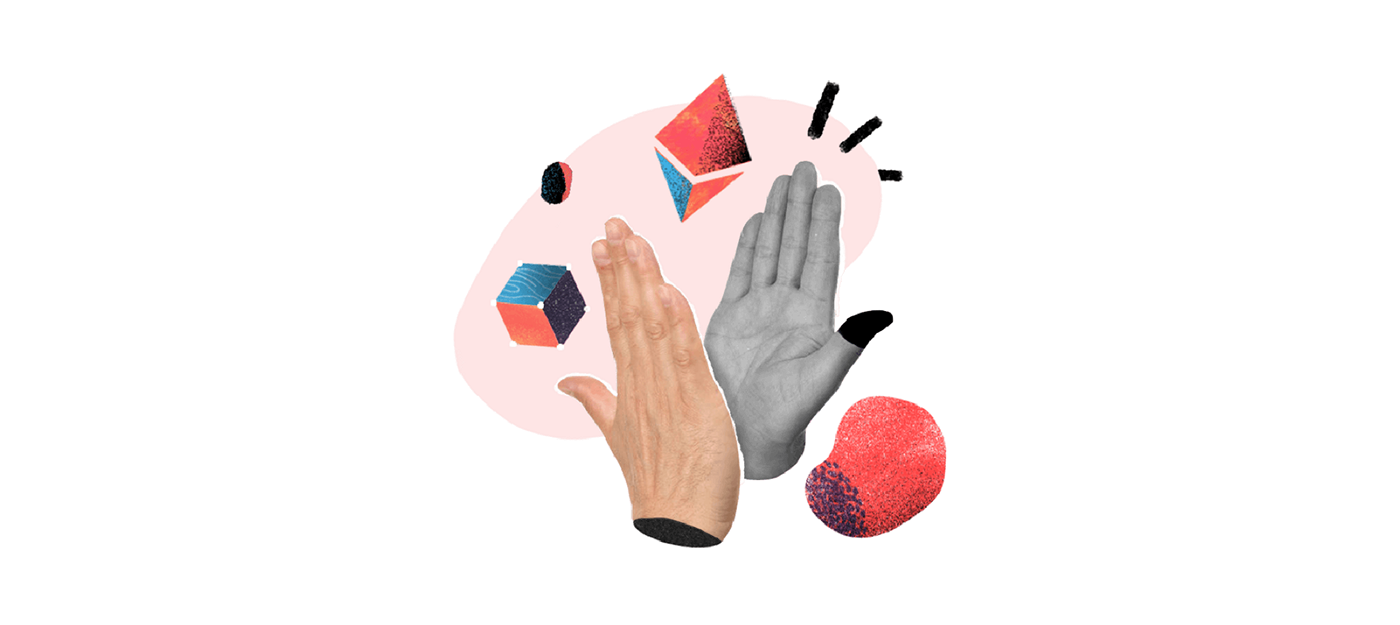
Illustration is a powerful communication tool. Consequently, we wanted an illustration style that helped AKASHA’s brand to distinguish itself. To achieve this we built a style based on collages of real photos combined with organic elements and shapes, always in sync with our colour palette.
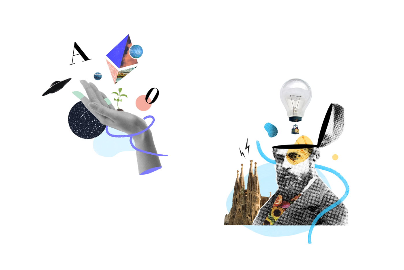
Adding Context
Each illustration always has the goal of helping to clarify an idea or a concept transmitted in the nearby text. Together they offer a coherent narrative and deliver a friendly message.
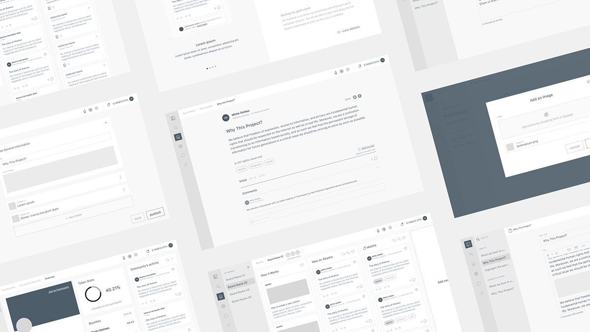
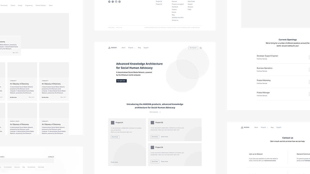
Wireframes
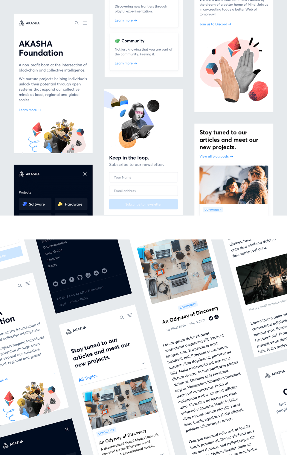
With the number of projects and the research group growing came the necessity of creating a new website that could clearly show the community what AKASHA was developing. Quick(er) to do and easy to analyse, wireframes are our favourite way of defining structure and content without compromising the design.
akasha.org website
This new website marks a new step for AKASHA Foundation. We aimed for a friendly, coherent and strong brand that’s present in every design decision, from each individual design element to more complex layers, such as illustrations.
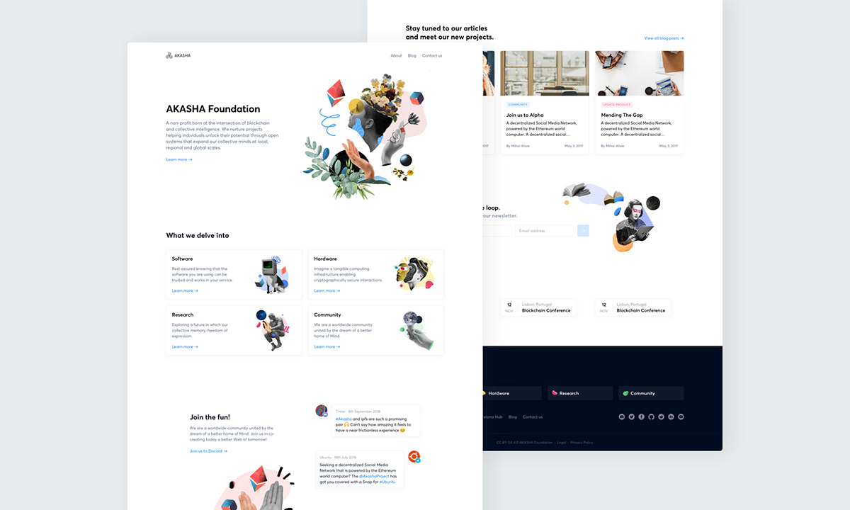
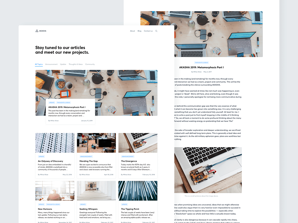
The new website shows the multiple subjects that AKASHA’s team is working on at the moment. As one of the best ways to share progress with the community, the AKASHA Blog became the go-to platform to track the progress and direction of the Foundation’s projects.
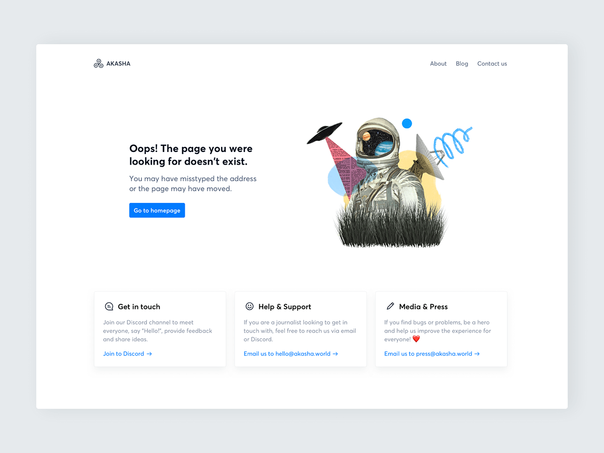
Got lost in space? Grab on to the nearest UFO to find your way home.
Features 💬🔎
Technically speaking, the Glossary was a big challenge to implement. It needs to analyse all of the website’s content and list all the specialist words and phrases so that everyone who joins the community can better understand AKASHA’s communication.
With so much content, we need to implement a search tool to help with the users find what they are looking for. By text and categories, the user can find the latest projects from the AKASHA foundation or find the newest article on the blog.

Mobile
So that the users of today can embrace the technlogy of tomorrow, it needs to be reachable on-the-go. That’s why the AKASHA Foundation website is full responsive.