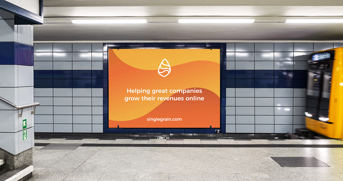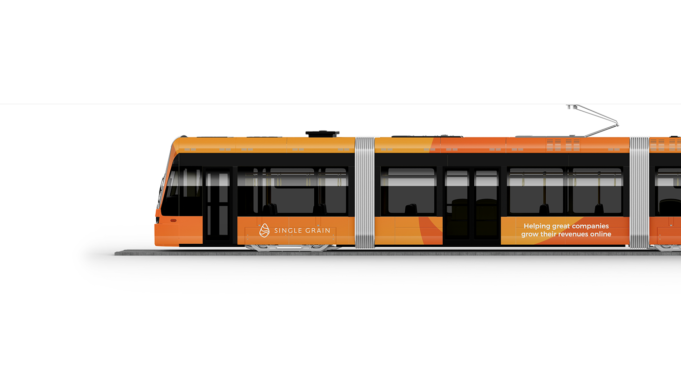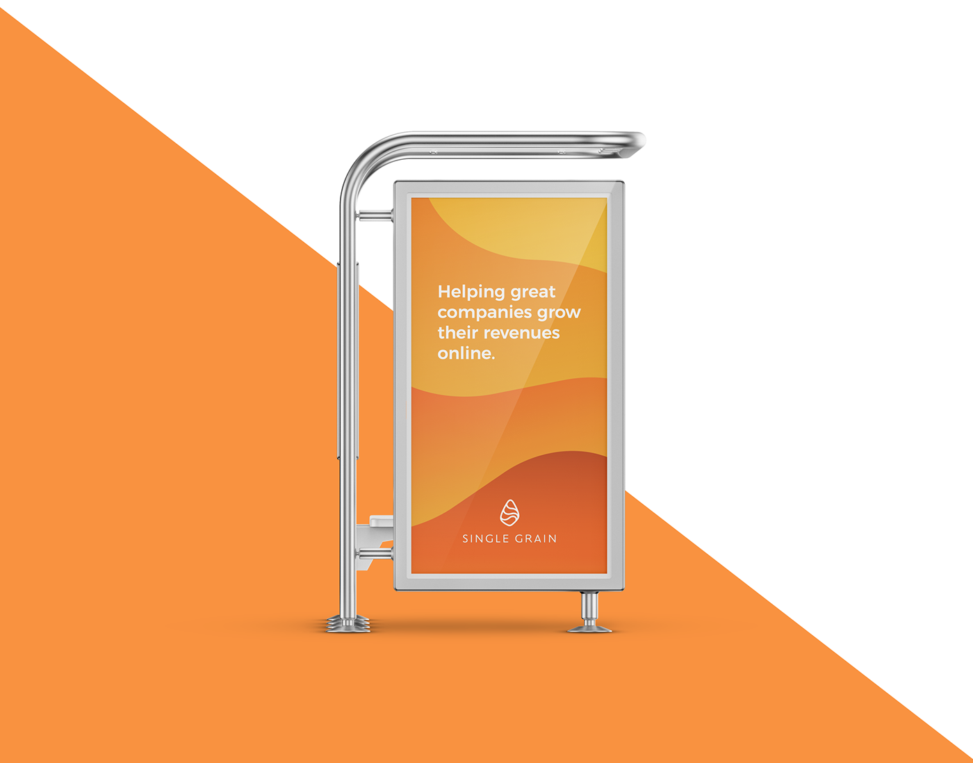
Growth that matters. Single Grain is a full-service digital
marketing agency which helps great companies grow their revenues online.
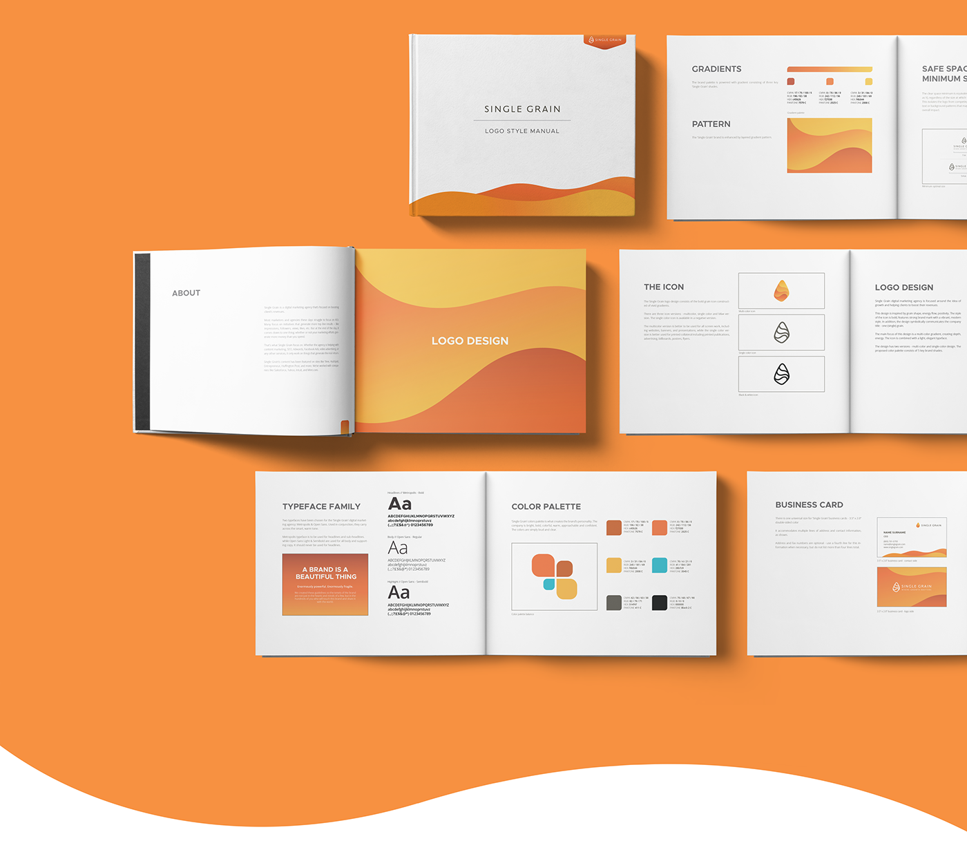
In 2017 smart by design had worked with a company in need of change. We developed a new brand and visual identity system, brand guidelines based on the newly defined brand values and objectives. The new brand became a symbol of growth and change.
Now Single Grain is a full-service digital marketing agency which helps great companies grow their revenues online, but in 2013 Eric Siu (CEO of Single Grain) bought failing SEO company for $2 and turned it into a marketing powerhouse.
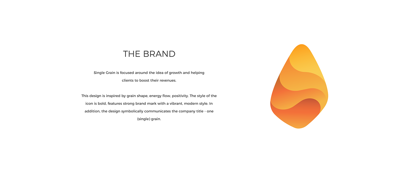
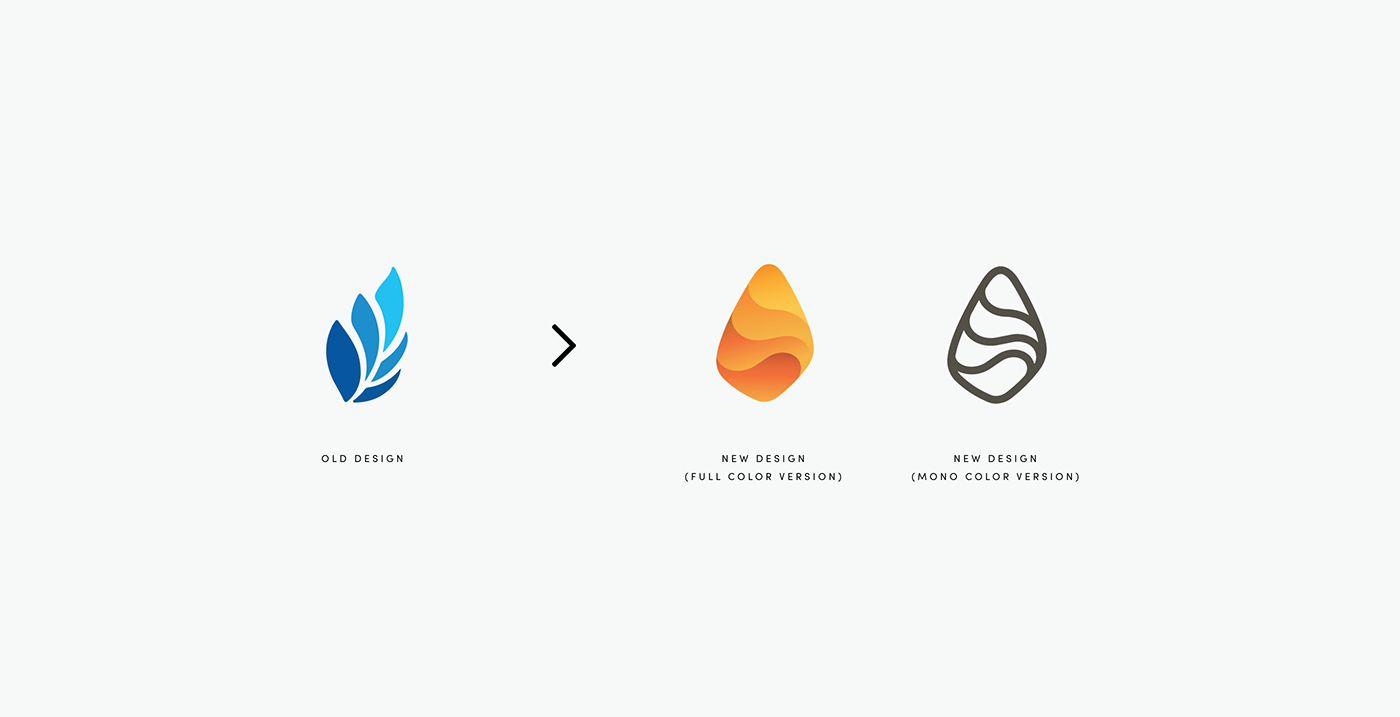
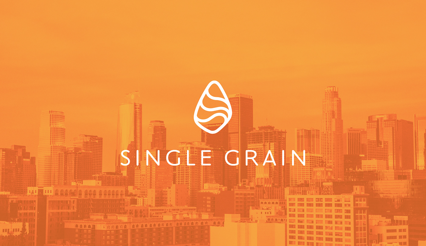
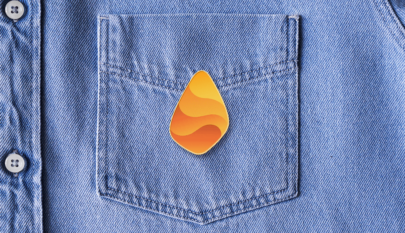
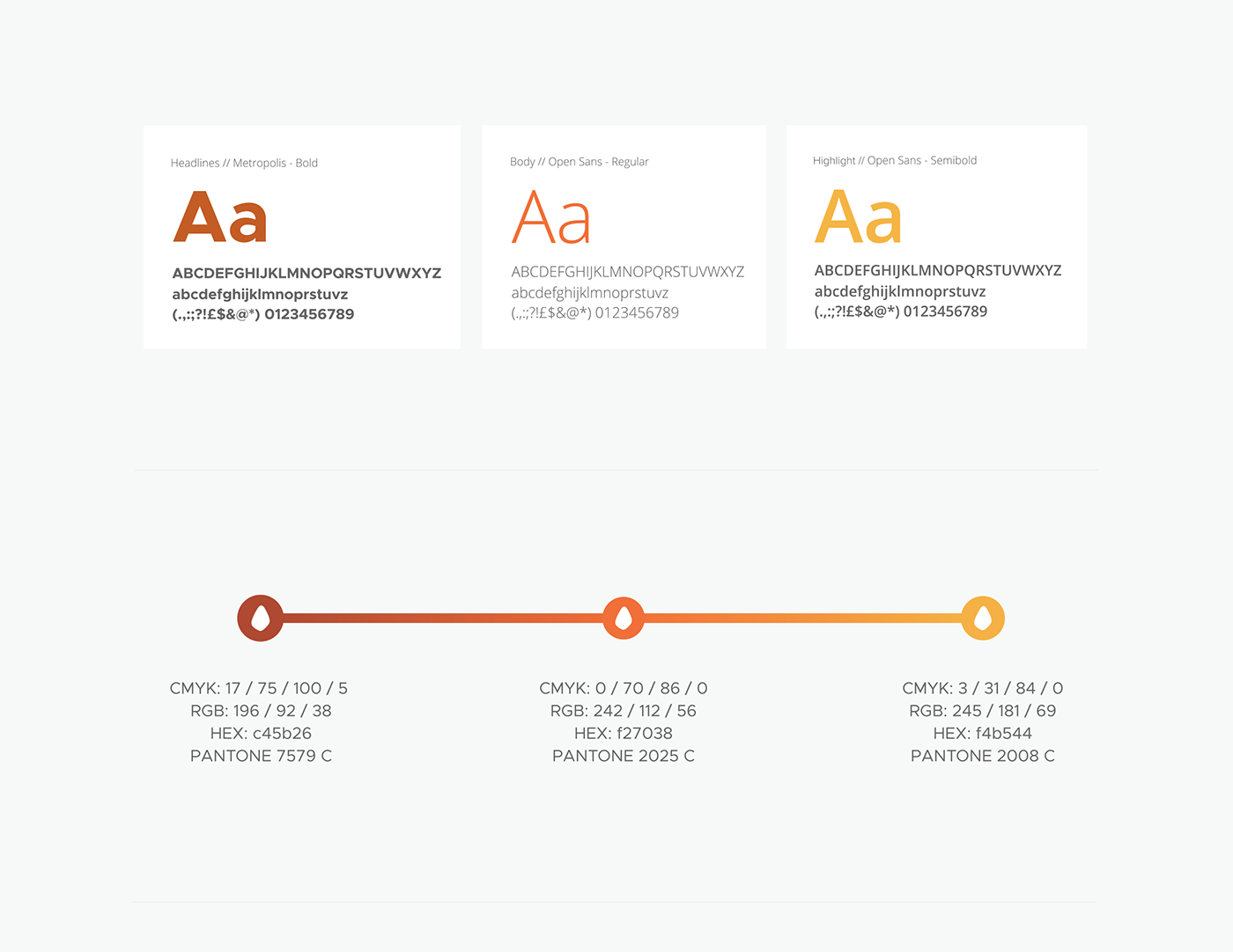
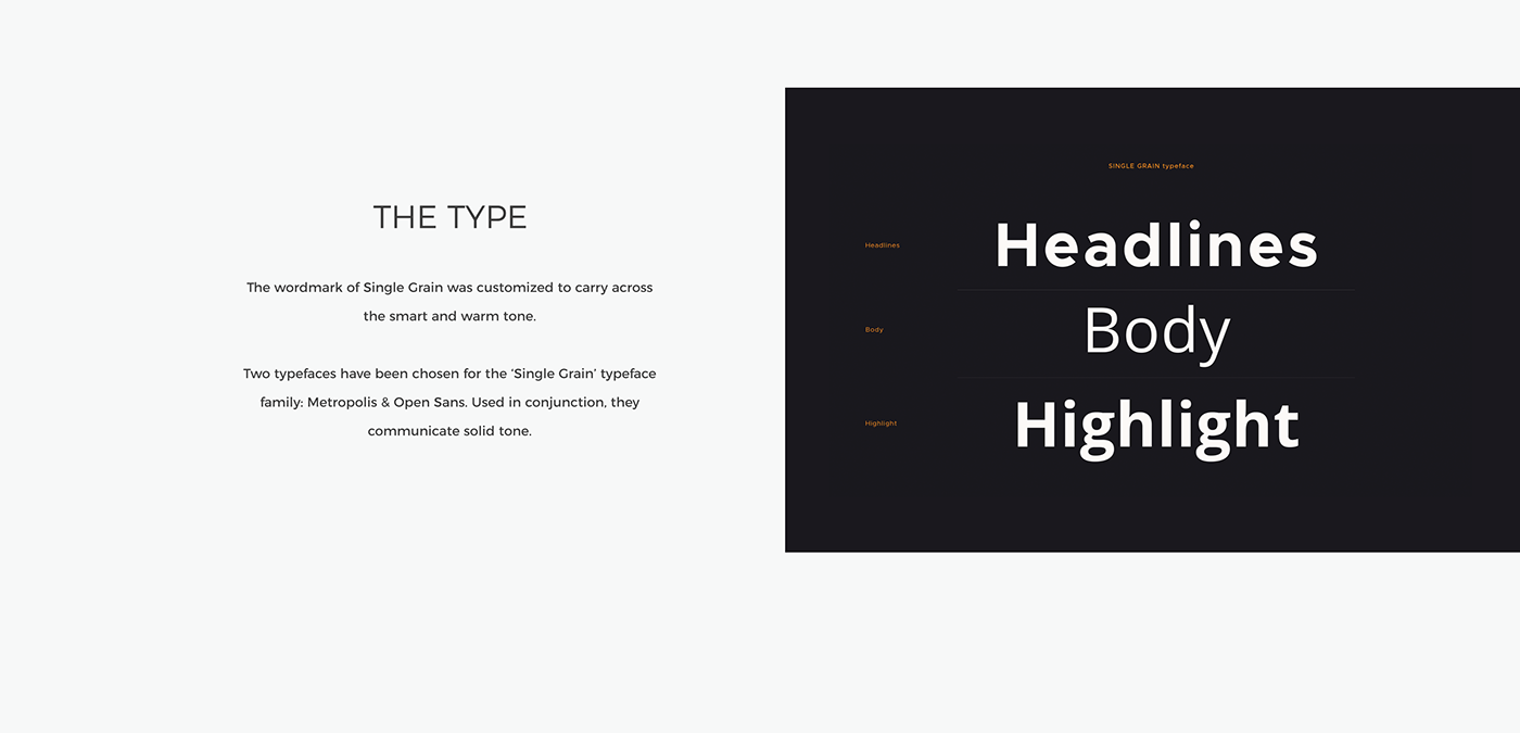
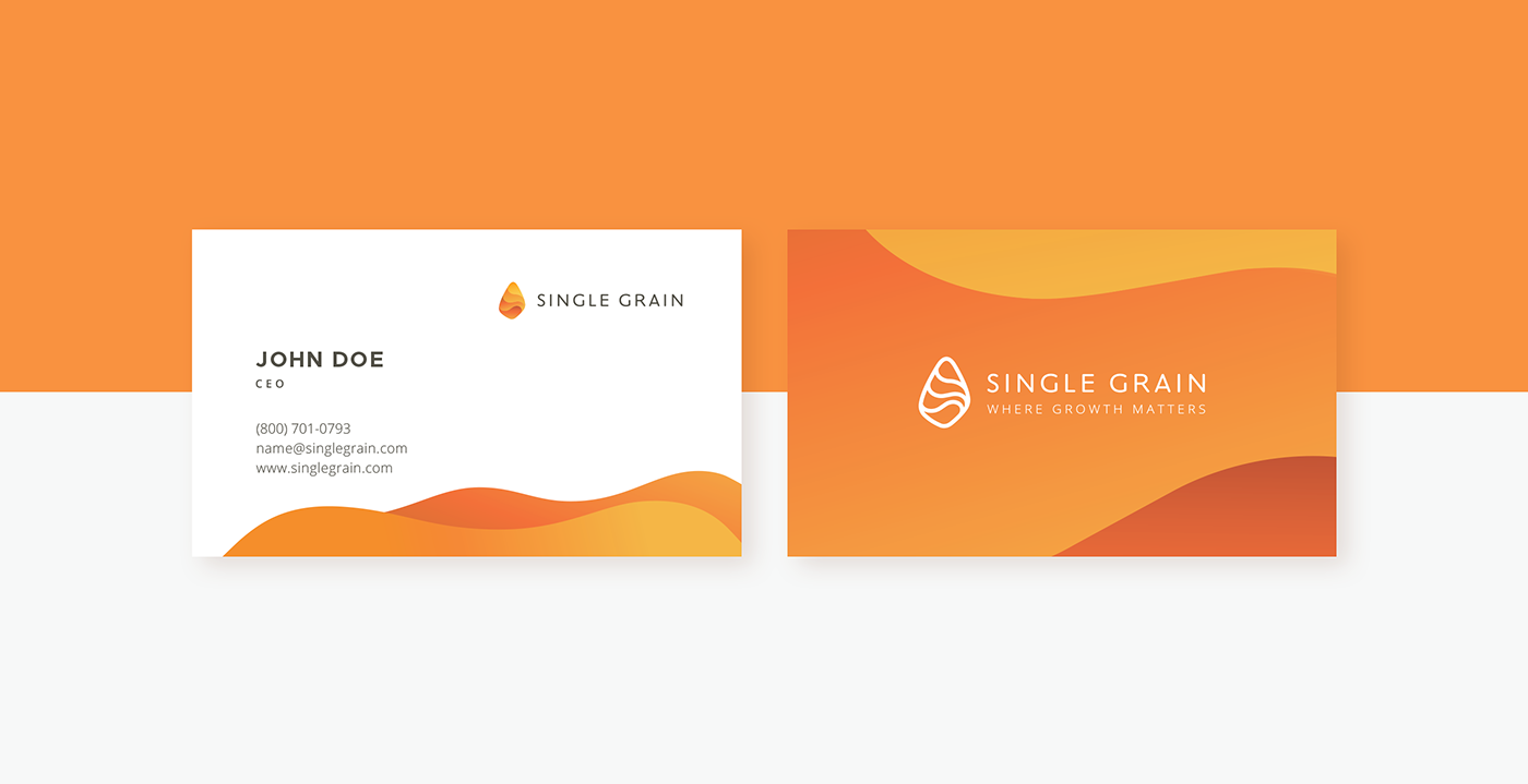
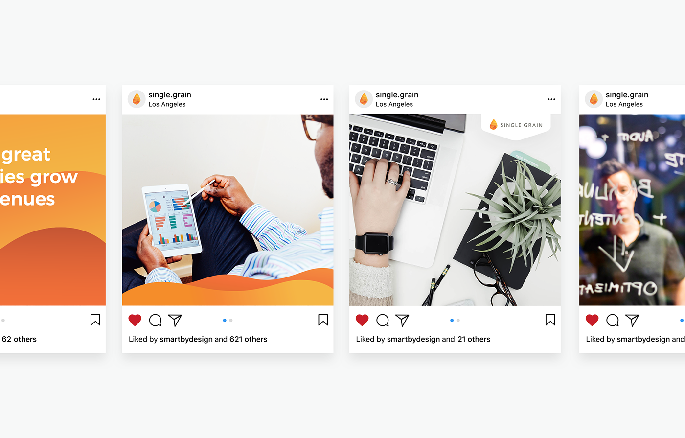
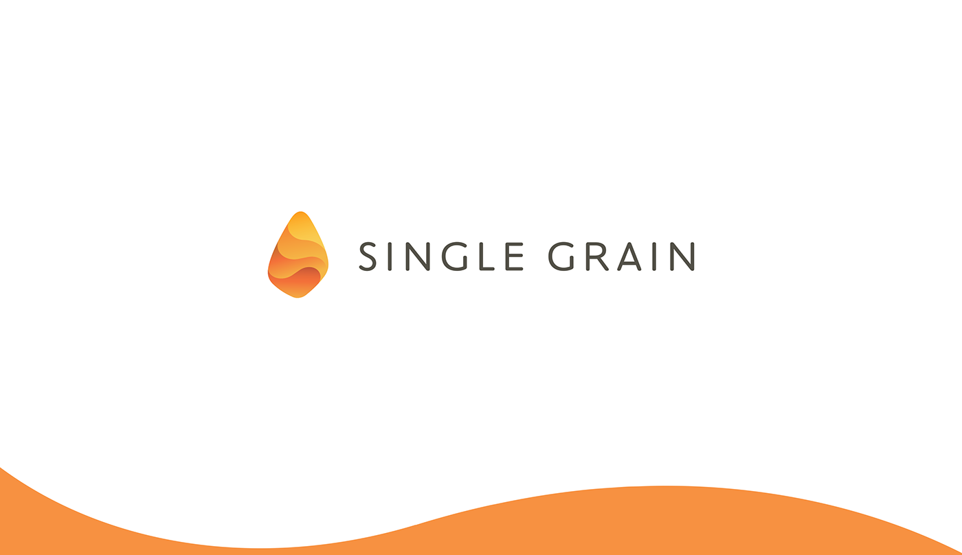
Single Grain is focused around the idea of growth and helping clients to boost their revenues. This design is inspired by grain shape, energy flow, positivity. The style of the icon is bold, features strong brand mark with a vibrant, modern style. In addition, the design symbolically communicates the company title - one (single) grain. ‘Single Grain’ color palette is what creates the brand’s personality. This gave the brand expression a modern update, and an advantage in the market, marking it out as the colorful brand in a sea of mono-chromatic competitors. It also allows the expression to work in a wide array of contexts by creating conversations subtly categorized through color selection.
We’re delighted to see the brand succeed and happy to share the process and outcome with you.
Our Role:
Brand Strategy
Brand Identity System
Art Direction
Brand Guidelines