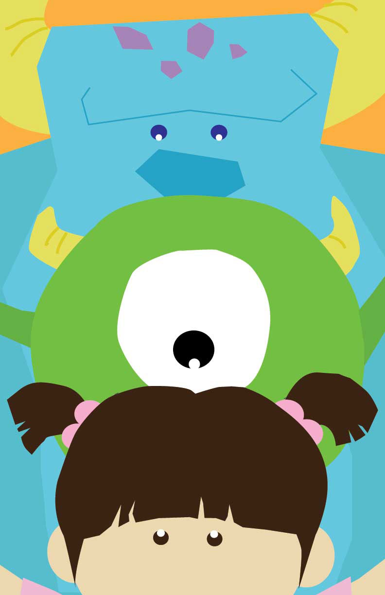
This is a work for my "Style Guide Design" project. My main design was "Monsters, Inc." from the Disney's Pixer movie, so I wanted to make it like cartoon style and target my audience to young kids. I design these graphics that people (company) can use it for , backpacks, pajamas, mug cups...etc.
My objective was to use collage techniques such as in the previous children's book project. From that reason, I decided to use shapes like small kid cut it for my icons. Like I wrote it before, my audience will be small kids, so I made it colorful, but I also tone down each color to make it not too pop. And characters didn't have that much pop color, so I used bright colors in the sub title (text) for accent.
The word "Monster" was key word and also a title of my design, so I put details of each monsters into those and changed the font size. The font that I used for my reference was Helvetica bold. I didn’t want to use too fancy looking font because I thought that will ruin my style. And I think that was successful choice I made.
The challenge thing for me was making three more monster icon. I could have end up with three monster icon and three element icon, but I decided to add more monster icon and get rid of one of my element icon. Because I challenged, my graphics became much more interesting and playful. Also, I had two themes for the pattern. One is for boys, and one is for girls, so I made one light blue and one light red (pink).
Overall I think I did a really great job on the poster. I tried to show their characters by showing their eyes and without drawing mouth. Also the orange perfectly matches to the design. I could have put the text into the poster, but I didn't want to make people's attention too much to that, so I made it simple and clean. For my final consideration, since I finish this project, I liked it very much, but right now I want to redesign it with same "Monsters, Inc." in adult audience