Strains matter
Chr. Hansen is a global bioscience company that develops natural solutions for the food, nutritional, pharmaceutical and agricultural industries. We have had the opportunity to work closely together with the Human Health team to support this very successful and fast-growing business line in achieving their ambitious goals, and in order to do so, we have had both of our key competencies in play – strategy and design.
Due to the massive growth and a plan to enter new markets, the Human Health team saw a need to revisit the essence of the division in order to develop a tool to ensure guidance and common direction in times with many new employees and massive growth.
The visual identity
For us, visual identity is the most powerful expression of strategy, as design, when done right, can amplify and enhance the message significantly. And this project has been no exception. With respect for and with a clear link to the mother brand, we have created a new visual identity for the Human Health division in Chr. Hansen based on their most valuable asset – their strains.
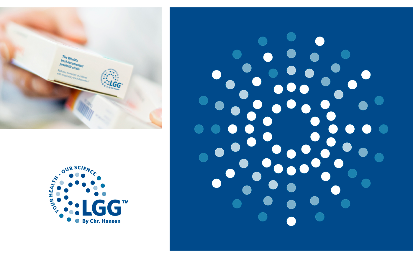
Visual identity element
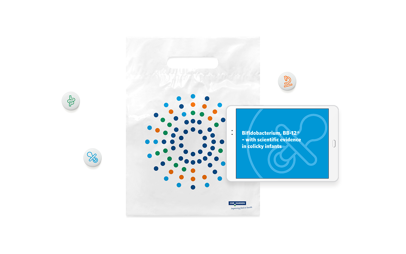
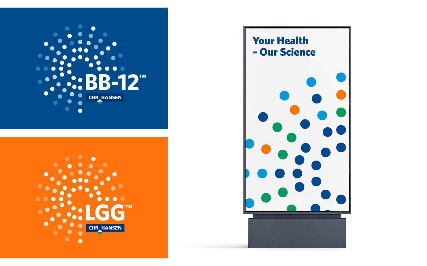
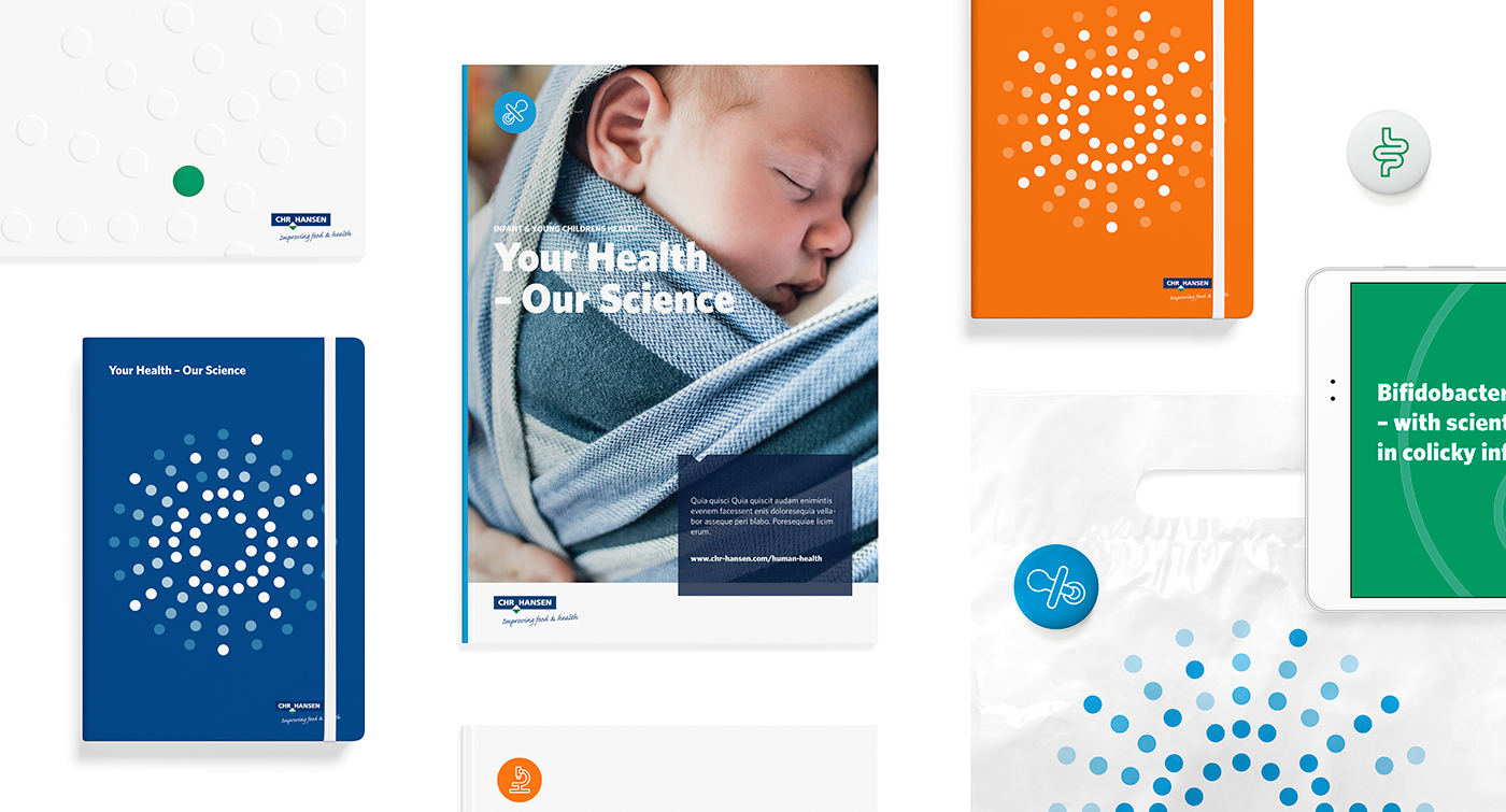
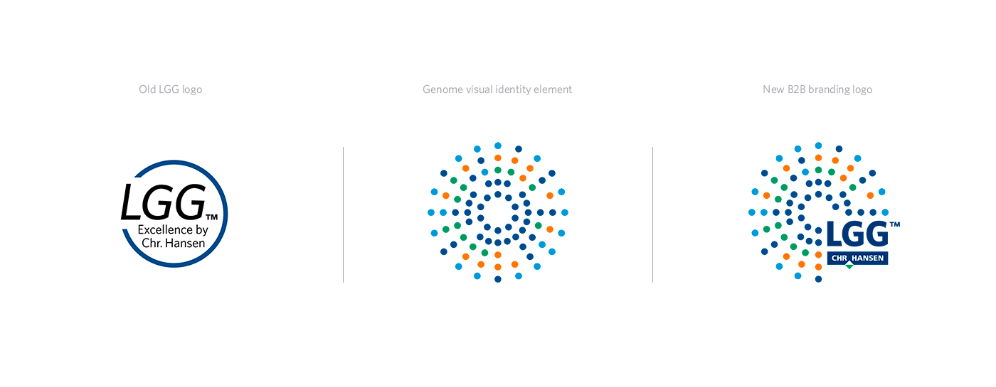
The new visual identity of the new Human Health division builds upon their most valuable asset – their strains. And the key visual element of the new identity is a genome symbol. The shape of the symbol originates from genome sequencing, and the colourful composition of dots in logo blue, logo green, light blue and orange serves as a unique recognizable proprietary graphic element in the Human Health visual identity.
The new visual identity of the new Human Health division builds upon their most valuable asset – their strains. And the key visual element of the new identity is a genome symbol. The shape of the symbol originates from genome sequencing, and the colourful composition of dots in logo blue, logo green, light blue and orange serves as a unique recognizable proprietary graphic element in the Human Health visual identity.

Colours & typography
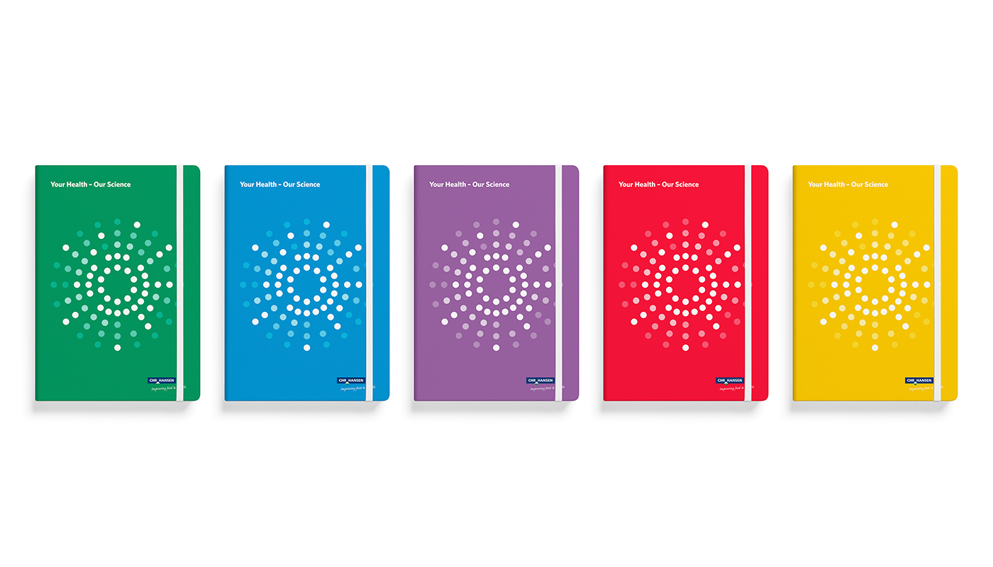
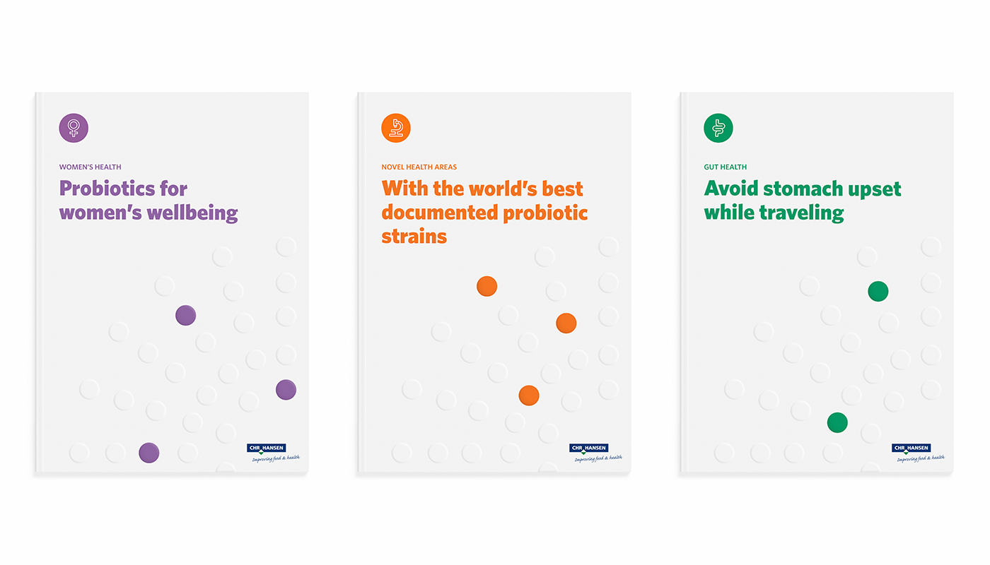
To ensure a close link to the Chr. Hansen corporate brand, the corporate typeface Whitney is also used for the division identity. Furthermore, the colour palette derives from the secondary colours in the corporate identity of Chr. Hansen, while introducing a few new colours such as purple. Each colour is associated with a specific health area, which will help make communication from the specific areas more consistent and recognizable by both internal and external stakeholders.
To ensure a close link to the Chr. Hansen corporate brand, the corporate typeface Whitney is also used for the division identity. Furthermore, the colour palette derives from the secondary colours in the corporate identity of Chr. Hansen, while introducing a few new colours such as purple. Each colour is associated with a specific health area, which will help make communication from the specific areas more consistent and recognizable by both internal and external stakeholders.
Icons
Each health area in Human Health has its own unique drawn category icon, to help determine which health area is concerned. Furthermore, we have created a large icon collection which covers everything from business themes to health and balance. All icons are drawn in a single line and can appear in both Human Health area colours and in corporate colours.
Each health area in Human Health has its own unique drawn category icon, to help determine which health area is concerned. Furthermore, we have created a large icon collection which covers everything from business themes to health and balance. All icons are drawn in a single line and can appear in both Human Health area colours and in corporate colours.