Illustration: Arild Sæther
New visual identity for Synnøve Finden.
Bold, playful and dynamic. Just like Synnøve was.
Bold, playful and dynamic. Just like Synnøve was.

Before and after
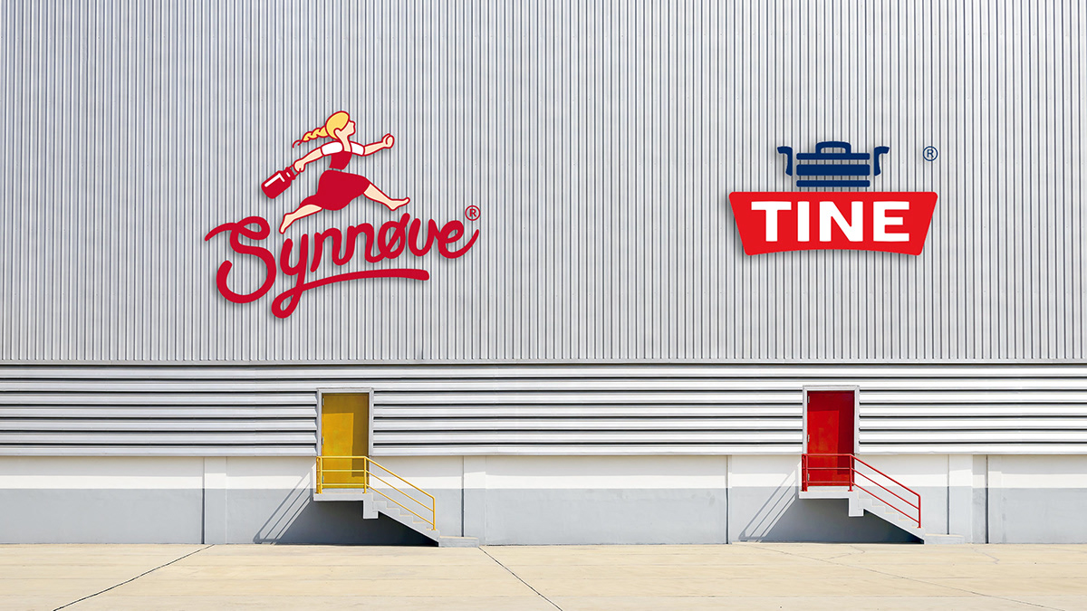
We have developed the new visual identity for the dairy company Synnøve Finden. Synnøve is the largest employer in the small village of Alvdal in Norway. Synnøve also have a facility in Namsos. In total, Synnøve has about 230 employees. Tine SA has over 5,000 employees, and is Synnøve's largest competitor. Synnove's new identity is based on a true story. A girl named Synnøve Finden, born at the small farm Finden on the west coast of Norway, became the dairy category's «first lady». She was ahead of her time and took her education at a time when women did not even have the right to vote. The girl with exceptional drive and courage left the small farm where she grew up and went to school in Stavanger. After having her education she went to the capital Kristiania to try her luck.The girl became a factory owner, together with her partner Pernille Holmen in 1928 and invested in Synnøve Findens Ostefabrikk at Vålerenga in Oslo.

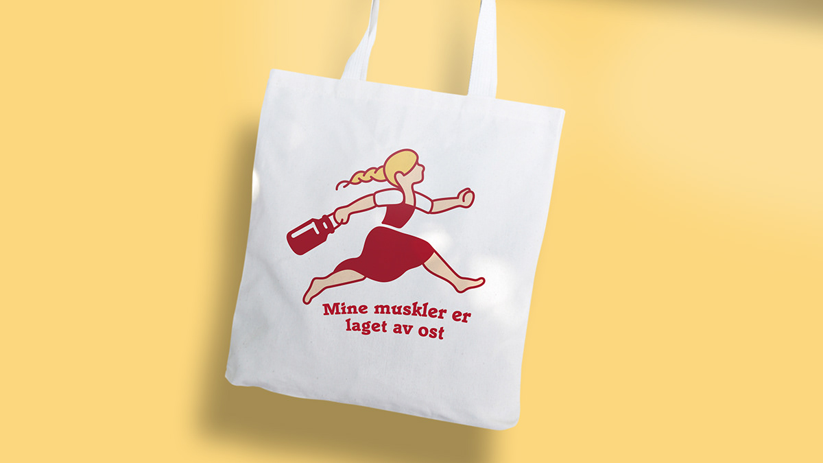
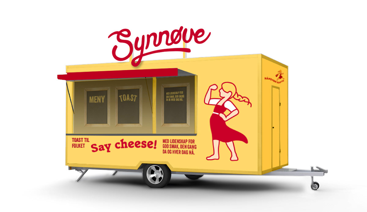
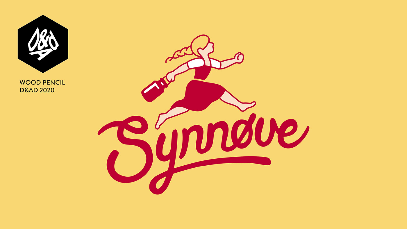
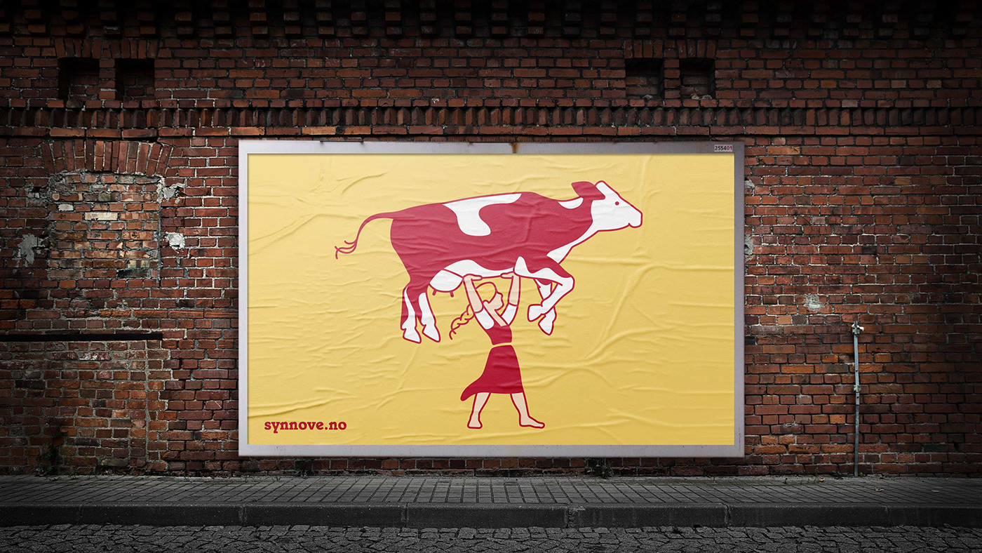
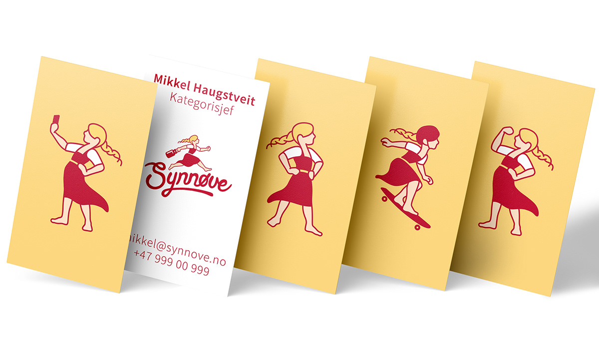
'Synnøve girl' is a living identity element, and the most important characteristic of the new visual identity. She exists in many different poses and is used actively on many surfaces. Everything from promotions, signs and animations.

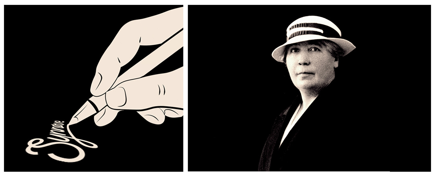
The signature is not authentic, but is inspired by Synnøve's personality. We wanted it to have a distinctive character, be a little unusual and unpretentious. Just like Synnøve herself.


Illustration: Arild Sæther

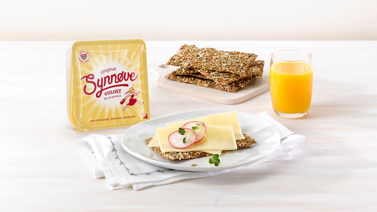
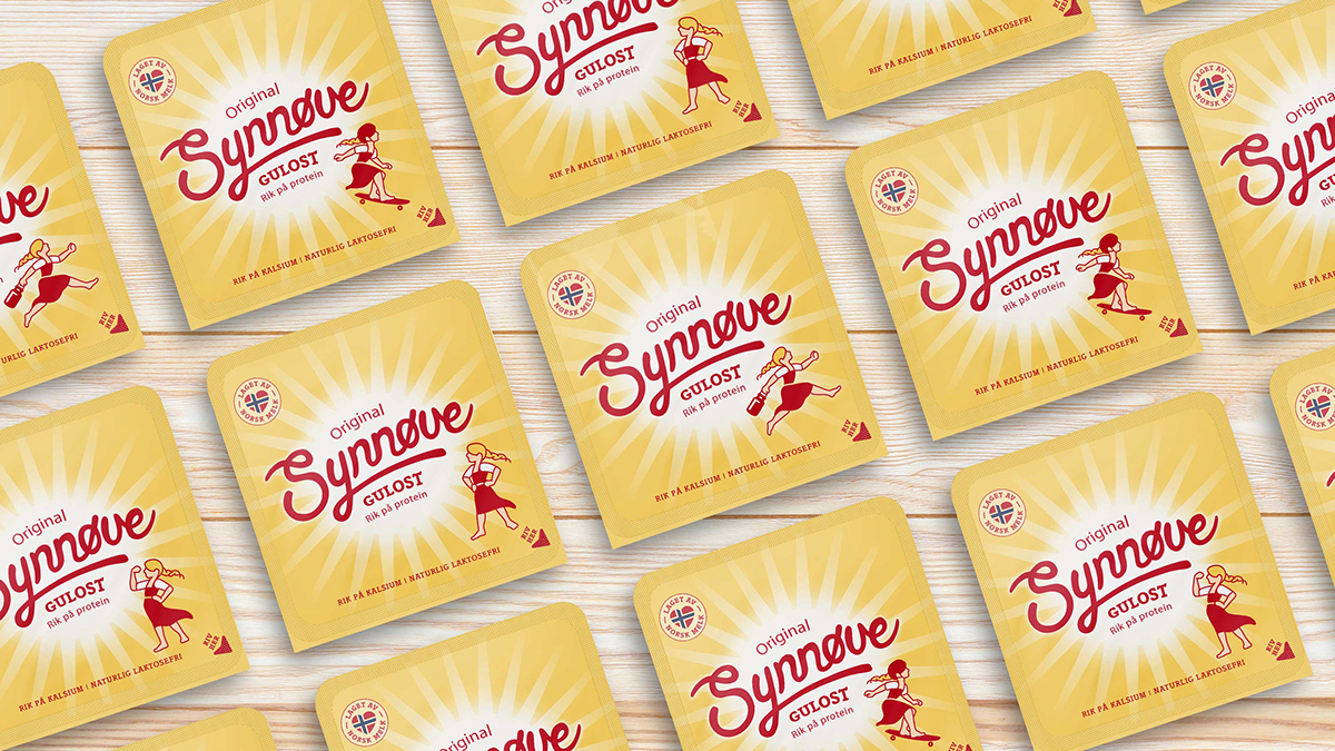
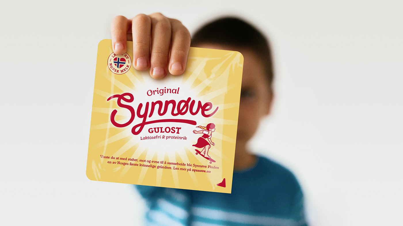
We have redesigned the most important product for Synnøve. Synnøve yellow cheese. In the store you can choose which 'Synnøve figure' you want to bring home.