The Early Intervention Centre (EIC) was founded in 2009, and since its early days, it has been staffed with a team of experienced educators who aim to nurture and provide children with a focused and holistic learning experience. Thanks to a genuine belief that every child can reach their potential no matter the roadblocks, the EIC has become one of the most reputable institutions in Singapore for early childhood special education group programmes. The challenge was to create a new visual identity that could pass on all the values of the school - respect, courtesy, cooperation, partnership, effort - and be a pillar of support in the parents journey.
After studying, researching and thinking a lot, I tried to create a simple – but of deep significance – solution.
Insight: Small big things.
What does it mean?
It means every child has the potential to transform small things into big, beautiful and unimaginable things no matter the roadblocks. EIC will help them in developing their potential whilst understanding and respecting their individuality.
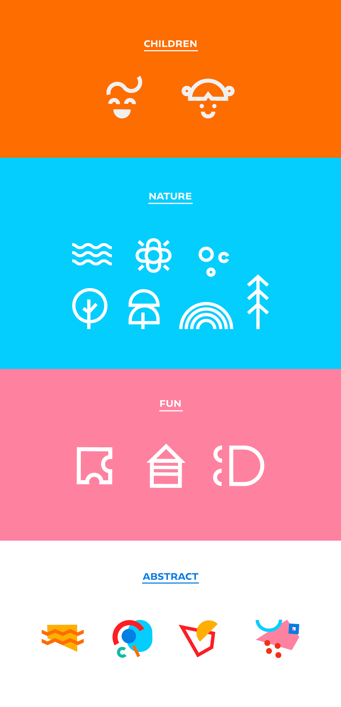
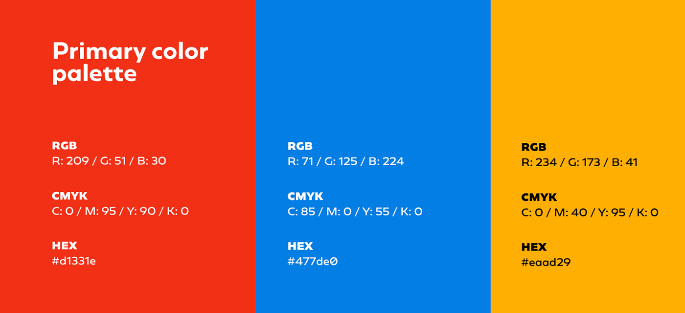
Firstly, the elements of the brand formation are: primary geometric elements - triangle, square, rectangle and circle - and primary colors - yellow, blue and red. These are the starting elements for the creation of multiple things. Infinite possibilities can arise from these colors and elements. The intention is to demonstrate the development of children from the junction of these simple elements and colors. That is, simple things becoming big things. As a consequence, simple elements and colors transform into different things and thus present endless possibilities for illustrations.


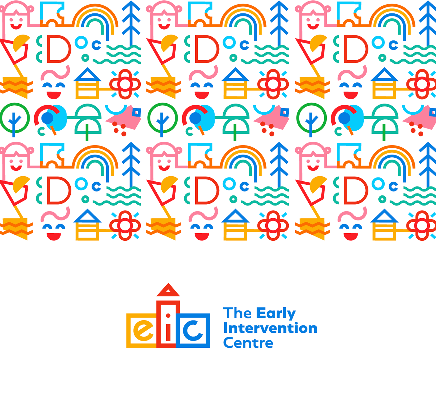
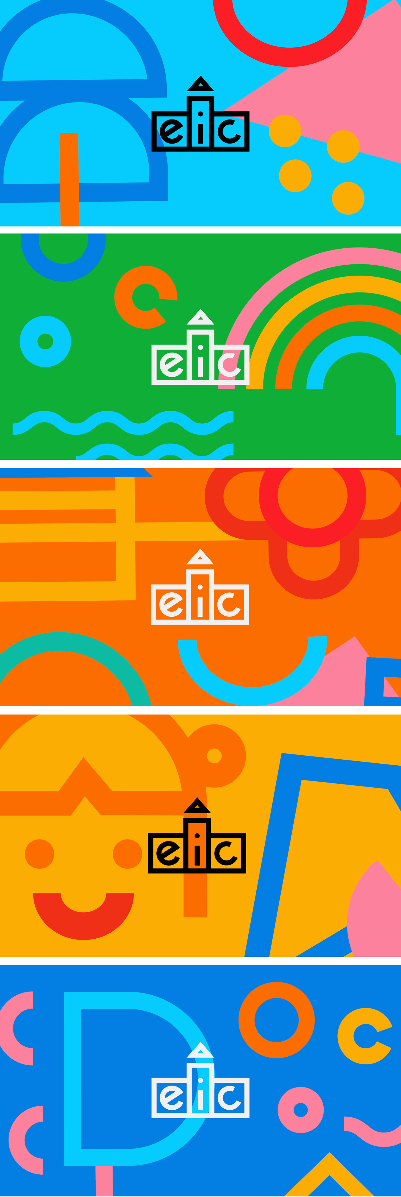
To create the visual identity proposed by the concept, I chose four themes that helped me to compose the support elements.