
М О Л О Д О С Т Ь
Y O U T H
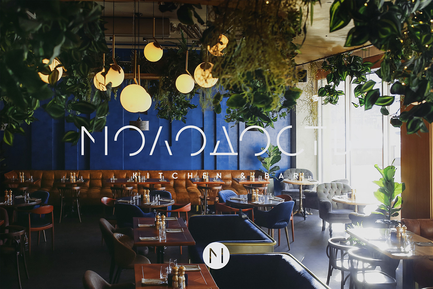
a kitchen and bar in Tyumen', Russia
We were hired to create a full brand identity for an upcoming project which was going to become a significant one for the city. The idea behind the name was to represent a mental and emotional youth, which makes one curious, greedy for life. No matter what the age is.
This is a 'how it tastes' and 'how it feels' place rather than 'how it looks'. It's about real values and pleasures. This is the place for those who, being already established, remain young in their souls.
The key challenge was to represent the idea of youth without being too childish to reach the 30+ audience of the project. A complex and well-balanced visual language was created, featuring the most traditional and conservative dogs whos seriousness was immediately reduced by punky and bright additions (mohawk, chewing gum bubble, etc). Calm yet fresh colour scheme balances the concept without making it over-playful while minimalistic and memorable logotype tightens together all the elements of the brand identity.


Art Director & Designer: Dmitry Gerais
Photo: provided by the client
Made by: the nineteen
restaurant, gastronomics and hospitality branding

Thanks for watching!


