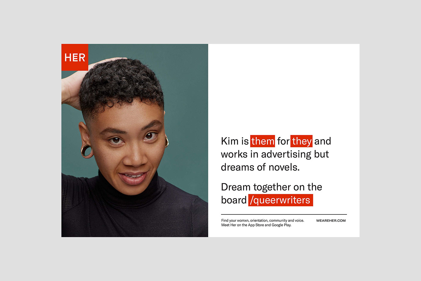
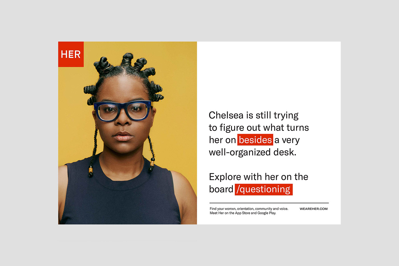
HER is the largest community for lesbian, bisexual and queer womxn to find connections, and themselves. It’s an international app and has 3+ million users actively using it to meet womxn in their area and to discuss topics on community boards worldwide.
Founder Robyn Exton hired me to completely reimagine Her’s brand from the ground up. We began by composing research and insight with strategy team Wolf & Wilhelmine in New York and solidified a plan for who and what Her would be positioned for. From there, I acted as the sole designer and director for a strategically-charged, new creative identity for Her that would allow them build spaces for queer women to connect emotionally, intellectually and sexually for years to come.
This work seeks to create a space where womanhood and queer identity are superpowers, where experience and fluidity leads to growth and where queer women thrive in abundance — of choices, opportunities, and connections. Photographed by Kathryna Hancock.


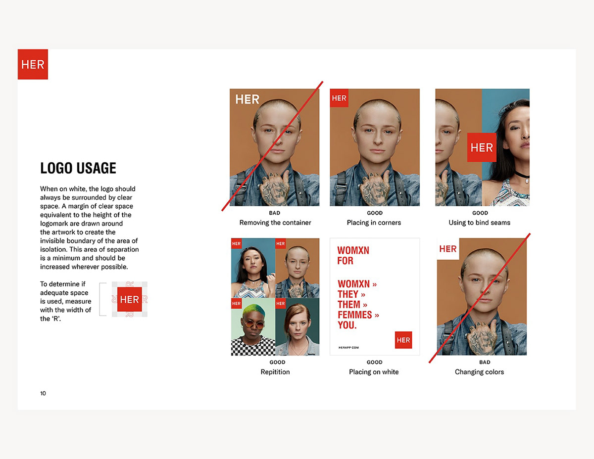
I designed the logo as a symbol of the future being unapologetically fluid. It takes the standard orientation of the center letter, ‘E’, and makes it a symbol of fluidity and expanding possiblity; It asks you to look twice because things are not as they might first appear to be. It's retained in a red, PSA-like badge so that it always speaks as loudly as possible and never becomes shy or apologetic in nature.


The brand’s signature photography is portraiture that employs a rainbow of seamless backgrounds, so when combined they create a spectrum effect of both color and identity. The casting was of real members of the community, no models.


COUPLES PHOTOGRAPHY
It's a dating app; So couples are a real thing created by HER. To capture them, we found and photographed real couples from the community helping us to show that love is love.