Что вы представляете, когда слышите “Женский клуб”?
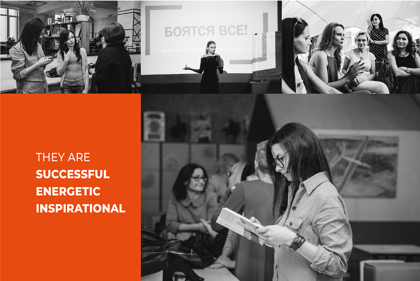
На ум сразу приходят собрания продавцов косметики или курсы кулинарии - устоявшиеся в нашем представлении стереотипы. WE ARE - точно не об этом. В идею клуба заложены самореализация женщины через обмен опытом, вдохновение друг друга, реализация идей, поддержка единомышленниц, поиск новых возможностей и веры в себя. Это успешные женщины, которые готовы делиться опытом и знакомиться с такими же.
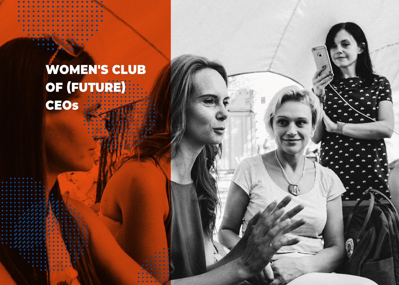
We ARE - женский клуб (будущих) СЕО.
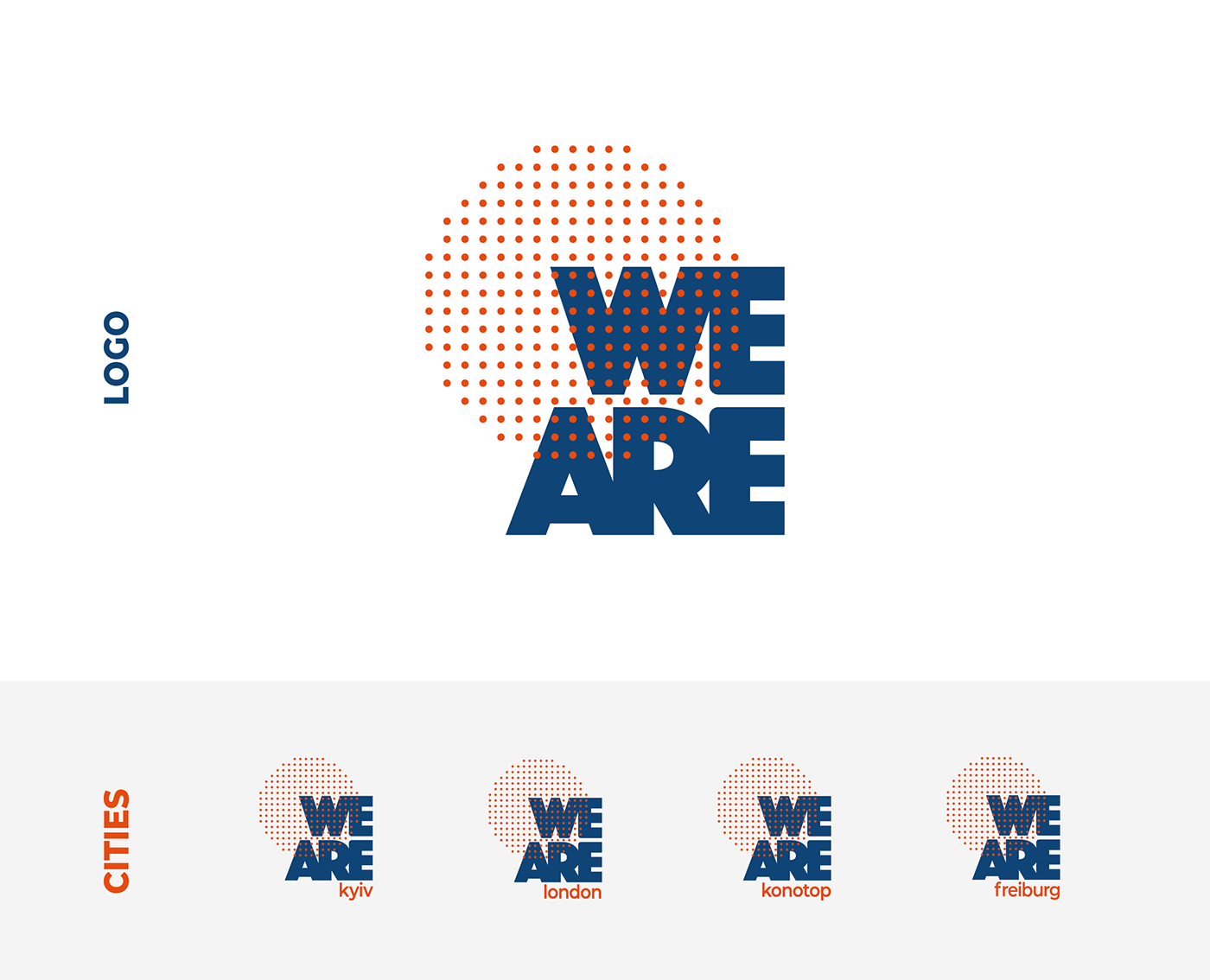
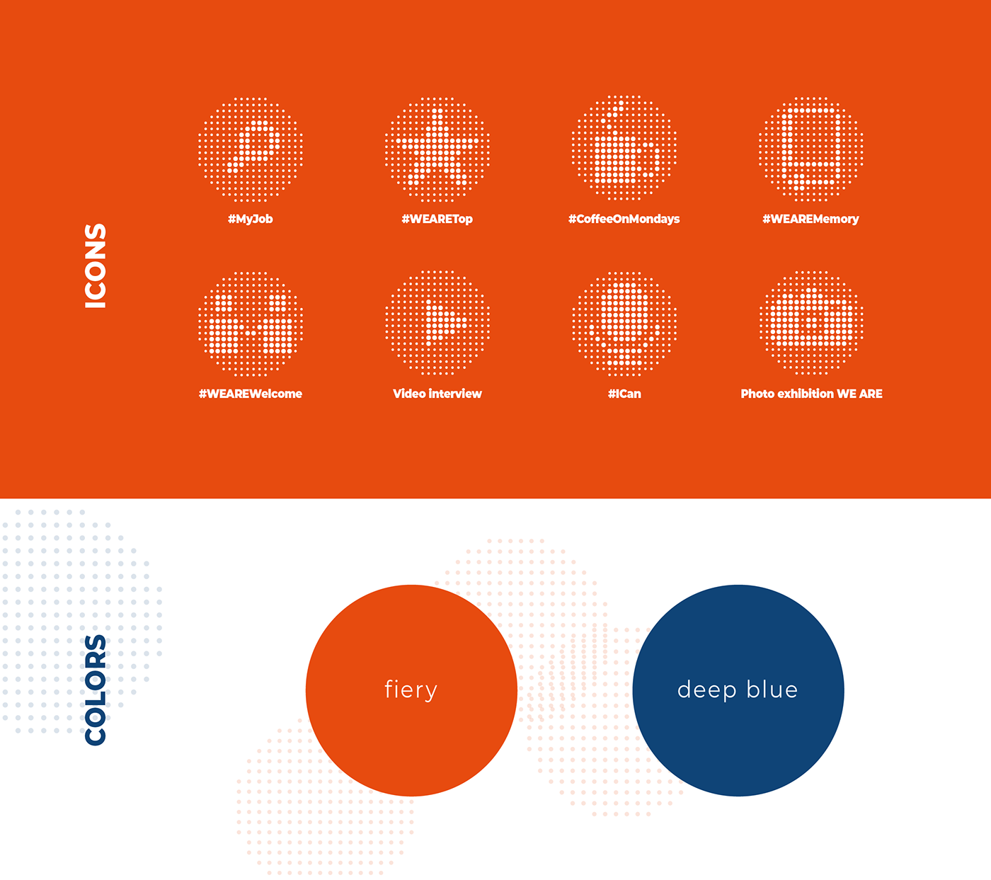
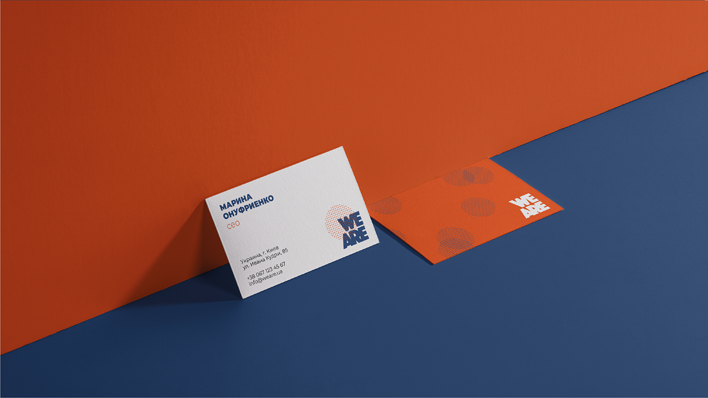
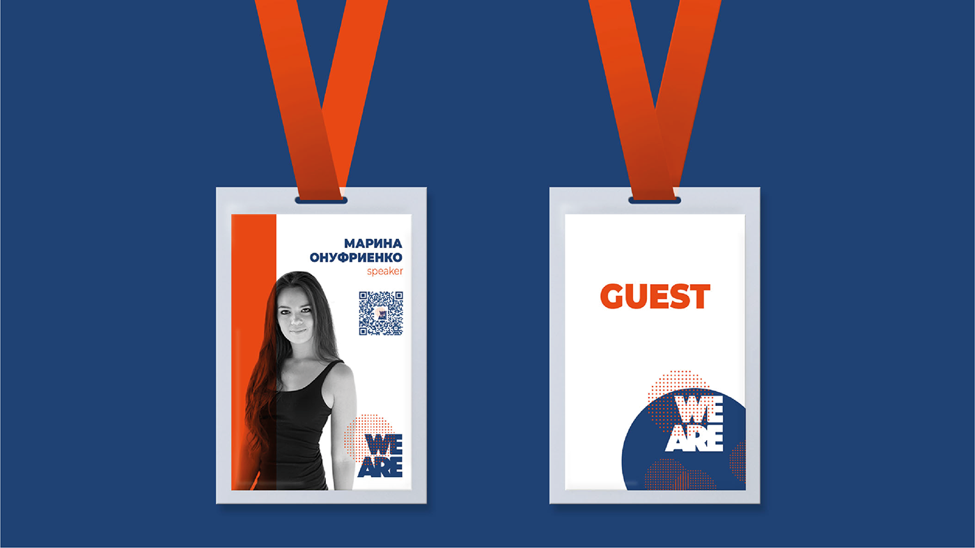
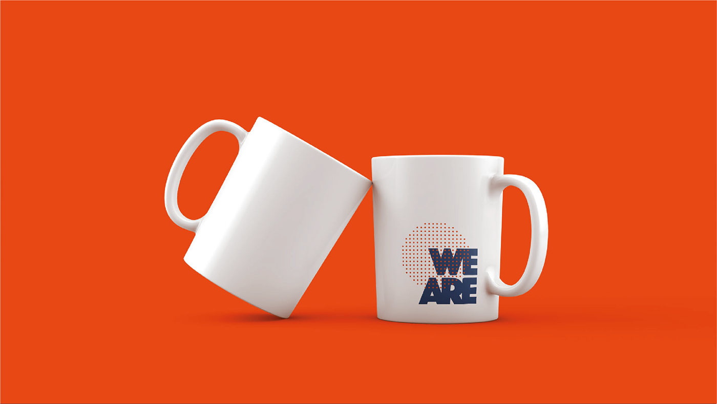
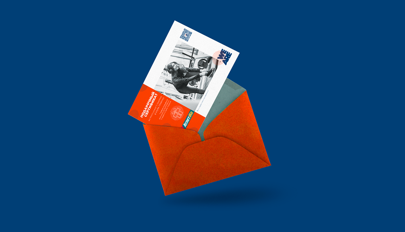
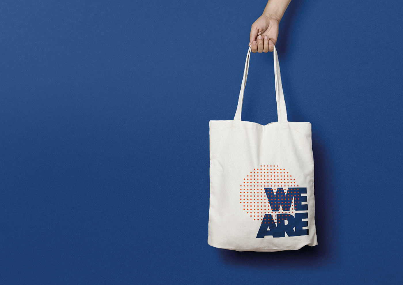
Логотип клуба символизирует единство и целостность его представительниц. В основе - они - сильные женщины. А для того, чтобы выстроить ассоциативный ряд с СЕО и бизнесом, было принято решение провести параллель с образом круглой печати. Эта часть логотипа и стала основой айдентики, которая формирует фирменные паттерны и образует пиктограммы для различных направлений работы сообщества. За 8 месяцев к клубу присоединились девушки и женщины с 7-ми стран мира в 14-ти городах. Так, организация, за короткий период времени, вышла на международный уровень и продолжает расти.
WE ARE - это движение, стиль жизни и залог успешности.
What do you imagine when you hear “Women's club”?
The first thing to cross your mind could be a bunch of cosmetic company representatives or cooking courses attendants - the established in our world stereotypes. WE ARE — is something out of the box. The idea of women’s self-realization through experience exchange, mutual inspiration, implementation of the ideas, mindful support, finding new opportunities and believing in yourself is underlying the creation of this club. These are the successful women ready to share their experience and get acquainted with the others who carry the same values through their lives.
WE ARE is the club for (future) females-CEO.
WE ARE is the club for (future) females-CEO.
The club's logo symbolizes the unity and integrity of its representatives.
In their core they are strong women. And in order to build an associative array with CEO and business, it was decided to draw a parallel with the image of a round stamp.
This part of logo became the basis of an identity, which forms the signature patterns and shapes of icons for different areas of the community operations. Over a period of 8 months, girls and women from 7 countries in 14 cities joined the club. This organization managed to reach the international level in a relatively short time and continues to grow.