Théâtre de Belleville
Season 2018-2019
—
—
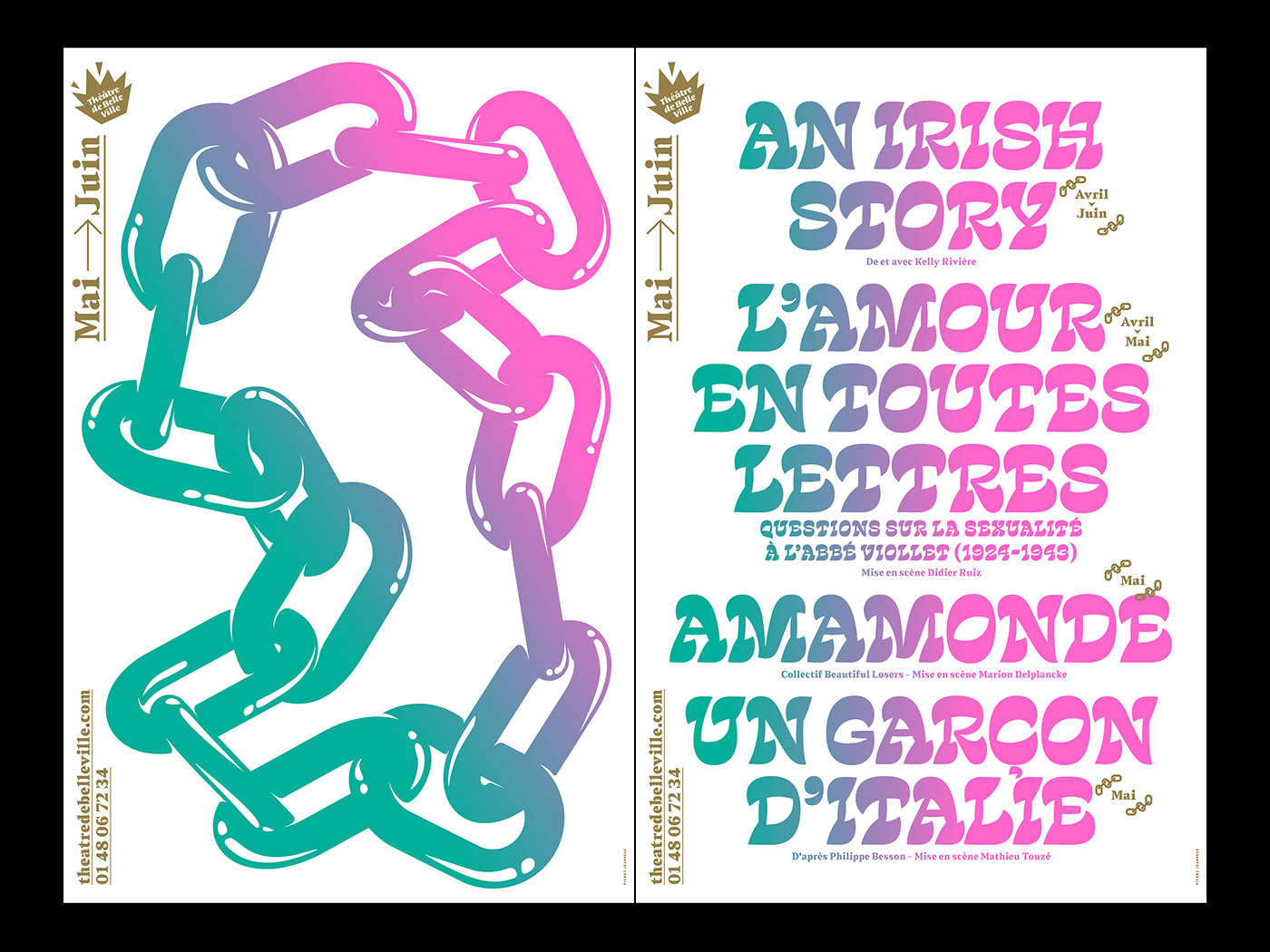
The new visual identity of Théâtre de Belleville last Season is built
around 5 illustrations displayed in Paris between September and July.
Each design stays for 2 months, and comes with a typographic
poster presenting the shows of the moment. The fonts were chosen to create
the best harmony with the illustrations of the temporality. Each poster is printed
in Pantone colors on a 70 cm x 100 cm and 40cm x 60cm on matte offset paper.
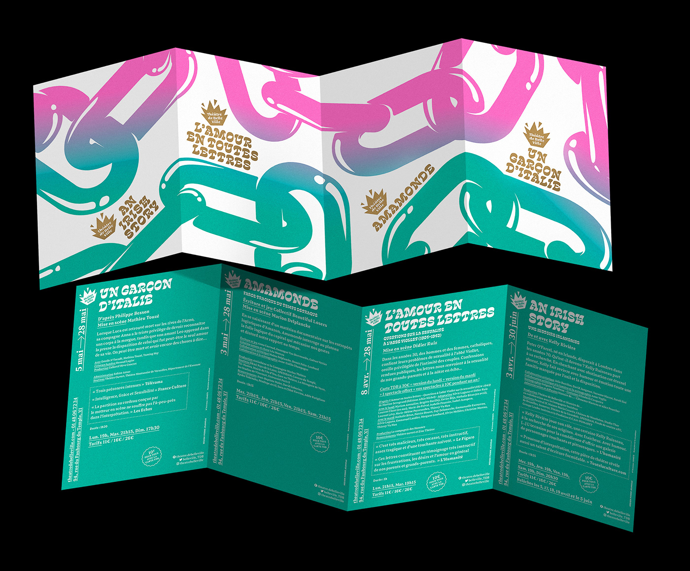
The theater program can be separated in 4 different flyers, printed on both sides.
The visual link between illustration and typography is strengthened
by 5 unique color gradients for each period.
Foundries
Out of the Dark - Dinamo - Ohnotype - Contrast Foundry
Théâtre de Belleville
Saison 2018-2019
—
La nouvelle identité visuelle de la Saison 18-19 du Théâtre de Belleville
—
La nouvelle identité visuelle de la Saison 18-19 du Théâtre de Belleville
se construit autour de 5 illustrations diffusées entre Septembre et Juillet.
Chaque visuel s'installe pour une période de 2 mois, accompagné d'une affiche typographique annonçant les spectacles de la temporalité.
Les typographies sélectionnées sont choisies afin d’entrer en résonance avec le visuel.
Chaque affiche est imprimée en 3 tons direct au format 70x100, 40x60,
Chaque visuel s'installe pour une période de 2 mois, accompagné d'une affiche typographique annonçant les spectacles de la temporalité.
Les typographies sélectionnées sont choisies afin d’entrer en résonance avec le visuel.
Chaque affiche est imprimée en 3 tons direct au format 70x100, 40x60,
et en programme détachable en 4 flyers recto/verso individuels.
Le lien visuel entre l'illustration et la typographie en regard
Le lien visuel entre l'illustration et la typographie en regard
s'effectue grâce à un jeu de 5 dégradés propre à chaque période.
Fonderies
Out of the Dark - Dinamo - Ohnotype - Contrast Foundry
Fonderies
Out of the Dark - Dinamo - Ohnotype - Contrast Foundry