

free for personal use. purchase only for commercial purposes
download link at the end of the project
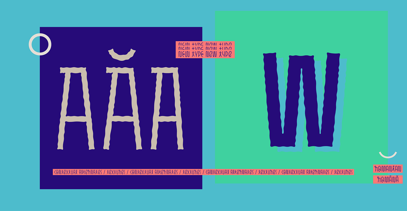
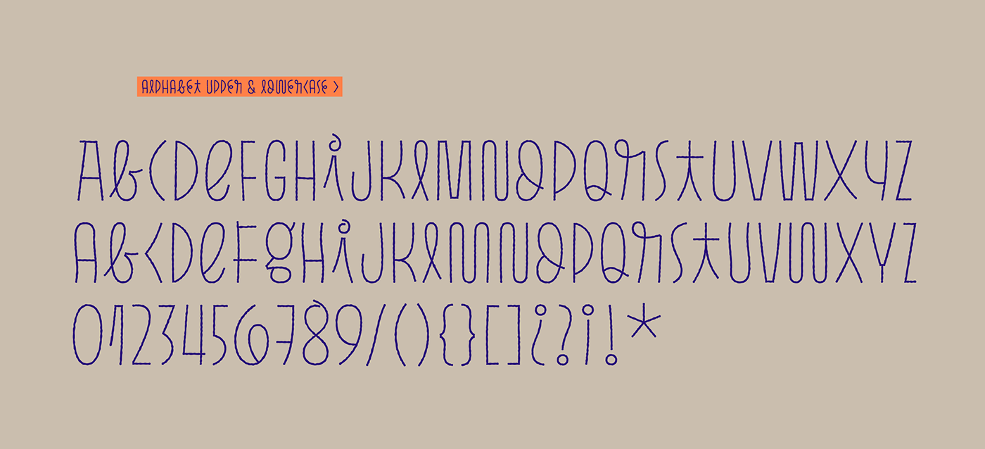
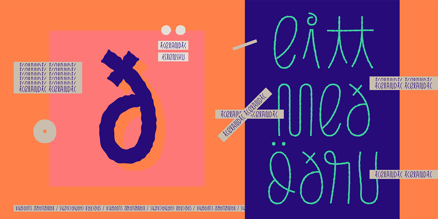
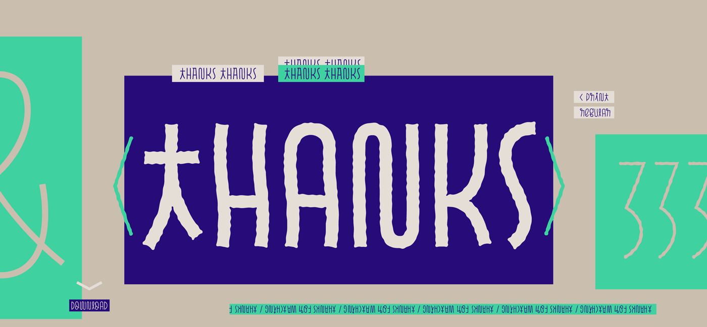
Pasto is a fun and charming display type family of two styles and four weights each.
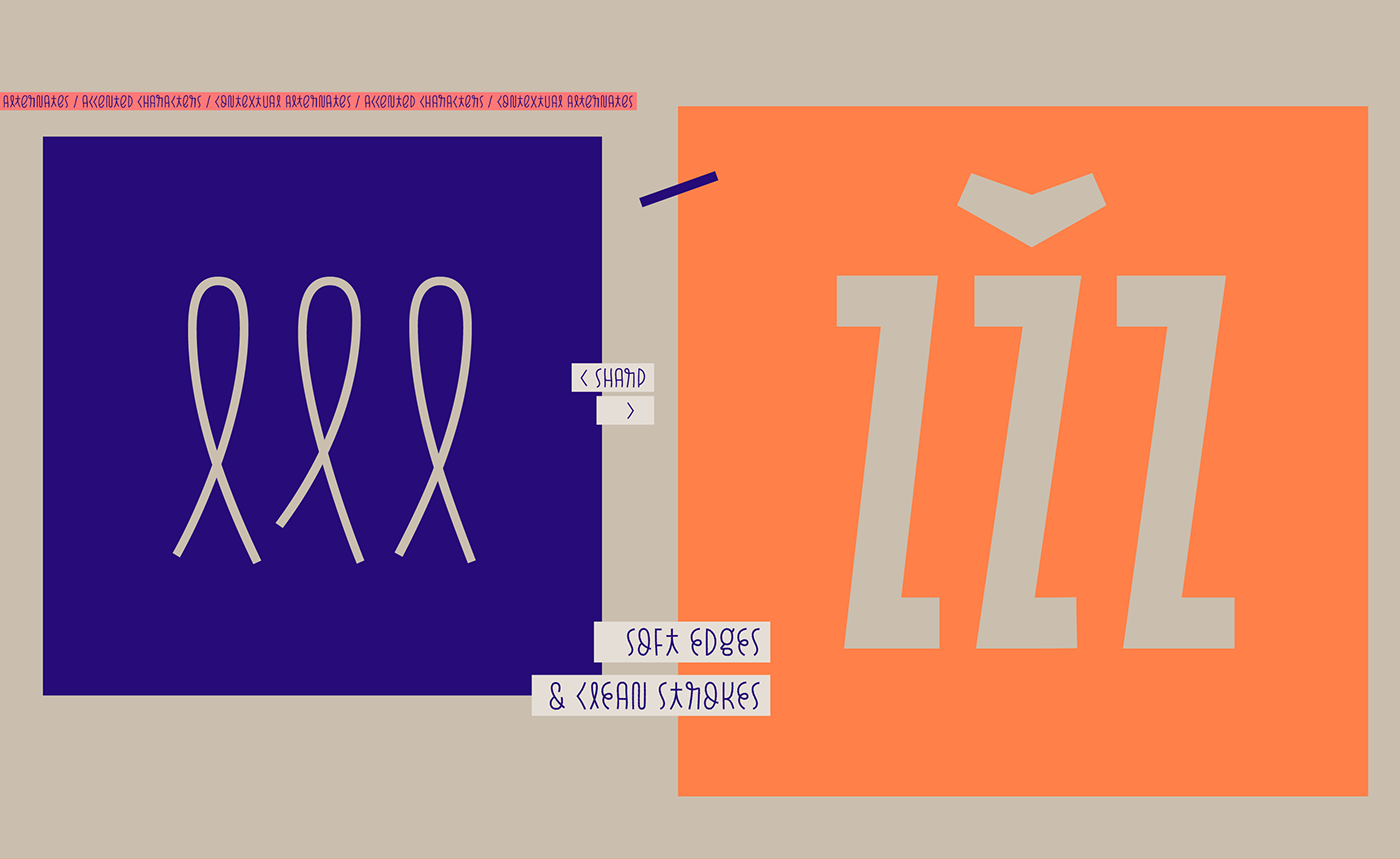
The first one, Print, is a textured irregular stamp style, and Sharp is a straightforward soft-edged type with
clean strokes.
As the name Pasto suggests ("Grass"), this typeface has natural shapes such as curves, curls, and confident but
delicate lines, making it playful yet strong. Going from Thin to Bold and from Print to Sharp, Pasto takes the
different sizes and textures in grass and translates them into different rhythms.
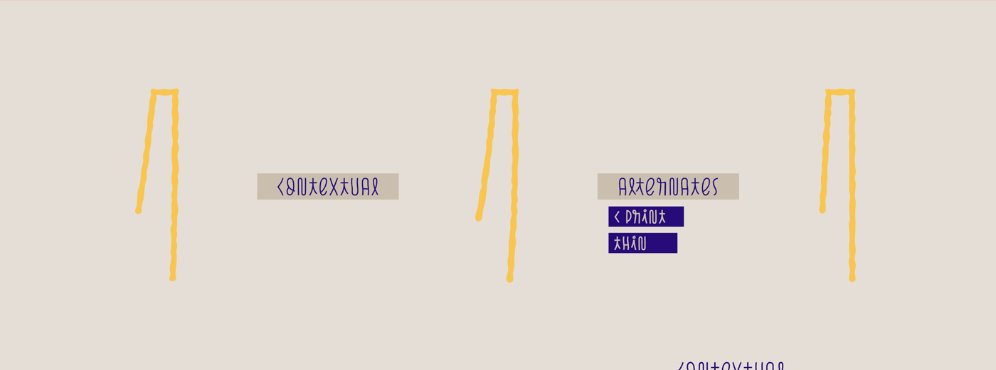
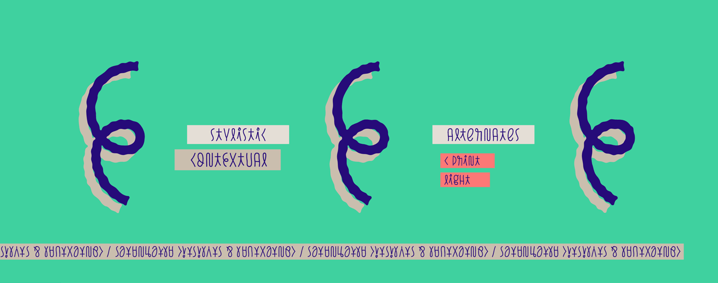
With developed OpenType Contextual Alternates, this type family provides three alternating alphabets that are
automatically replaced in turn repeatedly to avoid the same letterforms and textures appearing next to each
other, once more referring to its natural uniqueness inspiration.
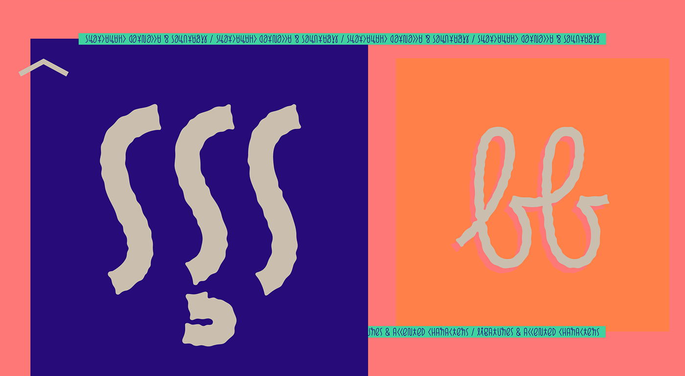
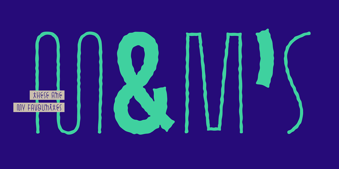
Ligatures are available for specific character combinations, to improve the overall look of the word or sentence.
Ligatures are available for specific character combinations, to improve the overall look of the word or sentence.
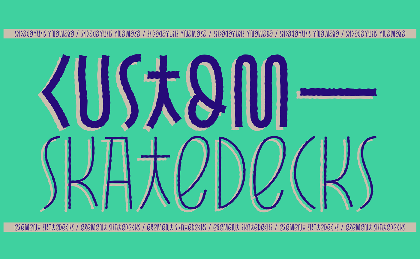
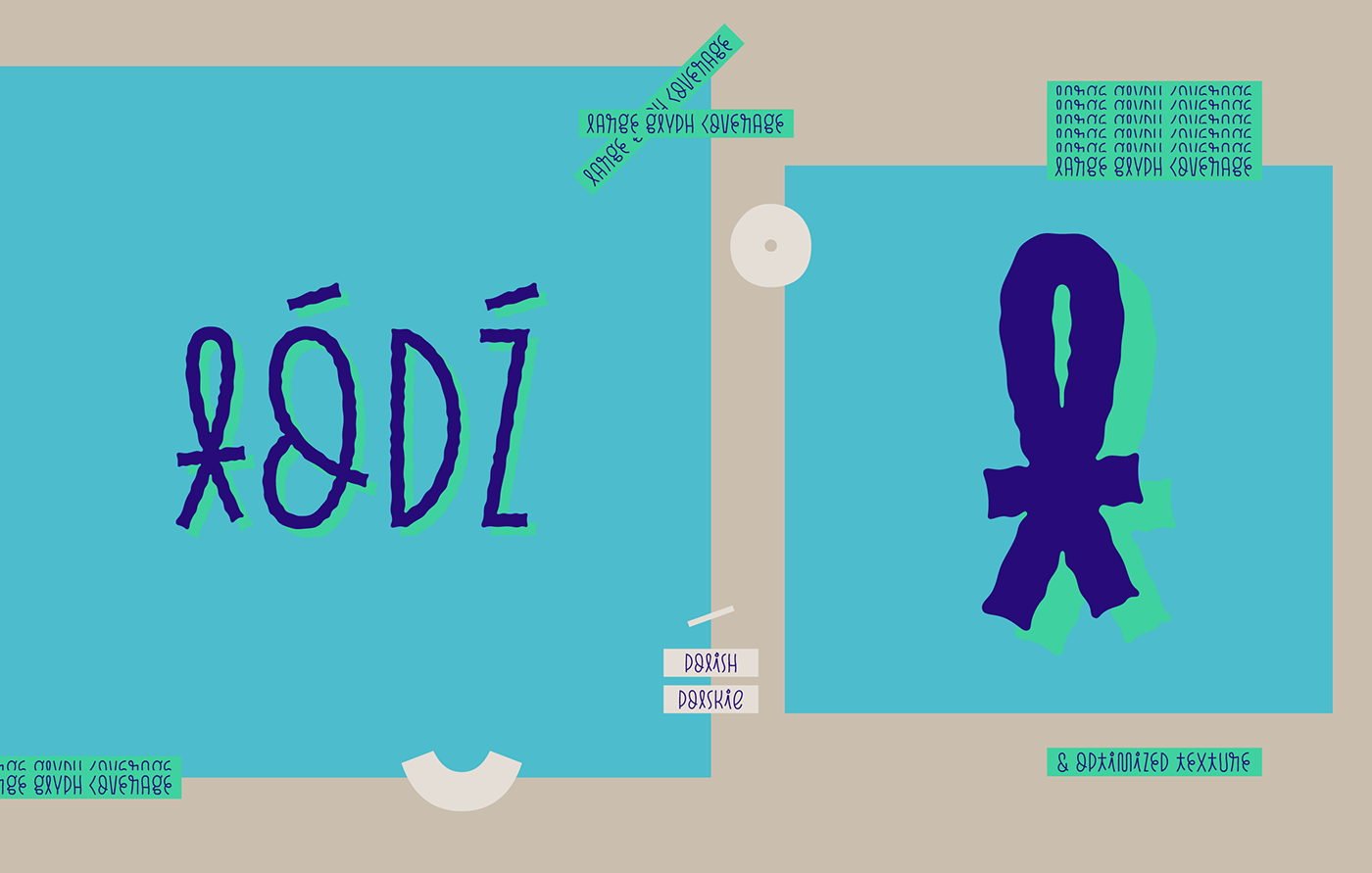
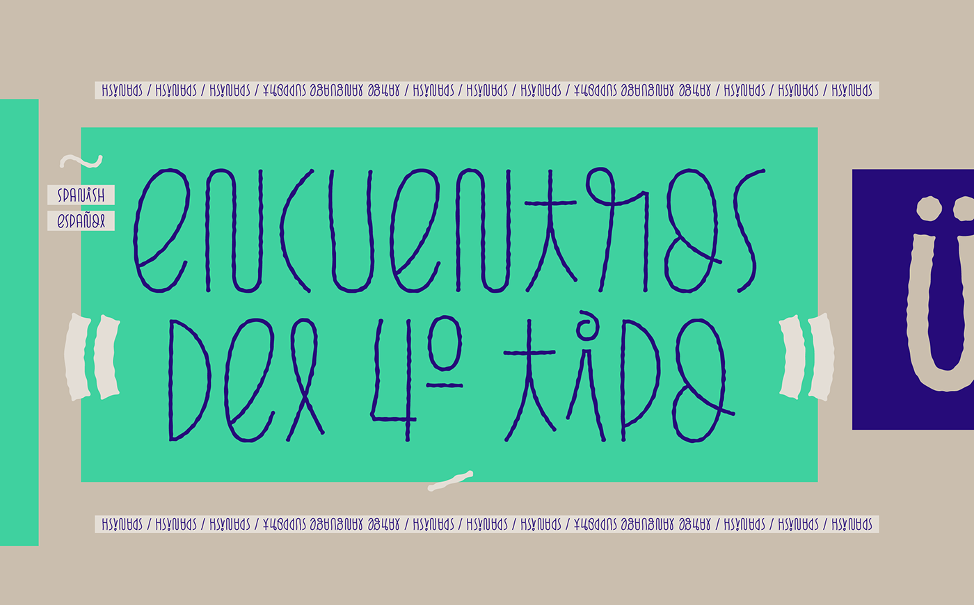
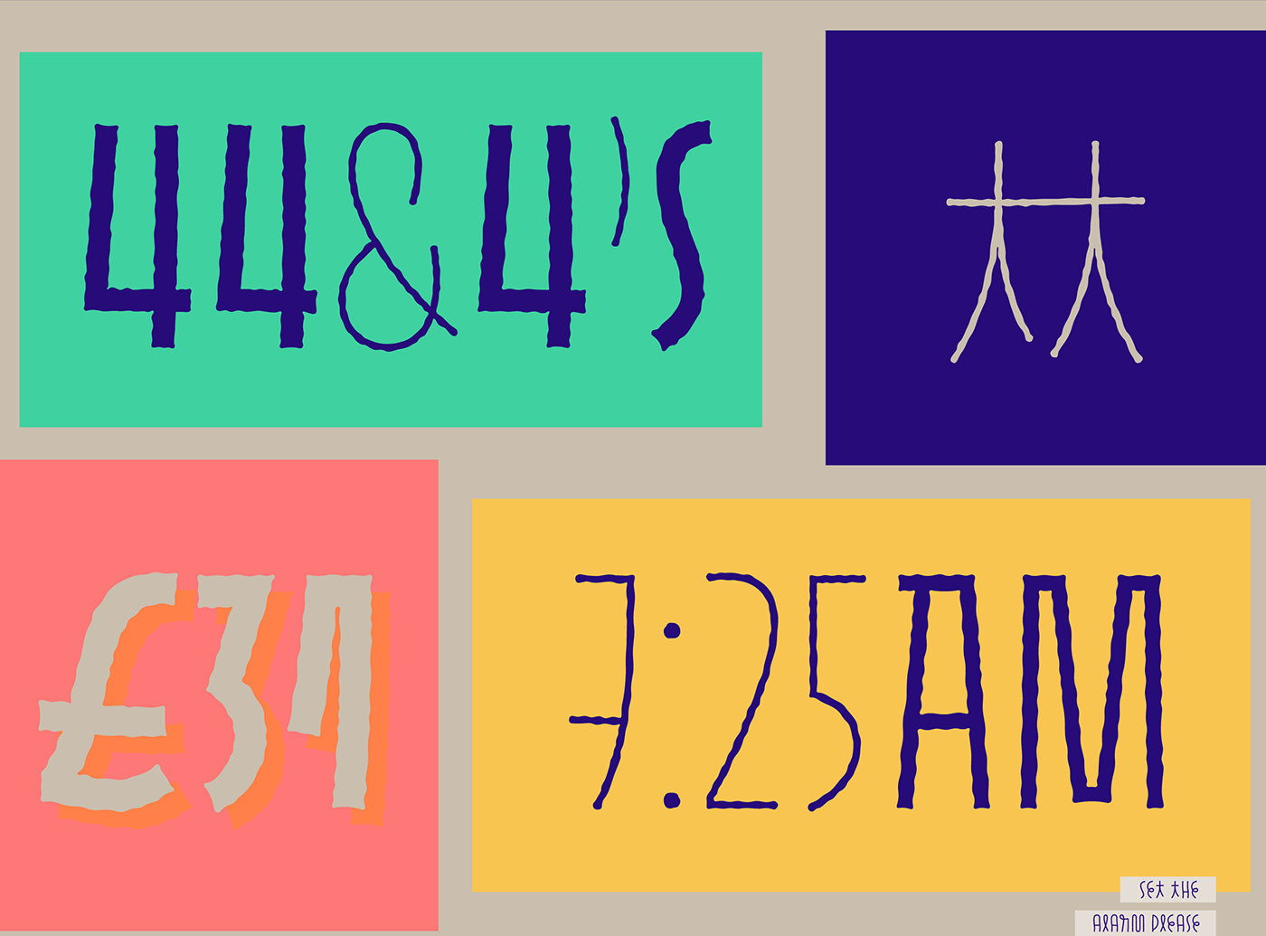
Perfectly suited for graphic design and any display use, Pasto has very large language support allowing users to
write in English, Spanish, Italian, French, German, Polish, Czech, Icelandic, among many others! Special
characters and currency symbols are also available.
Whatever the project, Pasto will step-up the game!
commercial licenses available at the following links:
MYFONTS / FONTSPRING / FONTS.COM / FONTSHOP / YOUWORKFORTHEM
Designer: Julia Martínez Diana
Design Date: 1st October 2018 - 14th May 2019
Release Date: 21st May 2019
Publisher: Antipixel
Imagery design: Julia Martínez Diana
Design Date: 1st October 2018 - 14th May 2019
Release Date: 21st May 2019
Publisher: Antipixel
Imagery design: Julia Martínez Diana


free for personal use. purchase only for commercial purposes
gratis para uso personal / comprar solo por motivos comerciales.
commercial licenses available at the following links:
MYFONTS / FONTSPRING / FONTS.COM / FONTSHOP / YOUWORKFORTHEM
thanks for watching!

