The Challenge
We were approached by ECHOtape, a large North American commercial tape manufacturer, to refresh their brand identity and package design. They are family run and have been producing specialty tapes for the manufacturing and construction industries for over 45 years. As with many heritage brands, ECHOtape felt their branding had become outdated and disjointed. Above all, they needed a fresh approach to their brand identity that would highlight the core values that had helped their company grow.

Our Approach
Because of ECHOtape’s long history, our strategy was to leave the core elements that have strong brand recognition and focus on the way they were implemented. We took all of the disjointed pieces and transformed them into a cohesive visual system with clear rules for easy execution. The system included refined typography, a signature icon set, and signature photography styles that highlighted the products and people of ECHOtape.


Package Design
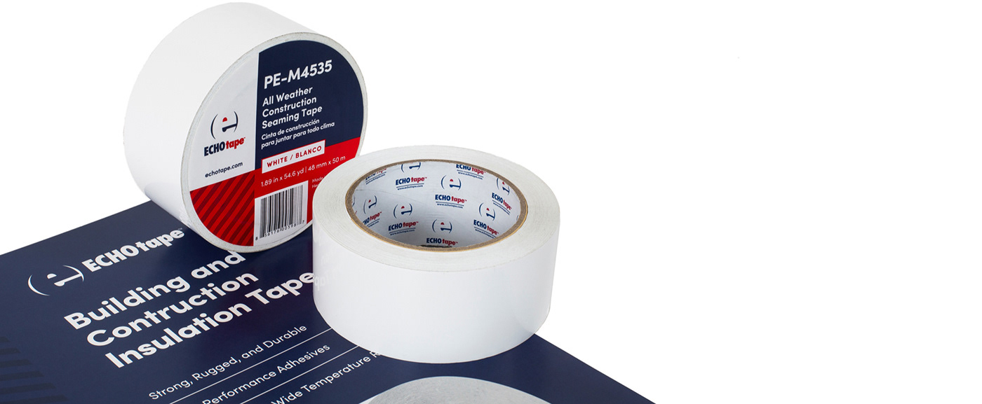
ECHOtape’s package design was a key element of the brand refresh. As one of the industry’s leaders for innovation, they needed packaging that accurately reflected the quality of their products.
In order to achieve this, we redesigned the tape labels to be clean, modern and very legible. An emphasis was placed on hierarchy and making the product information more digestible. Furthermore, we developed a modular system that had the flexibility to handle all of the content variations across ECHOtape’s product lines. This made the production of the new labels very efficient and cost-effective.


