The Challenge
Safesite launched in 2014 with a goal of making construction and heavy industries safer through their mobile app. Like many startups, they started with a placeholder brand identity that was never intended to be a long-term solution. That’s where Grant Burke came in. We were tasked with refreshing the existing visual system to bring it up to standards with their revolutionary product. One of the big challenges was to make the branding appealing for both the construction end-users and tech investors.

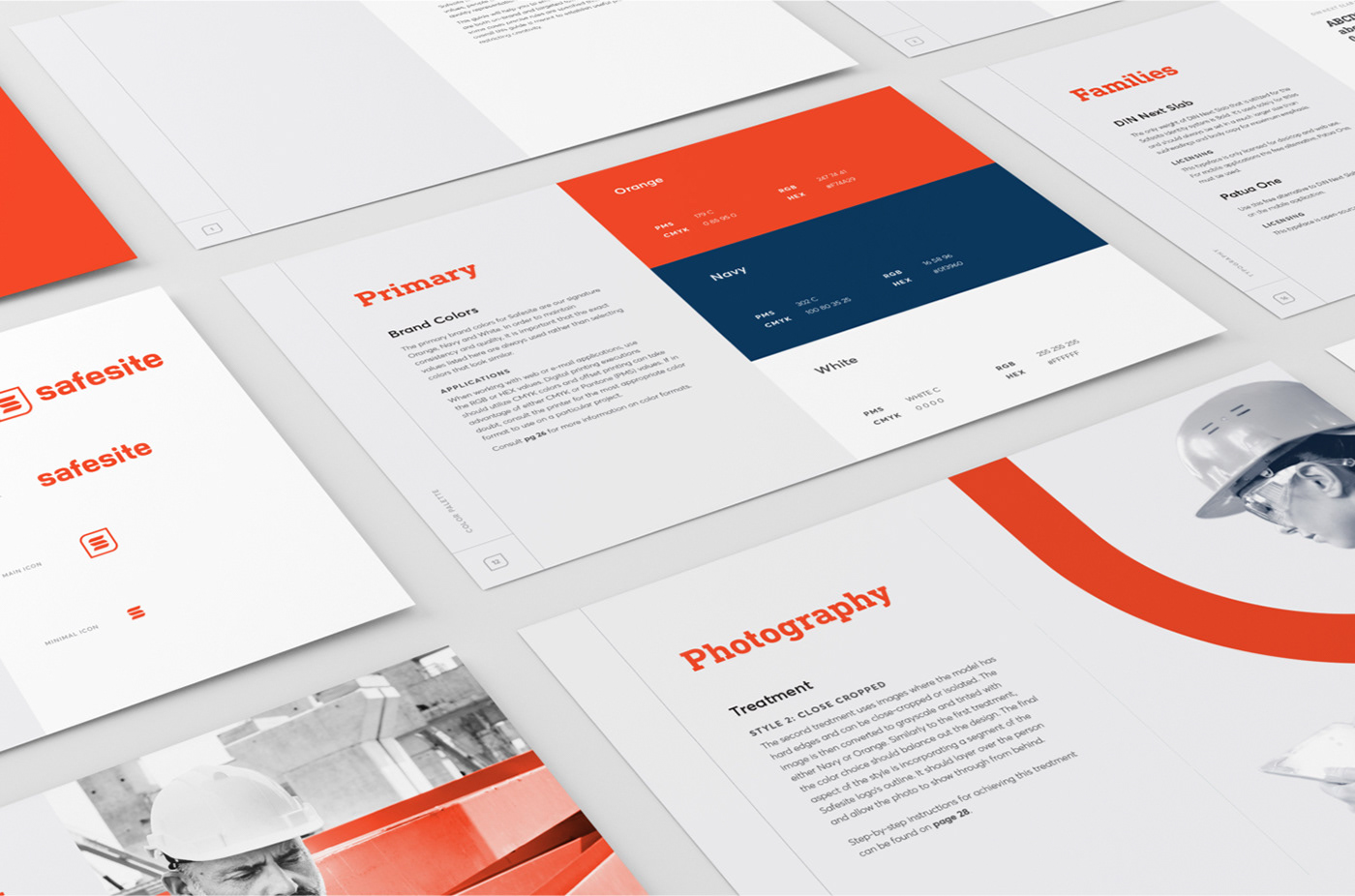
Our Approach
The solution we developed focused on pairing masculine and industrial elements with modern typography, whitespace and a clean colour palette. This created a strong, but refined look that appealed to Safesite’s two target groups.
We started with a strong logo that pairs customer typography with a simple, but memorable monogram icon. The square shape works perfect on the app/social icons and the stacked segments of the “S” give a nod to the construction industry.

Mobile App Design
When Safesite approached us to re-design the mobile app, they already had a large userbase that was actively using their software in the field. We strategically designed the new interface to respect the existing flow, while improving the experience and applying the new branding. The result was an app that looked more professional, but felt familiar to Safesite’s loyal users.


