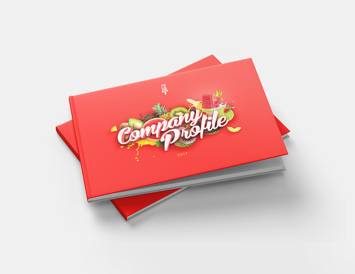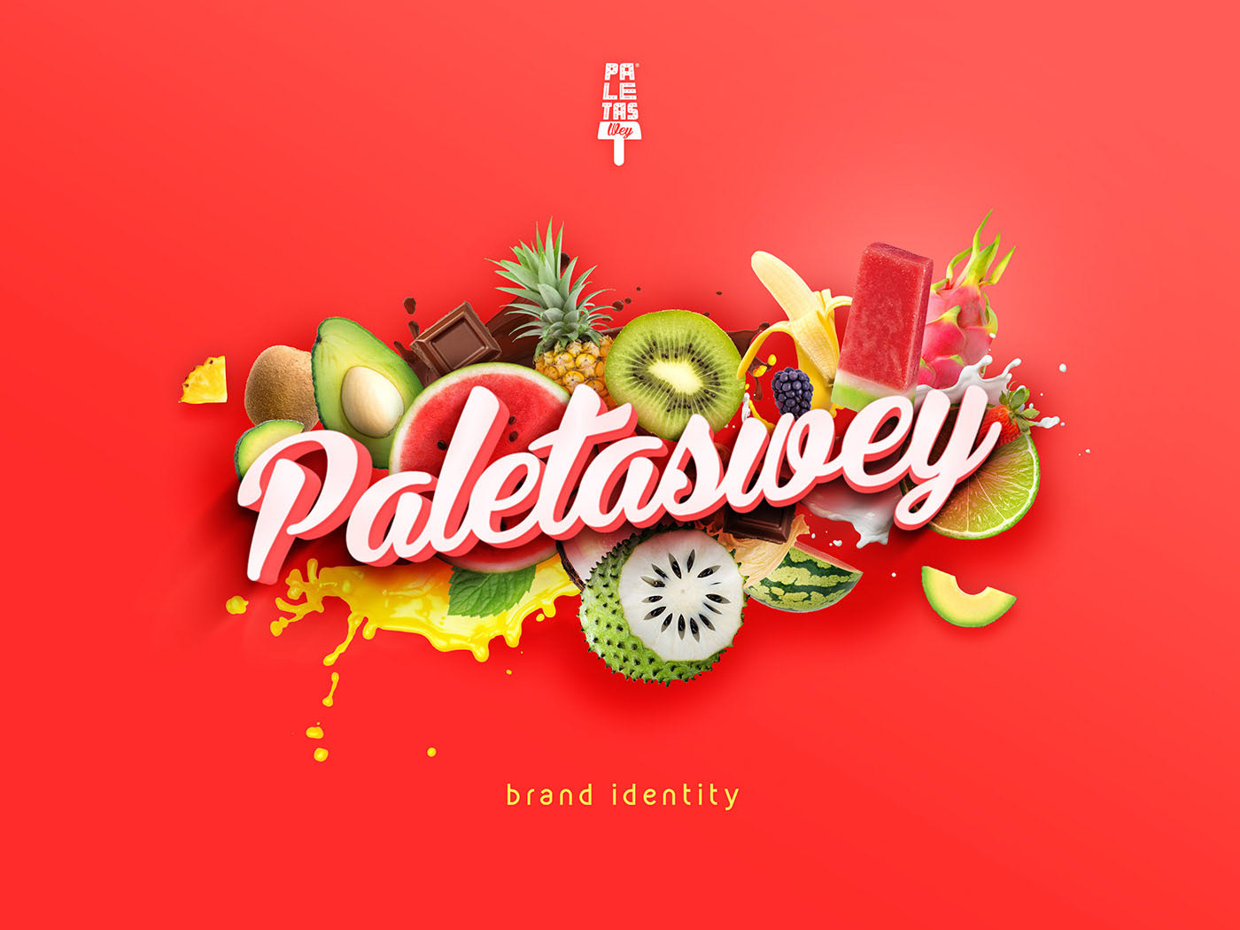
A rebranding project for Paletas Wey, a Mexican popsicle brand based in Bali. The new logo took inspirations from the shape of a Paletas, which is also the name of the product. Our new art direction for Paletas Wey emphasized on the excitement of enjoying a delightfully fresh chill dessert on a stick, and translate it into the whole brand's look & feel. We also did brand auditing and rebranding of all the existing designs with our new art direction, and document them on the brand guidelines so it can give direction & guides to their designers from all branches and cities.
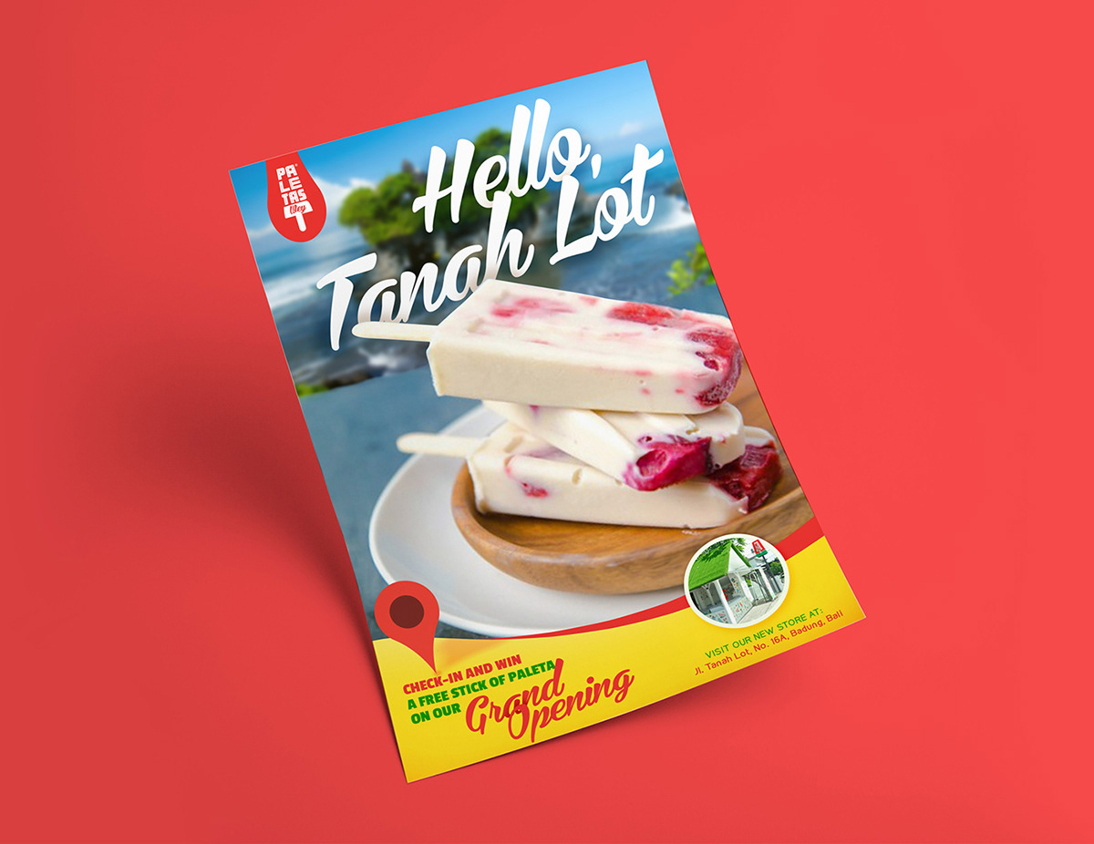
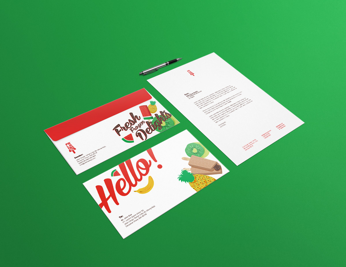
We created a unifying & mnemonic design element that utilize the brand's iconic stick's wave as part of the graphics in the marketing tools. When applied right, no matter how different the contents from one another, audiences can visually recognize in an instant that these flyers or brochures belong to a single brand, Paletas Wey. We also try to infuse the cheerful & fun tonality from their product into their corporate stationeries.