


Relap Identity & Brand Book
Identity
Started with a logotype and a future product prototype, with the development of product in three years there were realised many visual communications and user interfaces. As more people has joined the project it needed to unify the experience and make a guideline for the identity. At present all components are collected into complex corporate identity which covers digital and print. As a result, the scattered guides, layouts and style sheets are rethought and assembled into a brandbook for the company's third anniversary.
Product
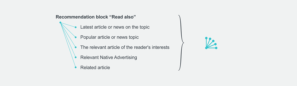
Recommendation system and native advertising network. High-load cloud service in the B2B segment. Our mission is to improve the quality of recommendations and relevant advertising on the Internet. At the moment, the company is fighting for a leading position in the market of recommendation systems and native advertising.
Audience
B2B product users, advertisers, marketers, account and brand managers, webmasters, developers and all members of the internet media.


Logo inversion can be used as a minimalist, but expressive technique to highlight important events.


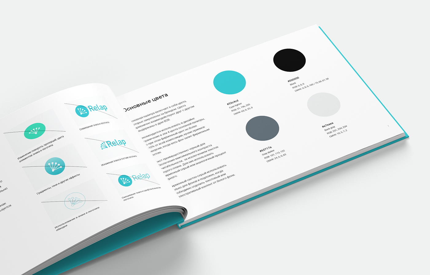
The symbolic graphics laid the principles of universality. Symbols are required for navigation and as visual anchors with text support.
The corporate identity is based on the best practices targeted at the end user — the service user. It is based on human-oriented design methods that successfully work in the rarest cases when designing visual communications and user experience.


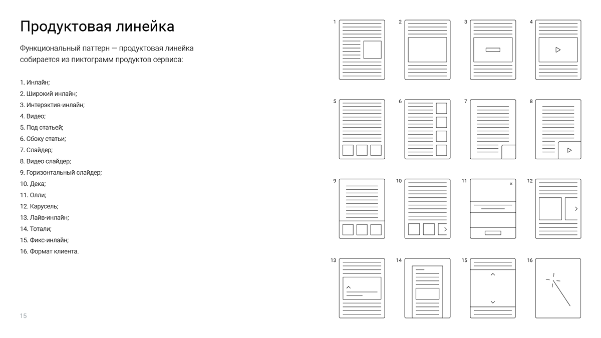
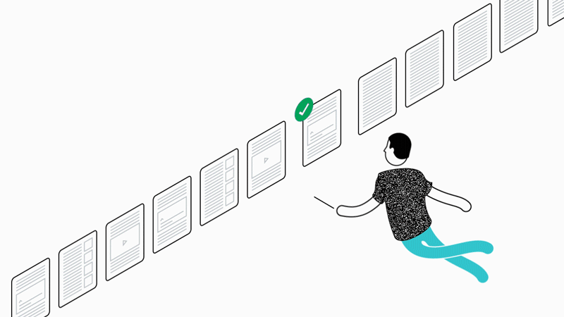
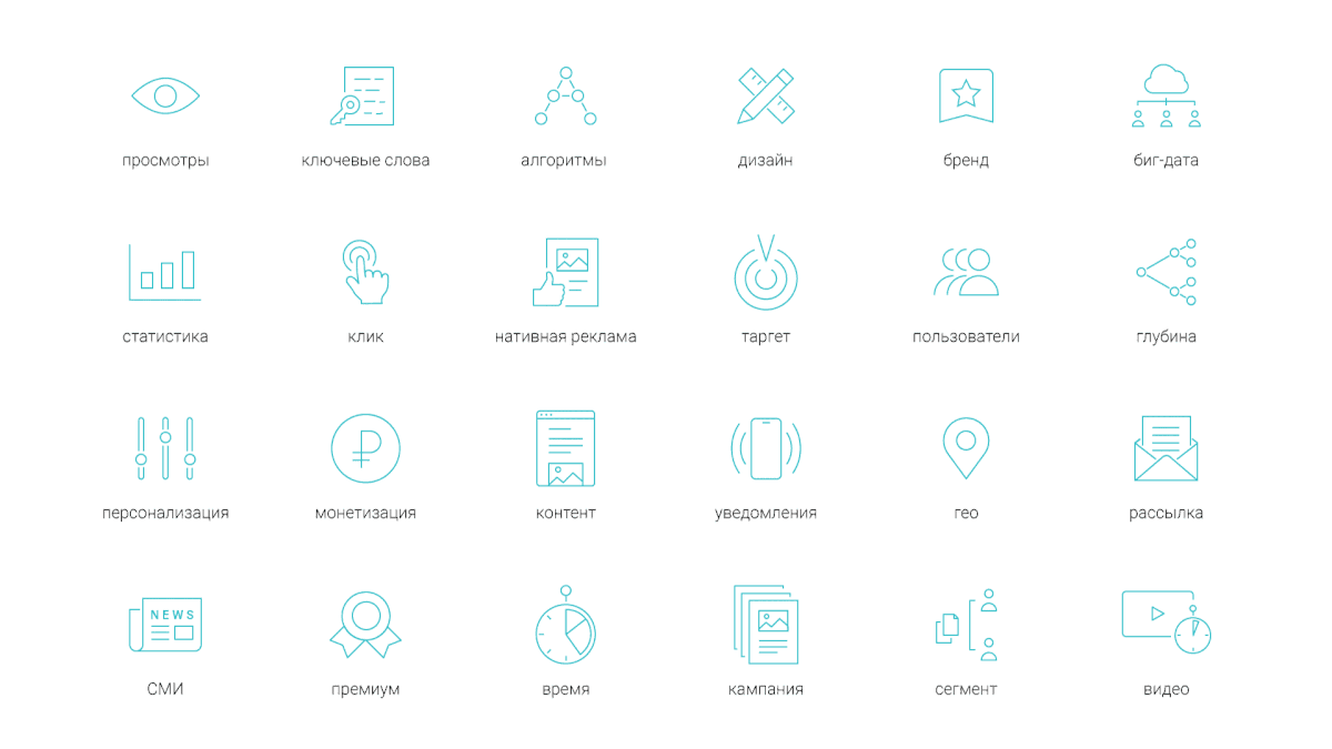
For each Relap product, a modular symbol system has been developed. Symbols of products can be used both as functional and filling decorative pattern, as well as go beyond the ordinary — to dilute the restraint of B2B, while maintaining a minimalistic approach.

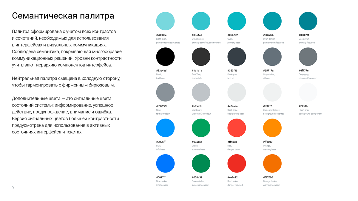
Minimalism and restraint are also in the illustration. Illustration is almost the only element of emotional design in this corporate style. The corporate style of the illustration consists of the pictographic style of graphics, the isometric projection (if you need volume and space), and a restricted palette with company colors, but its gradation towards white is allowed. Laconic, natural animation with attention to detail is allowed.

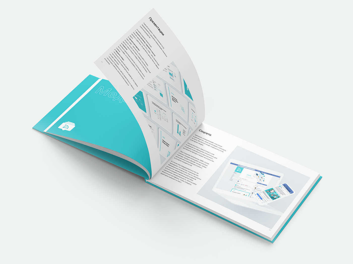
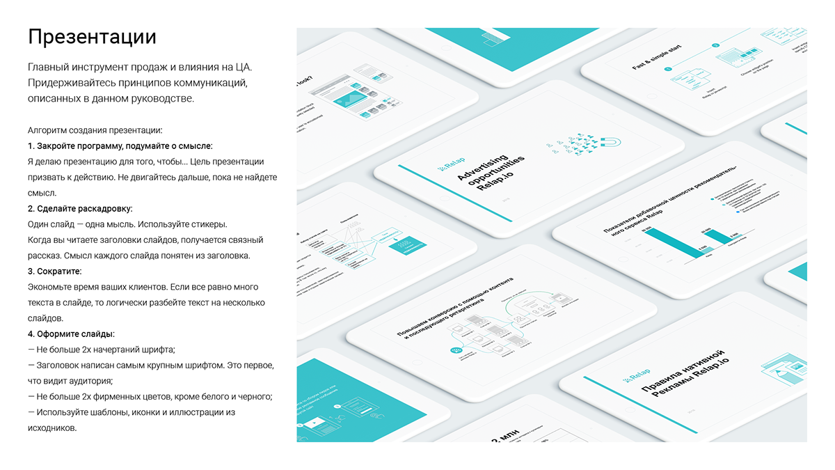
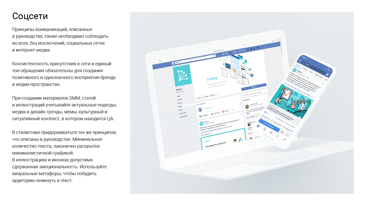
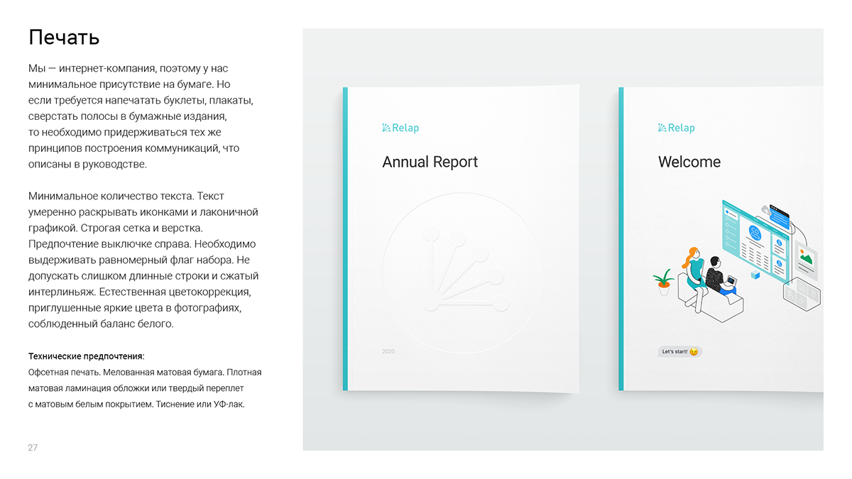
The “Media” section contains recommendations of preparing materials for presentations, web pages, social networks and print.
Standard page templates, basic interface patterns and a component library have been developed for the consistency of all interfaces of all products. Details of the library components will be discussed in a separate case. The main principles in the development of interfaces — clarity, accessibility and simplicity, aimed at the rapid solution of user problems.

The digital origin of the product is emphasized by the minimum presence on paper. Economical and discreet, but with attention to detail and the quality of materials.


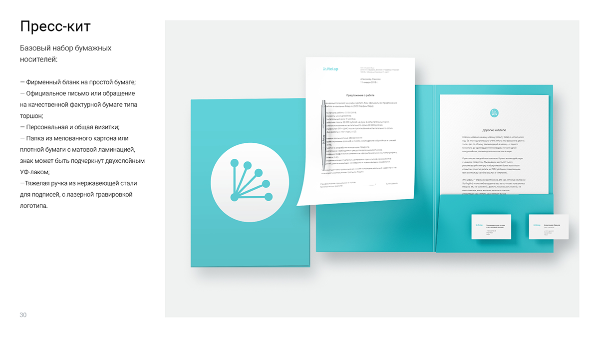
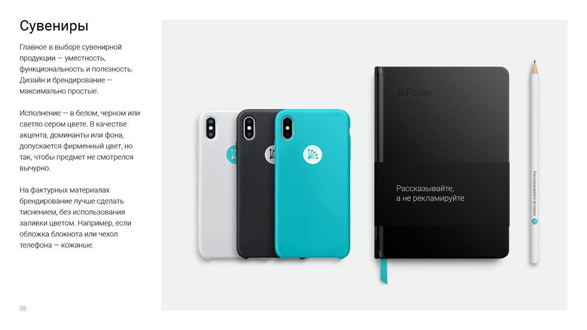
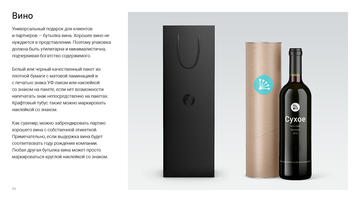
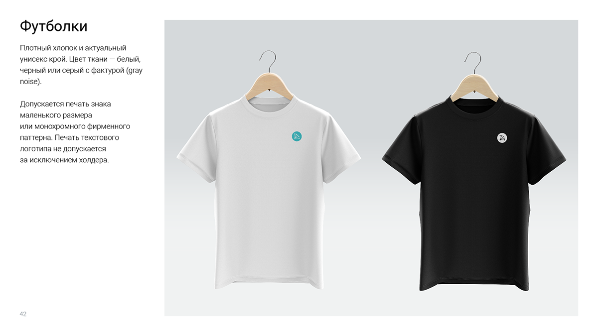
The main principle is that the objects of branding should be useful, pleasant to the eye and to the touch, understandable and not intrusive for the audience.


Minimalistic content looks nice and slim due to the grids and proportions. In this corporate style grids you need to pay special attention and follow the details, proportions and negative space.
Team
Art-director: Egor Abaturov
Designers: Alexey Razuvaev, Valeriya Glazunova
Motion designer: Konstantin Novikov
Thanks to Sergey Shalaev for his trust and feedback.


