

Designing an e-commerce website
for Ploe— a UX case study
Self-initiated project; Duration: 4 Weeks

Ploe is the leading e-commerce platform in the USA. It is a platform tailored for global fashion, providing customers with an easy, secure and fast online shopping experience through strong payment and logistical support.
Objective
To design an e-commerce
the website for Ploe customers
the website for Ploe customers
To update Ploe’s logo and brand as a company that sells coolness and hipster lifestyle
To create an intuitive and efficient shopping experience for users
The Challenge
Ploe is a successful hipster store that has expanded to 24 countries with over 300 stores since 1996. The company believes that clothing should be fun and cool, in a variety of styles and at affordable prices. Due to a demand for online services and to disrupt the fashion market, Ploe has decided it’s time to launch a brand new online store and to revamp its ideology as per current dynamics.
Process

Objective
Goal: To research the current market and audience of online clothing stores
Process: Market Research / Competitive Analysis / Contextual Inquiry Interviews
Market Research
To start off, I researched general information about the e-commerce clothing industry and noted the common trends and pain points of online clothing store websites. This secondary data helped me gain perspective about the subject matter and potential needs of current shoppers.

Competitive Analysis
Since there are many clothing stores, it was important to understand how Ploe compares against competitors. Therefore, I evaluated the websites of Ploe’s direct and indirect competitors by their strengths and weaknesses. This allowed me to better understand customer expectations and how Ploe can position themselves against competing companies.

Contextual Enquiry
No. Of participants: 8
Gender: 5 Female, 3 Male
Age: 18–35 years old
To gain primary research from shoppers, I conducted contextual inquiry interviews with 8 participants about their shopping methods. The interviews consisted of open-ended questions about their in-store and online shopping experiences. By the end, I was able to learn more about how shoppers behave and see patterns emerging.
Define
Goal: To define the target user and understand their needs, goals, and frustrations
Process: Empathy Map / Persona / Storyboard
Empathy Map
To synthesise the data, I constructed an empathy map by organising the data points from each interview participant into groups. Then, I was able to deduce the user needs to be based on the most common patterns within the user data.


Persona
To synthesise the data, I constructed an empathy map by organising the data points from each interview participant into groups. Then, I was able to deduce the user needs to be based on the most common patterns within the user data.

Storyboard
To further understand the user and problem space, I drafted a short storyboard illustrating the persona’s online shopping experience. This quickly communicates a perceived user problem and how Ploe’s website can pose as the solution to this problem.

Ideate
Goal: To ideate information architecture and flow
Process: Card Sorting / Sitemap / Task Flow / User Flow
Card Sorting
An open card sorting activity was conducted with 4 participants and consisted of 52 categorical terms commonly found in online clothing stores. Through observation and feedback, I was able to understand how the participants structured information in their minds, which informs how I should then design the information architecture of Ploe’s website to be intuitive for the user.


Sitemap
Next, I created a sitemap based on existing design patterns for e-commerce sites and the findings from the card sorting activity. By visualising the information architecture and identifying key relationships between screens, we can better understand the flows and interactions throughout the site.

Task Flow
Since one of Ploe’s goals is for customers to be able to order products efficiently, I constructed a task flow breaking down the necessary steps for a user to get from the landing page to the order confirmation page. Creating the task flow helped identify which pages were required within the customer’s process and forced me to think through the customer experience in more detail.

User Flow
To further analyse the flow, I explored the possible paths that users could take while ordering products in a user flow diagram. Creating the user flow diagram allowed me to organise which pages were required and how they should relate to each other based on user decisions.

Design
Goal: To design the UI and branding of Ploe’s website
Process: Sketches / Mid-Fidelity Wireframes / Branding
Sketches
I began designing the UI by sketching low-fidelity wireframes for the pages. By presenting annotated sketches to my mentor and peers, I was able to quickly gain feedback about my designs and make improvements for the next iteration.
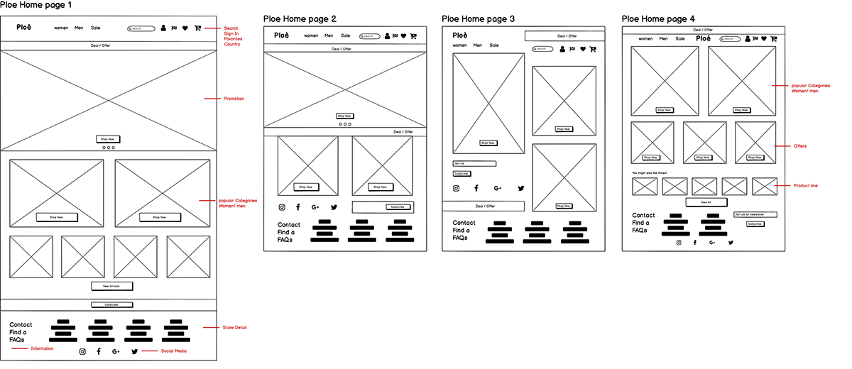
Mid-Fidelity Wireframe
I then created mid-fidelity wireframes in Sketch, which helped me focus on the basic layout and visual hierarchy of the UI design before adding the styling. I was also able to present these wireframes and gain valuable feedback. Below are the wireframes of some of the main screens.

Branding
Before moving into high-fidelity wireframes, I created branding guidelines to make sure the branding is cohesive and targets Ploe’s main audience. First, I gathered inspiration in a mood board and brainstormed logo ideas. Since Ploe brands itself as a clothing store with styles for everyone, I wanted the branding to be welcoming but also exhilarating and smart.

Prototype
Goal: To prototype Ploe’s website and gain usability feedback
Process: High-Fidelity Wireframes + Prototype / Usability Testing
Hi-Fidelity Wireframe + Prototype
Using the branding style, I created high-fidelity wireframes in Adobe XD. I then created a prototype in InVision to prepare for usability testing. Below are the designs of some of the main screens.

Usability Testing
Objectives:
To determine if the website meets the expectations of users who have shopped online before
To identify areas that cause confusion and/or hesitation for users
To test if users can browse and buy products and efficiently
User Jobs:
Sign into account
Browse for a product and view information about it
Learn if the product is in stock at nearby stores
Add the product to purchasing bag and apply a discount
Purchase the product
Usability Testing
Results:
I conducted usability testing with 3 participants who have similar backgrounds to our persona, Violetta. From direct observation and conversations, I was able to collect valuable usability feedback from target users.
Iterate
Goal: To iterate upon the design and identify key improvements
Process: Affinity Map / Revised Wireframes + Prototype / UI Kit
Affinity Map
I created an affinity map to synthesise the usability findings, identifying reoccurring behaviours and feedback. Then, I drew insights from the information, which informed recommendations for the next iteration of the design. Since all of the insights involved usability issues within the payment and checkout process, I made changes for the next iteration based on user feedback. Check the affinity map here.

Revised Wireframe + Prototype
Finally, I revised the wireframes and the InVision prototype based on the recommendations drawn from the affinity map. The changes are shown below. Feel free to interact with the revised prototype using the button below.


Reflection
Building a website for Ploe was a relatively straightforward project because many features have well-established design patterns. Therefore, I gained much experience in researching best practices and determining which solutions were best based on user needs.
Additionally, since many people have used e-commerce websites before, user expectations are more concrete, which makes it even more important for the website to reflect common e-commerce design patterns.
As I learned from this project, usability testing can be a big help in discovering areas that are inconsistent with user expectations. Overall, I gained much perspective and understanding of the e-commerce experience.
Next Steps
Prototype other features based on the persona’s user needs
Identify areas of improvement through user feedback
Design the UI for mobile and tablet screens
Continue organising design deliverables for handoff


