
The 'Two by Four' typeface began with a logo project: the client's old wordmark was in bold Chancery script, so I tried to reference that style in modular type. The client chose another option, so I decided to build a full alphabet for a gothic-blackletter-modular
typeface.
typeface.

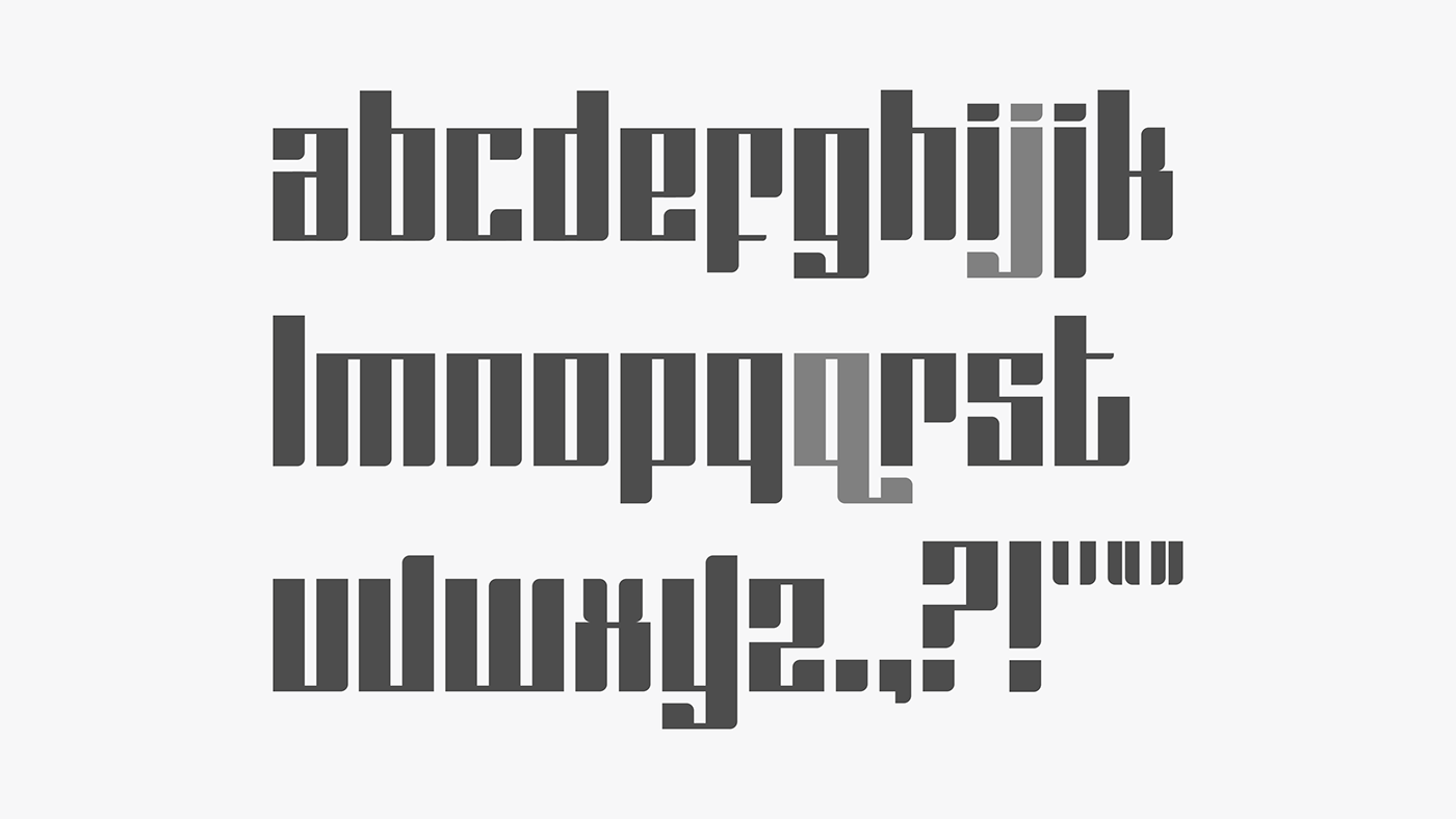

The letterforms have strong vertical stress and thin horizontal strokes. Vertical strokes are rounded off to evoke the up- and down-strokes of a calligrapher’s pen – starting square, finishing with a slight lift.
Letter-spacing is equal to the standard counter width. Leading is the x-height multiplied by 2. The word-spacing is equal to the standard vertical stroke width, plus double letter-spacing.
Letter-spacing is equal to the standard counter width. Leading is the x-height multiplied by 2. The word-spacing is equal to the standard vertical stroke width, plus double letter-spacing.
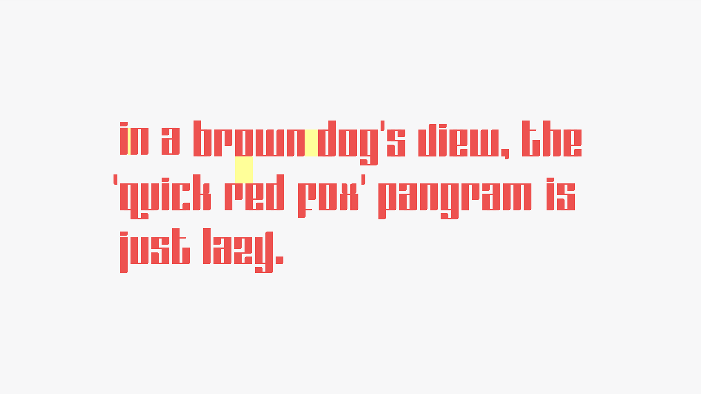


All the fonts I'm working on will be used for my graphic tee line, but I haven't figured out how to export them to TTF with proper formatting and kerning. So for now I have to
put words together the way Gutenberg did it.
So far I've only finished one other font. (It's inaccurate of me to use the word 'finished': to be honest, I haven't touched it in a year, and I'm afraid to.) It's called 'Jam', as in 'jam-
packed'; also, as in 'jam-filled cookies'.
put words together the way Gutenberg did it.
So far I've only finished one other font. (It's inaccurate of me to use the word 'finished': to be honest, I haven't touched it in a year, and I'm afraid to.) It's called 'Jam', as in 'jam-
packed'; also, as in 'jam-filled cookies'.
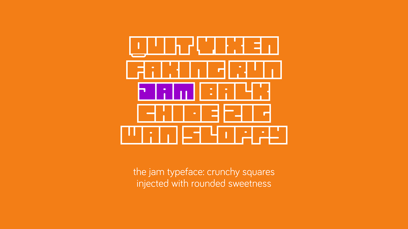

This typeface also began as a rejected logo. I wanted a block caps font for my tee brand, but I phoned it in after the first sprint, which is why there are no punctuation marks, and no numerals.
Every letter starts with a square, with rounded corners for all counters. It began as a monospace, mono-width typeface, but then I mixed in a thinner stroke when I got to 'E', and 'M' and 'W" brought their own troubles.
As inspired by pastry jam-filling machines, the counters should ooze out of the hard, cookie-cutter forms. This works best with high contrast between the forms and the
negative space. Outlines also bring the forms out nicely. (The example in the first poster uses an outline thickness that is equal to the minimum counter width/height.)
______
The alphabet above shows how close the letter-spacing can get, and the line-height too. But there is that glaring gap under Q, because I lost control of that letter. If you can
think of a way to fix it, I’ll be happy update this project with your idea.
think of a way to fix it, I’ll be happy update this project with your idea.
Ideal letter-spacing should be equal to the minimum counter width/height, the way it is in the first poster.
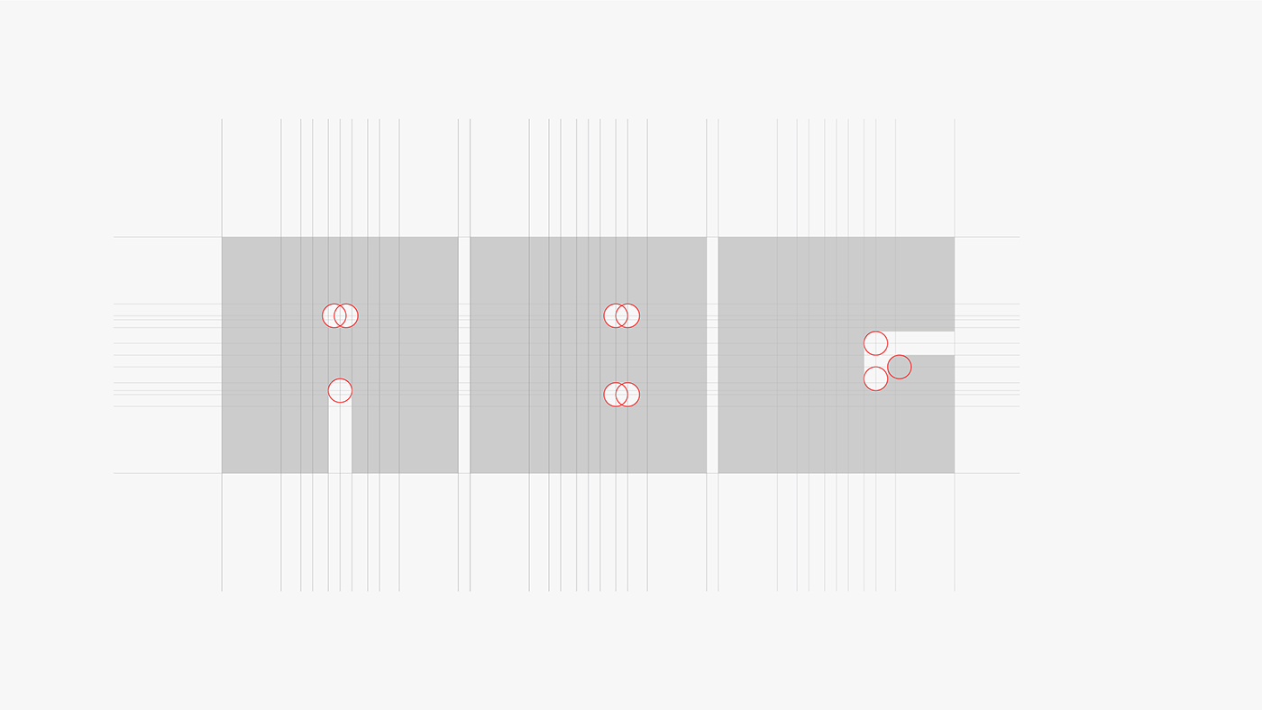
So many gridlines. I’m not sure what most of them are doing, which is a big danger signal for a modular typeface. Clearly, every other letter forced me to modify my rules. The 'S' seems unbalanced, the horizontal strokes vary a lot, and the closed counters of 'B', 'D', 'P', and 'R' are offset from the center for some reason I do not remember. But it looks pretty nice on tees.

Thanks for viewing this project. I would be grateful for ideas on how to fix the many problems in these typefaces – please let me know in the comments.


