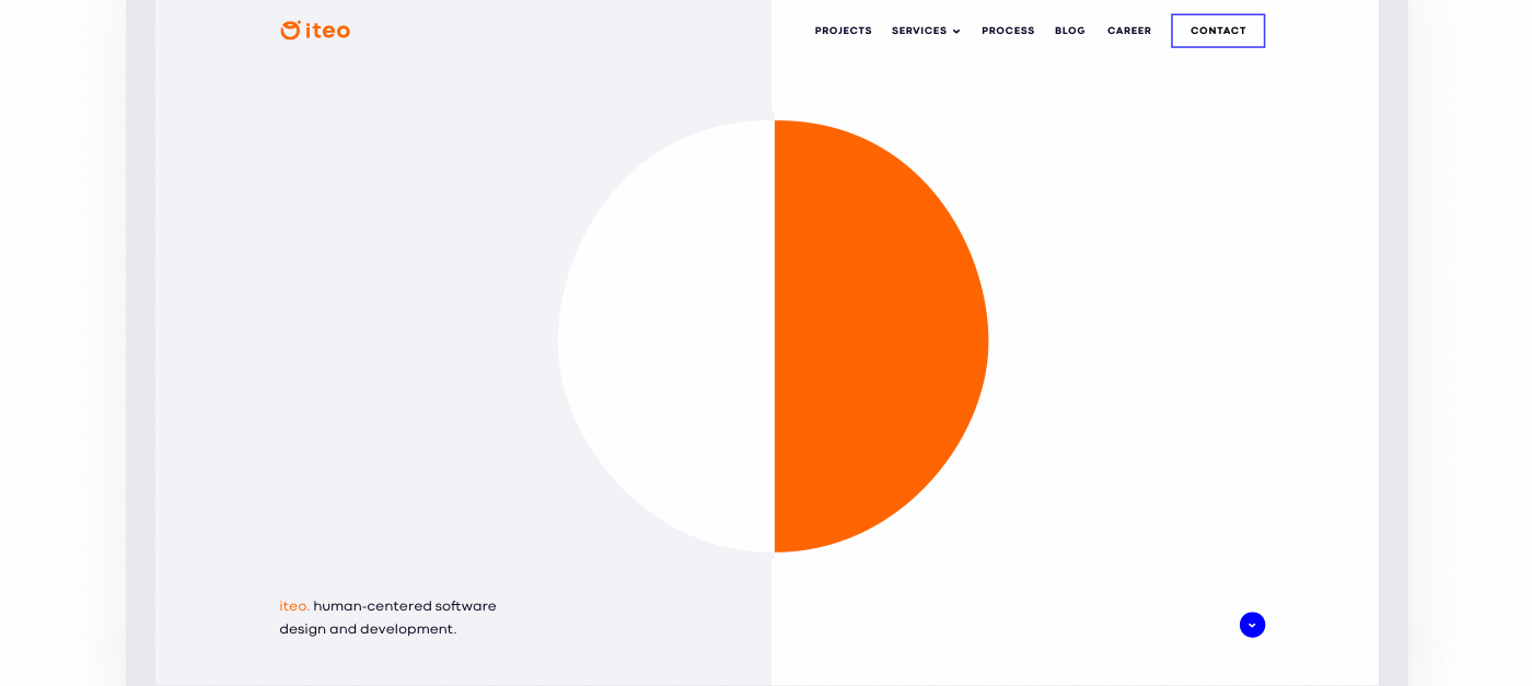


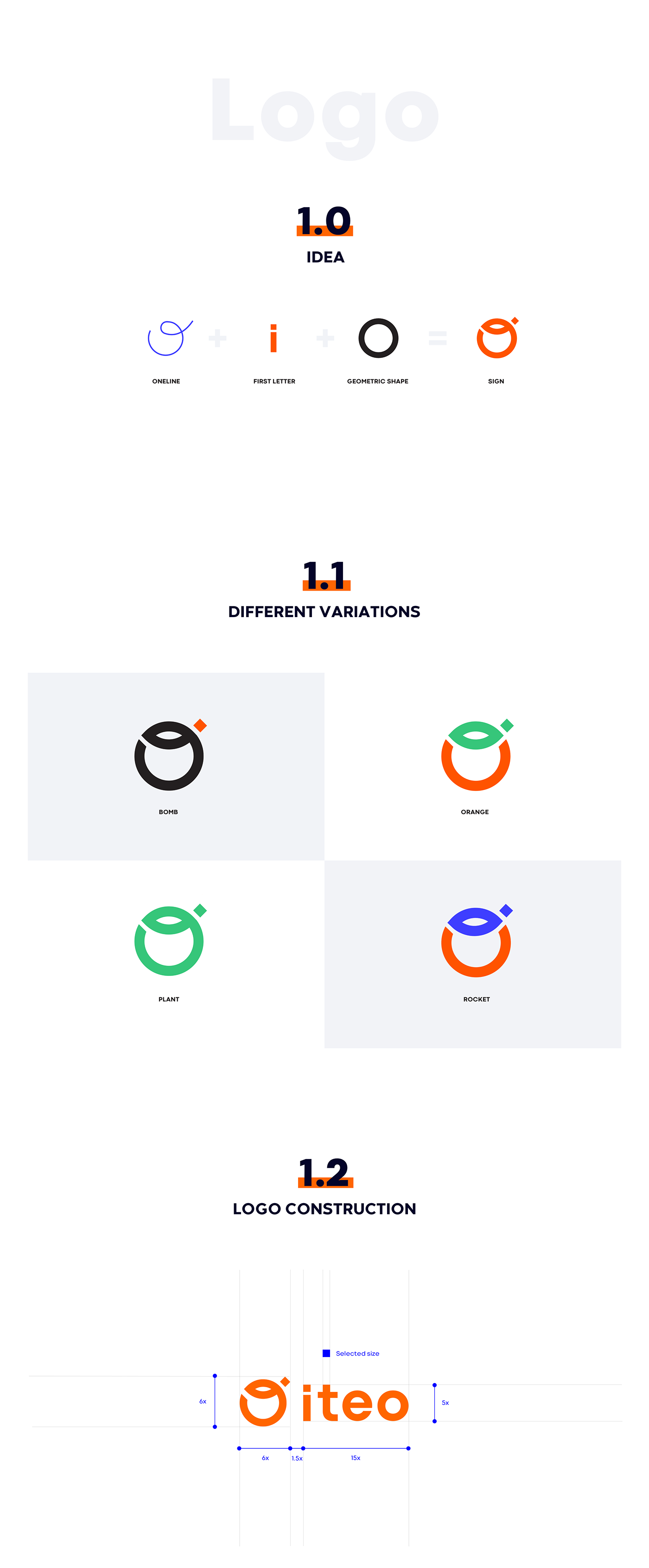
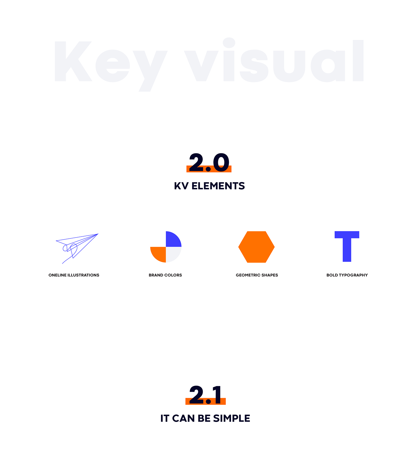
Designing is the process that is most easily visualized by one line with its beginning and end. In our case it is a blue line, the one that's building three-dimensional illustrations, contrasting with geometric, orange shapes.
The combination of these two styles - linearity and geometricity - has helped us find a balance between business professionalism and unrestricted creative freedom. The visual representation of this synthesis is the iteo trademark - linear and geometric at the same time. On the basis of these assumptions, a comprehensive system was created, which includes job-related items, advertising materials, a responsive website and new office equipment.


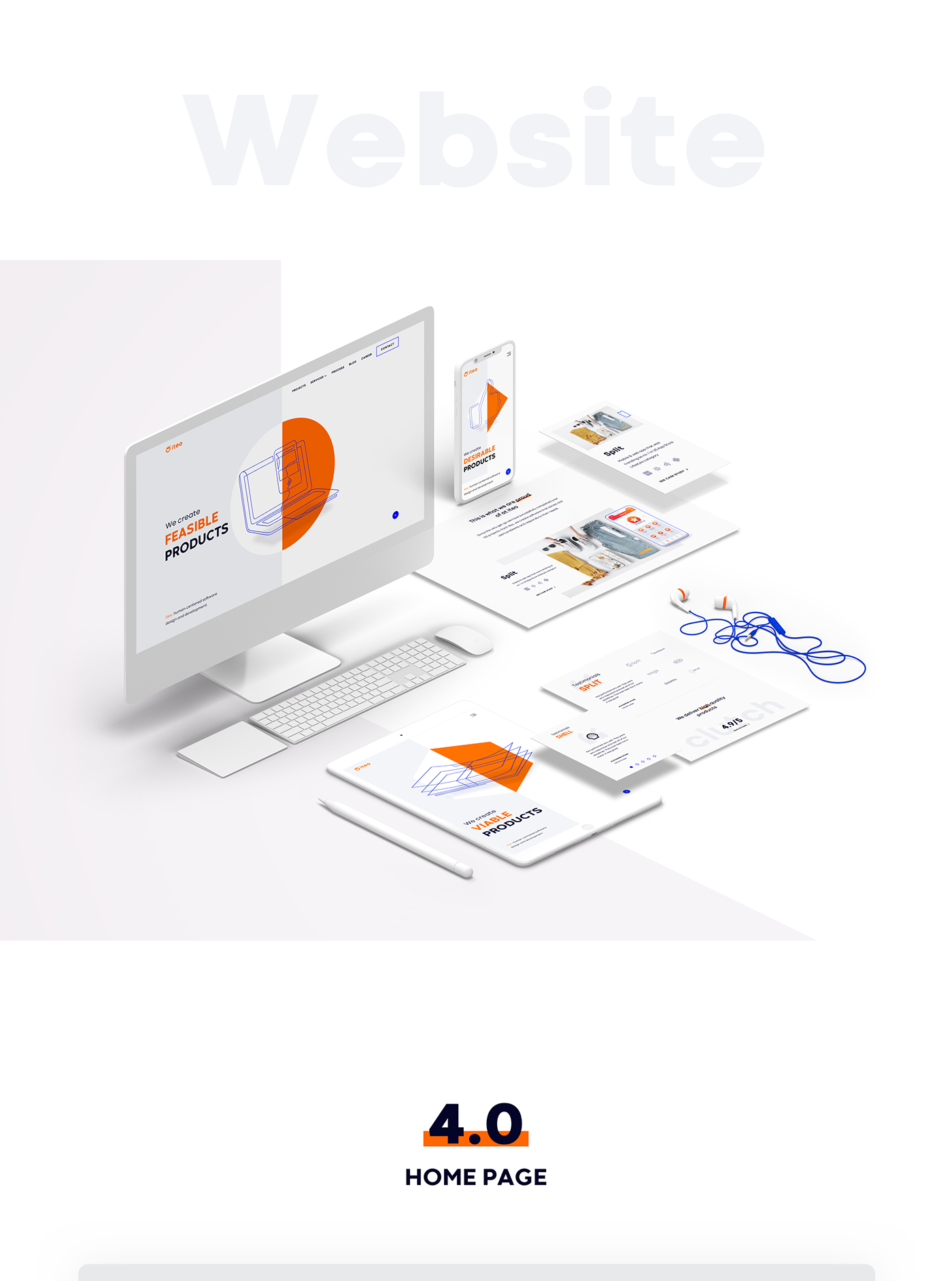
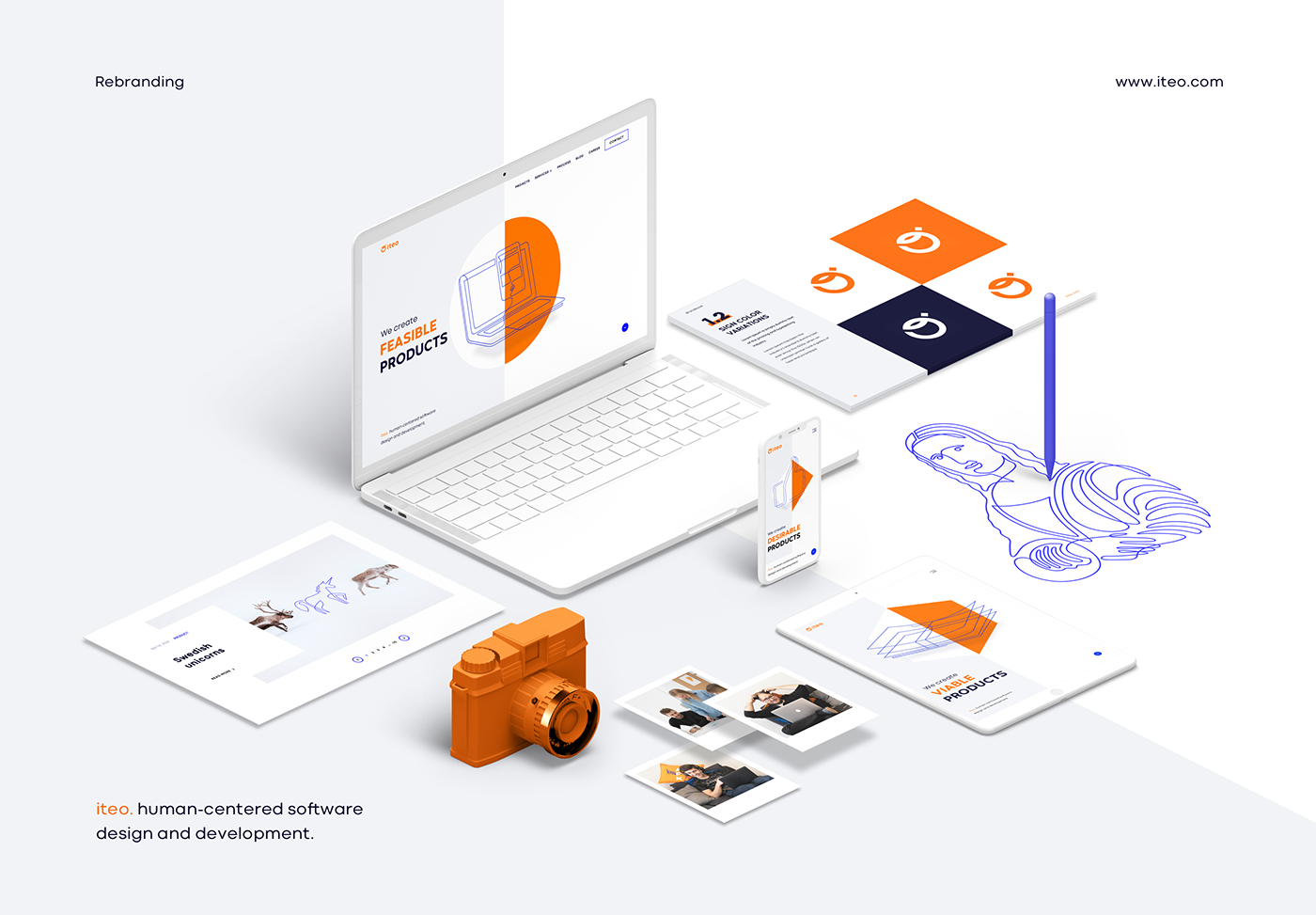
New iteo website is one of the most important elements of our new visual identity. It allows us to better reflect the current competence and character of the team, combining its elements into a coherent whole.
We created it in accordance with the principle that a digital product should be not only visually stimulating, but also meet a number of functional and design assumptions. We have successfully implemented a product that shows a wide range of our services in a simple and intuitive way.