

Introduction
As UI designer with a background in music, I have always been passionate about experiences that marry music and technology. Through design, I hope one day to make the experience of music more accessible and enjoyable.
To better understand Apple Music, I took a trip down into the app itself and see what needs to be enhanced in terms of UI&UX.
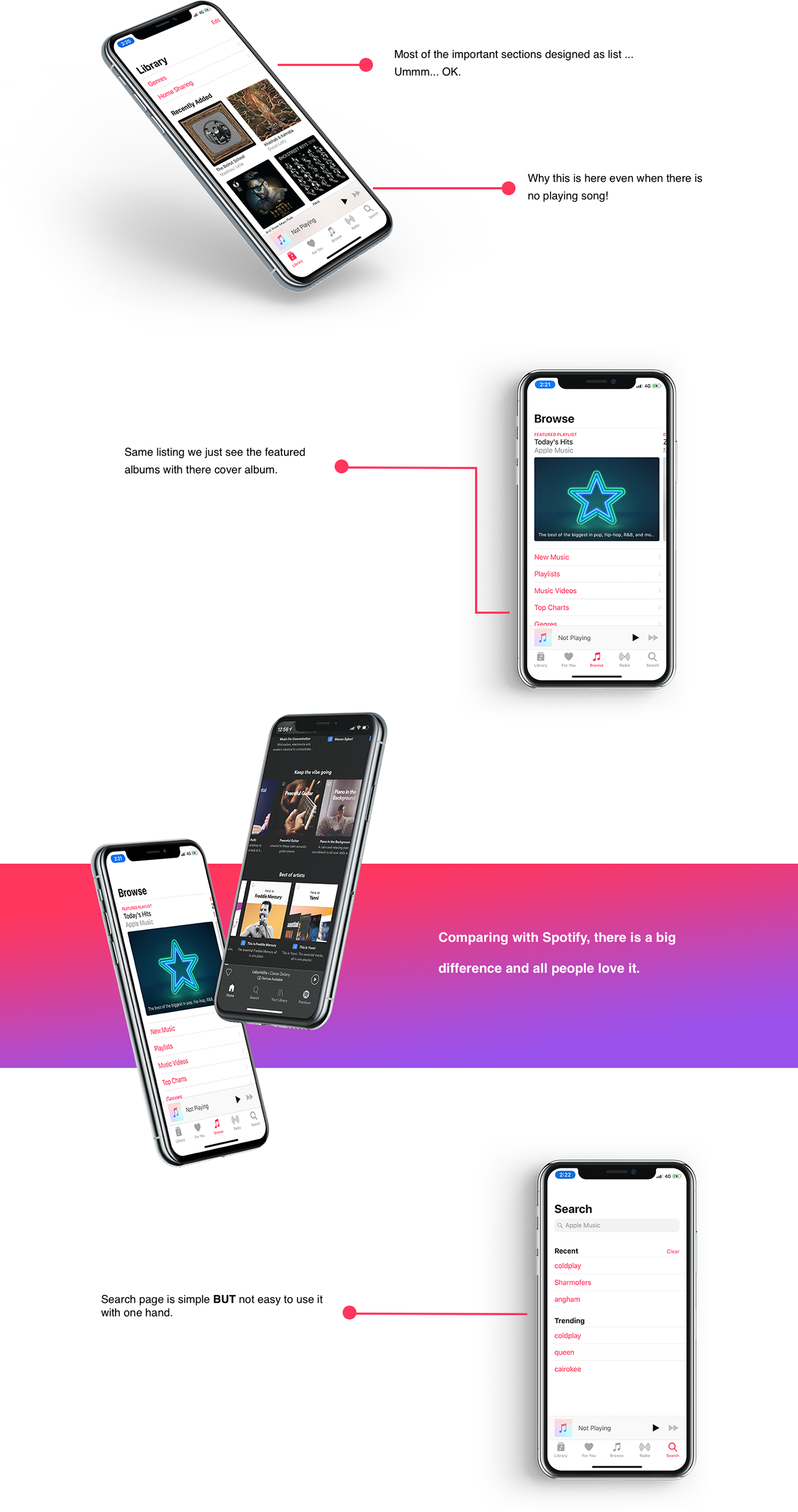
It's time to agree on that we MUST change the way we design the search section based on a lot of research I think this will become a trend, let's start from the beginning.
There was a study published on July 10, 2018 by Theo Strauss and he was talking about this case - Search bar design - Lyft took a different approach with their search bar. Instead of a floating field up top, he2 added it to an overlay towards the bottom-mid section of the screen. This simple change made it more accessible for almost 100% of users.
Although we don’t think about it too often, a search bar all the way at the top of the screen is hard to reach. Especially for users who have smaller hands or users who have less flexible hands, reaching up is annoying, mostly because the top of the screen is far away from where their fingers sit.
If you visualize most apps, the main content is in the middle or lower-mid area. Tab bars for navigation, posts on social media, and keyboards on messaging platforms are all examples of important pieces of experiences sitting in a more reachable position.

As you can see in this graph from 2015, around half of phone users interact one-handed. And, as you can see from this amazing meme that resurfaces once a year, that’s how people do it. Lyft doesn’t make you stretch your thumb one bit; the search bar is in the sweet spot.

Just look at this graph from the same study, half of all search bars are in the “Out of Reach” area. Lyft’s is right beneath the thumb in that diagram in the green (good) area.
My UI Suggestion
After all of this BLA BLA BLA above I will show you what I'm thinking it will be good to see in Apple Music in iOS 13 or later on.


One more thing


