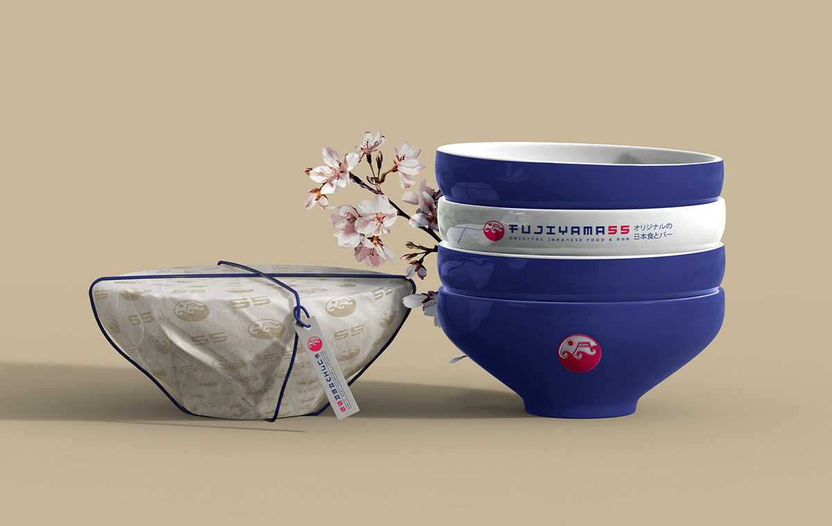
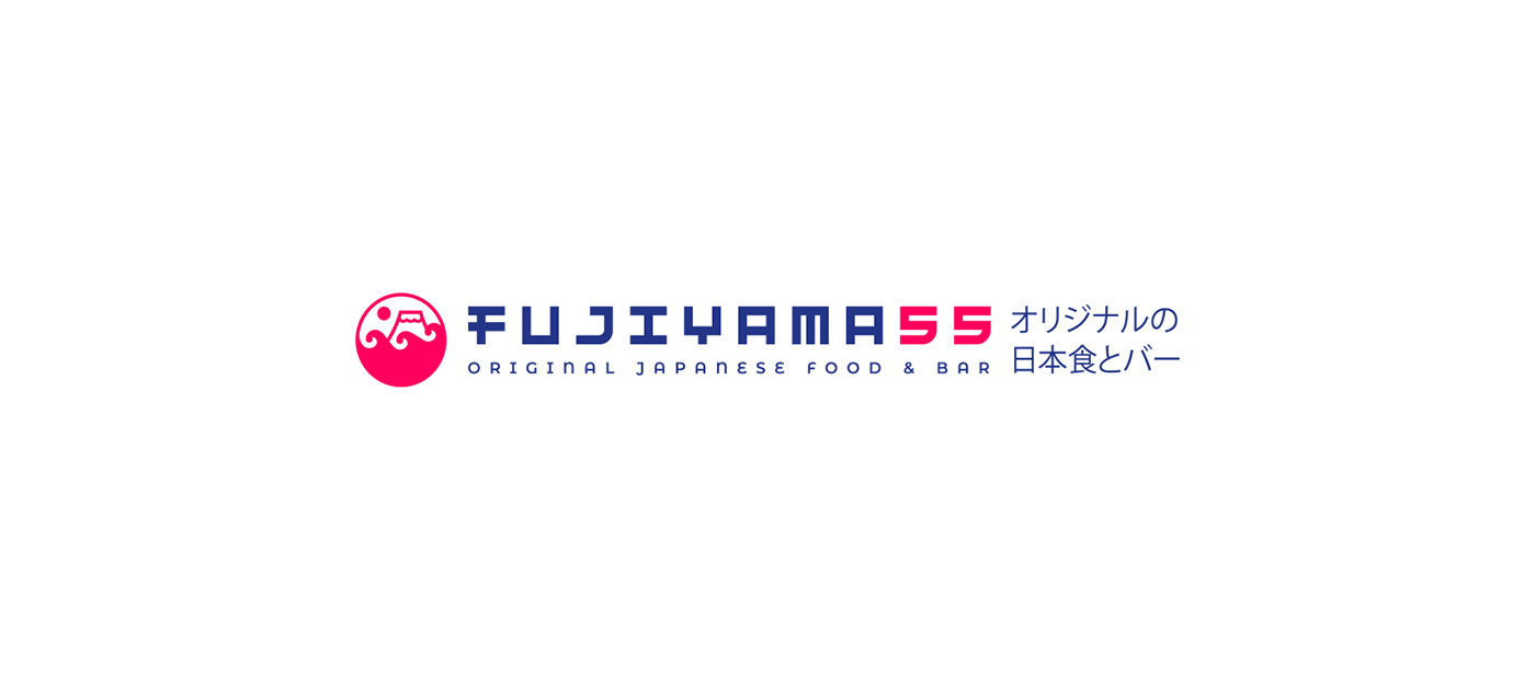
FUJIYAMA 55
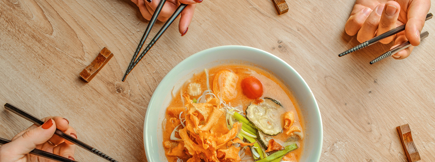
FUJIYAMA 55 is a restaurant of Japanese cuisine which shows residents of Russia all diversity of authentic dishes and familiarizes them with culture of modern Japan via food, atmosphere and service. The main dish of the restaurant is ramen which enjoys special popularity with the Japanese.
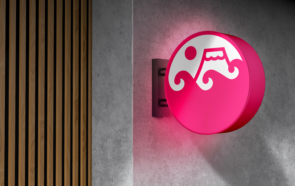
Logotype makes it possible to entertain the red logo. It is not clear that the parts are divided, thanks to which they can be used.
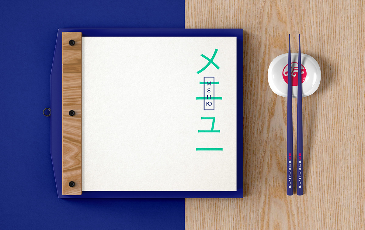
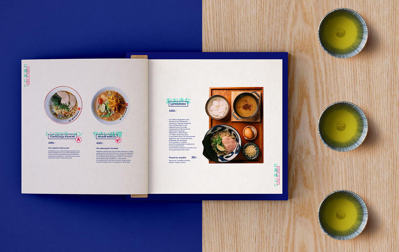
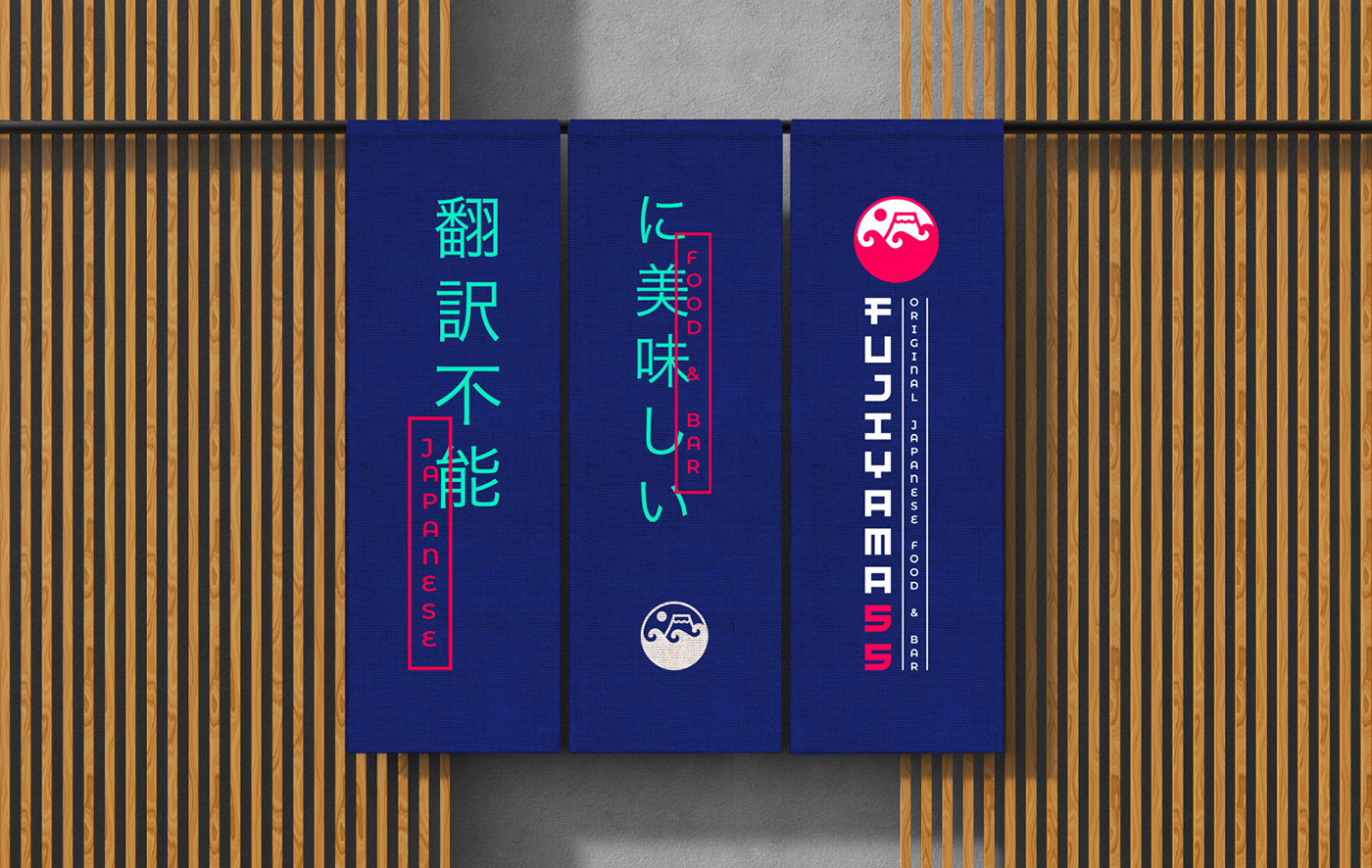
The signboards were borrowed from Japanese signboards which emerge from behind each other. We have used the principle of overlapping and transferred to all carriers. Depending on the carrier, Text blocks can be both vertical and horizontal layout.
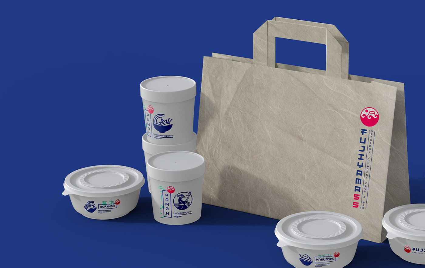
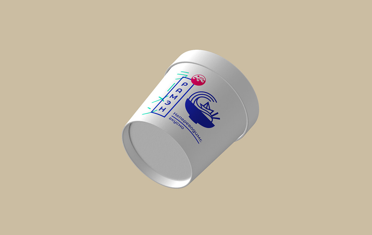
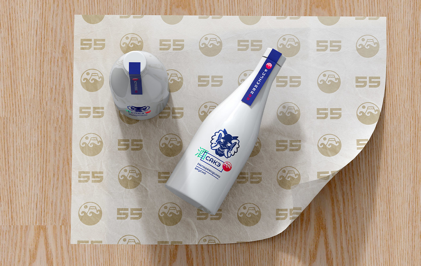
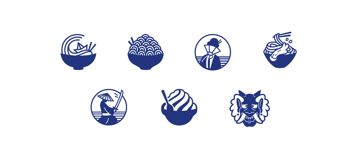
COMPANY STAMPS
Show your main dish - ramen. They are used on packaging and in communication. At formation, stamps are put in a circle.
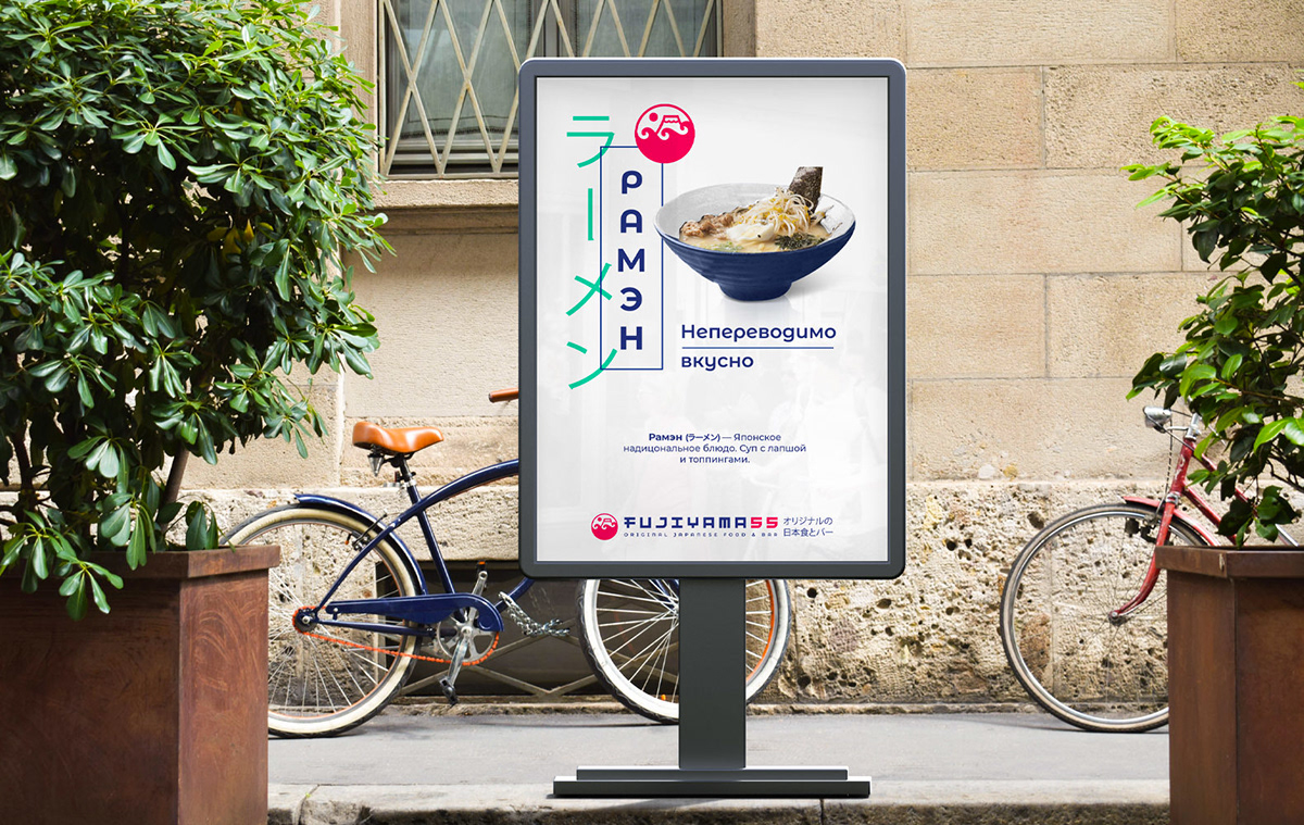
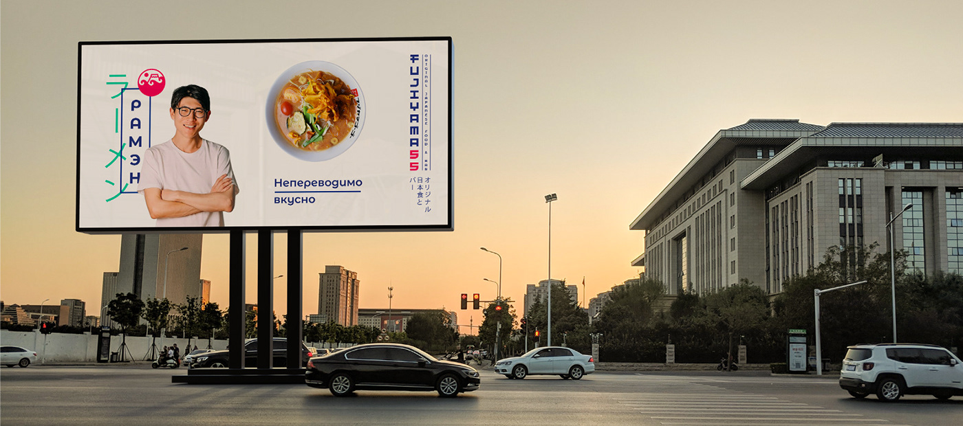
TO GO
The stamp is accompanied with the name of a dish, which is duplicated in the frame of the green color. A slogan is used as a subheading.