Rebranding project for The Black History Museum located in Richmond, VA. Collaboration of 8 graphic design students with artist and designer, Noah Scalin for VCU's Design Rebels socially conscious design service learning class.
It was our intention to create a brand that encompasses the mission of the museum to become a repository of knowledge that highlights the resistance, resilience and creativity of Black Americans throughout history.
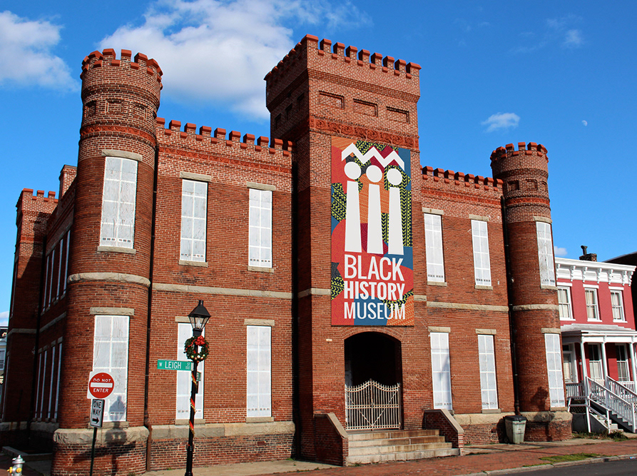
The museum’s future move to the Richmond Armory created the perfect opportunity to create a new brand identity that represents the museum as the exciting, inspiring, and community driven center that it is. We see the museum as existing beyond the physical space, and created a brand that is both intriguing and flexible.
Project designers included: Kassy Edwards, Hunter Graham, Eric Hayes, Jessica Stevens, Samantha Wittwer, and Kris Woodson
The Black History Museum and Cultural Center of Virginia is more than a museum. It seeks to tell the story of the black experience through the collective histories of Richmond, the Carver neighborhood, and inevitably the South. It’s a narrative with manythemes: community, resistance, resilience, and creativity. We wanted the museum’s identity mark to serve as an introduction to the story.
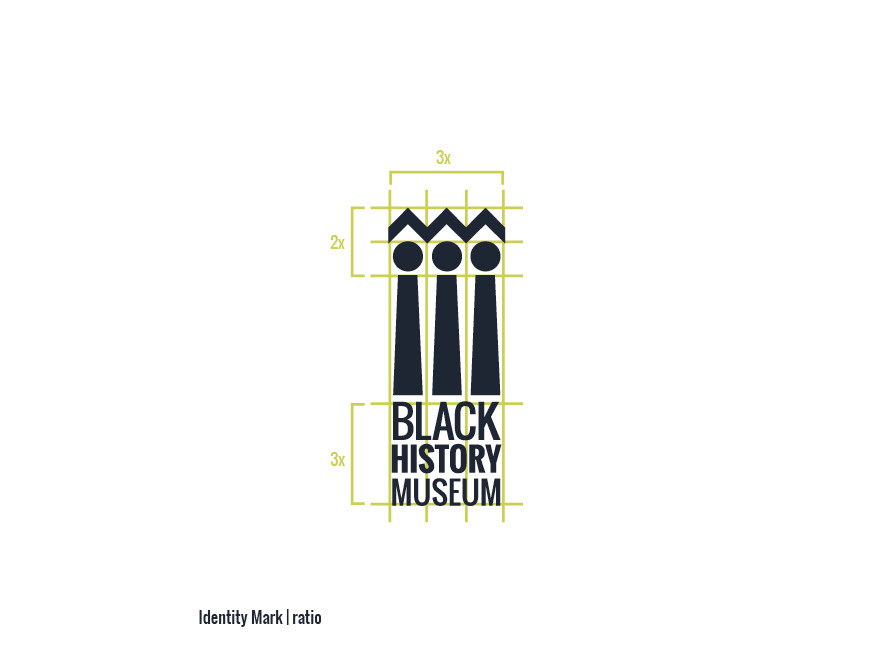
A good logo mark should spark an interest without giving too much away, like a good book cover. It should point to key themes in an aesthetically appealing way. Our mark started as 3 figures standing together on a platform created by the Black History Museum type. The figures are further connected by a continuum of ideas. We chose three figures to represent to idea of community and the coming together of ideas and experiences to create a collective whole, each figure may also represent the museum’s three key values of resistance, resilience, and creativity. The logo is an abstract representation of community and the pillars upon which the history stands. The three vertical column stand or resistance, resilience and community.
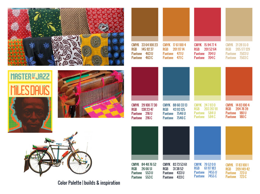
The icon also inspired the idea of patternization, a technique found in Kente cloth found in many African nations. We were intrigued by the idea that the logo may also bring the viewer back to the roots of the museum, the African American Experience, without being too literal. We used Kante Cloth as inspiration for the museum’s color palette and nine key patterns used to further the message and inspiration of the museum.
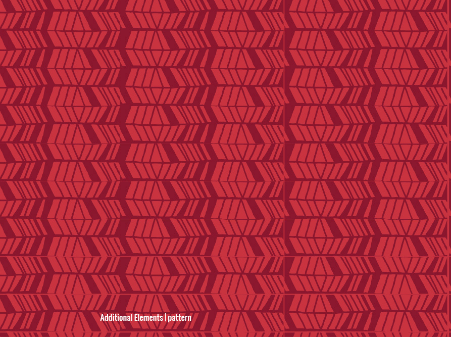
Based on the geometry present in the identity mark, we created a set of patterns for use across the brand. They are meant to add a playfulness and sense of creativity to whatever they are applied to, and become more or less extreme through color application. Patterns may be re–sized as necessary, they work well at any proportion to each other.
We took the concept of a quilt and applied it to elements that can be used in many different ways, We suggest placing them behind the identity mark, as pattern, or as elements in a layout. We arrived at the shapes for the ‘quilts’ by abstracting African nations into nearly unrecognizable shapes.
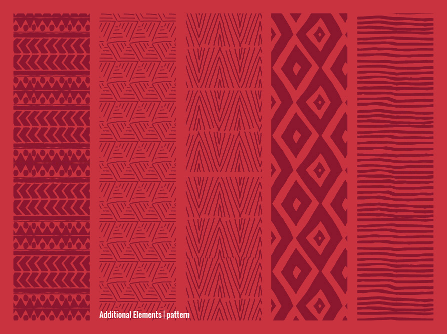
Based on the geometry present in the identity mark, we created a set of patterns for use across the brand. They are meant to add a playfulness and sense of creativity to whatever they are applied to, and become more or less extreme through color application. Patterns may be re–sized as necessary, they work well at any proportion to each other.

We took the concept of a quilt and applied it to elements that can be used in many different ways, We suggest placing them behind the identity mark, as pattern, or as elements in a layout. We arrived at the shapes for the ‘quilts’ by abstracting African nations into nearly unrecognizable shapes.