ATLANTA PELOTON™
<<<<<<<<<<<<<<<<<<<<<<<<<<<<<<<<<<<<<<<<<<<<<<<<<<<<<<<<<<<<<<<<<<<<<<<<<<<<<<<<<<
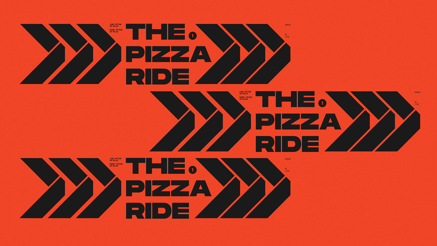
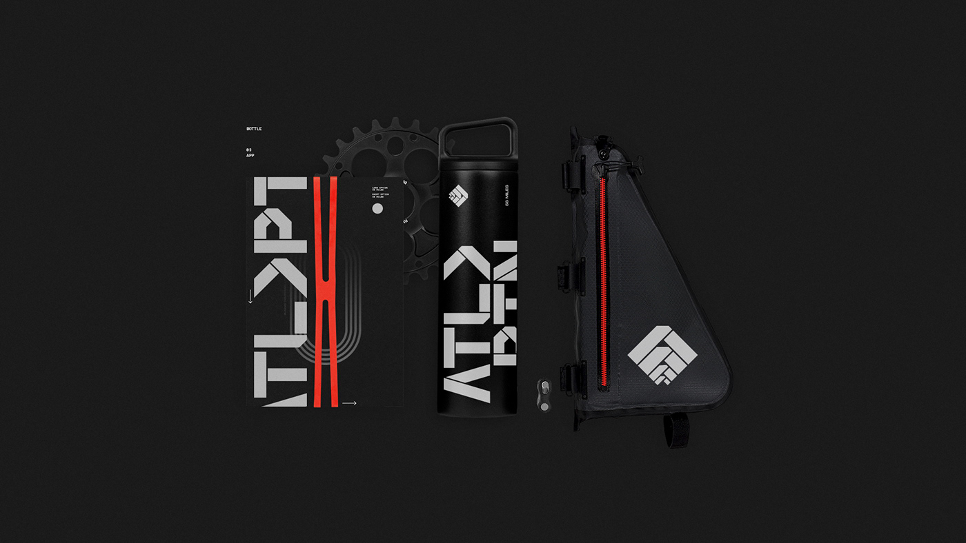
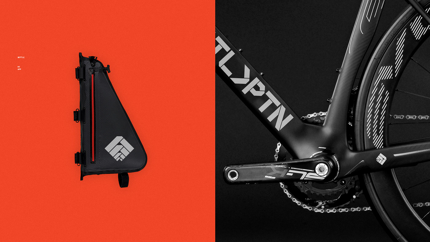
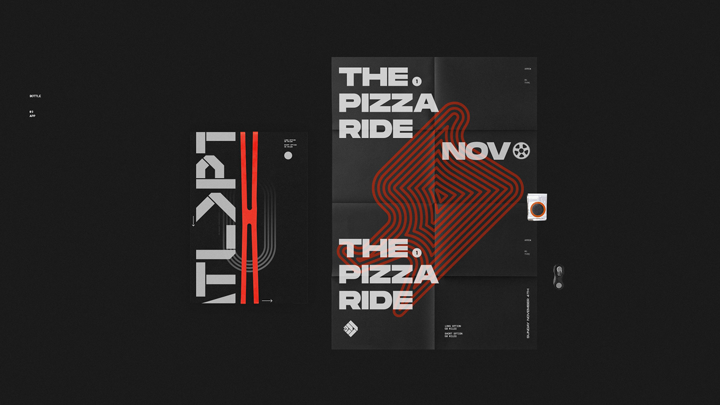
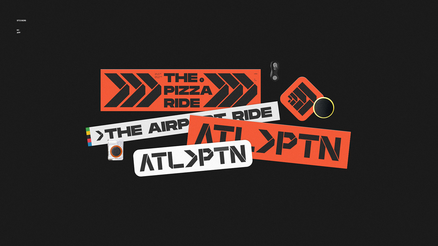
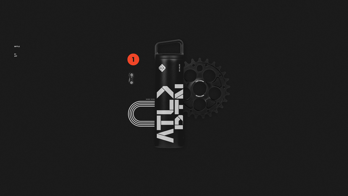
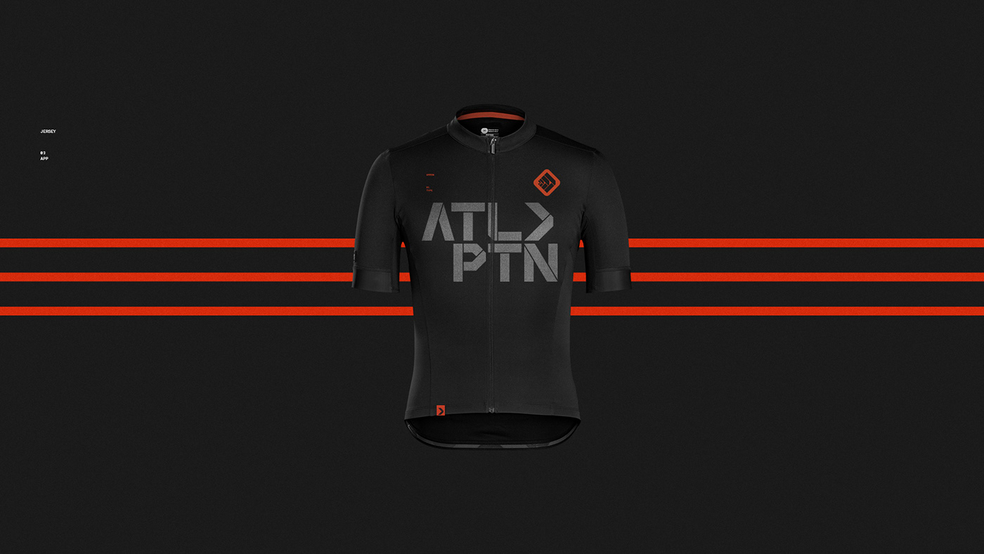
The name “ATLPTN” which is shorthand for "Atlanta Peloton”. The site will be the virtual hub for all things cycling in Atlanta, USA.
| Client requirements |: I prefer clean lines, minimalist looks but with bold elements and colors. I am open to many different design styles but would prefer this brand and logo have a hard, almost intimidating feel to them. This sport and this group are intense and we need a look that reflects the culture.
<<<<<<<<<<<<<<<<<<<<<<<<<<<<<<<<<<<<<<<<<<<<<<<<<<<<<<<<<<<<<<<<<<<<<<<<<<<<<<<<<<<
The brand
We have created a project supported by the concept of "peloton". Typography has been designed with modules that evolve towards the creation of the isotype in the search to build a versatile system of forms. The language has been configured through geometrically arranged modules to establish an open and pregnant system open to the possibility of creating multiple applications both ON and OFF.
↓