

[ITA]
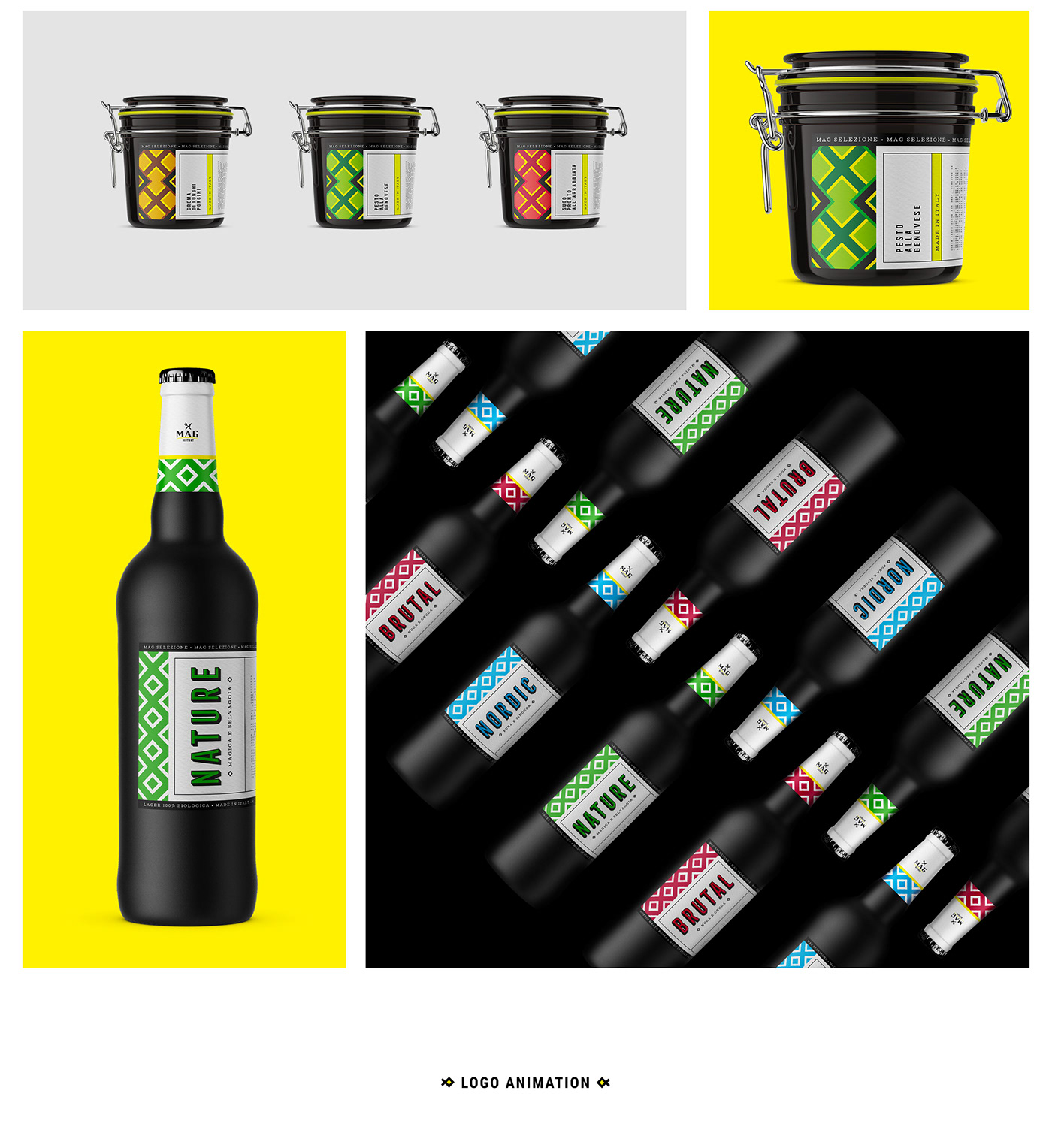
Il concept ideato dal cliente ha subito nel tempo numerose modifiche dal nome al tono di voce, mantenendo sempre l'impegno ad offrire cibo buono e sano. In questa versione definitiva del progetto, l'idea era quella di creare un luogo in cui mangiare bene e in cui poter acquistare prodotti di qualità da utilizzare a casa propria scegliendoli tra quelli selezionati da MAG per il cliente. Questa selezione e i piatti serviti variano al variare delle stagioni per assicurare sempre prodotti freschi e di qualità.
Il concept ideato dal cliente ha subito nel tempo numerose modifiche dal nome al tono di voce, mantenendo sempre l'impegno ad offrire cibo buono e sano. In questa versione definitiva del progetto, l'idea era quella di creare un luogo in cui mangiare bene e in cui poter acquistare prodotti di qualità da utilizzare a casa propria scegliendoli tra quelli selezionati da MAG per il cliente. Questa selezione e i piatti serviti variano al variare delle stagioni per assicurare sempre prodotti freschi e di qualità.
SFIDA
Per THANATOS Digital Agency questa è stata una delle imprese più impegnative, si trattava della terza versione di un progetto a 360° e il rischio di aver terminato la spinta creativa era reale.
SOLUZIONE
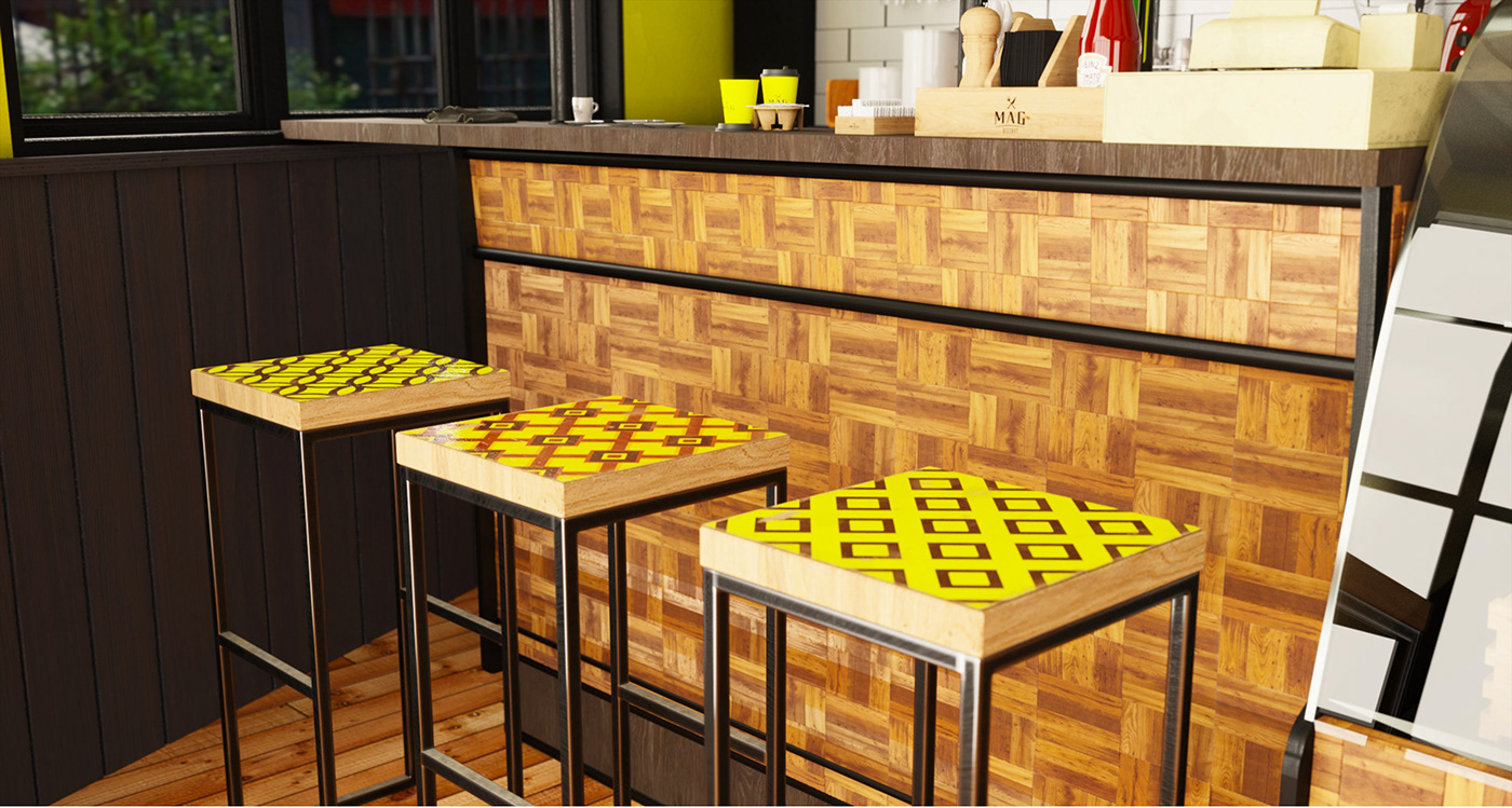
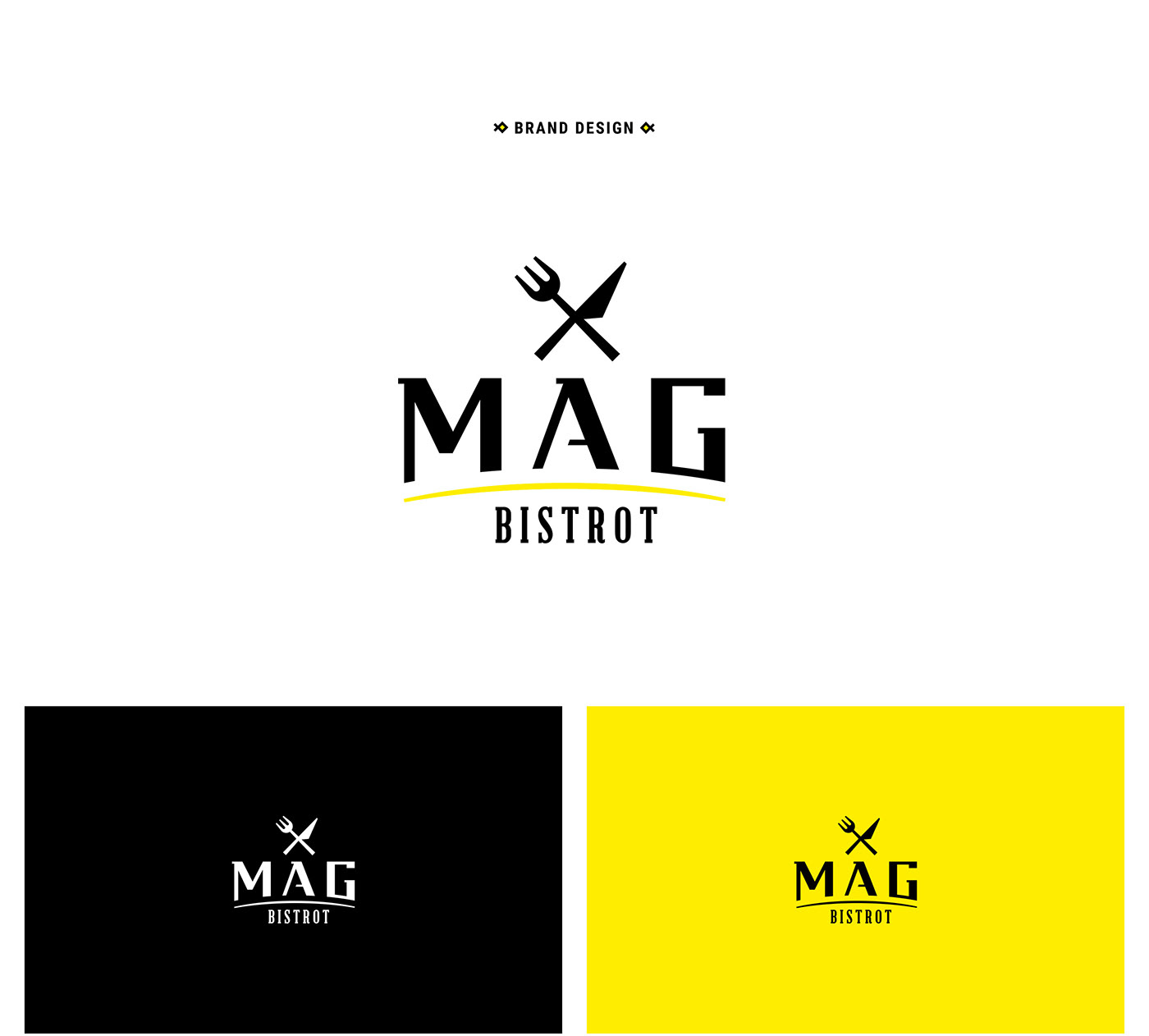
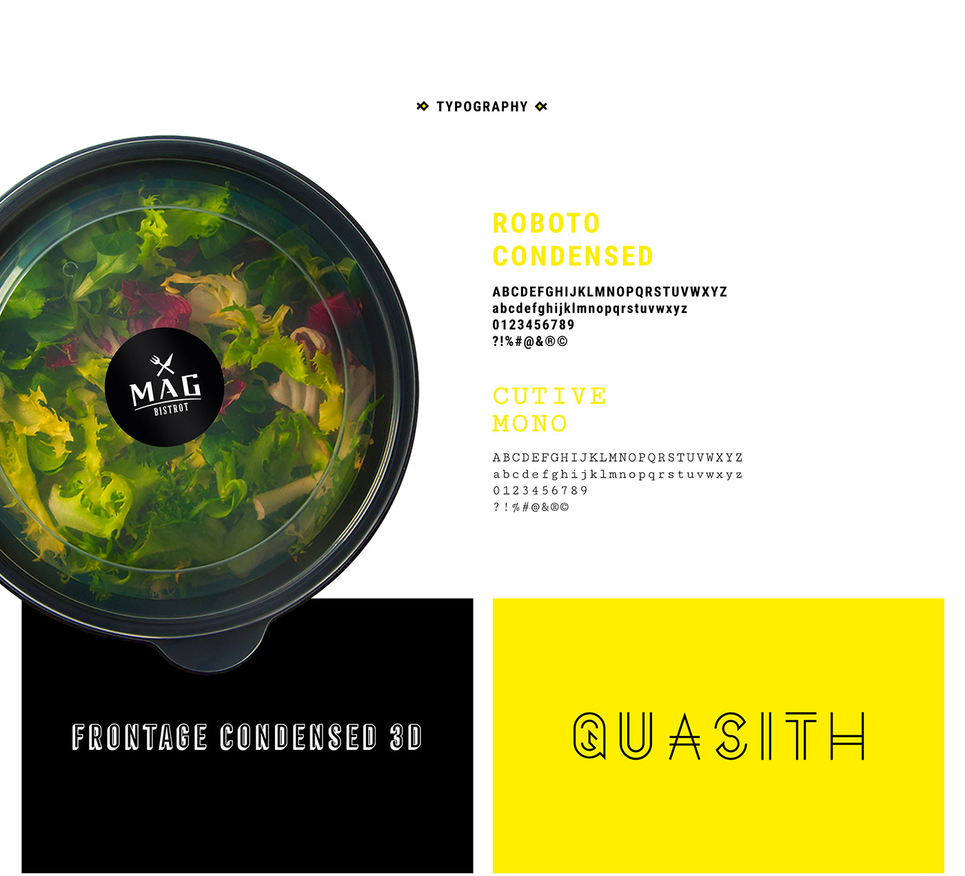
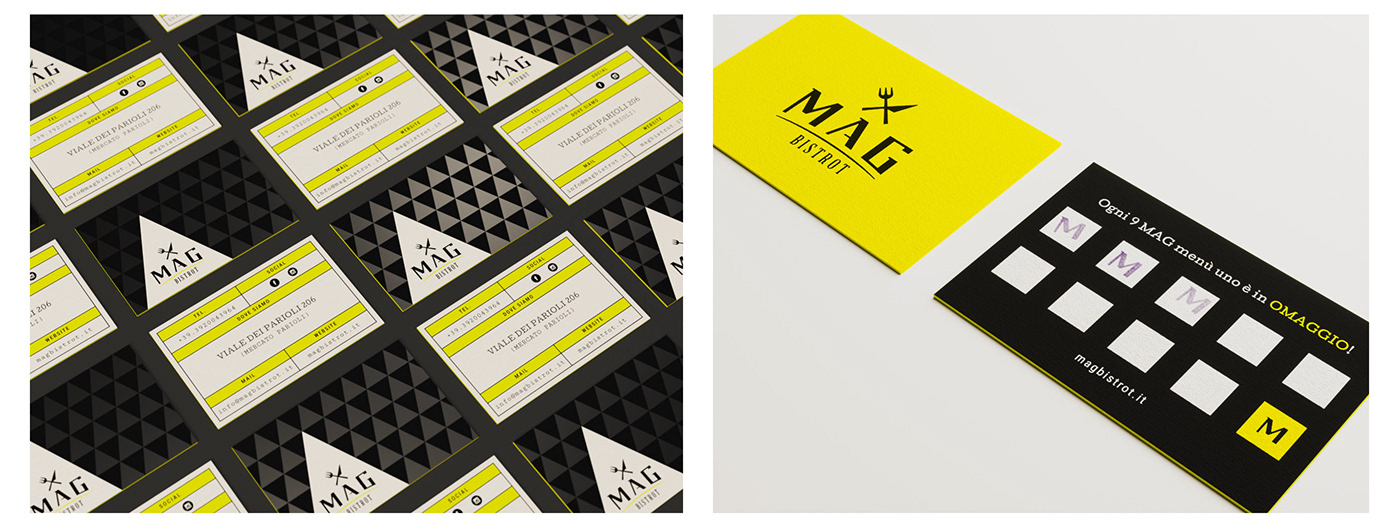
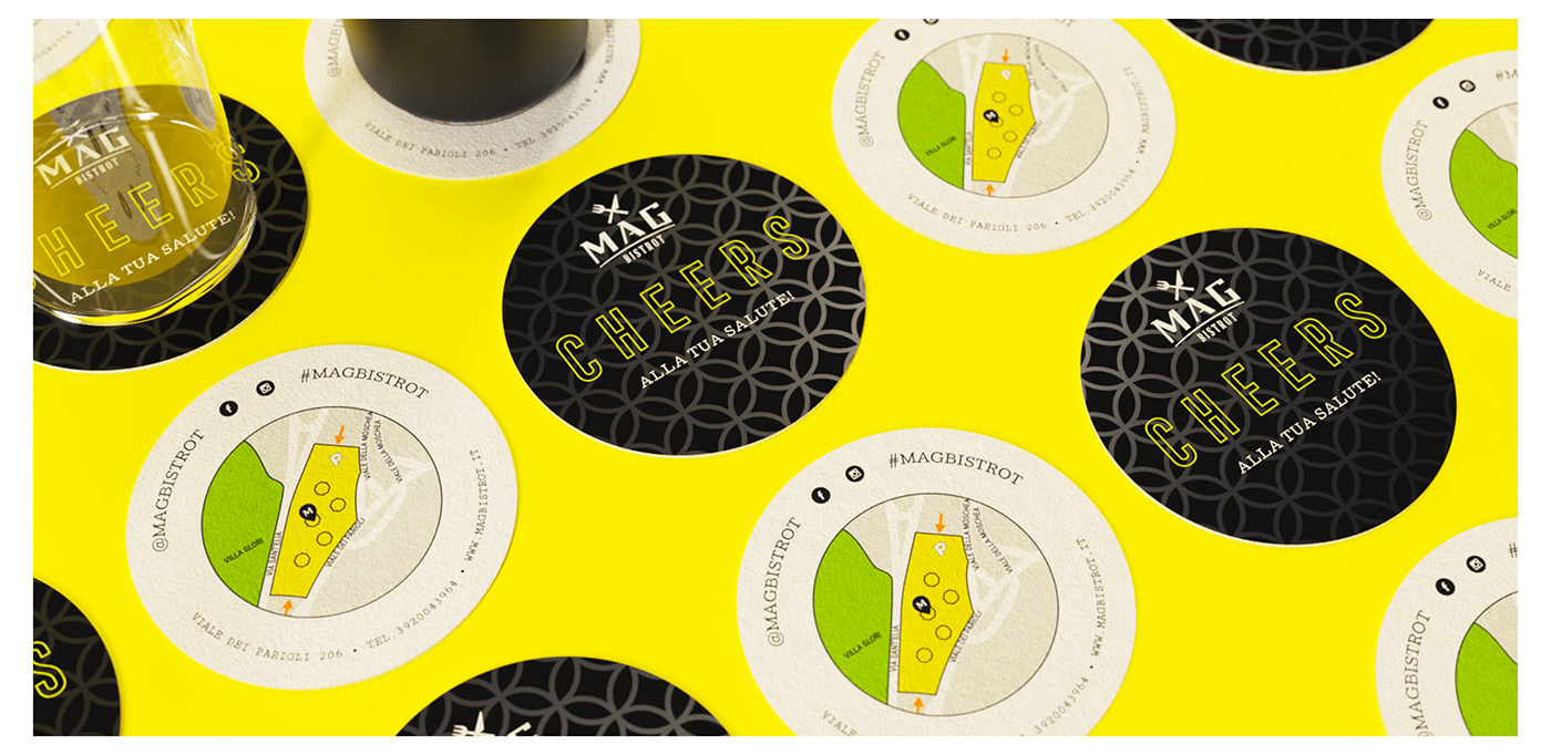
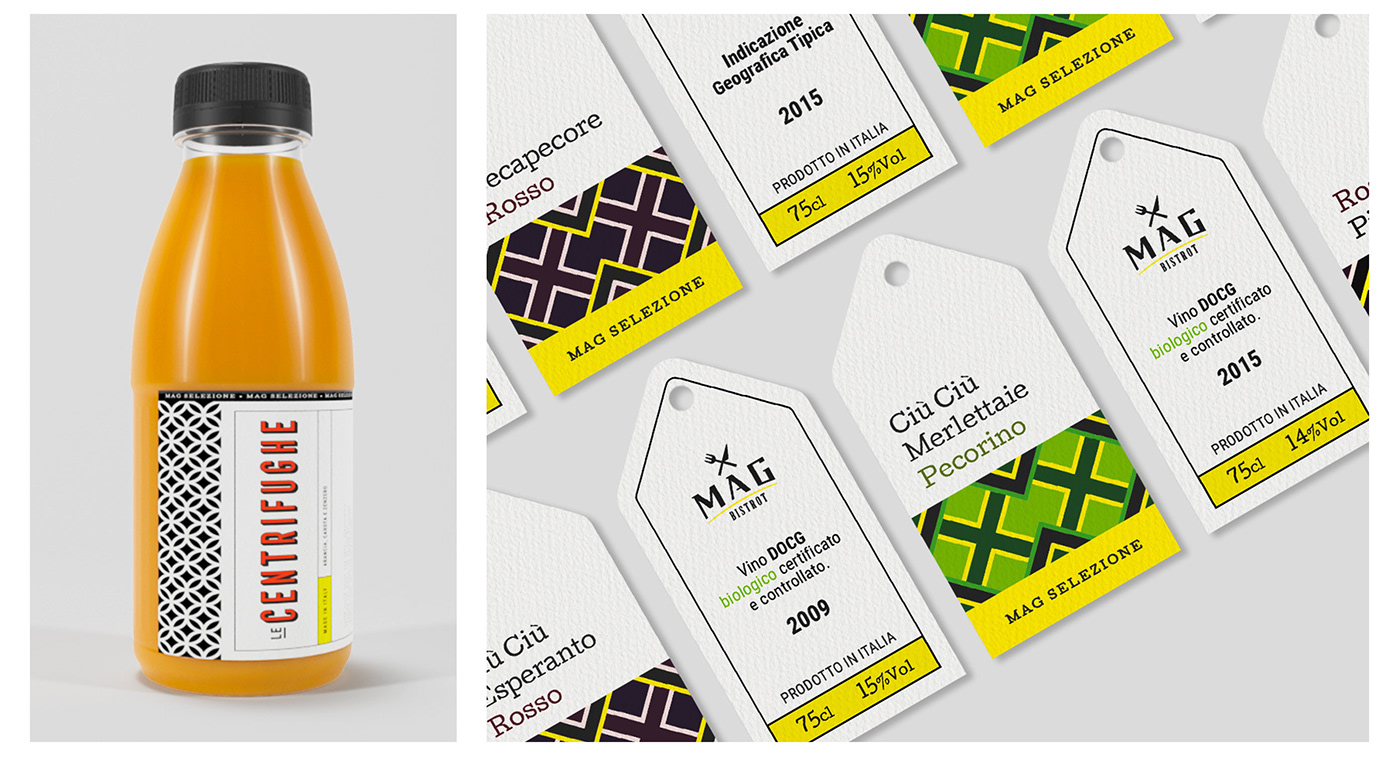
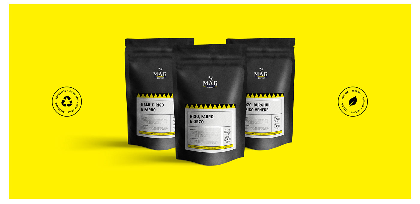
Grazie anche alla partecipazione di altre persone, anche solo con un suggerimento o un parere, siamo riusciti a trovare una nuova chiave di lettura e siamo molto orgogliosi del risultato finale. Il lettering delle lettere M - A- G è completamente custom, realizzato ad hoc per il cliente. Il mix industriale e rustico degli ambienti si sposa alla perfezione con il logo, le etichette, i pack e le texture geometriche. Nel complesso risulta un luogo vivo e dinamico.
-
[ENG]
The concept created by the customer has undergone numerous changes from the name to the tone of voice over time, always maintaining the commitment to offer good and healthy food. In this final version of the project, the idea was to create a place to eat well and where to buy quality products to be used at home by choosing them from those selected by MAG for the customer. This selection and the dishes served vary with the seasons to always ensure fresh and quality products.
CHALLENGE
For THANATOS Digital Agency this was one of the most demanding companies, it was the third version of a 360 ° project and the risk of having completed the creative drive was real.
SOLUTION
Thanks also to the participation of other people, even with a suggestion or an opinion, we managed to find a new interpretation and we are very proud of the final result. The lettering of the letters M - A - G is completely custom, made specifically for the customer. The industrial and rustic mix of the environments goes perfectly with the logo, the labels, the packs and the geometric textures. Overall it is a lively and dynamic place.