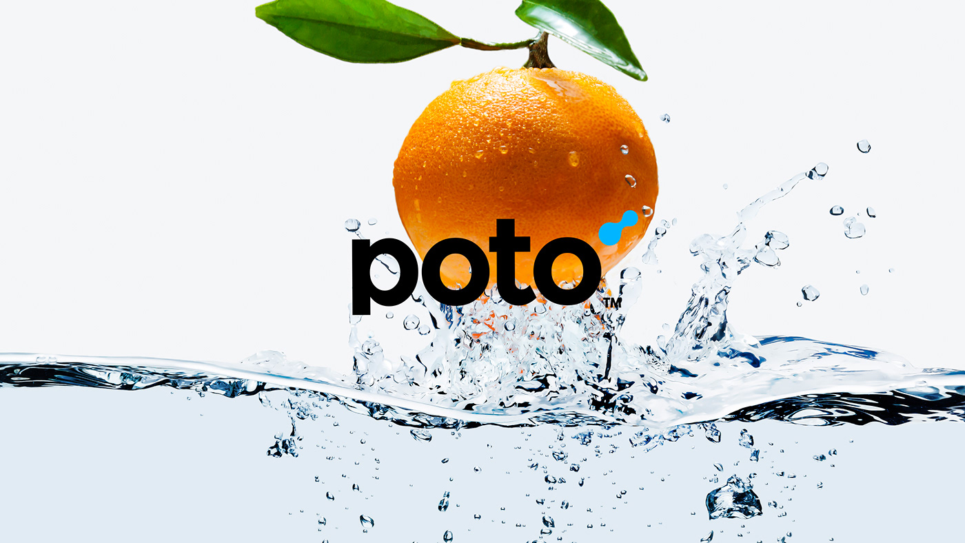
Poto
Brand & Packing Design
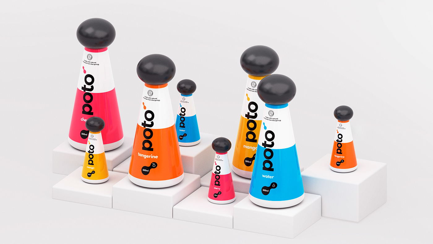
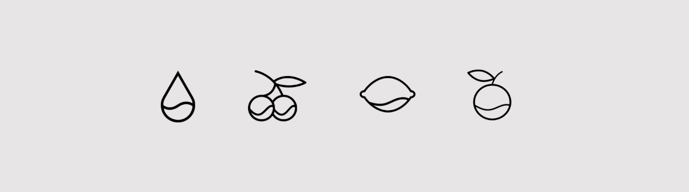
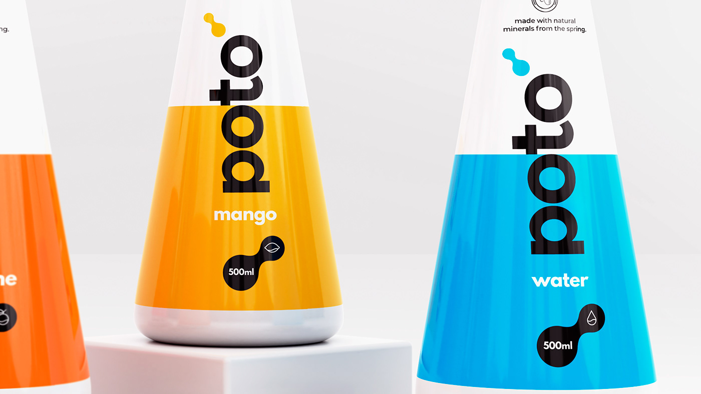
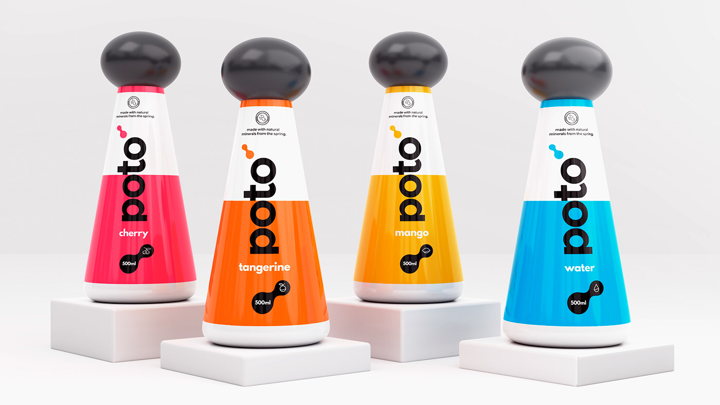
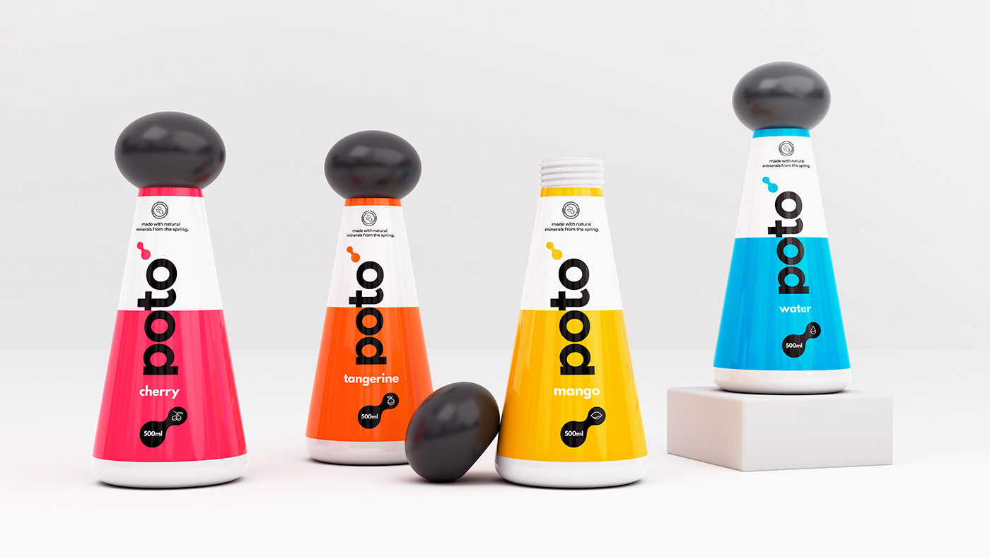
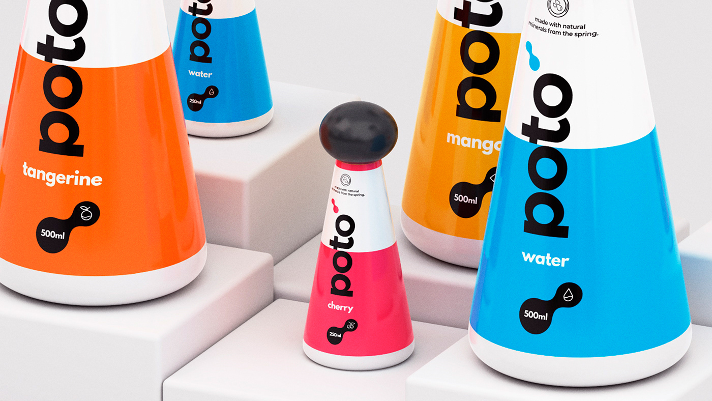
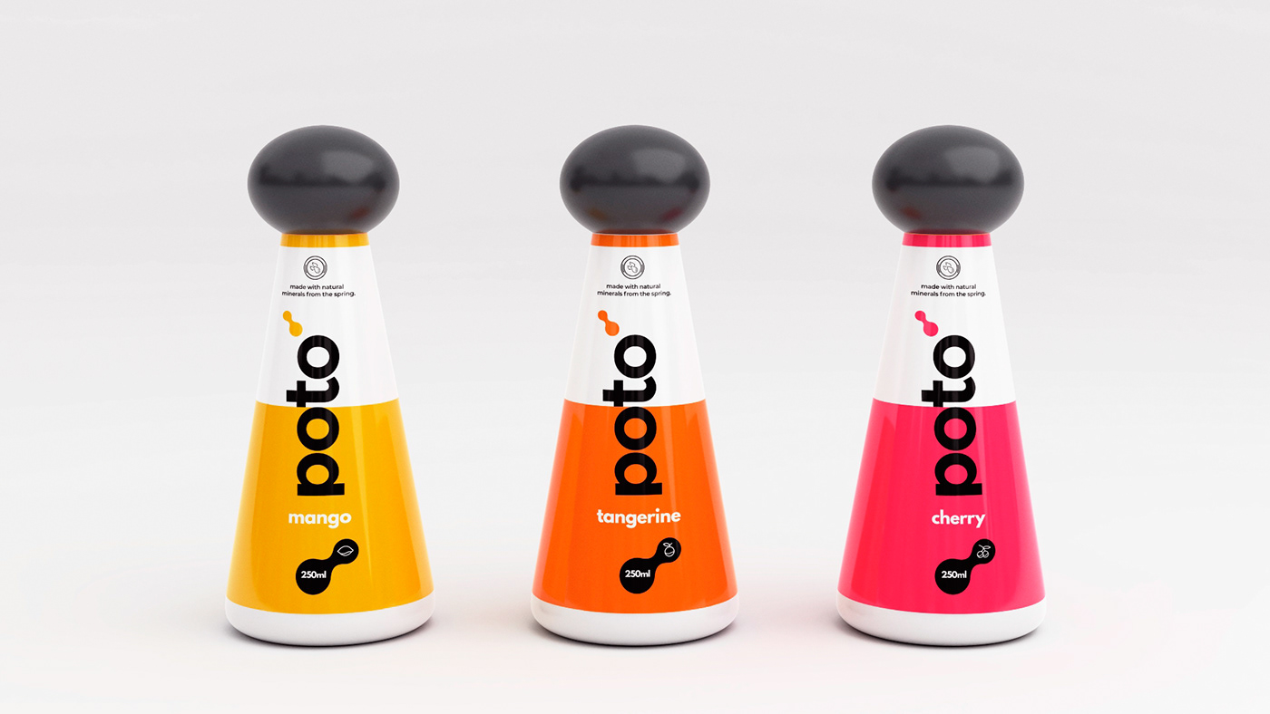
This water company called Poto, offers water made with natural minerals from the spring. Other water companies process and filter their water, taking out all the natural minerals and electrolytes our body needs leaving the water with no natural electrolyte/minerals. We also offer energy water. This is water that contains electrolyte and minerals that gives energy.
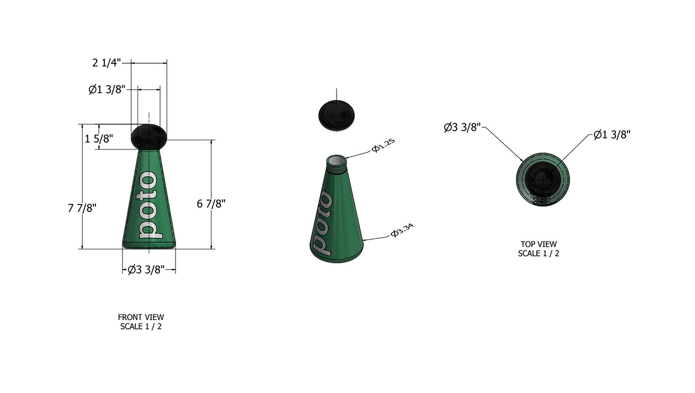
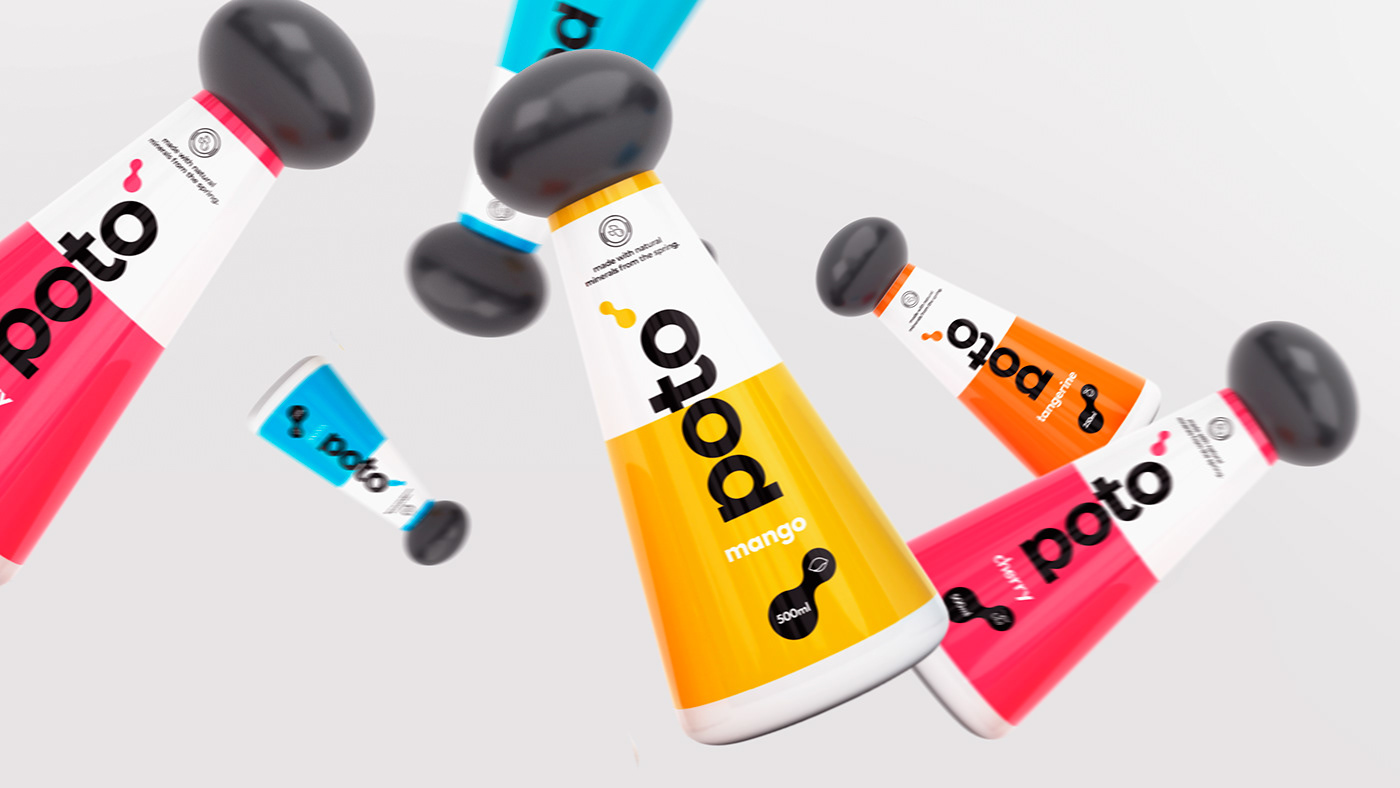
Poto is a company that was built out of the desire to create sustainable water that will minimize the use of plastic in the environment. The bottle will be made with almost paper aka Bioplastic. This is a type of plastic that is 70% paper making it easy for the bottle to be recycled. We aim to make the bottle lightweight, easy to recycle and made with renewable resources helping to reduce the impact of our packaging to our environment. The bottle is 100% recyclable, efficient to transport and reusable.
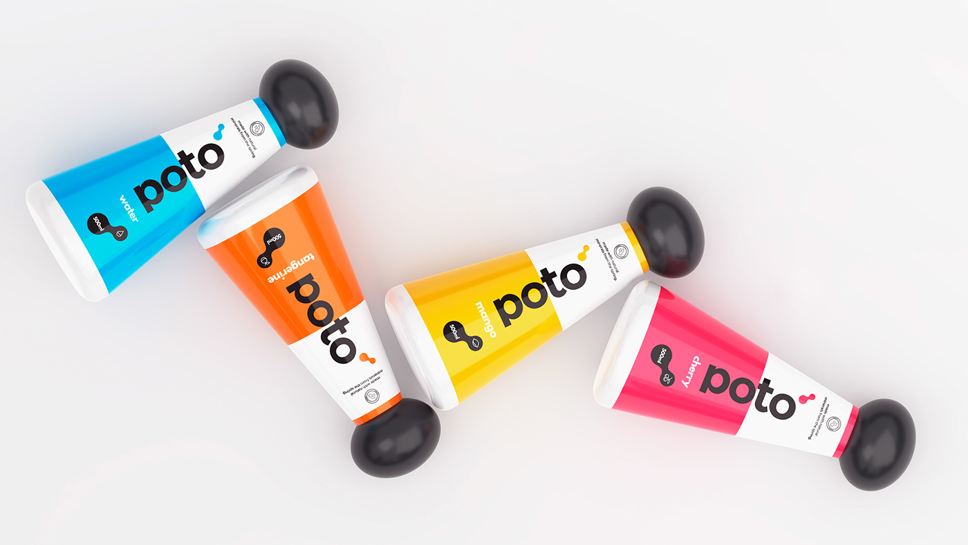
Over the years we have seen companies come out with the same bottle shape and the same content. We wanted to change something and so we decided to change the shape of the bottle. With the shape you get more water than the regular bottle, you can easily carry it around without worrying about dropping it and you can fit into anything. I call it the bottle with an attitude.


Client: Poto
Art Director: Raphael Iglesias
Artist 3D: Júlio Cezar
Location: Toronto, Canada
Year: 2019
Contact
design@raphaeliglesias.com