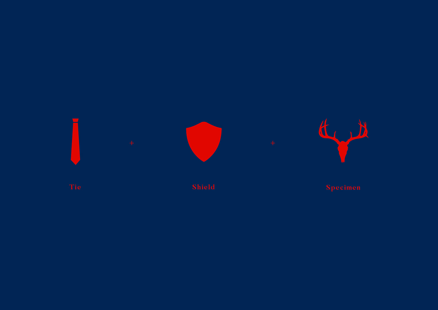
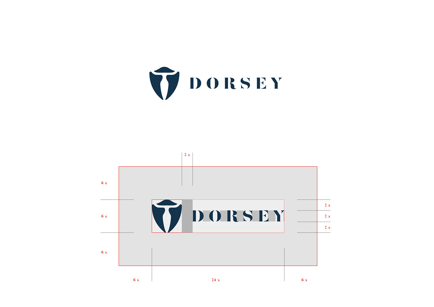
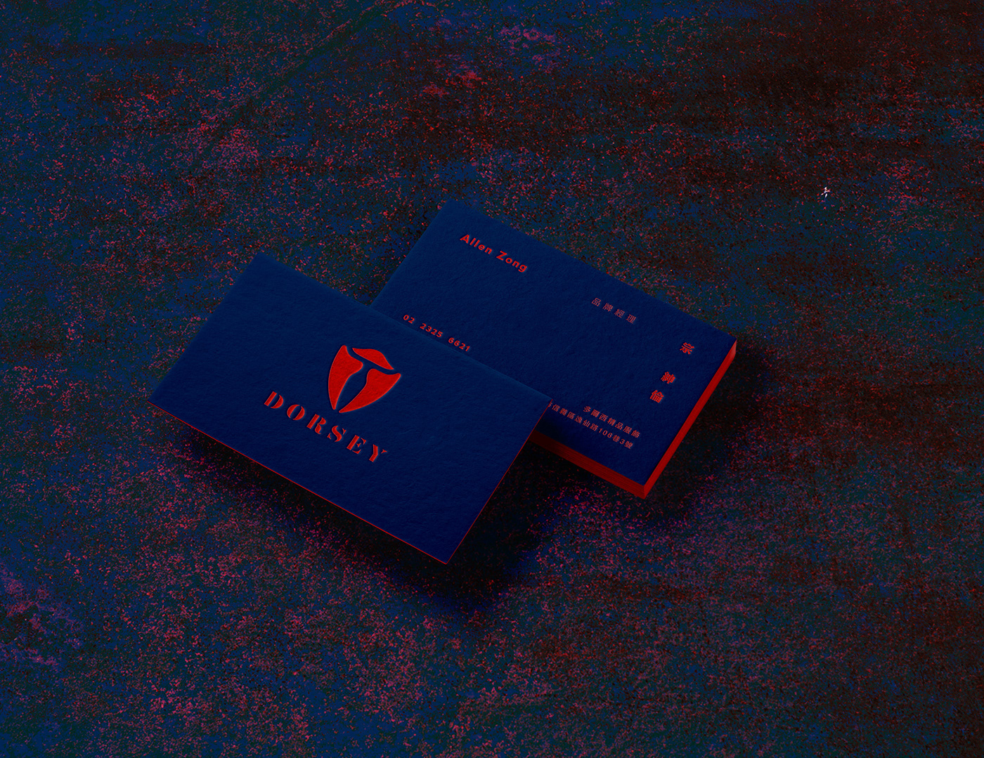
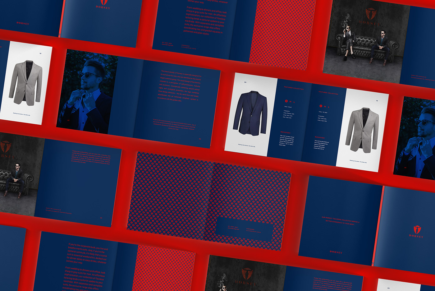
The brand identity of Dorsey is especially designed for its suit stores for men, who are identified as the brand’s target customer group. The visual design of the brand is oriented to a perception of self-possession, maturity and prudence. Conceptually centering around animal rights and ecological protection, the logo combines three design elements – the tie, ram’s horn and shield, adumbrated into an extremely simplistic symbol in accordance with the golden ratio. The key outdoor visual identification, as well as the signboard, of the store is mainly made of weathering steel that has been cut into big chunks to bring about a dignified textural perception. In terms of the spatial planning of the store, the fair-face concrete walls are retained and furnished with iron and wood items that are arranged in rows to display the products.
多爾西品牌識別提案,品牌客戶群鎖定為男士西裝,視覺設計以沉穩,成熟,穩重的面向設定,標誌概念以提倡動物權與生態保護為概念核心,將三個設計理念領帶,羊角,盾牌等元素做結合,依造黃金比的邏輯方式進而勾畫出西裝的極簡符號。戶外店面主視覺和招牌以耐候鋼材為主,材料大面積切割的視覺呈現出穩重的質感,店內的空間規劃保留清水混泥土牆面,搭配鐵件和木頭的成列方式展示商品。