


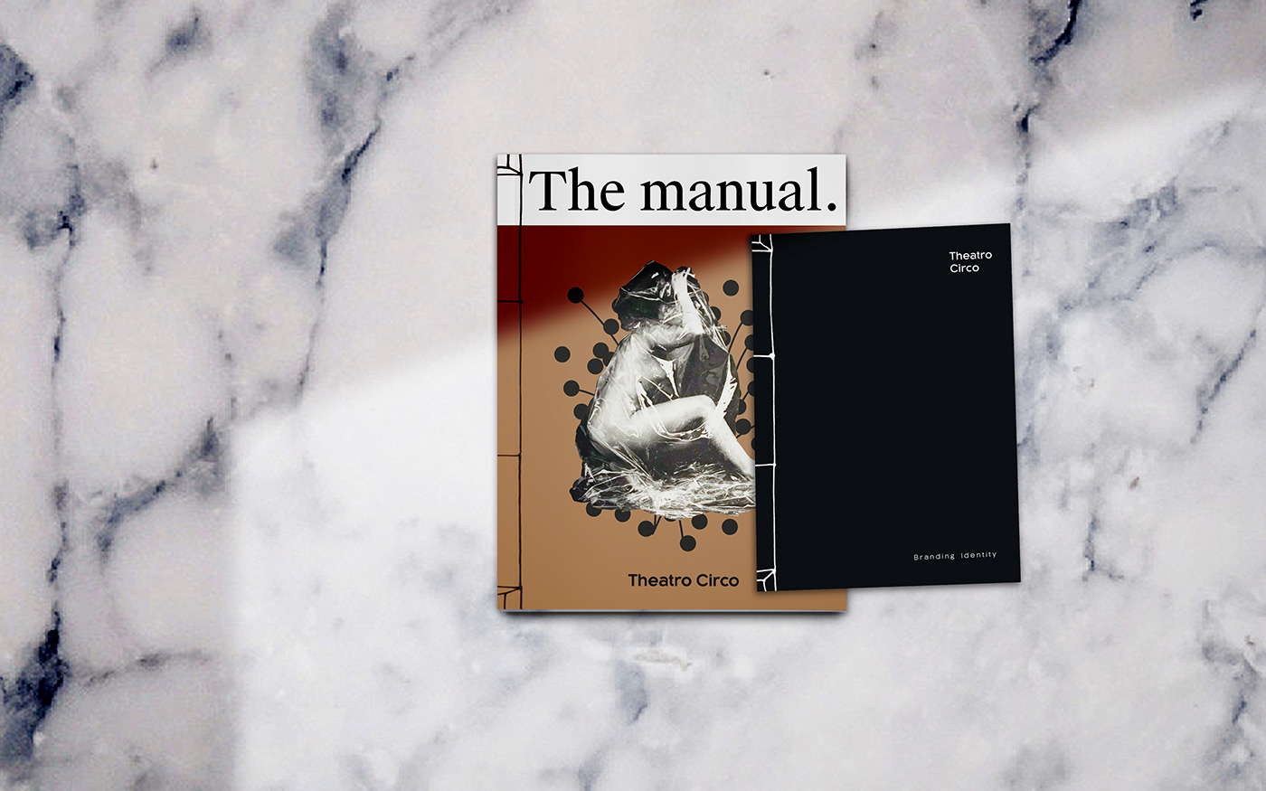
Theatro Circo
Brand identity (Re-brand)
Theatro Circo is more than a public theatre company. They have a keen eye to find new ways to reach and impact target audiences. That is where we came in: we found a new visual system to match their identity with their new objectives.
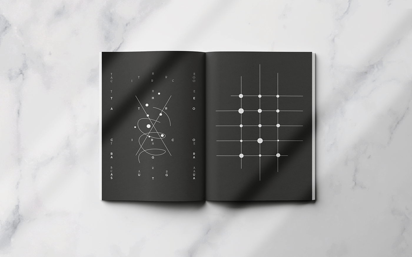
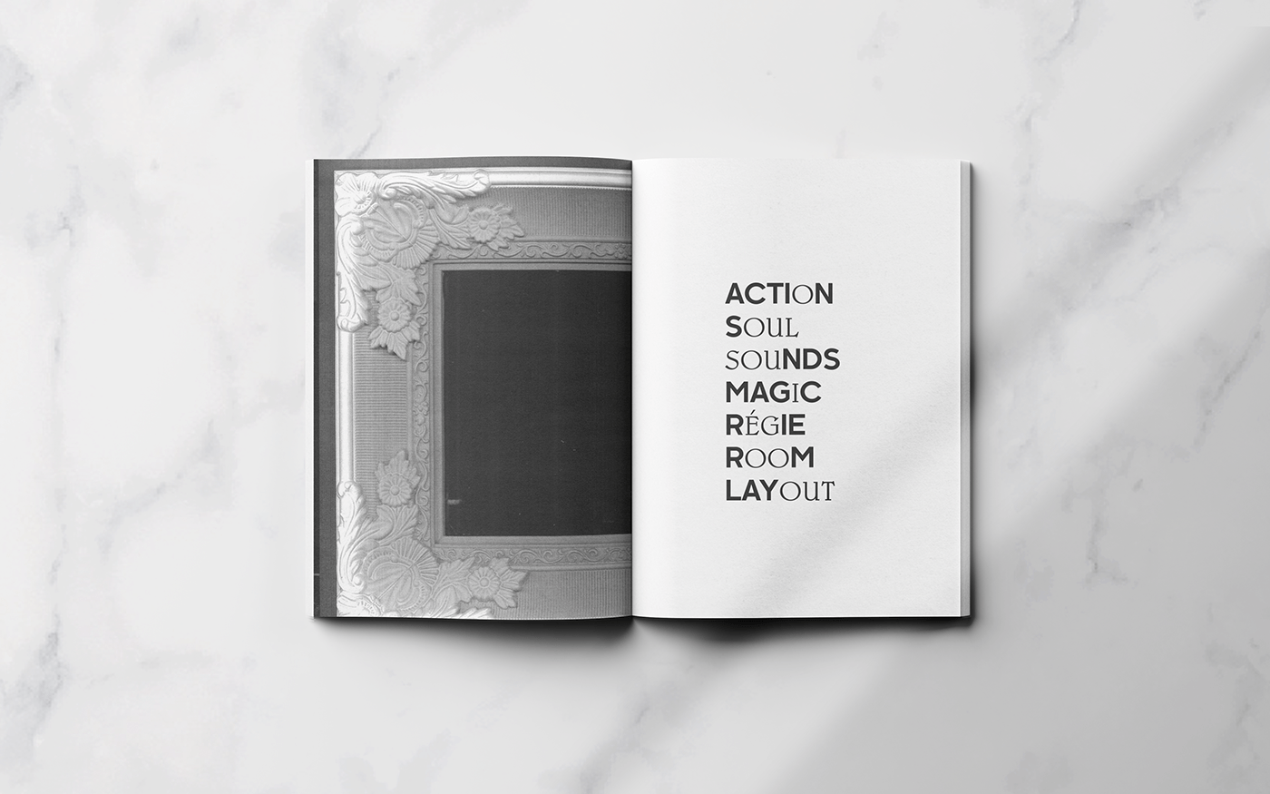
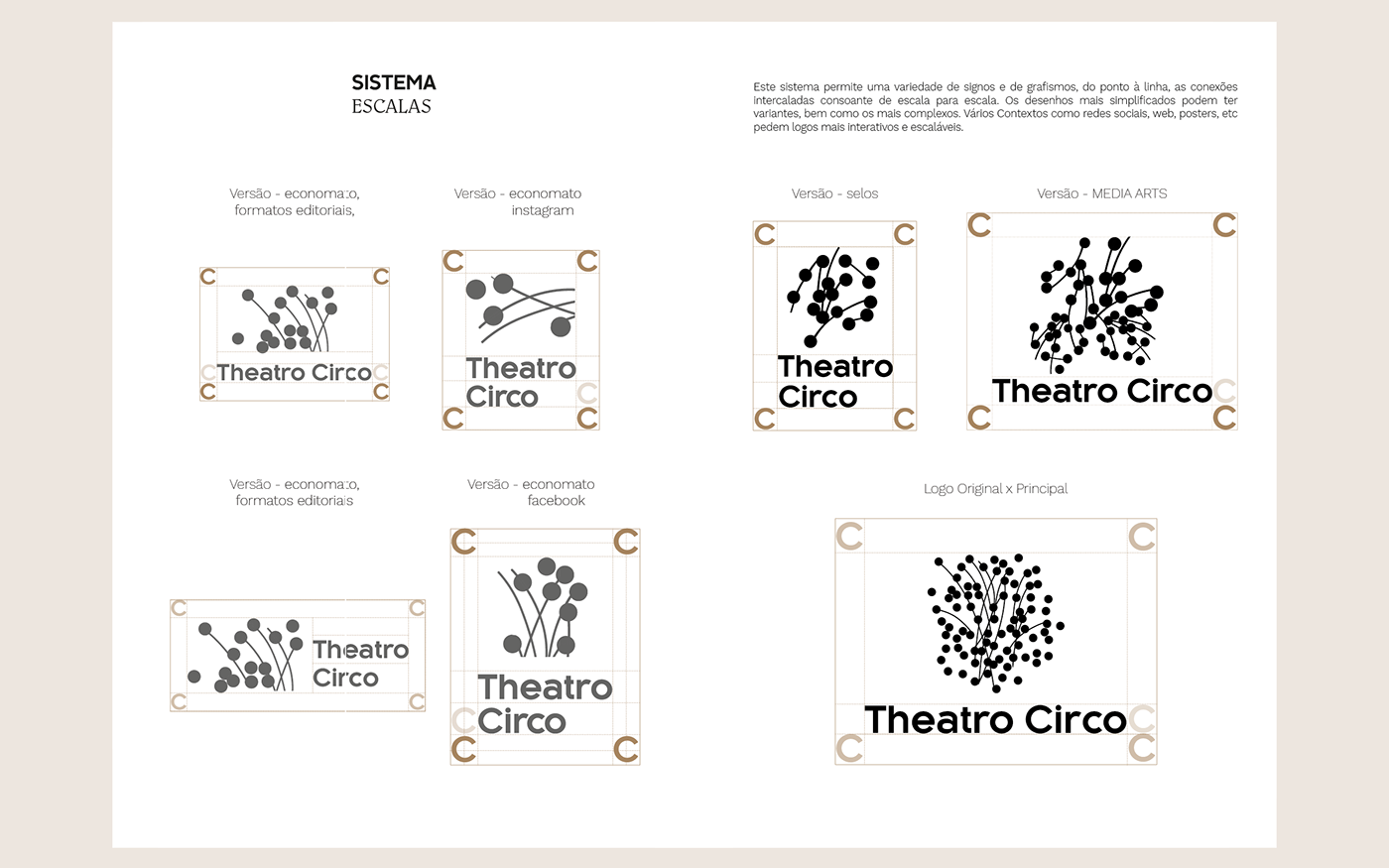
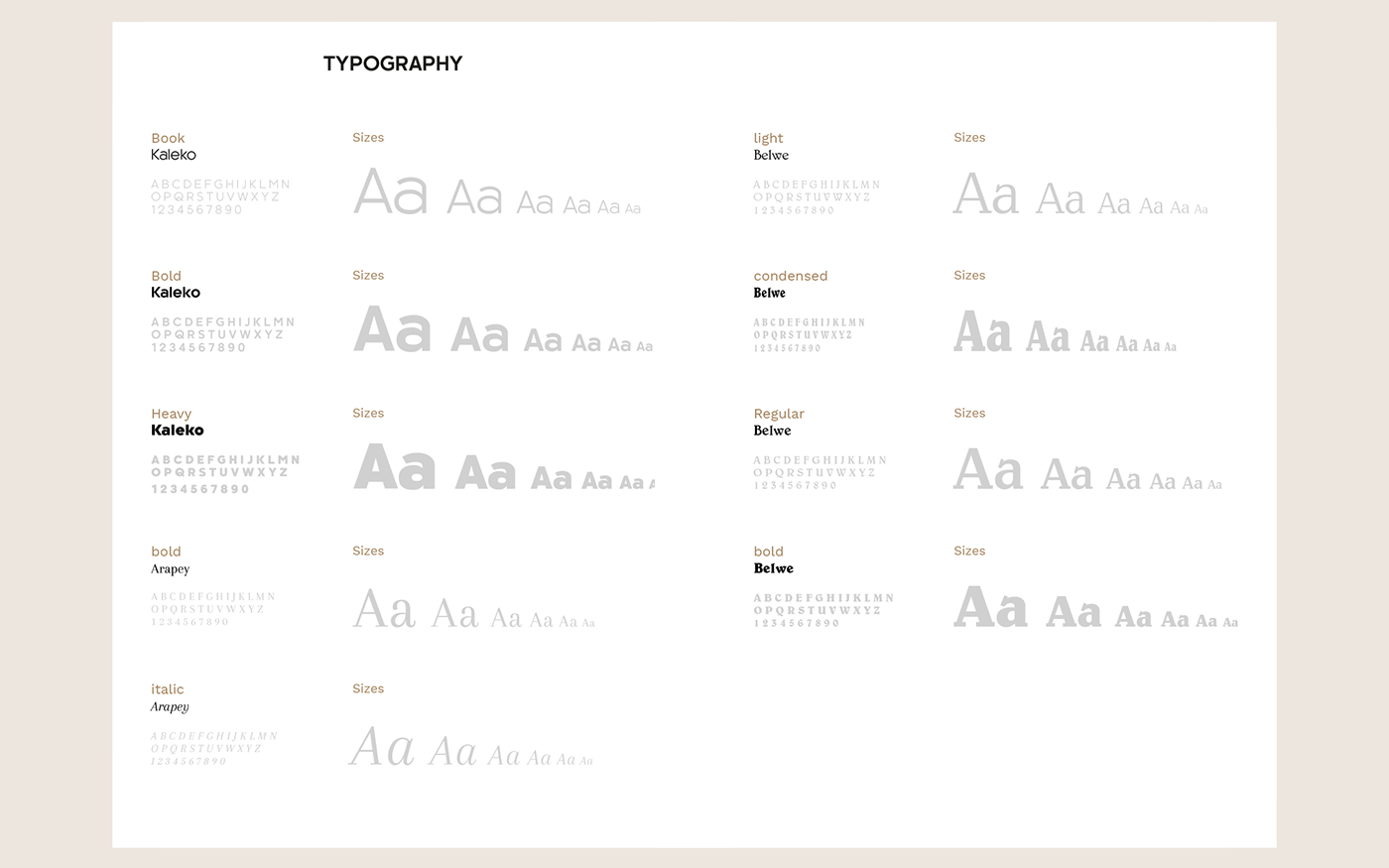
We made diversity an essential part. Typography is delivered through curved forms because communication is never a straight line. We chose strong and geometric typography to provide steadiness and rigor and also curvy, adding balance to the organic and fluid curves. Adding a little bit more spice, these two characters have no endings, as humanity evolves and find new ways to communicate.
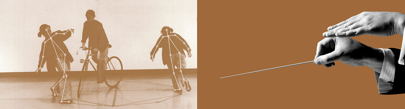
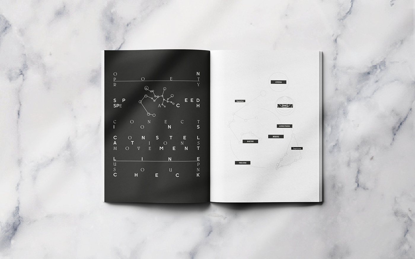
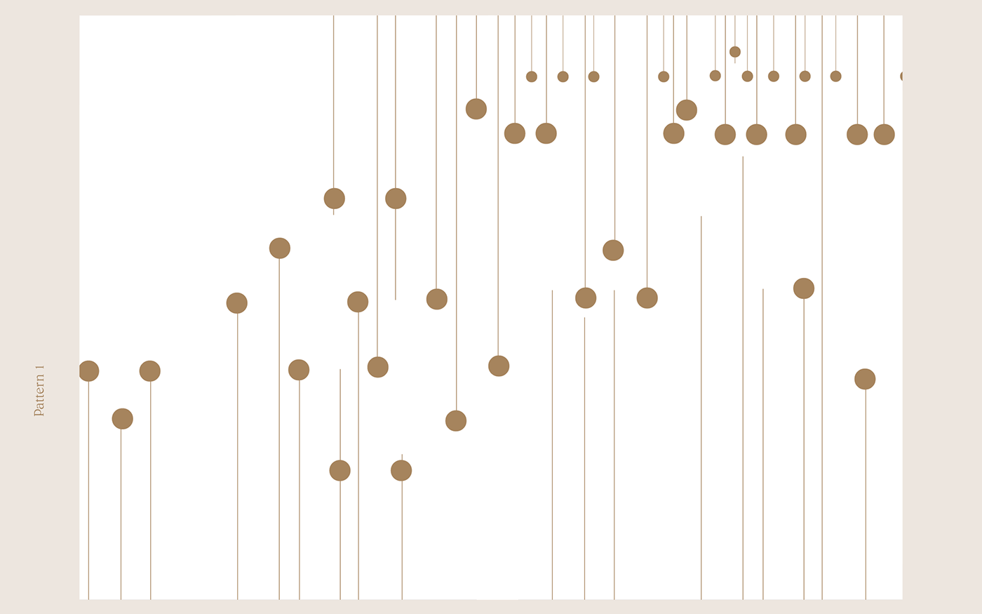
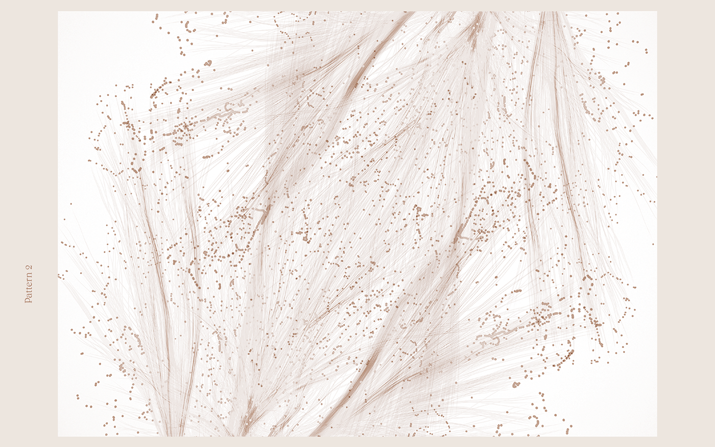
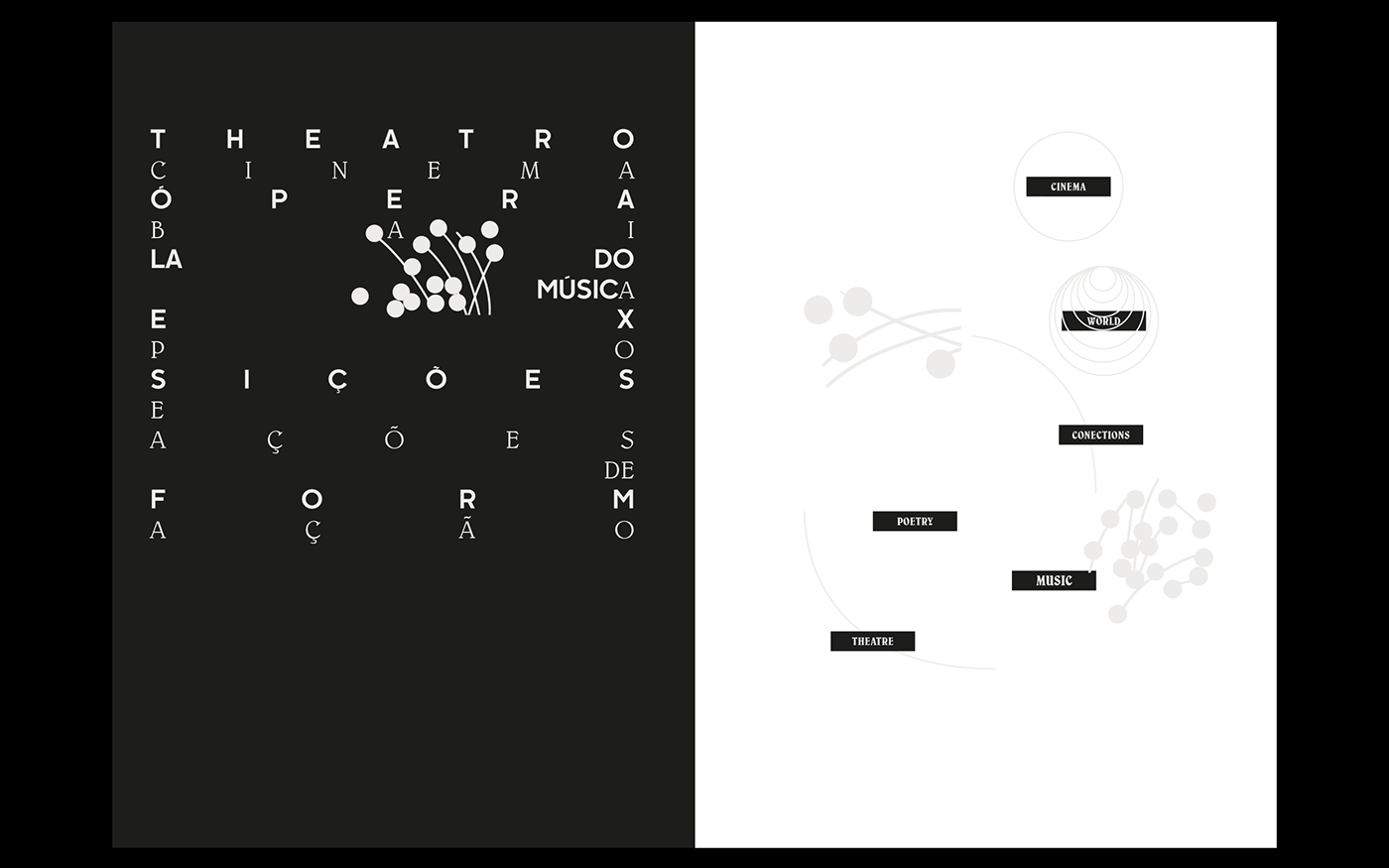
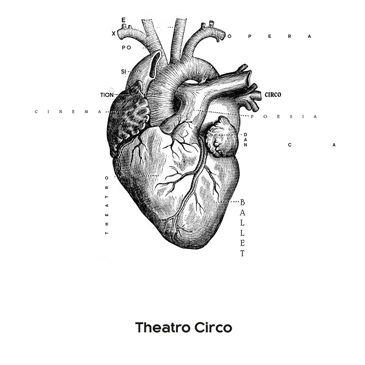
There are numerals ways to play with type and imagery, as the logo itself suggests. It is a multicultural, diverse and complex, yet, simple system, in which the line and dot are connected as one, but engaging a lot of areas. Conceptually, media arts, theatre, cinema, workshops, music, art, spectacle, summits, etc are connected as one (circle), but also work individually in their space (lines).
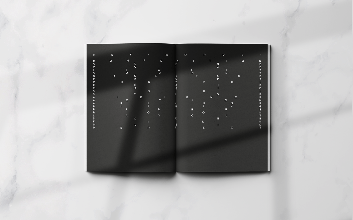
Relevant ________Substancial
Important
Info
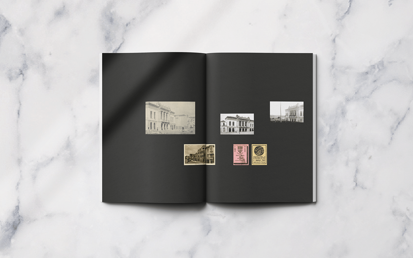
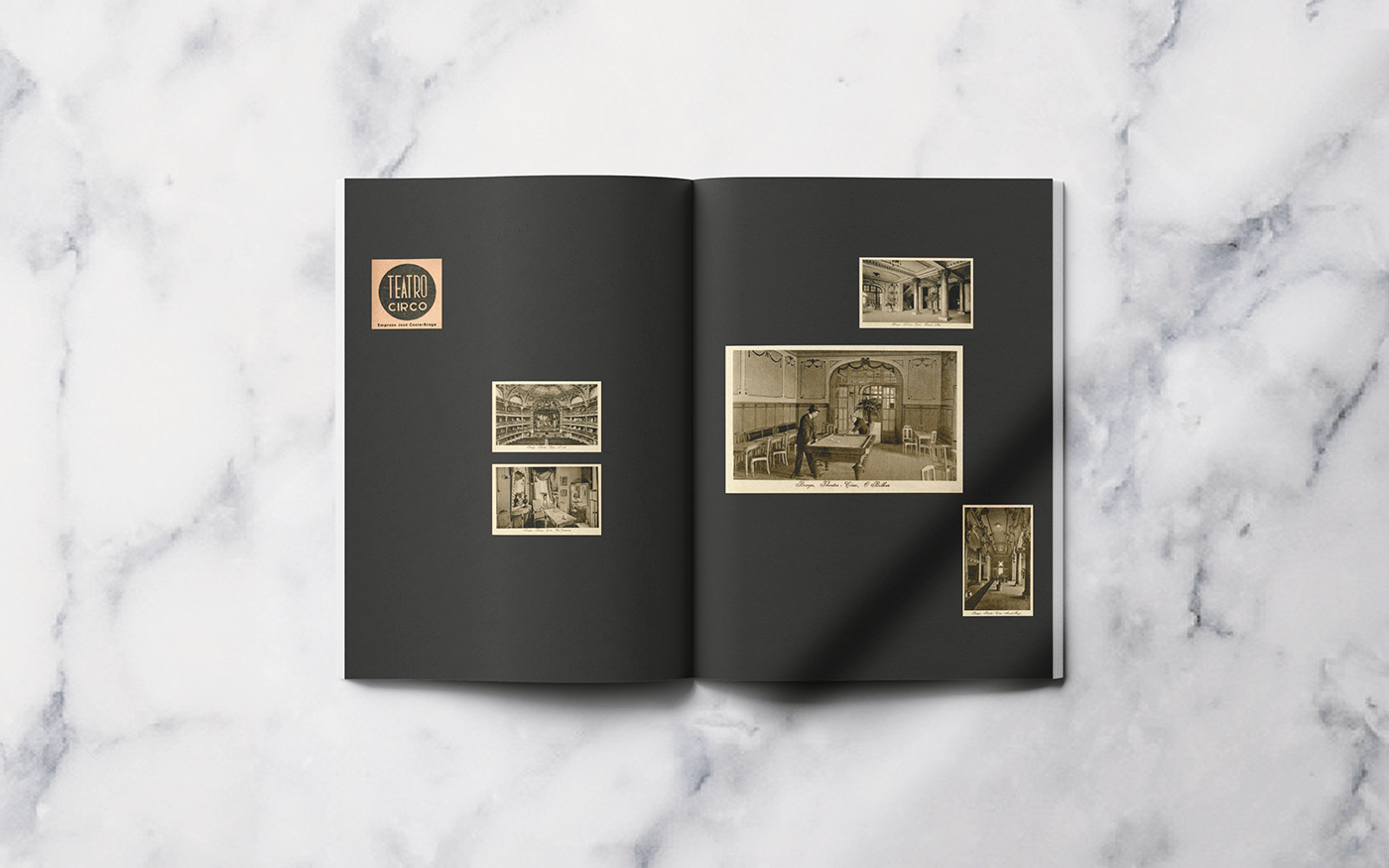
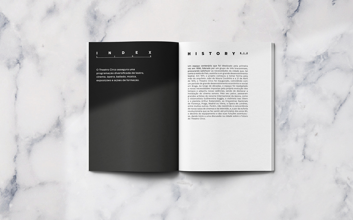
Theatro Circo was founded in Braga, Portugal in 1915 by João de Moura Coutinho, and has since then regularly been setting up theatre shows for people who are not necessarily always interested in traditional theatre. Over the years, the theatre had some changes and has been experiencing a significant growth in both public interest and audience, and is now over 100 years in showbiz.
The commitment of the theatre as a tone and it is always bold and never boring, the theatre has chosen formal, elegant, vanguard, modernity, art and spectacle as key-words of its arquitectural details. A renewal of its visual identity is needed. Theatre is about feelings and being able to express emotions, and therefore my task was to create a bold, flexible and emotionally engaging identity.
Theatro Circo is a house that values primarily the promotion of culture, the formation of audiences and eclectic and diversified programming. The main focus of this Theatro Circo
re-brand restructuring was the renewal of the entire graphic line, visual communication, either on more traditional approaches like the stationary, and improvement of its usability, optimization of the visual, and add a plus effort for responsive website. Update their visual identity into a contemporary tone.
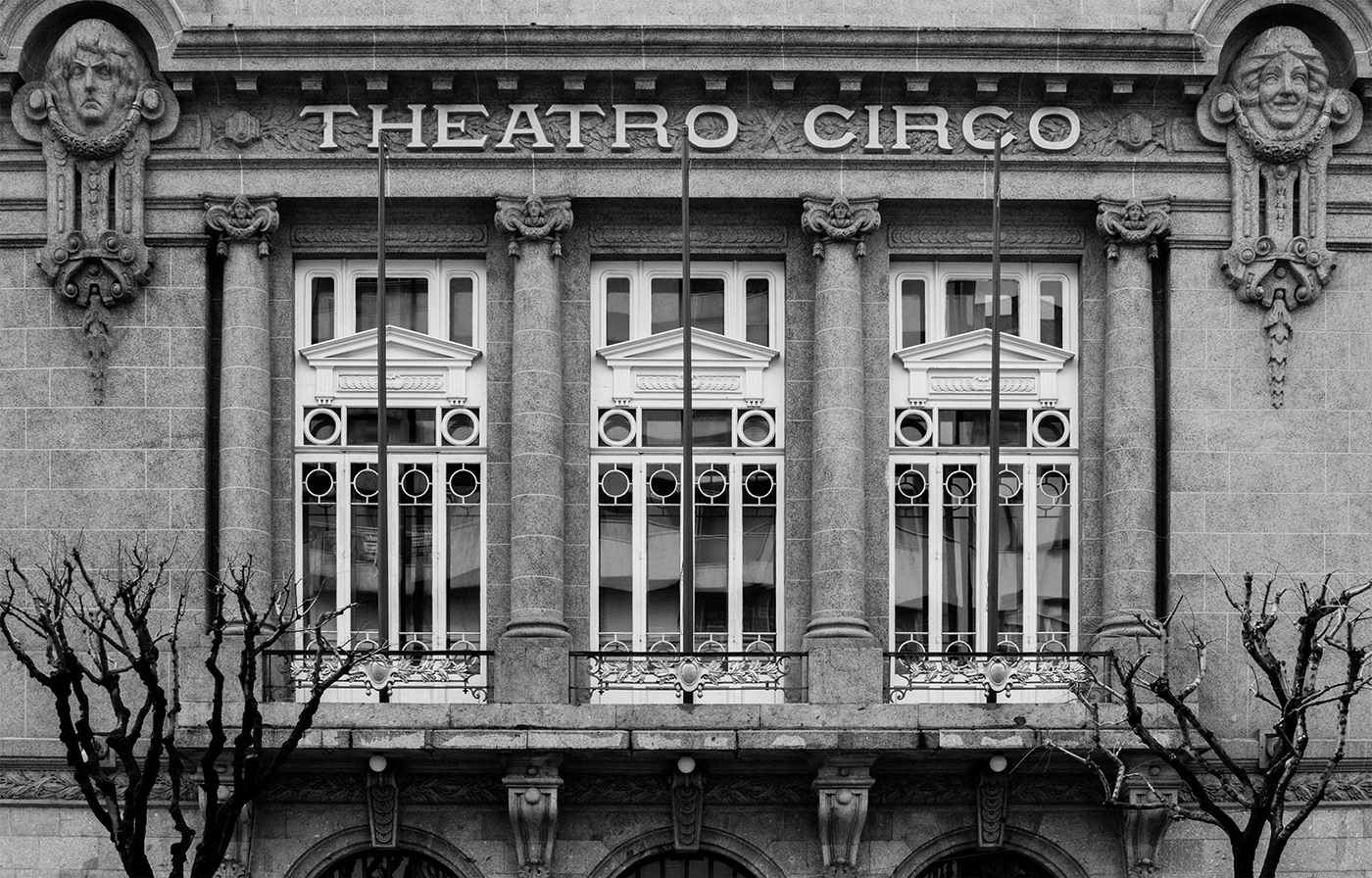
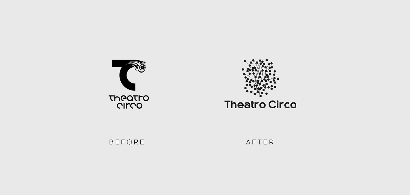
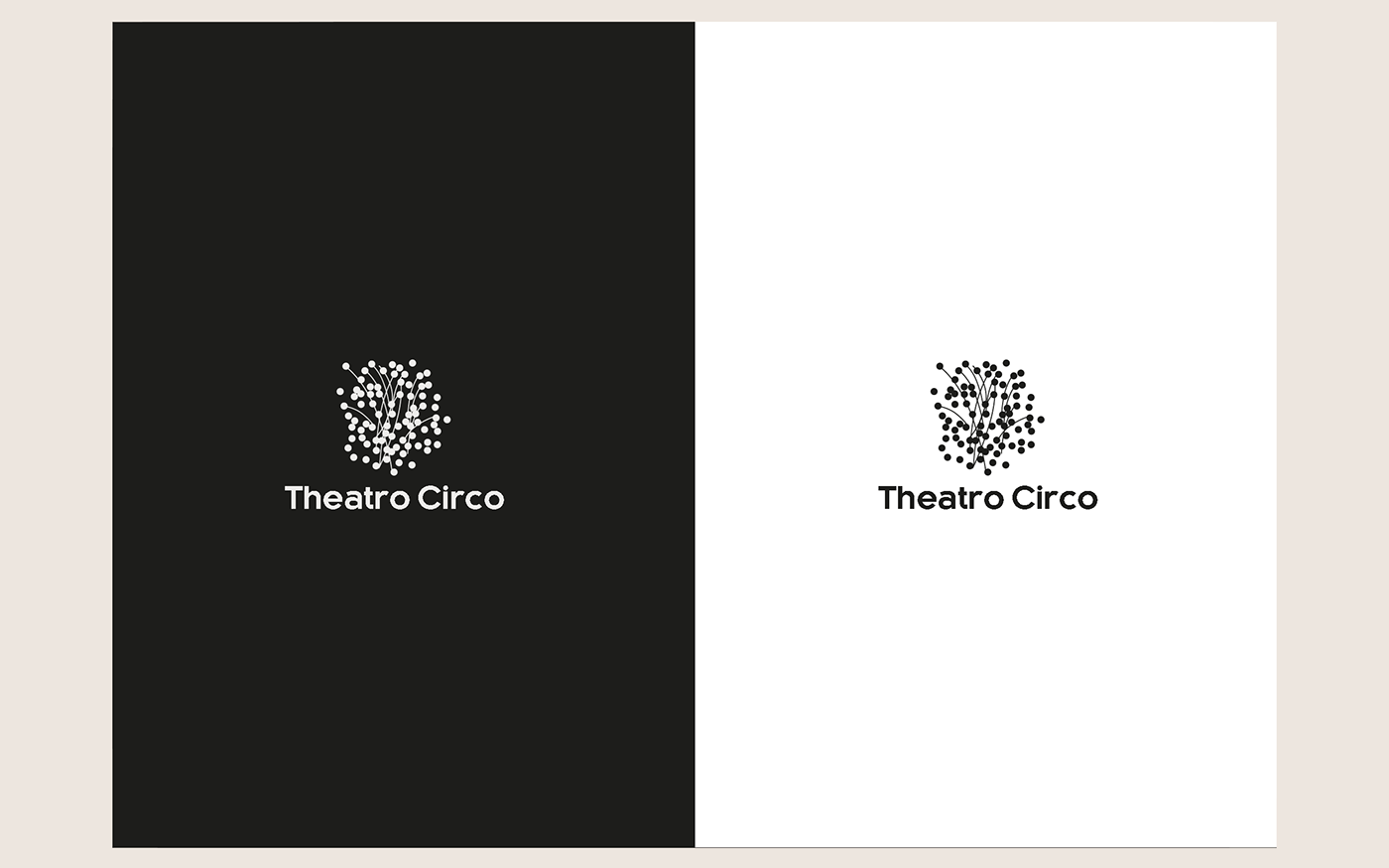
From the beginning was felt that the logo was a little bit dated and needed a new update.There was a need for a legible and creative logo, which could represent the art deco vibe and also the contemporary but timeless presence, created a re-usable logo with multiple connections, different significant, the dots represent the exaggeration proper to his time, the vastness of multidisciplinary, the emphasis of adaptability. The lines represent the connexions, the tender line between past, present and future. A feeling of depth, and type is kaleko 205, a font family by Talbot type, designed by Adrian Talbot.
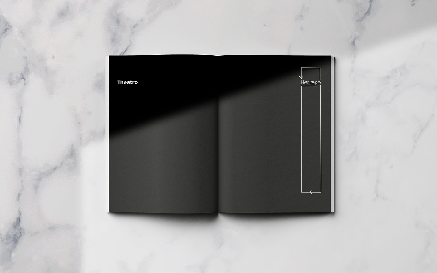
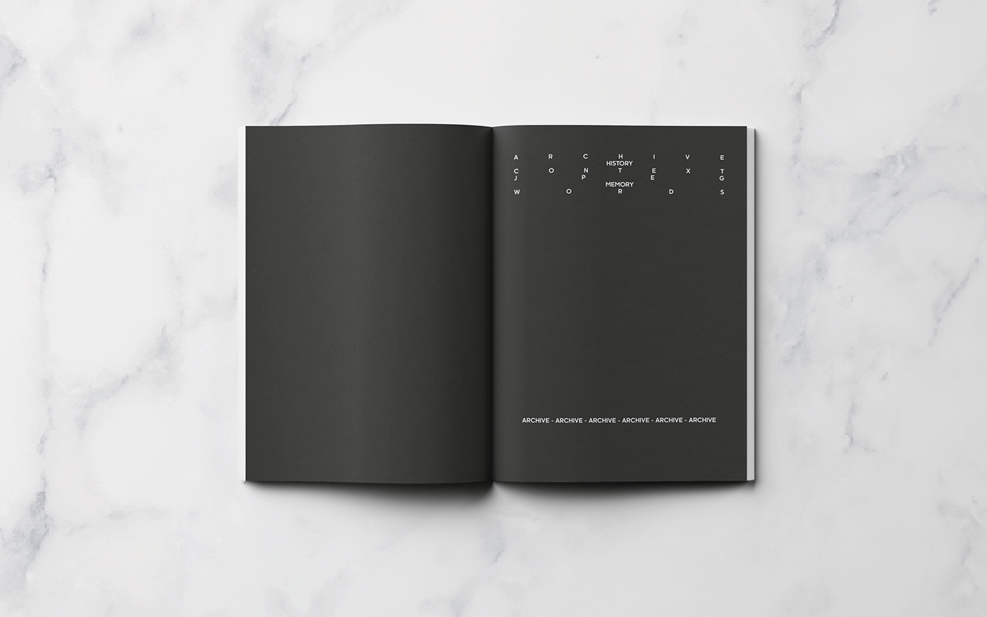
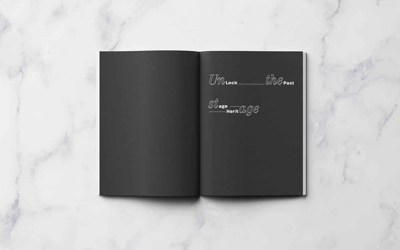
History
For decades, space has been readapted to new needs imposed by the very evolution of the times and acquired new values, of which the highlight is the installation of sound cinema. For her stage, there were great internationally renowned artists of the time, such as the cellist Guilhermina Suggia, violinist Isac Stern and pianist Arthur Rubenstein, the National Orchestras of Florence, Prague, Madrid or Vienna, the London Opera, among many others.
80s and 90s
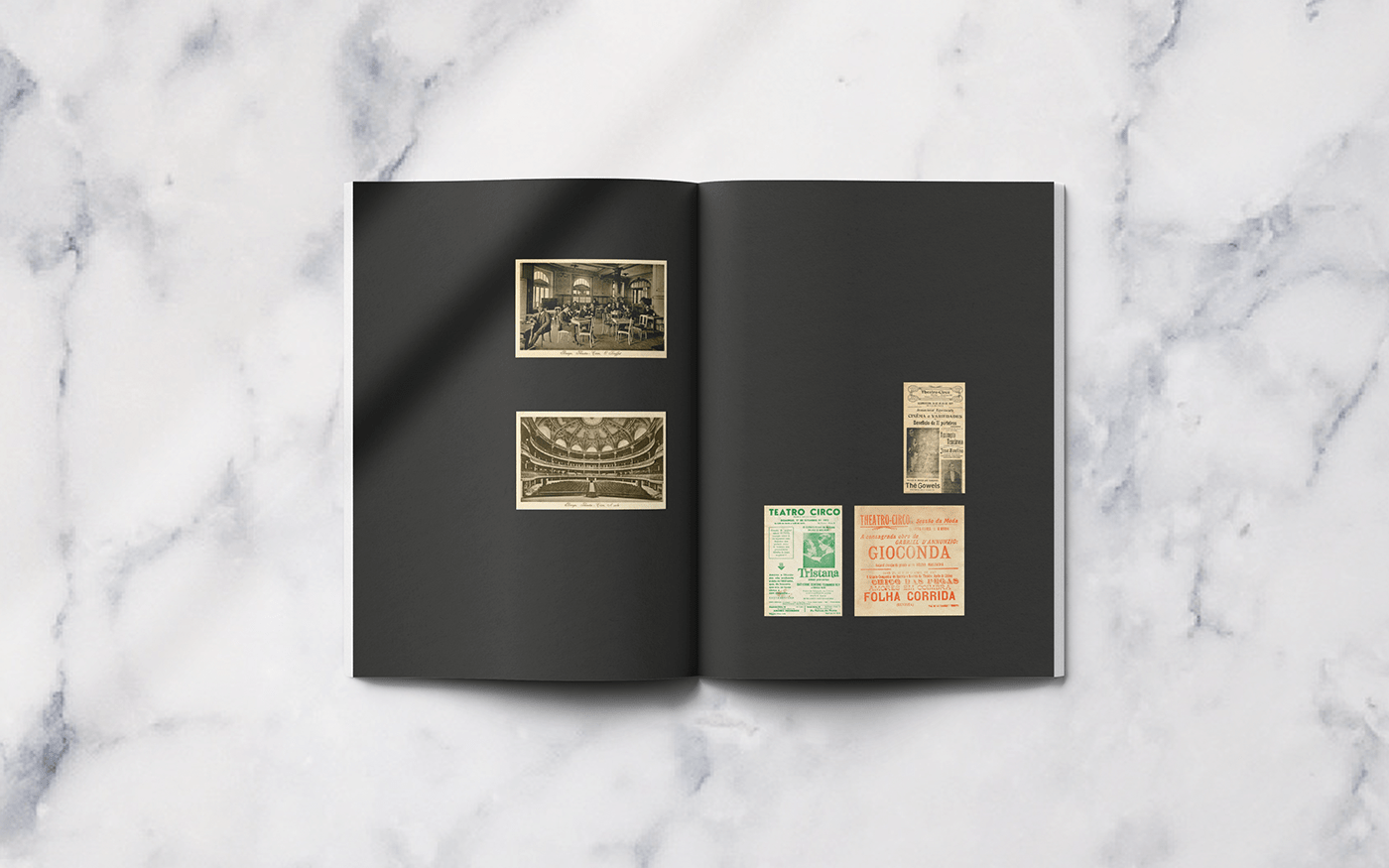
In the late 80's and throughout most of the 90's, Theatro Circo continued to ensure a diverse program of theater, film, opera, ballet, music, exhibitions and training actions.
The Restoration
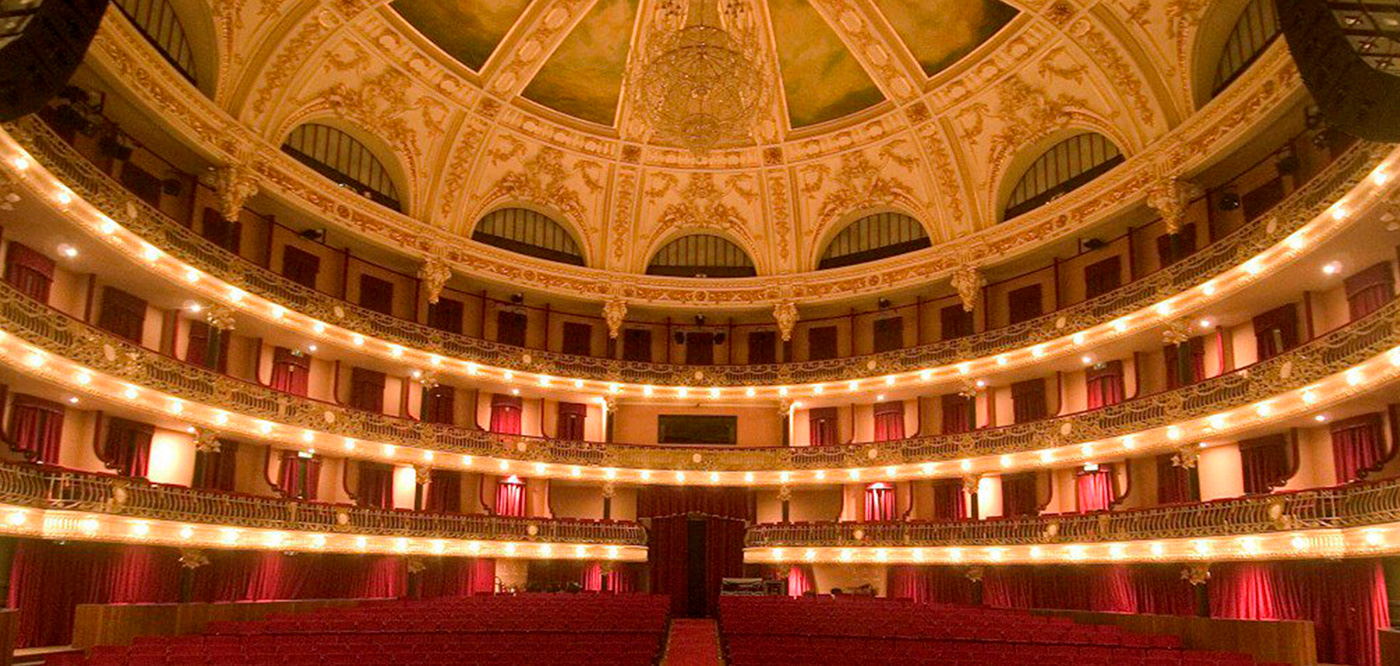
The process of remodeling began in 1999, and Theatro Circo underwent extensive restoration and requalification works, in a decision of the Autarchic Executive, which followed a protocol established between the Municipality of Braga and the Ministry of Culture, co-financed by the FEDER. The requalification, constituted by the restoration of the whole property with total respect for its architecture and the reinforcement and consolidation of the structure and its security, had as its objective the reconversion of Theatro Circo into a large cultural complex, equipped with the most current and complete scenic technology and capable of responding to the needs of contemporary art in its most varied dimensions. All this process culminated on 27 October 2006.

PT
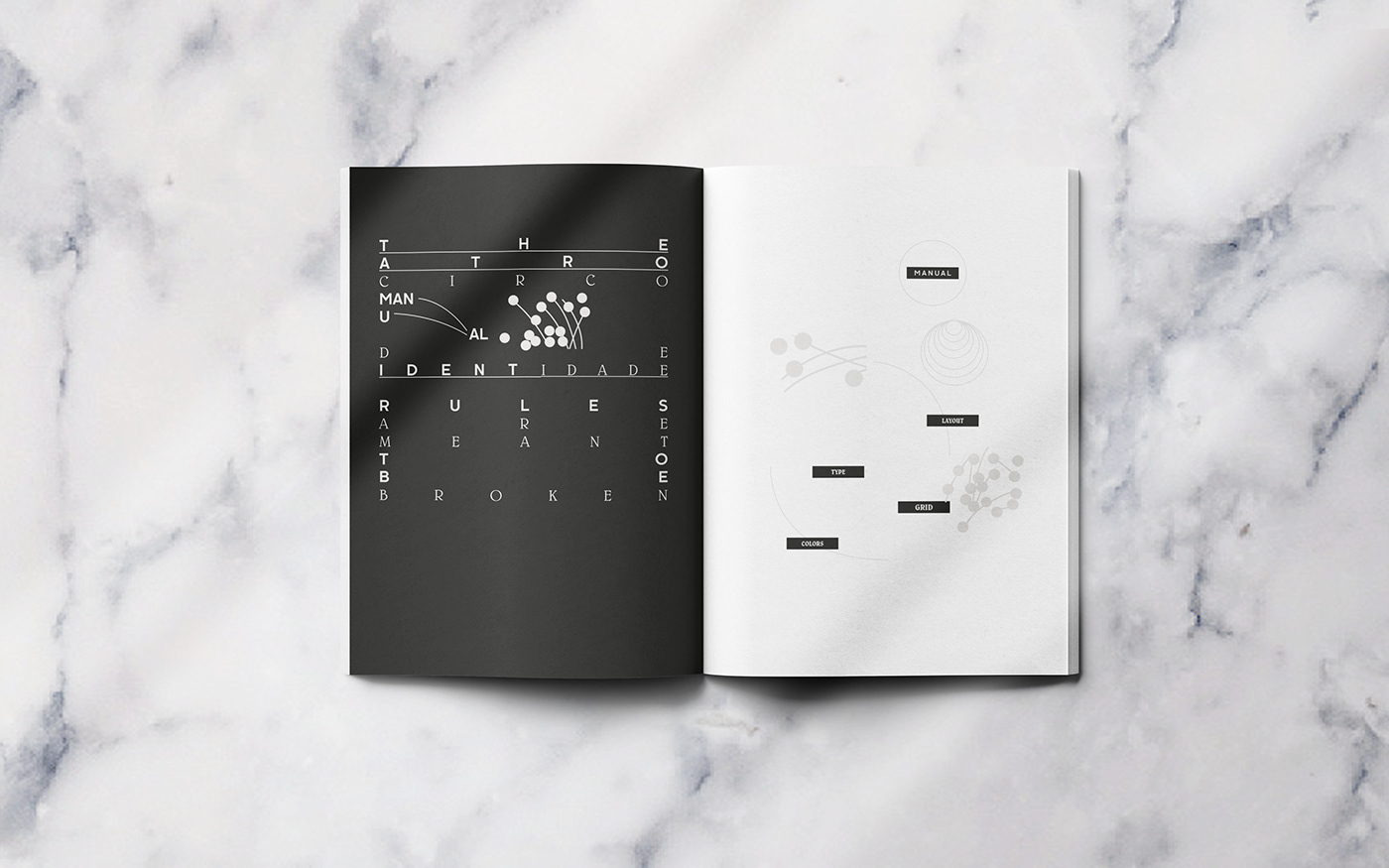
O manual representa a identidade da marca e as orientações visuais do logótipo criam uma harmonia entre os pontos ligados que são: o teatro, espectáculo, música, cinema, workshops, festivais de uma forma diversa mas sempre complementares da estrutura do edifício que é rica em arquitetura, tanto eclética quanto art déco.
EN
The manual represents the brand identity and the visual guidelines of the logo, it creates an harmony between the connected dots witch are: theatre, spectacle, music, cinema, workshops, festivals in a diverse way but always in complementary of the structure of the building witch is rich in arquitecture, both eclectic and art deco.
.
Video Promocional - Cortesia MezzoLab
.

.
.
.
.
.
.
.
.

.


.
.


PT
O Theatro Circo assegura uma programação diversificada de teatro, cinema, ópera, bailado, música, exposições e ações de formação há mais de 100 anos.
EN
Theatro Circo provides a diversified program of theater, cinema, opera, ballet, music, exhibitions and training activities over 100 years.
.
.
Teaser campaign (Curiosity)


Logo animation
Details


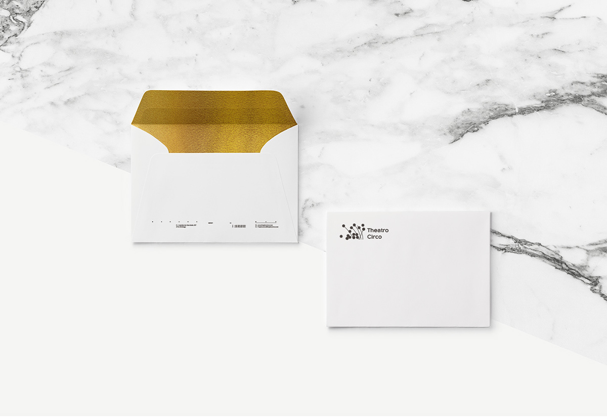
Business card

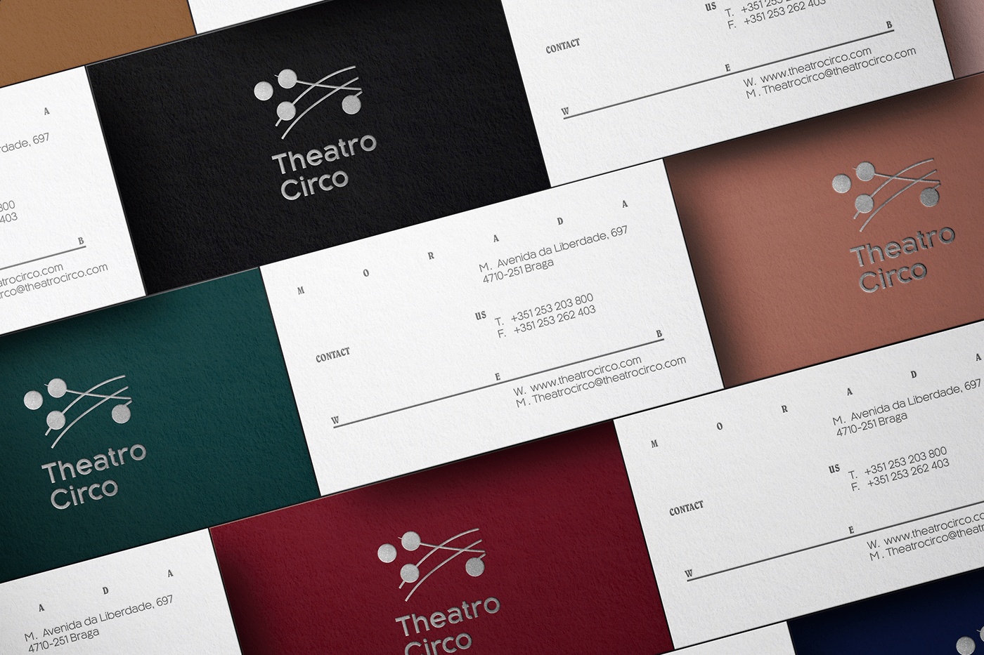
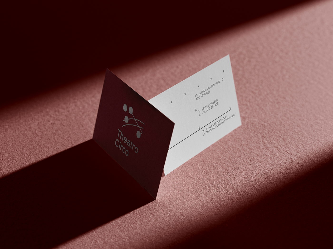
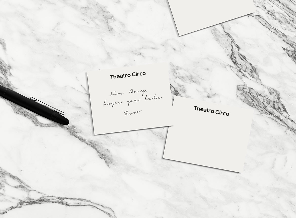
Stationary & merchandising


.
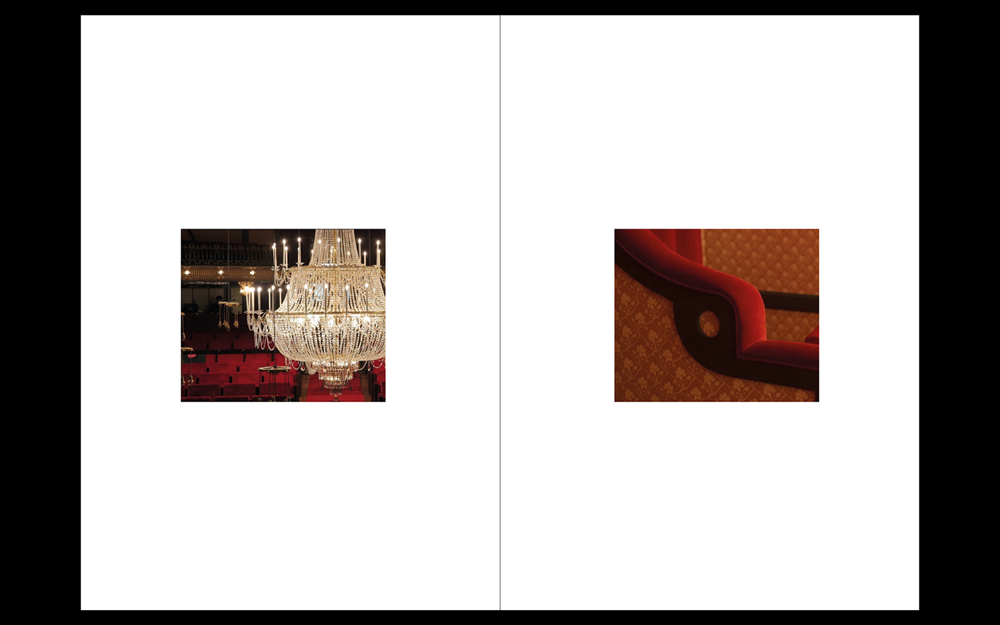
Special details of the Theatre (are what makes it special)

GRID (Animated)
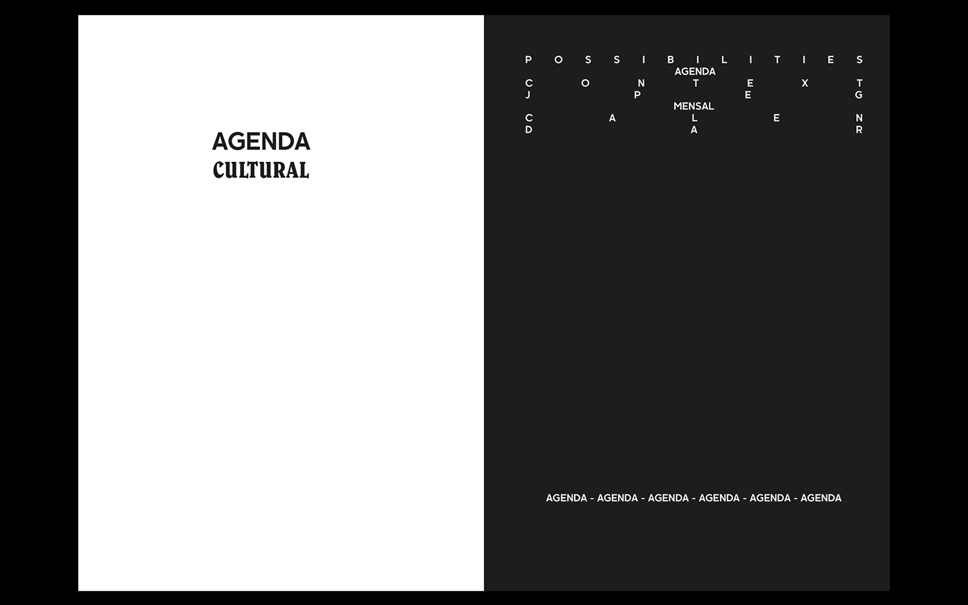
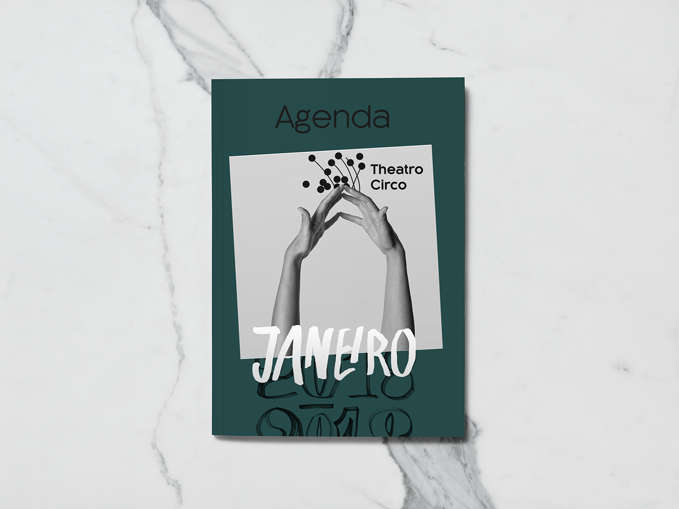
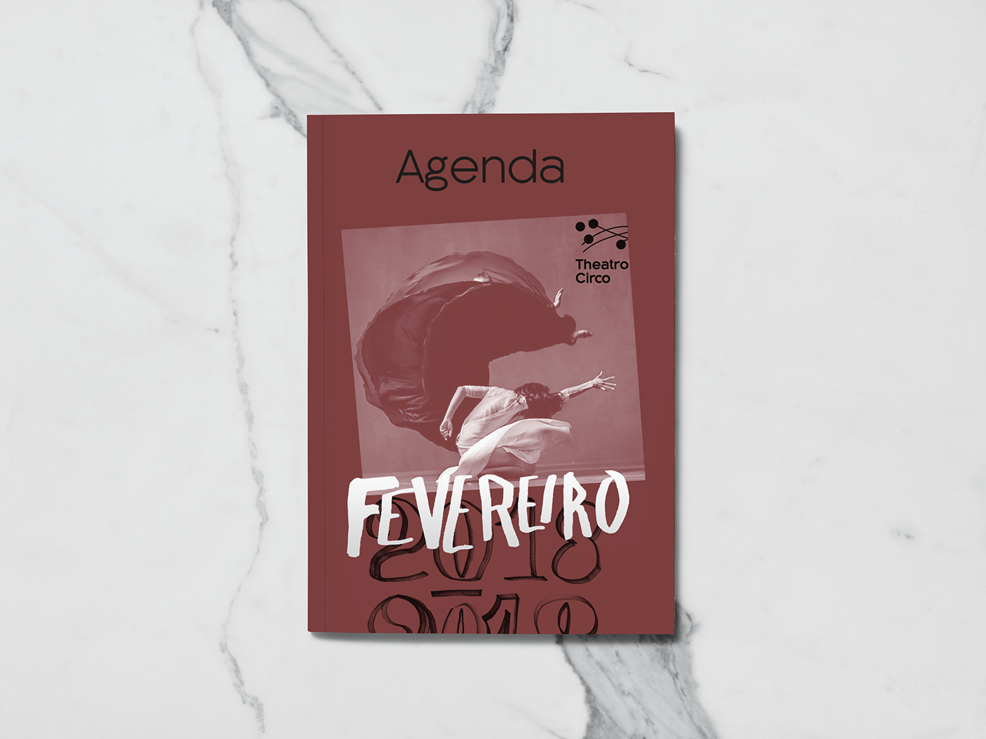
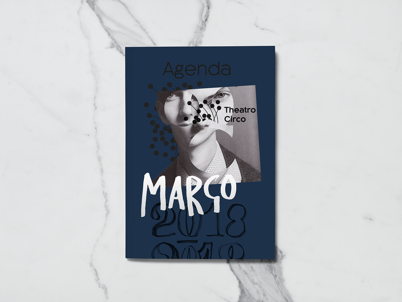
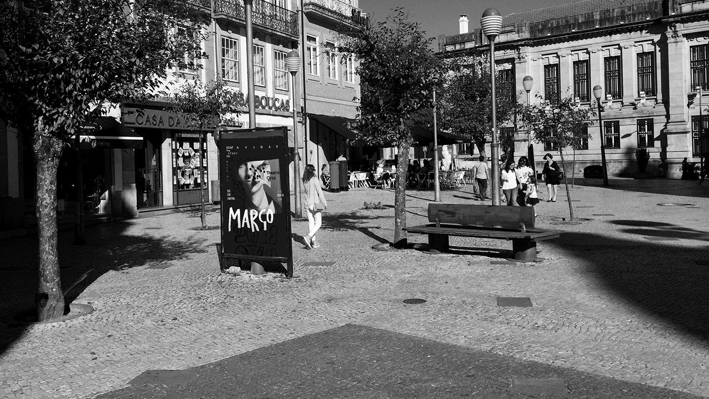
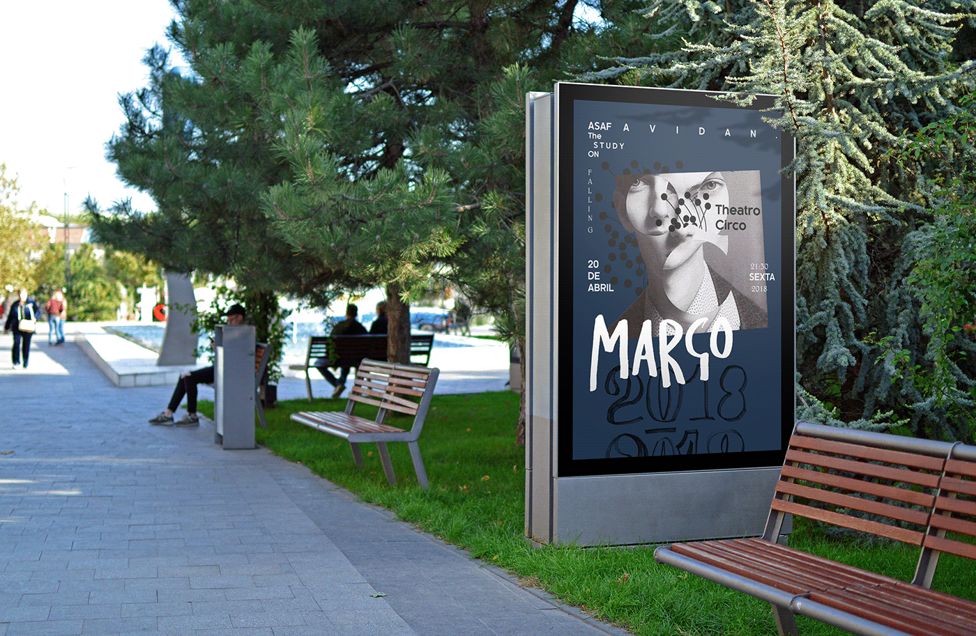
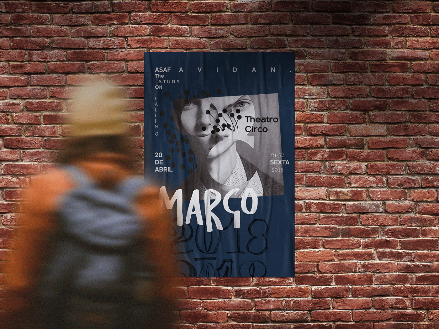
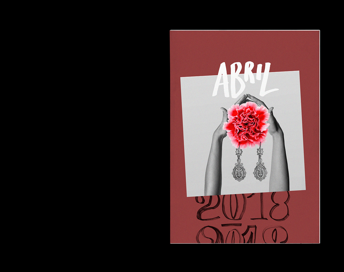
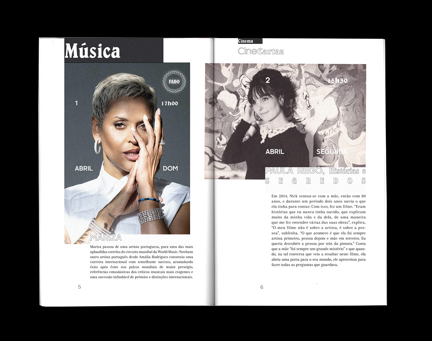
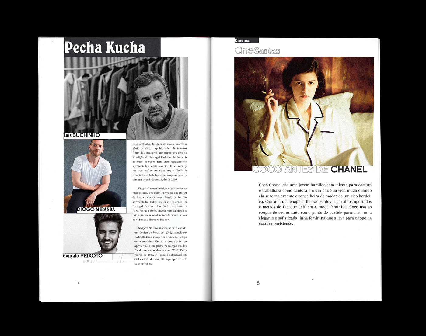
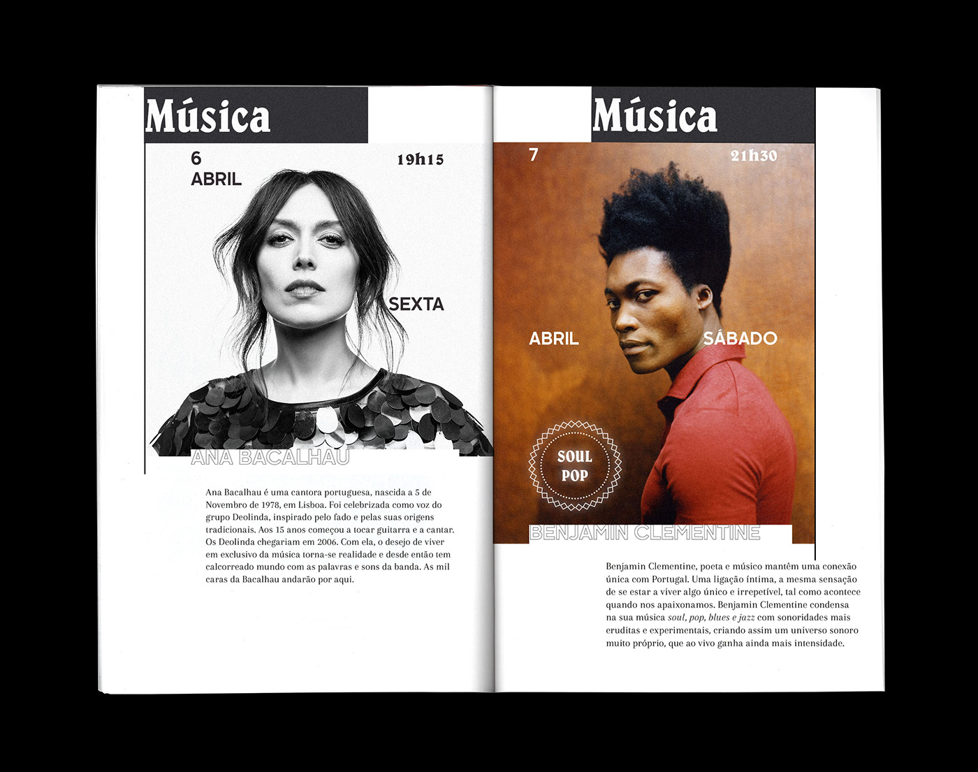
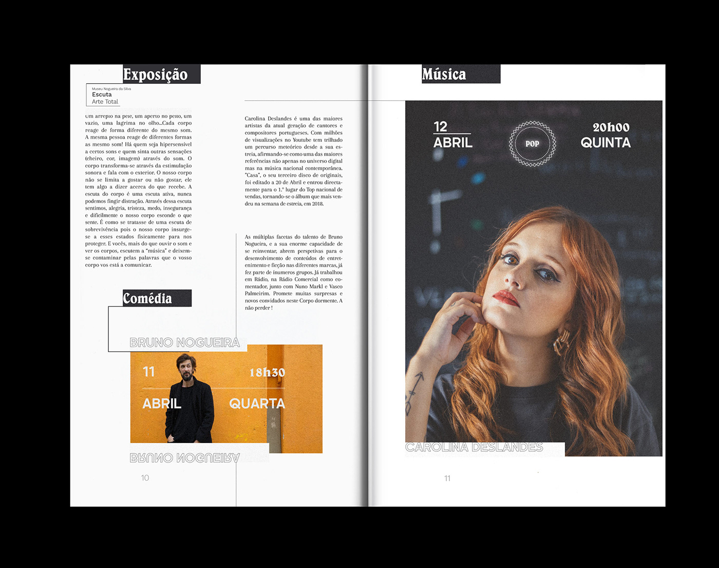
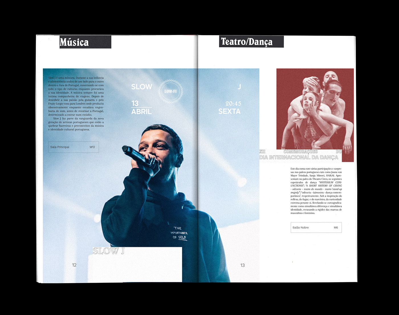
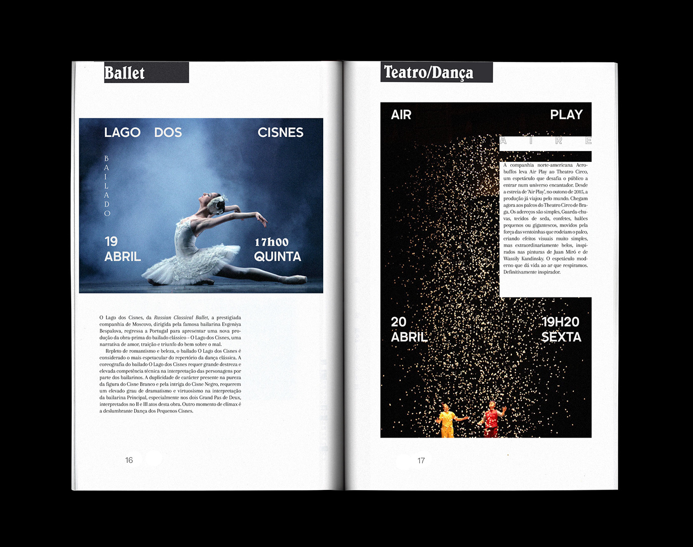
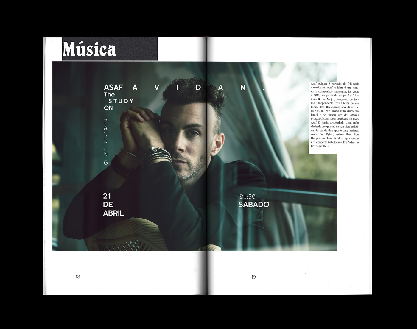
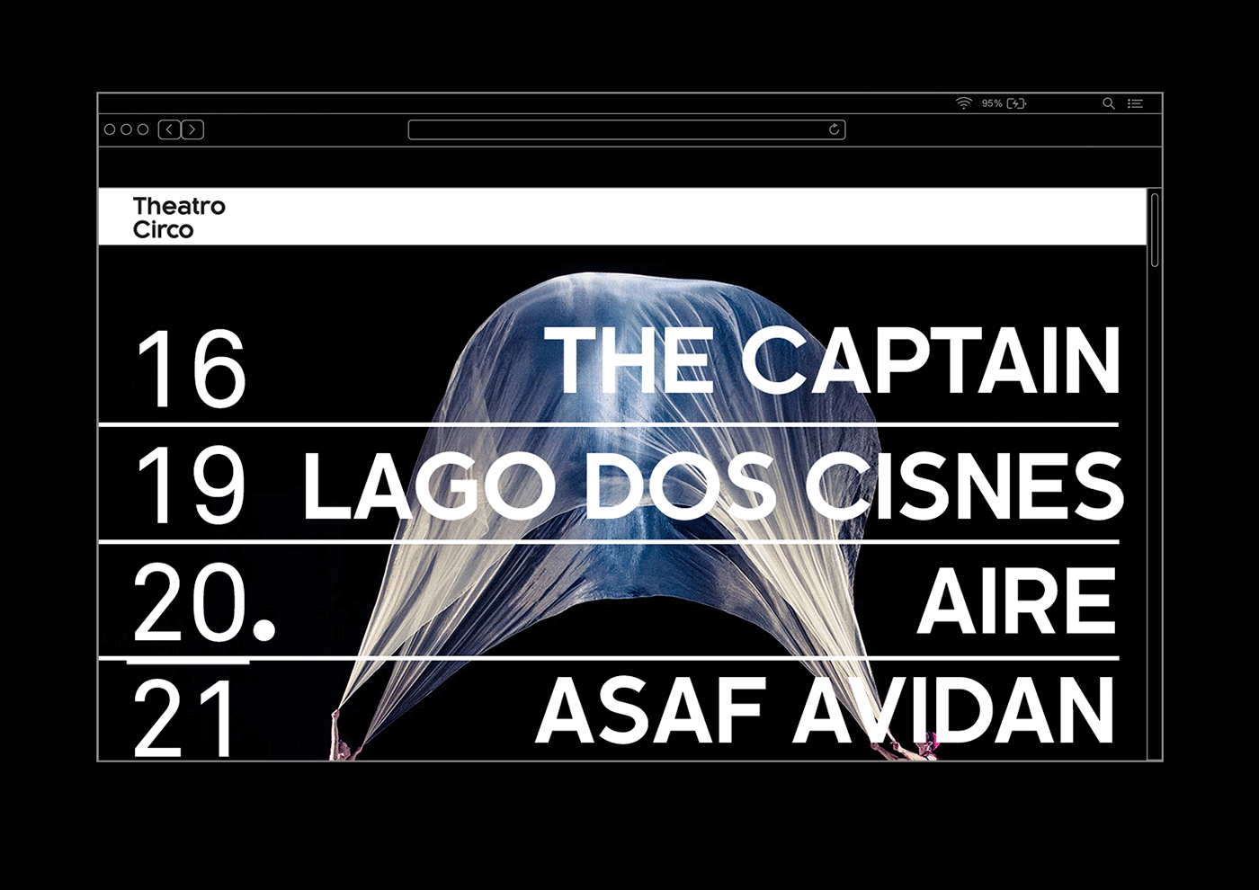
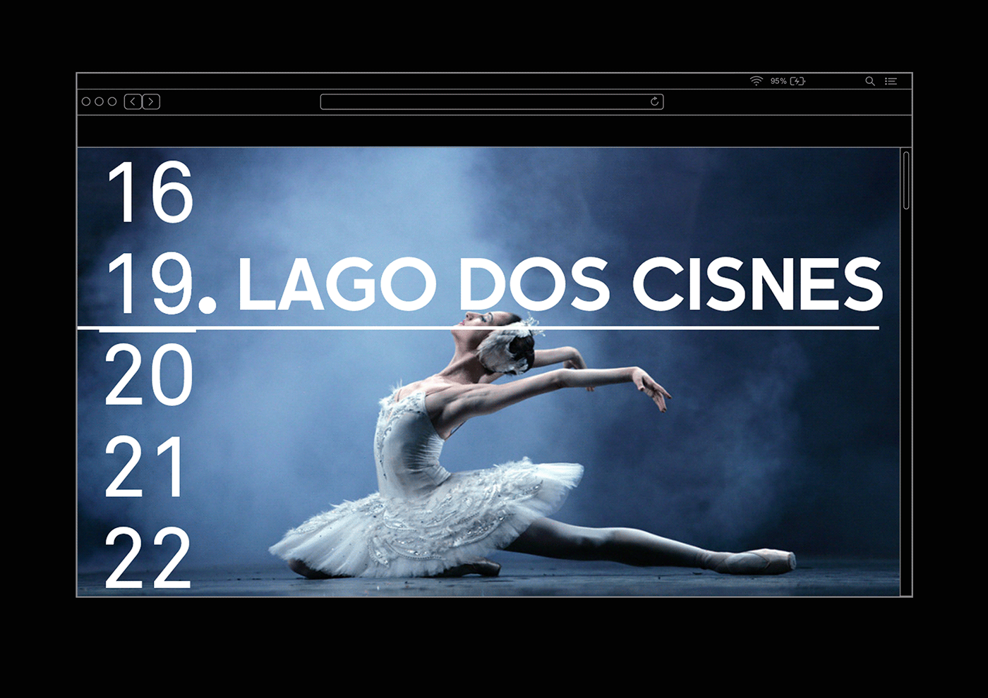
Cultural Agenda (A5)
Poster
Agenda


Social Media


WEB
Mershandising


Proposal of Rebranding - Theatre Circo
(Own initiative)
Projeto II - Identity
Proposta por Prof. João Martino
Ano lectivo 2017/18 |
ESAD Matosinhos
Thank you !


